Enlarged modules box up to 250px, so that buttons don't overlap anymore#464
Enlarged modules box up to 250px, so that buttons don't overlap anymore#464rinatkhaziev merged 3 commits intoAutomattic:masterfrom TheCrowned:fix/361-settings-style-update
Conversation
|
@TheCrowned I'd add a bit more information to this PR's description, for example a screenshot of before and after on a mobile device (or a mobile emulator) While there is some more info in #361 it would be nice to have all the rationale for the PR here since Issues could have long conversations and not always start or go over the main reasoning in one place. Having a summary of the "why" in PRs is very useful (the "Why" can include things like screenshots to demonstrate). |
… be responsive and adapt itself to different resolutions.
|
All right - I have updated the PR initial description with details and screenshots. Also, I took the chance to make another commit further improving the layout on small screens (details above) :) |
 mdbitz
left a comment
mdbitz
left a comment
mdbitz
left a comment
There was a problem hiding this comment.
Verified the styling updates that no buttons break to 2 lines on my mobile.
@rinatkhaziev tagging you to verify this is good to merge.
|
Thanks for your contribution @TheCrowned. Unfortunately, your solution doesn't really cover all the bases. We'll be better off with using Flexbox in conjunction with media queries. So that for smaller viewport a module should take 100% of widh and modules should be stacked on top of each other. If you're unfamiliar with Flexbox, here's a good starting point: https://css-tricks.com/snippets/css/a-guide-to-flexbox/ I'm tentatively punting this to 0.9 |
|
Nice, I didn't know about the Tested the changes on my phone, see screenshots :)
|
4 participants
Fix styling not being optimal on mobile devices (and small resolutions in general), as proposed in #361.
In particular,
min-widthproperty from modules container, which prevented the page from being fully adaptable to different resolutions.Any viewer which is at least ~ 250px wide should see the page well. Tested with Chrome (with variable window size) and a mobile emulator. Now, if the viewer is not at least ~ 500px wide, module boxes are all stacked in a single column.
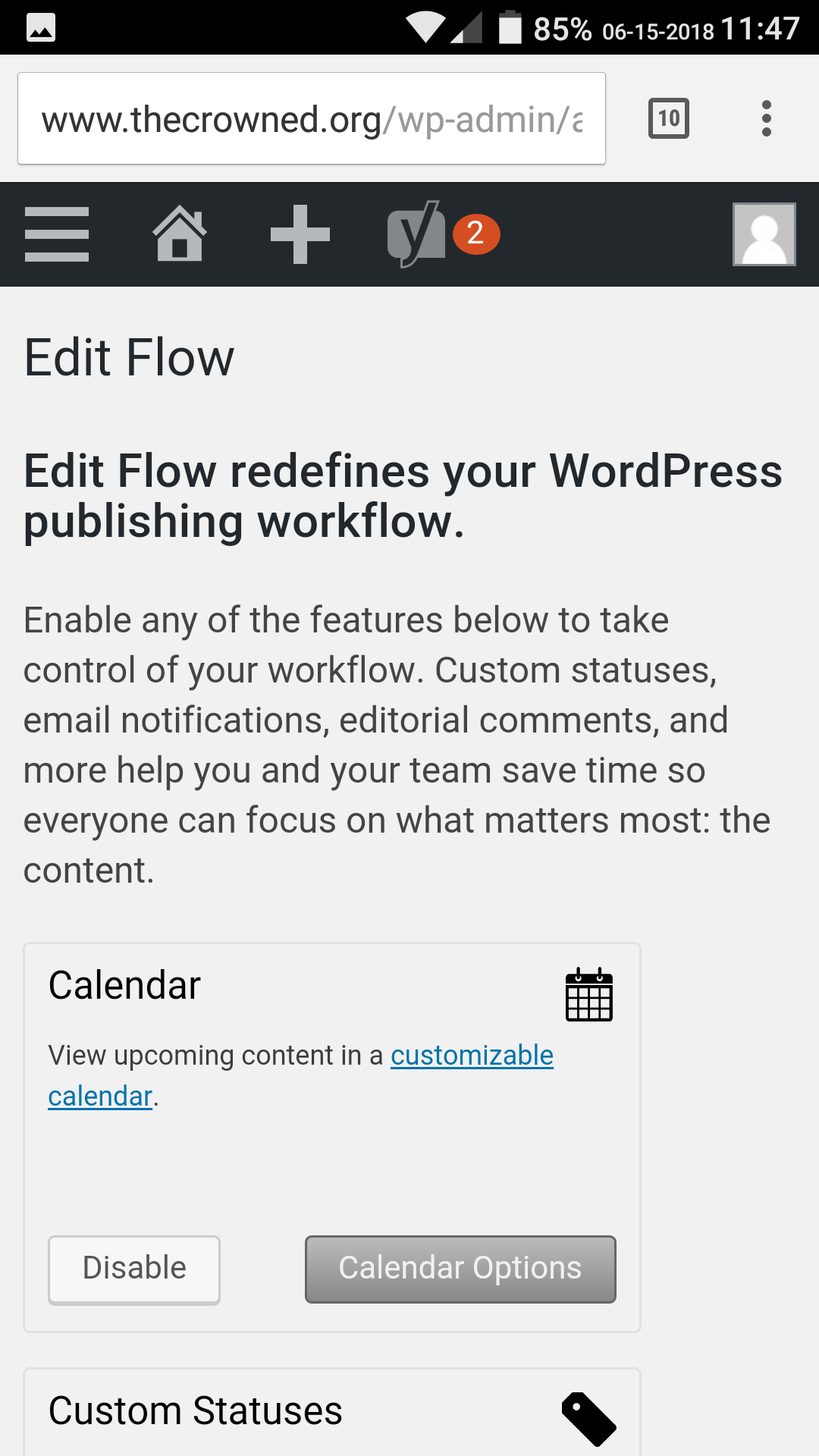
Before CSS changes
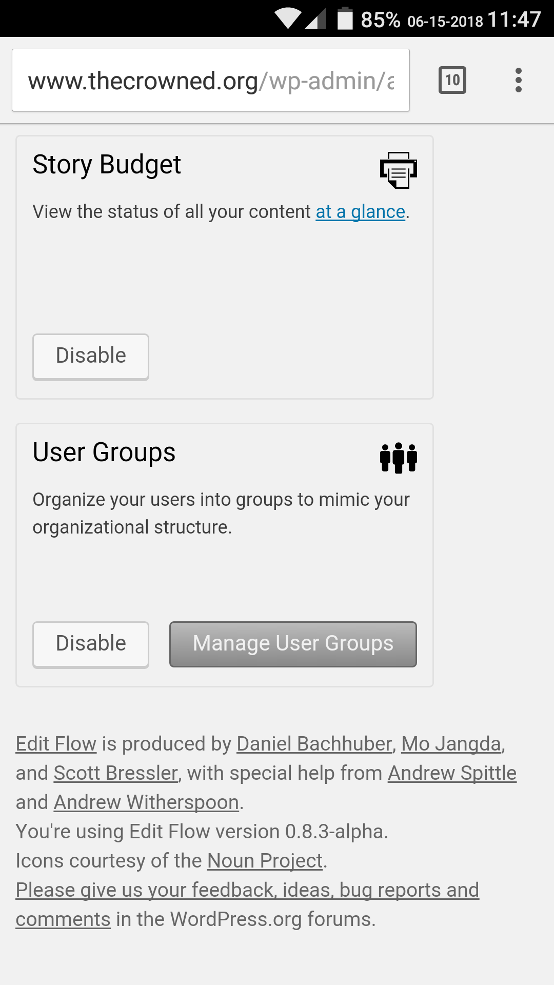
After CSS changes