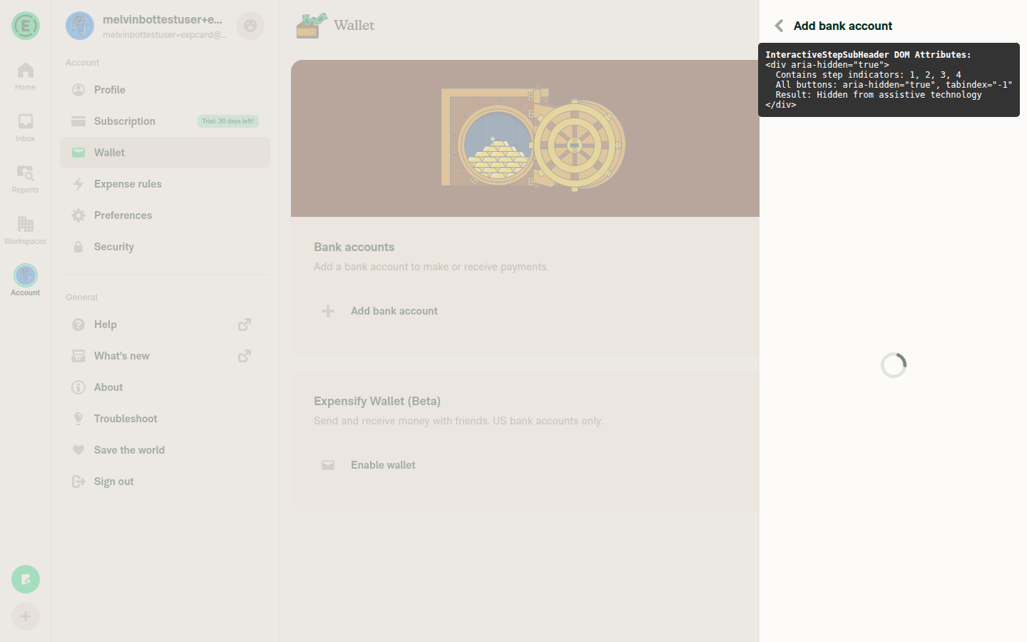
Hide InteractiveStepSubHeader from assistive technology#84824
Conversation
The step indicator wizard component is decorative/visual-only.
Remove focusable and accessibilityLabel from the container View
and add aria-hidden to hide the entire component tree from screen
readers and keyboard navigation.

Co-authored-by: Rushat Gabhane <rushatgabhane@users.noreply.github.com>
|
@MelvinBot this should work for react native too |
|
Yes, From React Native's if (ariaHidden !== undefined) {
processedProps.accessibilityElementsHidden = ariaHidden;
if (ariaHidden === true) {
processedProps.importantForAccessibility = 'no-hide-descendants';
}
}So setting
This is also consistent with how the codebase already uses |
|
@MelvinBot can't we use accessible false |
|
In this component, the container has child With Note that the individual |
|
@MelvinBot what about native? |
|
The same distinction applies on native (iOS and Android):
So |
|
@MelvinBot what if we add accesible=false? |
|
Adding
Some components in the codebase do use both as a belt-and-suspenders pattern (e.g., Happy to add |
|
yeah just add accessible={false} no need other things @MelvinBot |
Co-authored-by: Rushat Gabhane <rushatgabhane@users.noreply.github.com>
|
Done — replaced |
|
@MelvinBot mark ready for review |
|
Done — PR is now marked as ready for review. |
 melvin-bot
bot
requested review from
ahmedGaber93
and removed request for
a team
melvin-bot
bot
requested review from
ahmedGaber93
and removed request for
a team
|
@ahmedGaber93 Please copy/paste the Reviewer Checklist from here into a new comment on this PR and complete it. If you have the K2 extension, you can simply click: [this button] |
melvin-bot
bot
requested review from
joekaufmanexpensify
and removed request for
a team
|
@MelvinBot use web agent to post screnshot and also verify from DOM if things are fixed |
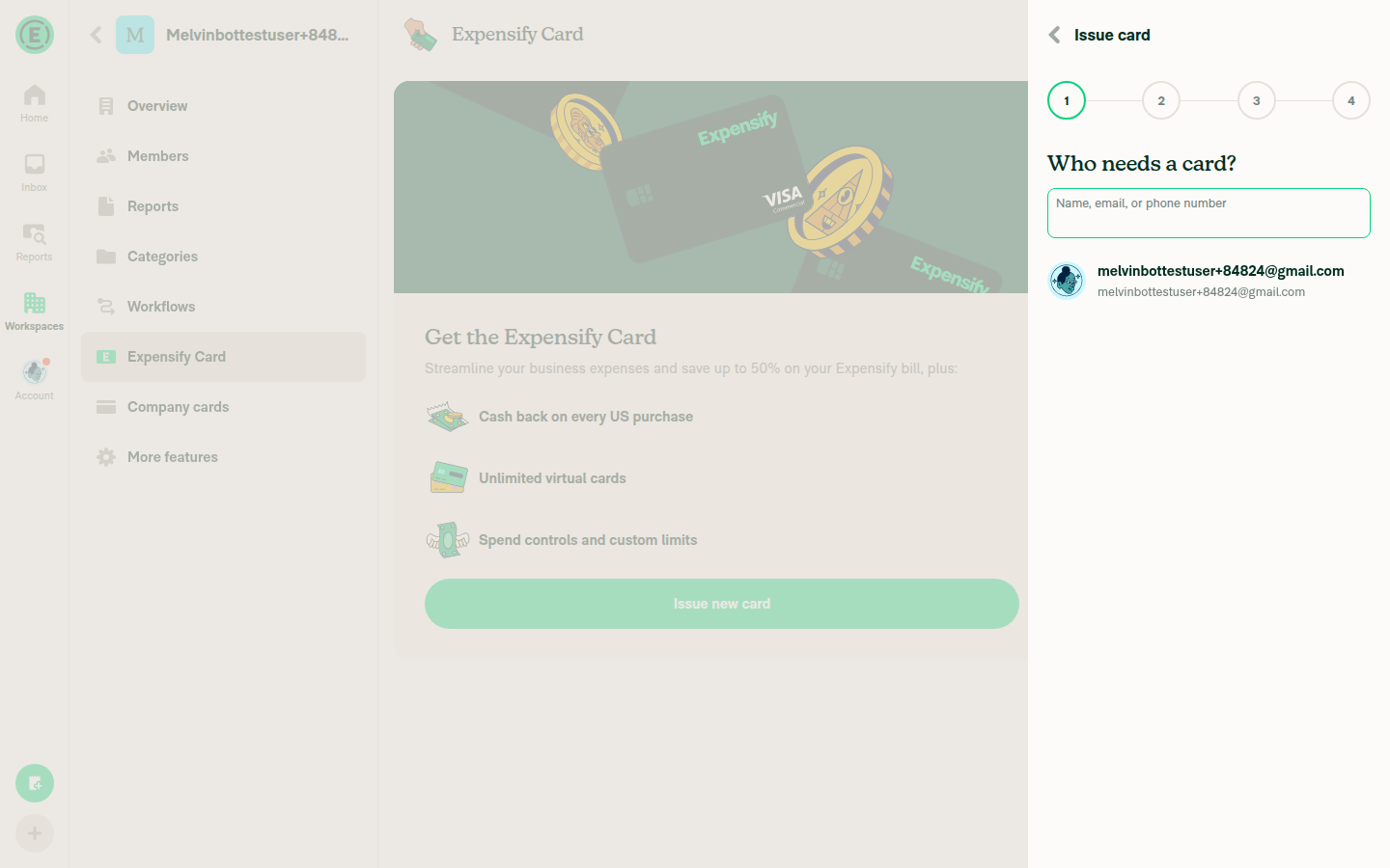
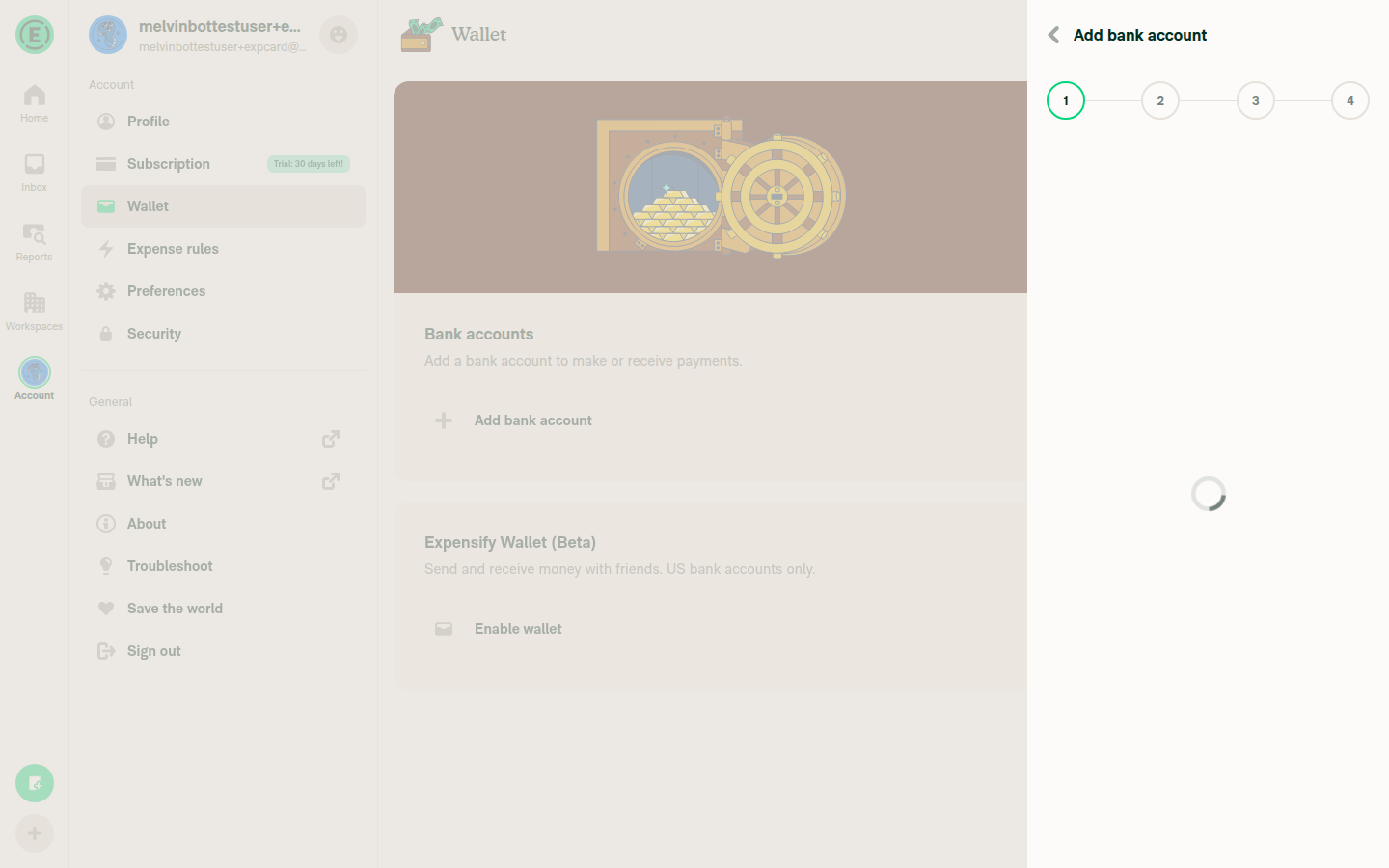
Web Testing & DOM VerificationI tested the PR on the web build and inspected the DOM. Here are the results: ScreenshotsIssue New Card wizard — step indicators visible: Step indicators close-up: DOM Inspection Results
Note on the outer container: The current branch uses If you want the container itself to also have |

Reviewer Checklist
Screenshots/VideosAndroid: HybridAppAndroid: mWeb ChromeiOS: HybridAppiOS: mWeb SafariMacOS: Chrome / Safari |
|
@MelvinBot cool, please add aria-hidden |
Co-authored-by: Rushat Gabhane <rushatgabhane@users.noreply.github.com>
|
Added The container now has both props — |
melvin-bot
bot
requested review from
shubham1206agra
and removed request for
a team
|
@shubham1206agra Please copy/paste the Reviewer Checklist from here into a new comment on this PR and complete it. If you have the K2 extension, you can simply click: [this button] |
|
The failing check is unrelated to this PR. Analysis: The Evidence: This PR only modifies Re-running the test workflow should resolve this. |
|
@MelvinBot merge main |
…AssistiveTech

Co-authored-by: Rushat Gabhane <rushatgabhane@users.noreply.github.com>
|
Merged |
|
@MelvinBot post screenshot too, to verify |
|
Ready for merge |
|
Here are screenshots from testing the PR on web: Step indicator circles (1, 2, 3, 4) visible in the wizard header: DOM inspection confirming Verification results:
|
 joekaufmanexpensify
left a comment
joekaufmanexpensify
left a comment
joekaufmanexpensify
left a comment
There was a problem hiding this comment.
Fine for product
|
🚧 @deetergp has triggered a test Expensify/App build. You can view the workflow run here. |
|
🧪🧪 Use the links below to test this adhoc build on Android, iOS, and Web. Happy testing! 🧪🧪
|


|
🚀 Deployed to staging by https://github.com/deetergp in version: 9.3.38-0 🚀
|
|
🚀 Deployed to production by https://github.com/cristipaval in version: 9.3.38-4 🚀
|
5 participants
Explanation of Change
The
InteractiveStepSubHeadercomponent (the numbered step indicator circles 1, 2, 3, etc.) was partially accessible to assistive technology — the outer containerViewhadfocusableand anaccessibilityLabel, making it discoverable via keyboard Tab navigation and screen readers, even though the individual step buttons were already hidden (accessible={false},aria-hidden).This change makes the entire step indicator component purely decorative by:
focusablefrom the container (prevents keyboard Tab focus)accessibilityLabelfrom the container (no longer needed)aria-hiddento the container (hides the entire component tree from screen readers on all platforms)The step indicator is visual-only — users navigate between steps using the back button in the header, not by clicking step indicators directly.
Fixed Issues
$ #76905
Tests
aria-hidden="true"in the DOMOffline tests
N/A — this is a purely presentational/accessibility change with no network behavior.
QA Steps
PR Author Checklist
### Fixed Issuessection aboveTestssectionOffline stepssectionQA stepssectiontoggleReportand notonIconClick)src/languages/*files and using the translation methodSTYLE.md) were followedAvatar, I verified the components usingAvatarare working as expected)StyleUtils.getBackgroundAndBorderStyle(theme.componentBG))npm run compress-svg)Avataris modified, I verified thatAvataris working as expected in all cases)Designlabel and/or tagged@Expensify/designso the design team can review the changes.ScrollViewcomponent to make it scrollable when more elements are added to the page.mainbranch was merged into this PR after a review, I tested again and verified the outcome was still expected according to theTeststeps.Screenshots/Videos
Android: Native
N/A — accessibility attribute change, no visual difference
Android: mWeb Chrome
N/A — accessibility attribute change, no visual difference
iOS: Native
N/A — accessibility attribute change, no visual difference
iOS: mWeb Safari
N/A — accessibility attribute change, no visual difference
MacOS: Chrome / Safari
N/A — accessibility attribute change, no visual difference