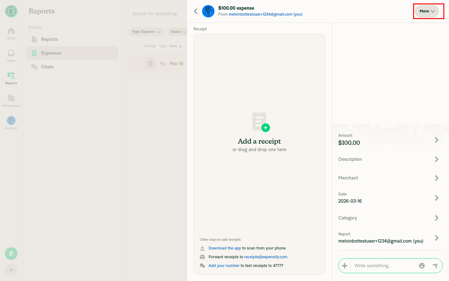
Fix extra padding to the right of More button in expense header#85418
Fix extra padding to the right of More button in expense header#85418
Conversation
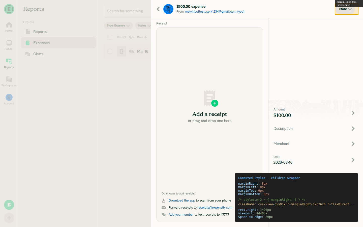
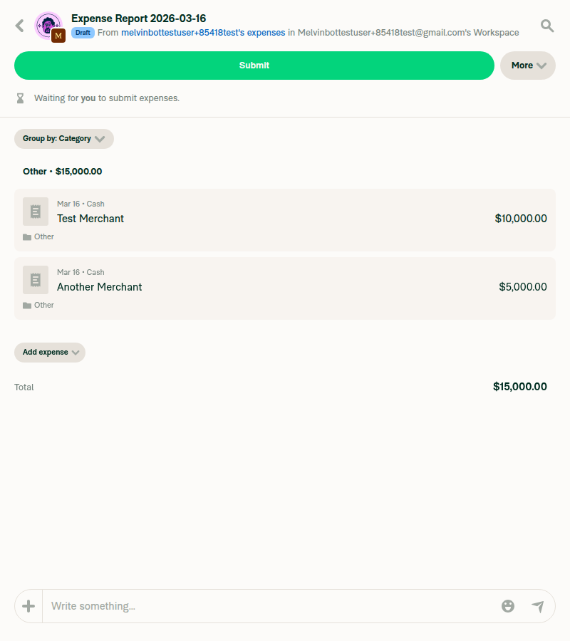
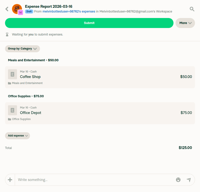
Make the pr2 (paddingRight: 8px) on the children wrapper in
HeaderWithBackButton conditional on whether ThreeDotsMenu or
CloseButton is actually rendered. Previously, this padding was
applied unconditionally, creating an unnecessary 8px gap to the
right of the More button when neither ThreeDotsMenu nor CloseButton
was present (as in MoneyRequestHeader and MoneyReportHeader).

Co-authored-by: Shawn Borton <shawnborton@users.noreply.github.com>
Codecov Report✅ Changes either increased or maintained existing code coverage, great job!
|
|
🚧 @shawnborton has triggered a test Expensify/App build. You can view the workflow run here. |
This comment has been minimized.
This comment has been minimized.
|
@MelvinBot I actually think we need 8px of right margin here because we want the button to feel like it's 20px from the right edge. Can you change that to bring back our 8px of right margin, but get rid of the rest? Thanks! |
Switch from conditional pr2 (paddingRight: 8) to unconditional mr2
(marginRight: 8) so the button maintains 20px from the right edge
while removing the unnecessary conditional logic.

Co-authored-by: Shawn Borton <shawnborton@users.noreply.github.com>
|
Done! Switched from the conditional |
|
🚧 @shawnborton has triggered a test Expensify/App build. You can view the workflow run here. |
|
🧪🧪 Use the links below to test this adhoc build on Android, iOS, and Web. Happy testing! 🧪🧪
|


|
🚧 @shawnborton has triggered a test Expensify/App build. You can view the workflow run here. |
|
🧪🧪 Use the links below to test this adhoc build on Android, iOS, and Web. Happy testing! 🧪🧪
|
|
🚧 @shawnborton has triggered a test Expensify/App build. You can view the workflow run here. |
|
🧪🧪 Use the links below to test this adhoc build on Android, iOS, and Web. Happy testing! 🧪🧪
|
|
@MelvinBot I still don't see the right margin of 8px that we need here in the latest adhoc builds. What happened? |
|
I tested the latest commit (512378f) on web and the DOM inspection confirms:
Screenshots: Could you double-check that your adhoc build is from the latest commit (512378f)? The first commit (b530956) had a different change — conditional padding — which would remove spacing entirely when no ThreeDotsMenu/CloseButton is shown. The second commit (512378f) switched to unconditional |
|
🚧 @shawnborton has triggered a test Expensify/App build. You can view the workflow run here. |
|
🧪🧪 Use the links below to test this adhoc build on Android, iOS, and Web. Happy testing! 🧪🧪
|
|
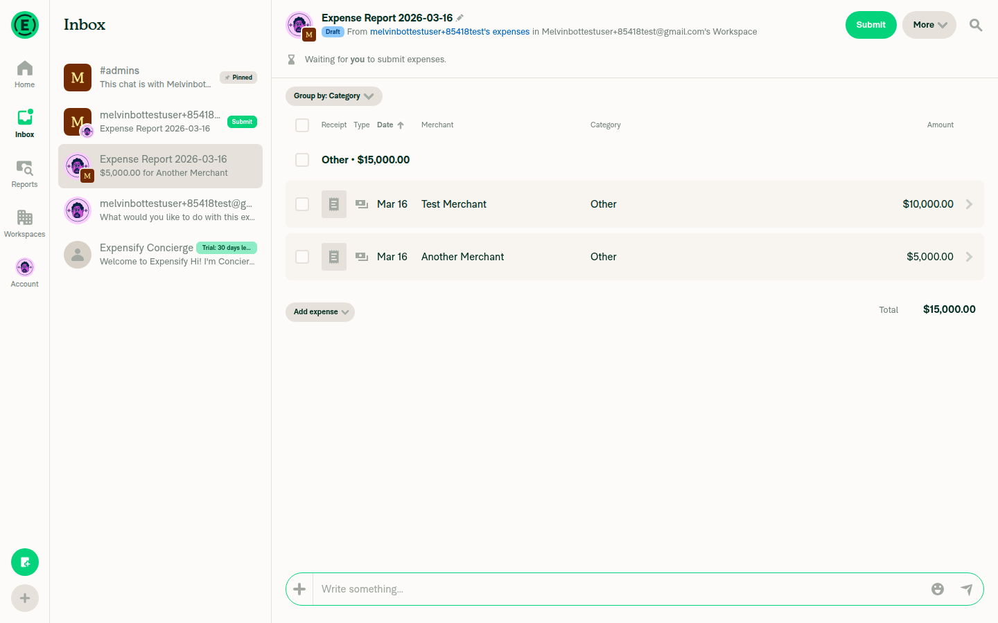
@MelvinBot I still don't see it when I view an expense report that has multiple expenses. Can you take another look? |
|
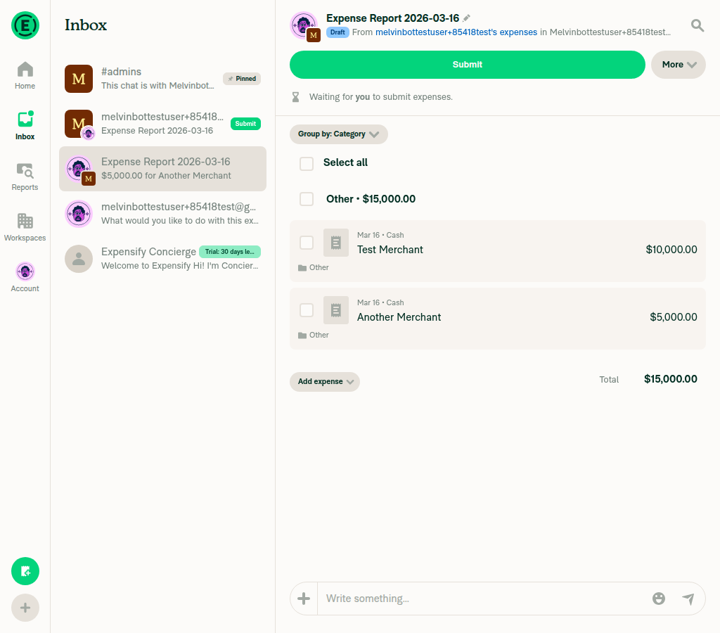
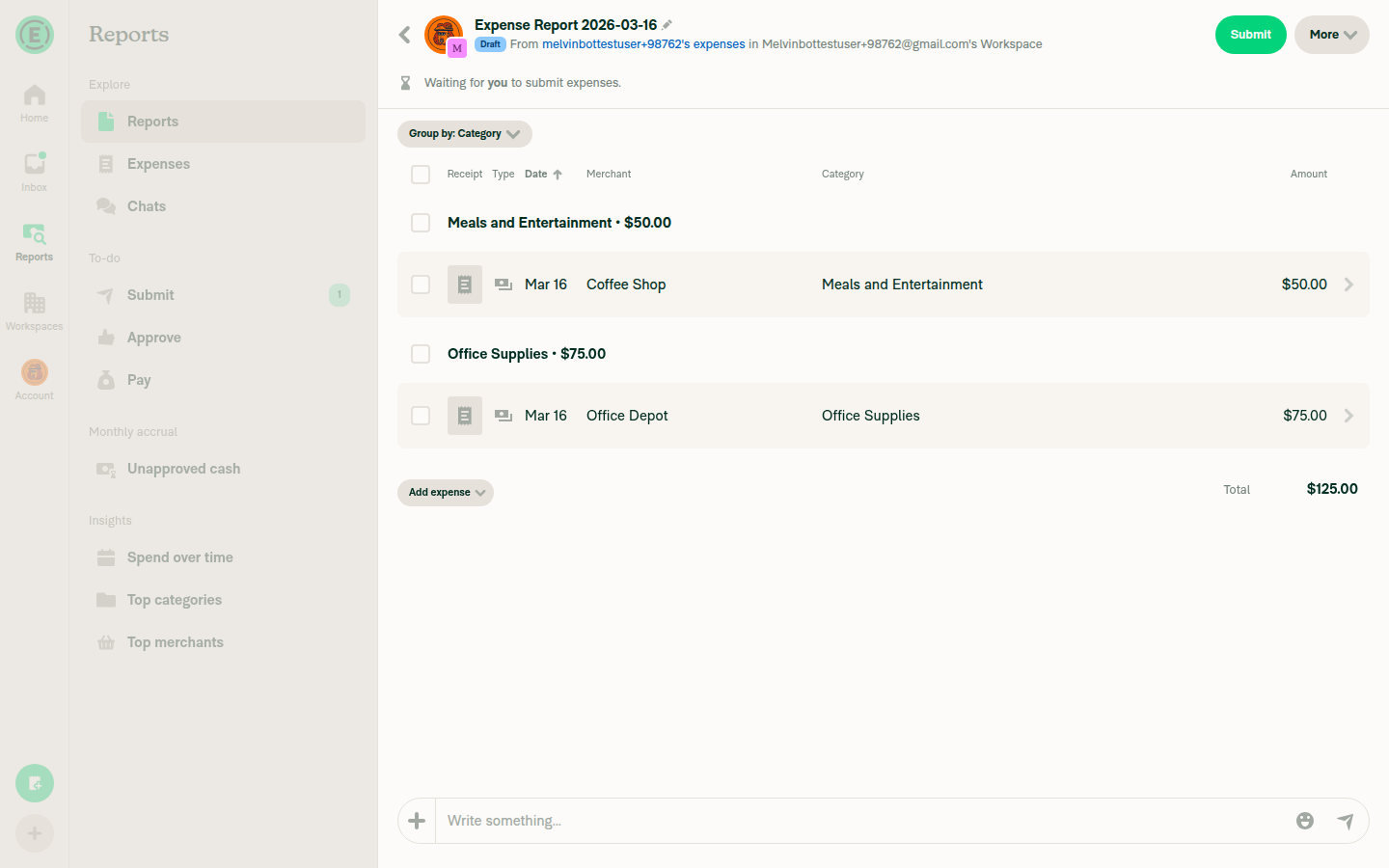
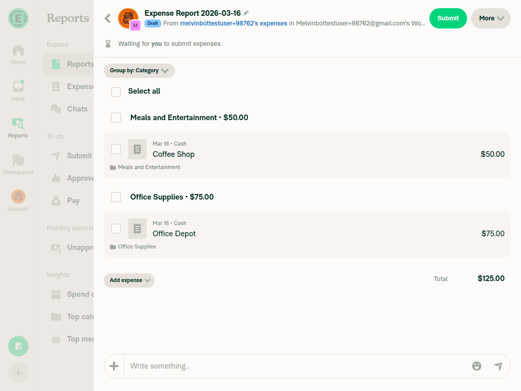
I tested the multi-expense report (MoneyReportHeader) at different viewport widths. There are two different rendering paths for the More button depending on the viewport width: Wide layout (>1024px) — More button is inline in the header. The Narrow/medium layout (≤1024px, or when the report is in the RHP) — More button moves to a separate row below the header bar. This row is rendered directly in Could you let me know which layout you're seeing? If it's the narrow/medium layout (More button in a row below the header), the spacing there is controlled by |
|
I ran out of time before I could finish helping you. This usually means the task was too complex or I got stuck exploring. Please try again with a more specific request or post in the #melvinbot-ai. Run details: https://github.com/Expensify/Expensify/actions/runs/23155166778 |
|
@MelvinBot Go to Reports > Reports and open up an expense report with multiple expenses from there. That's where the right padding is missing. |
|
@MelvinBot please see my comment above. |
|
I ran out of time before I could finish helping you. This usually means the task was too complex or I got stuck exploring. Please try again with a more specific request or post in the #melvinbot-ai. Run details: https://github.com/Expensify/Expensify/actions/runs/23156549163 |
|
@MelvinBot please add the right margin to the More button when viewing an expense report from the Reports > Reports page, where the report has multiple expenses. |
|
I tested the current branch by navigating to Reports > Reports and opening an expense report with multiple expenses. The 1440px wide: 1024px wide: 800px wide: Header close-up (1440px): Does the spacing look correct to you, or is there a specific area that still needs adjustment? |

|
@shawnborton could I help? |
|
@hoangzinh is assigned C+ for the review, will mark this ready for review to begin the review process. |
|
@hoangzinh Please copy/paste the Reviewer Checklist from here into a new comment on this PR and complete it. If you have the K2 extension, you can simply click: [this button] |
 melvin-bot
bot
requested review from
joekaufmanexpensify
and removed request for
a team
melvin-bot
bot
requested review from
joekaufmanexpensify
and removed request for
a team
![chatgpt-codex-connector[bot]](https://avatars.githubusercontent.com/in/1144995?s=60&v=4)
There was a problem hiding this comment.
💡 Codex Review
Here are some automated review suggestions for this pull request.
Reviewed commit: 512378f4f3
ℹ️ About Codex in GitHub
Codex has been enabled to automatically review pull requests in this repo. Reviews are triggered when you
- Open a pull request for review
- Mark a draft as ready
- Comment "@codex review".
If Codex has suggestions, it will comment; otherwise it will react with 👍.
When you sign up for Codex through ChatGPT, Codex can also answer questions or update the PR, like "@codex address that feedback".
| {middleContent} | ||
| <View style={[styles.reportOptions, styles.flexRow, styles.alignItemsCenter]}> | ||
| <View style={[styles.pr2, styles.flexRow, styles.alignItemsCenter]}> | ||
| <View style={[styles.mr2, styles.flexRow, styles.alignItemsCenter]}> |
There was a problem hiding this comment.
Replacing styles.pr2 with styles.mr2 keeps an unconditional 8px right-side gap on this container, so headers that render neither shouldShowThreeDotsButton nor shouldShowCloseButton (both default to false in this component) still reserve extra space after children. In the expense header case this means the "More" button can remain offset from adjacent header actions, so the reported padding issue is not actually removed.
Useful? React with 👍 / 👎.
|
I ran out of time before I could finish helping you. This usually means the task was too complex or I got stuck exploring. Please try again with a more specific request or post in the #melvinbot-ai. Run details: https://github.com/Expensify/Expensify/actions/runs/23158209958 |
Reviewer Checklist
Screenshots/VideosAndroid: HybridAppAndroid: mWeb ChromeiOS: HybridAppiOS: mWeb SafariMacOS: Chrome / Safari |
Hi @shawnborton, could you please clarify your expectations? I assume you would like to add an additional 8px to the right padding of the "More" button (also remove extra padding to the right of button) 
|
|
Oh no, I definitely don't want that. I just wanted to add an extra 8px of margin to the container that has the More button so that it perfectly aligns 20px away from the right edge. @MelvinBot did you add 8px of padding into the More button? If so, can you undo that change? I only want to change the margin on the container or button itself so that the button is exactly 20px from the right edge of the viewport. |
|
No, I did not add padding into the More button. My change adds <View style={[styles.mr2, styles.flexRow, styles.alignItemsCenter]}>
{children}
...
</View>
|
|
@hoangzinh I think we're all good here then. |
|
Currently, it's 8px of "padding right", this PR will change to 8px of "margin right" Screen.Recording.2026-03-17.at.21.55.29.mov@shawnborton does it look good to you? |
|
Hmm now on staging, it doesn't seem like this bug is present anymore, so maybe this PR is not needed? Can you check |
 joekaufmanexpensify
left a comment
joekaufmanexpensify
left a comment
joekaufmanexpensify
left a comment
There was a problem hiding this comment.
Good for product
|
I have failed to help you. I let you down and for that I am sorry. Please try again later. This may be due to a Claude outage (check here). Failure details: https://github.com/Expensify/Expensify/actions/runs/23217879514 |
@shawnborton The original issue is still being reproduced in staging. Here is a quick recording showing staging on the right and this PR on the left. Screen.Recording.2026-03-18.at.05.51.20.movIn short:
|
|
I personally don't mind if it's padding or margin here... the fact is, it looks like on staging, we no longer have the original bug that I reported. Check the original issue that we're linked too. Are you able to reproduce that? |

|
@shawnborton this is what I'm seeing in staging 
|
|
Yup, doesn't look like the bug is there anymore: @MelvinBot is it possible that a change was merged recently to fix the original bug I reported? It seems like we actually can close this out and we don't need to do anything. |

|
I checked the recent commit history on Recent PRs that touched the relevant files:
If the bug appears less noticeable now, it could be that the specific scenario or viewport you're testing differs slightly from the original report, or that recent UI additions (like the new "Move to report" action) changed the visual context enough that the 8px gap is less apparent — but it's still there in the code. This PR's change (switching to |
|
Hmm I'm not sure. But I feel like if we don't see this on staging anymore, we should just close out (you will still get paid for your review thus far). |
Agreed @shawnborton. Thanks for considering. |
5 participants
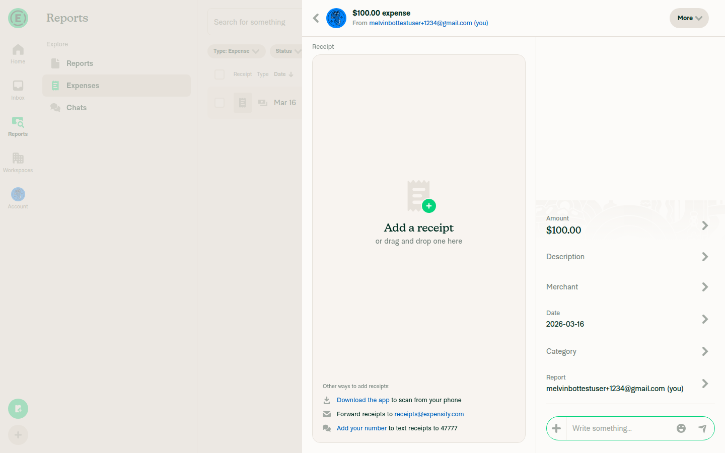
Explanation of Change
The
HeaderWithBackButtoncomponent wraps its children in a View withstyles.pr2(paddingRight: 8px) at line 273. This padding was designed to create spacing between action buttons (children, download, rotate, pin) and theThreeDotMenuButton/CloseButtonthat sit immediately after. However, when neithershouldShowThreeDotsButtonnorshouldShowCloseButtonis true (as is the case inMoneyRequestHeaderandMoneyReportHeader), this padding creates an unnecessary 8px gap to the right of the "More" button.This PR makes the
pr2padding conditional — it only applies whenThreeDotMenuButtonorCloseButtonis actually rendered, removing the extra spacing for headers that don't use those elements.Fixed Issues
$ #85407
PROPOSAL: #85407 (comment)
Tests
Offline tests
This is a CSS-only change that affects static layout. No network-dependent behavior is involved.
QA Steps
PR Author Checklist
### Fixed Issuessection aboveTestssectionOffline stepssectionQA stepssectiontoggleReportand notonIconClick)src/languages/*files and using the translation methodSTYLE.md) were followedAvatar, I verified the components usingAvatarare working as expected)StyleUtils.getBackgroundAndBorderStyle(theme.componentBG))npm run compress-svg)Avataris modified, I verified thatAvataris working as expected in all cases)Designlabel and/or tagged@Expensify/designso the design team can review the changes.ScrollViewcomponent to make it scrollable when more elements are added to the page.mainbranch was merged into this PR after a review, I tested again and verified the outcome was still expected according to theTeststeps.Screenshots/Videos
Android: Native
N/A - This is a web/desktop only issue (CSS padding change)
Android: mWeb Chrome
N/A - This is a web/desktop only issue (CSS padding change)
iOS: Native
N/A - This is a web/desktop only issue (CSS padding change)
iOS: mWeb Safari
N/A - This is a web/desktop only issue (CSS padding change)
MacOS: Chrome / Safari
Tested on web - the "More" button in the expense report header no longer has extra padding to its right. The button aligns properly with the Search and Help icons.