"from" selector in compose not obvious -> align with Gmail behavior #4270
Description
This "from" only shows when the user has more than one sending address (another sending alias)
Gmail makes it pretty obvious that it's "from"
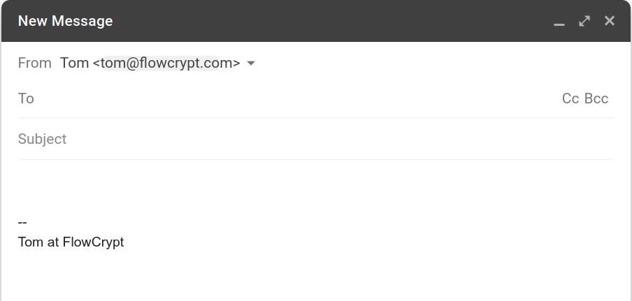
Our own UI is a lot less obvious, and can confuse the user:
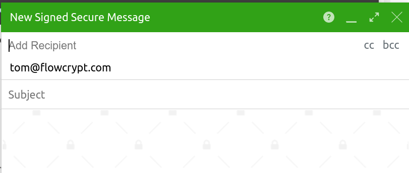
Todo in this issue:
- add
FromandTo(andCc/Bcc) to the left of the input fields - switch order of inputs:
Fromshould be aboveToand others - (maybe)
Fromwould not have to be visible in "collapsed" (unfocused) view. It's only needed in the expanded view, similar to what Gmail does