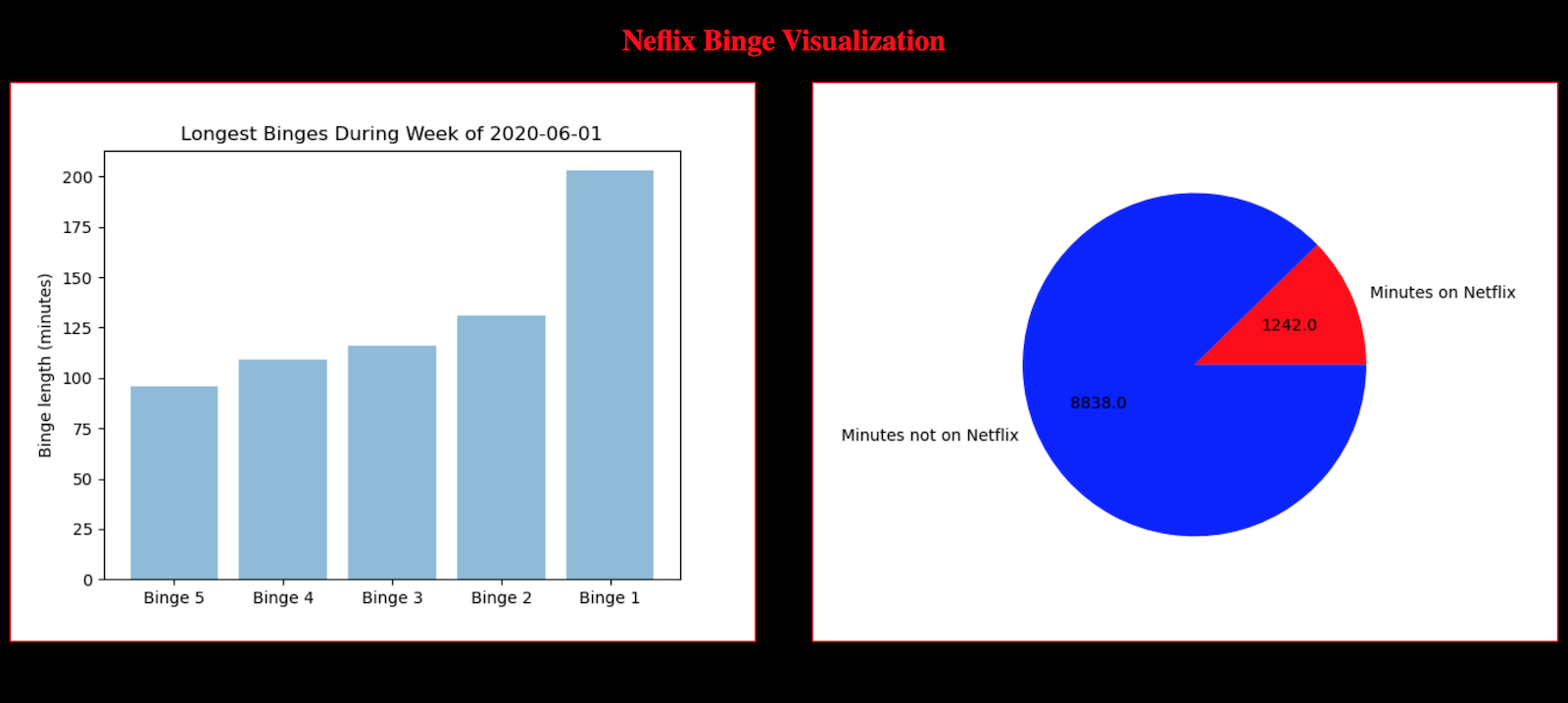
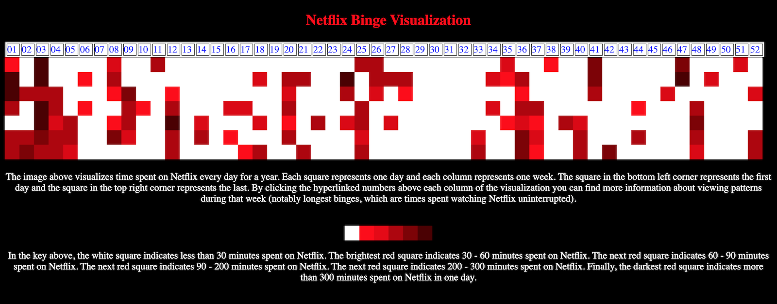
I downloaded my Netflix data and wrote SA_Visualization.py to create a striking image visualizing my daily streaming minutes over the course of a year. I also parsed my data to find my longest binge streaks for every week of the year. Additionally, for each week of the year I created a pie chart showing my time spent on versus not on Netflix. I created a website to elegantly show all these figures.
Here is what the website looks like:
Here is what an example page for weekly binge statistics looks like: