Skip to content
Merged
Show file tree
Hide file tree
Changes from all commits
Commits
File filter

Filter by extension

Filter by extension

Conversations
Failed to load comments.
Loading
Jump to
Jump to file
Failed to load files.
Loading
Diff view
Diff view
35 changes: 23 additions & 12 deletions packages/@adobe/spectrum-css-temp/components/table/index.css
Original file line number Diff line number Diff line change
Expand Up @@ -18,6 +18,7 @@ governing permissions and limitations under the License.
--spectrum-table-cell-spacious-padding-y: var(--spectrum-global-dimension-size-175);
--spectrum-table-row-border-radius: calc(var(--spectrum-table-border-radius) - 1px);
--spectrum-table-row-sticky-focus-indicator-width: 3px;
--spectrum-table-column-resizer-placeholder-width: 10px;
}

.spectrum-Table {
Expand All @@ -42,7 +43,6 @@ svg.spectrum-Table-sortedIcon {
}

.spectrum-Table-menuChevron.spectrum-Table-menuChevron {
display: none;
flex: 0 0 auto;
margin-inline-start: var(--spectrum-table-header-sort-icon-gap);
min-inline-size: var(--spectrum-icon-chevron-down-medium-width);
Expand Down Expand Up @@ -106,23 +106,13 @@ svg.spectrum-Table-sortedIcon {
}
.spectrum-Table-headCellButton {
box-sizing: border-box;
padding-block-start: var(--spectrum-table-header-padding-y);
padding-inline-end: 0;
padding-block-end: var(--spectrum-table-header-padding-y);
padding-inline-start: var(--spectrum-table-header-padding-x);

/* truncate text with ellipsis */
overflow: hidden;
white-space: nowrap;
text-overflow: ellipsis;
}
}
.is-hovered,
&.focus-ring {
.spectrum-Table-menuChevron {
display: inline-block;
}
}
}

.spectrum-Table-columnResizer {
Expand Down Expand Up @@ -151,7 +141,7 @@ svg.spectrum-Table-sortedIcon {
.spectrum-Table-columnResizerPlaceholder {
flex: 0 0 auto;
box-sizing: border-box;
inline-size: 10px;
inline-size: var(--spectrum-table-column-resizer-placeholder-width);
block-size: 100%;
user-select: none;
}
Expand Down Expand Up @@ -305,6 +295,27 @@ svg.spectrum-Table-sortedIcon {
display: flex;
align-items: center;
}
.spectrum-Table-headCellButton--alignStart {
justify-content: flex-start;
padding-block-start: var(--spectrum-table-header-padding-y);
padding-inline-end: 0;
padding-block-end: var(--spectrum-table-header-padding-y);
padding-inline-start: var(--spectrum-table-header-padding-x);
}
.spectrum-Table-headCellButton--alignCenter {
justify-content: center;
padding-block-start: var(--spectrum-table-header-padding-y);
padding-inline-end: calc(var(--spectrum-table-header-padding-x) - var(--spectrum-table-column-resizer-placeholder-width));
padding-block-end: var(--spectrum-table-header-padding-y);
padding-inline-start: var(--spectrum-table-header-padding-x);
}
.spectrum-Table-headCellButton--alignEnd {
justify-content: flex-end;
padding-block-start: var(--spectrum-table-header-padding-y);
padding-inline-end: calc(var(--spectrum-table-header-padding-x) - var(--spectrum-table-column-resizer-placeholder-width));
padding-block-end: var(--spectrum-table-header-padding-y);
padding-inline-start: 0;
}

.spectrum-Table-headerCellText {
flex: 0 1 auto;
Expand Down
50 changes: 42 additions & 8 deletions packages/@react-spectrum/table/src/TableView.tsx
Original file line number Diff line number Diff line change
Expand Up @@ -632,14 +632,40 @@ function TableColumnHeader(props) {
}

let _TableColumnHeaderButton = (props, ref: FocusableRef<HTMLDivElement>) => {
let {focusProps, ...otherProps} = props;
let {focusProps, alignment, ...otherProps} = props;
let {isEmpty} = useTableContext();
let domRef = useFocusableRef(ref);
let {buttonProps} = useButton({...otherProps, elementType: 'div', isDisabled: isEmpty}, domRef);
let {hoverProps, isHovered} = useHover({...otherProps, isDisabled: isEmpty});

return (
<div className={classNames(styles, 'spectrum-Table-headCellContents', {'is-hovered': isHovered})} {...hoverProps}>
<div className={classNames(styles, 'spectrum-Table-headCellButton')} {...mergeProps(buttonProps, focusProps)} ref={domRef}>{props.children}</div>
<div
className={
classNames(
styles,
'spectrum-Table-headCellContents',
{
'is-hovered': isHovered
}
)
}
{...hoverProps}>
<div
className={
classNames(
styles,
'spectrum-Table-headCellButton',
{
'spectrum-Table-headCellButton--alignStart': alignment === 'start',
'spectrum-Table-headCellButton--alignCenter': alignment === 'center',
'spectrum-Table-headCellButton--alignEnd': alignment === 'end'
}
)
}
{...mergeProps(buttonProps, focusProps)}
ref={domRef}>
{props.children}
</div>
</div>
);
};
Expand Down Expand Up @@ -746,6 +772,14 @@ function ResizableTableColumnHeader(props) {
}, []);

let showResizer = !isEmpty && ((headerRowHovered && getInteractionModality() !== 'keyboard') || resizingColumn != null);
let alignment = 'start';
let menuAlign = 'start' as 'start' | 'end';
if (columnProps.align === 'center' || column.colspan > 1) {
Copy link
Copy Markdown
Member

Choose a reason for hiding this comment

The reason will be displayed to describe this comment to others. Learn more.

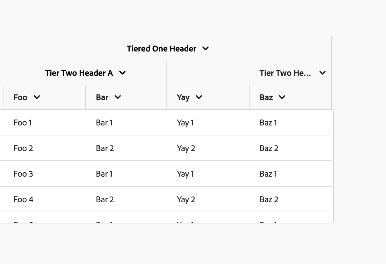
Unrelated to the PR, but this reminded me that nested columns were a thing so I tried adding resizing to those stories:
image

Noted that I couldn't resize the parent columns, not sure we want to support that right now/may need to discuss the behavior there. Do we wanna disable resizing for columns with children for now? Happy to open a PR if so.

Copy link
Copy Markdown
Member Author

Choose a reason for hiding this comment

The reason will be displayed to describe this comment to others. Learn more.

Yeah, I have not done anything with parent columns, I'm not sure how that would work. Maybe it'd be good to disable it from being an option to even set that prop somehow...

Copy link
Copy Markdown
Member

Choose a reason for hiding this comment

The reason will be displayed to describe this comment to others. Learn more.

How about we add a warning in TableView if column.hasChildNodes + allowsResizing is provided. We could then add a couple checks in other places to prevent a column from rendering as a resizable column if it has childNodes

Copy link
Copy Markdown
Member Author

Choose a reason for hiding this comment

The reason will be displayed to describe this comment to others. Learn more.

I guess, do actions still matter for combined columns?
I'll merge this one and make a follow up to discuss

alignment = 'center';
} else if (columnProps.align === 'end') {
alignment = 'end';
menuAlign = 'end';
}

return (
<FocusRing focusRingClass={classNames(styles, 'focus-ring')}>
Expand All @@ -770,14 +804,14 @@ function ResizableTableColumnHeader(props) {
stylesOverrides,
'react-spectrum-Table-cell',
{
'react-spectrum-Table-cell--alignCenter': columnProps.align === 'center' || column.colspan > 1,
'react-spectrum-Table-cell--alignEnd': columnProps.align === 'end'
'react-spectrum-Table-cell--alignCenter': alignment === 'center',
'react-spectrum-Table-cell--alignEnd': alignment === 'end'
}
)
)
}>
<MenuTrigger onOpenChange={setHeaderMenuOpen}>
<TableColumnHeaderButton ref={triggerRef} focusProps={focusProps}>
<MenuTrigger onOpenChange={setHeaderMenuOpen} align={menuAlign}>
<TableColumnHeaderButton alignment={alignment} ref={triggerRef} focusProps={focusProps}>
{columnProps.allowsSorting &&
<ArrowDownSmall UNSAFE_className={classNames(styles, 'spectrum-Table-sortedIcon')} />
}
Expand All @@ -786,7 +820,7 @@ function ResizableTableColumnHeader(props) {
<div className={classNames(styles, 'spectrum-Table-headerCellText')}>{column.rendered}</div>
}
{
columnProps.allowsResizing && resizingColumn == null && <ChevronDownMedium UNSAFE_className={classNames(styles, 'spectrum-Table-menuChevron')} />
columnProps.allowsResizing && <ChevronDownMedium UNSAFE_className={classNames(styles, 'spectrum-Table-menuChevron')} />
}
</TableColumnHeaderButton>
<Menu onAction={onMenuSelect} minWidth="size-2000" items={items}>
Expand Down
109 changes: 109 additions & 0 deletions packages/@react-spectrum/table/stories/Table.stories.tsx
Original file line number Diff line number Diff line change
Expand Up @@ -673,6 +673,115 @@ storiesOf('TableView', module)
</TableView>
)
)
.add(
'should fill cell width allowsResizing',
() => (
<TableView aria-label="TableView with filled cells" selectionMode="multiple" width={500} height={200} onSelectionChange={s => onSelectionChange([...s])}>
<TableHeader>
<Column allowsResizing>File Name</Column>
<Column align="center" allowsResizing>Type</Column>
<Column align="end" allowsResizing>Size</Column>
Comment thread
snowystinger marked this conversation as resolved.
<Column allowsResizing>Description</Column>
</TableHeader>
<TableBody>
<Row>
<Cell>2018 Proposal</Cell>
<Cell>PDF</Cell>
<Cell>214 KB</Cell>
<Cell>very very very very very very long long long long long description</Cell>
</Row>
<Row>
<Cell>
<View
width="100%"
backgroundColor="gray-200">
100%
</View>
</Cell>
<Cell>
<View
UNSAFE_style={{margin: 'auto', overflow: 'hidden', textOverflow: 'ellipsis', whiteSpace: 'nowrap'}}
width="100%"
backgroundColor="gray-200">
100%
</View>
</Cell>
<Cell>
<View
UNSAFE_style={{marginInlineStart: 'auto', overflow: 'hidden', textOverflow: 'ellipsis', whiteSpace: 'nowrap'}}
width="100%"
backgroundColor="gray-200">
100%
</View>
</Cell>
<Cell>
<View
UNSAFE_style={{overflow: 'hidden', textOverflow: 'ellipsis', whiteSpace: 'nowrap'}}
width="100%"
backgroundColor="gray-200">
very very very very very very long long long long long description
</View>
</Cell>
</Row>
<Row>
<Cell>
<View
UNSAFE_style={{overflow: 'hidden', textOverflow: 'ellipsis', whiteSpace: 'nowrap'}}
width="50%"
backgroundColor="gray-200">
50% div
</View>
</Cell>
<Cell>
<View
UNSAFE_style={{margin: 'auto', overflow: 'hidden', textOverflow: 'ellipsis', whiteSpace: 'nowrap'}}
width="70%"
backgroundColor="gray-200">
70% div
</View>
</Cell>
<Cell>
<View
UNSAFE_style={{float: 'right', overflow: 'hidden', textOverflow: 'ellipsis', whiteSpace: 'nowrap'}}
width="70%"
backgroundColor="gray-200">
70% div
</View>
</Cell>
<Cell>
<View
UNSAFE_style={{overflow: 'hidden', textOverflow: 'ellipsis', whiteSpace: 'nowrap'}}
width="70%"
backgroundColor="gray-200">
very very very very very very long long long long long description
</View>
</Cell>
</Row>
<Row>
<Cell>
<span style={{backgroundColor: 'var(--spectrum-global-color-gray-200'}}>
span child
</span>
</Cell>
<Cell>
<span style={{backgroundColor: 'var(--spectrum-global-color-gray-200'}}>
span child</span>
</Cell>
<Cell>
<span style={{backgroundColor: 'var(--spectrum-global-color-gray-200'}}>
span child
</span>
</Cell>
<Cell>
<span style={{backgroundColor: 'var(--spectrum-global-color-gray-200'}}>
very very very very very very long long long long long description
</span>
</Cell>
</Row>
</TableBody>
</TableView>
)
)
.add(
'column widths and dividers',
() => (
Expand Down