Add Header Control#100
Conversation
 jarolrod
force-pushed
the
headertext-control
branch
from
jarolrod
force-pushed
the
headertext-control
branch
from
2fb2611 to
827abff
Compare
|
updates from 2fb2611 -> 827abff (pr100.01 -> pr100.02, diff) changes:
|
 promag
left a comment
promag
left a comment
promag
left a comment
There was a problem hiding this comment.
Tested ACK, but should address the following comments.
| height: sourceComponent.height | ||
| Layout.fillWidth: true | ||
| Layout.preferredWidth: 0 | ||
| active: root.description.length > 0 |
There was a problem hiding this comment.
Should handle description === undefined?
There was a problem hiding this comment.
undefined wouldn't have a length greater than zero, so isn't this fine as is?
There was a problem hiding this comment.
Accessing length of undefined is an error?
| font.family: "Inter" | ||
| font.styleName: root.bold ? "Semi Bold" : "Regular" | ||
| font.pointSize: root.headerSize | ||
| color: "#FFFFFF" |
There was a problem hiding this comment.
Yes please, names are better. I'd recommend using two types. First, descriptive ones like red, blue, green. Then, functional ones like primary, accent, error, success, neutral, etc to which the descriptive ones are assigned. Then you’d only reference the functional ones in the code.
There was a problem hiding this comment.
we'll keep this in mind, but for now leave as is?
There was a problem hiding this comment.
Agree, not the place to address this.
jarolrod
force-pushed
the
headertext-control
branch
from
827abff to
06bc708
Compare
 jarolrod
force-pushed
the
headertext-control
branch
from
jarolrod
force-pushed
the
headertext-control
branch
from
06bc708 to
6aee4e3
Compare
|
updated from 827abff -> 6aee4e3 rebased and addressed review comments. Here is a diff of the changes on Header.qml: -import QtQuick 2.12
-import QtQuick.Controls 2.12
-import QtQuick.Layouts 1.11
+import QtQuick 2.15
+import QtQuick.Controls 2.15
+import QtQuick.Layouts 1.15
-Item {
+Control {
id: root
property bool bold: false
property bool center: true
@@ -19,10 +19,8 @@ Item {
property string subtext
property int subtextMargin
property int subtextSize: 15
- implicitHeight: childrenRect.height
- ColumnLayout {
+ contentItem: ColumnLayout {
spacing: 0
- width: parent.width
Label {
Layout.fillWidth: true
Layout.preferredWidth: 0
@@ -36,10 +34,10 @@ Item {
wrapMode: Text.WordWrap
}
Loader {
- height: sourceComponent.height
Layout.fillWidth: true
Layout.preferredWidth: 0
active: root.description.length > 0
+ visible: active
sourceComponent: Label {
topPadding: root.descriptionMargin
font.family: "Inter"
@@ -47,15 +45,15 @@ Item {
font.pointSize: root.descriptionSize
color: "#DEDEDE"
text: root.description
- horizontalAlignment: center ? Text.AlignHCenter : Text.AlignLeft
+ horizontalAlignment: root.center ? Text.AlignHCenter : Text.AlignLeft
wrapMode: Text.WordWrap
}
}
Loader {
- height: sourceComponent.height
Layout.fillWidth: true
Layout.preferredWidth: 0
active: root.subtext.length > 0
+ visible: active
sourceComponent: Label {
topPadding: root.subtextMargin
font.family: "Inter"
@@ -63,7 +61,7 @@ Item {
font.pixelSize: root.subtextSize
color: "#FFFFFF"
text: root.subtext
- horizontalAlignment: center ? Text.AlignHCenter : Text.AlignLeft
+ horizontalAlignment: root.center ? Text.AlignHCenter : Text.AlignLeft
wrapMode: Text.WordWrap
}
} |
| id: root | ||
| property bool bold: false | ||
| property bool center: true | ||
| property string header |
There was a problem hiding this comment.
This could be required property string header.
Github-Pull: bitcoin-core#100
Rebased-From: 11bc38f
Github-Pull: bitcoin-core#100
Rebased-From: 6aee4e3
Github-Pull: bitcoin-core#100
Rebased-From: 11bc38f
Github-Pull: bitcoin-core#100
Rebased-From: 6aee4e3
Github-Pull: bitcoin-core#100
Rebased-From: 11bc38f
Github-Pull: bitcoin-core#100
Rebased-From: 6aee4e3
Github-Pull: bitcoin-core#100
Rebased-From: 11bc38f
Github-Pull: bitcoin-core#100
Rebased-From: 6aee4e3
Github-Pull: bitcoin-core#100
Rebased-From: 11bc38f
Github-Pull: bitcoin-core#100
Rebased-From: 6aee4e3
Github-Pull: bitcoin-core#100
Rebased-From: 11bc38f
Github-Pull: bitcoin-core#100
Rebased-From: 6aee4e3
Github-Pull: bitcoin-core#100
Rebased-From: 11bc38f
Github-Pull: bitcoin-core#100
Rebased-From: 6aee4e3
11755e8 qml: demo Header control (jarolrod) c3b55c1 qml: introduce Header qml control (jarolrod) Pull request description: This introduces and demos the `Header` control. This component is to be used as the main text component for wizard pages; it implements the style for [wizard text](https://www.figma.com/file/GaCoOSNHB2yMB9ThiDtred/Bitcoin-Core-App-Main?node-id=2777%3A66555) set in the [main design file](https://www.figma.com/file/GaCoOSNHB2yMB9ThiDtred/Bitcoin-Core-App-Main?node-id=1035%3A1883). It's properties allows for a good level of customization, so this can be extended to any page (wizard or not) that needs a header. The `header` control consists of a required **header** text, and optional **description** and **subtext** strings. This allows the control to be reused for all currently designed wizard pages. The **description** label will only be shown if the `description` property is given a value. Similarly, the **subtext** label will only be shown if the `subtext` property is given a value. The `bold`, `headerSize`, `descriptionSize`, `descriptionMargin` and `subtextSize` properties have been given default values that represent the most common sizes in our wizard pages. Looking at the designed wizard pages; All headers have a size of 28 except the first one. Also, only one header is bold. Therefore, the `bold` property has been given a default value of false and `headerSize` a default value of 28. Similarly, all descriptions have a size of 18 and a margin of 10 except the first one; set 18 as default value for `descriptionSize` and 10 as default value for `descriptionMargin`. There is only one page with subtext, and it sets the size for the subtext to 15; set the default value for `subtextSize` to 15. This means that the code to represent header text can be condensed. For example, the following code represents the header text for the [onboarding connections page](https://www.figma.com/file/GaCoOSNHB2yMB9ThiDtred/Bitcoin-Core-App-Main?node-id=2777%3A66830): ```qml Header { header: "Connections" description: "Communicating with the Bitcoin network can use a lot of data." } ``` The diagram below shows a breakdown of the control and how it works/example usage: 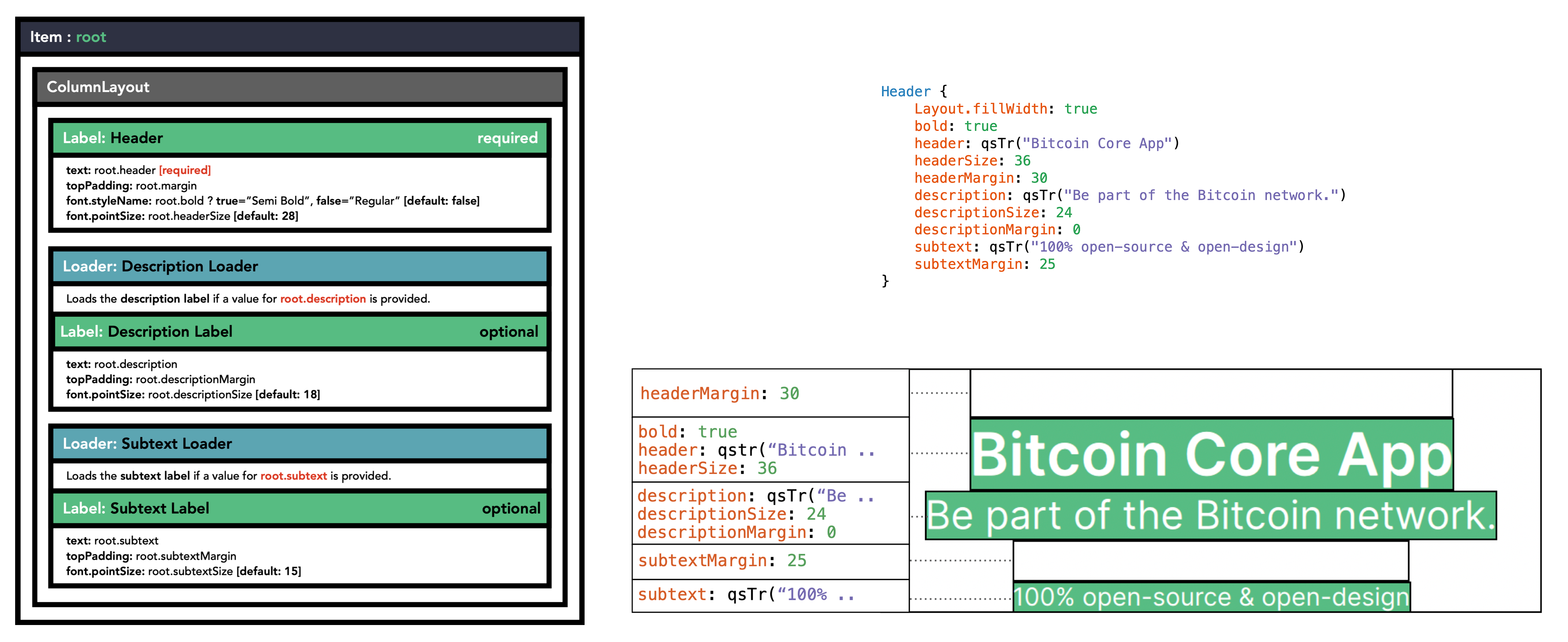 [](https://api.cirrus-ci.com/v1/artifact/github/bitcoin-core/gui-qml/win64/insecure_win_gui.zip?branch=pull/100) [](https://api.cirrus-ci.com/v1/artifact/github/bitcoin-core/gui-qml/macos/insecure_mac_gui.zip?branch=pull/100) [](https://api.cirrus-ci.com/v1/artifact/github/bitcoin-core/gui-qml/android/insecure_android_apk.zip?branch=pull/100) ACKs for top commit: promag: Code review ACK 11755e8. Tree-SHA512: c24246bb24cb557d9189f1292839c59c7bc28220fedda2f084e6d65329390c8796be14c3df7964c09e71afa8098795112518153c8c882888d4a328f3216abd04
11755e87b8f5359b45987e515ce20a318ac5d1de qml: demo Header control (jarolrod) c3b55c122f0f8fd270128bae32884d11eb24875c qml: introduce Header qml control (jarolrod) Pull request description: This introduces and demos the `Header` control. This component is to be used as the main text component for wizard pages; it implements the style for [wizard text](https://www.figma.com/file/GaCoOSNHB2yMB9ThiDtred/Bitcoin-Core-App-Main?node-id=2777%3A66555) set in the [main design file](https://www.figma.com/file/GaCoOSNHB2yMB9ThiDtred/Bitcoin-Core-App-Main?node-id=1035%3A1883). It's properties allows for a good level of customization, so this can be extended to any page (wizard or not) that needs a header. The `header` control consists of a required **header** text, and optional **description** and **subtext** strings. This allows the control to be reused for all currently designed wizard pages. The **description** label will only be shown if the `description` property is given a value. Similarly, the **subtext** label will only be shown if the `subtext` property is given a value. The `bold`, `headerSize`, `descriptionSize`, `descriptionMargin` and `subtextSize` properties have been given default values that represent the most common sizes in our wizard pages. Looking at the designed wizard pages; All headers have a size of 28 except the first one. Also, only one header is bold. Therefore, the `bold` property has been given a default value of false and `headerSize` a default value of 28. Similarly, all descriptions have a size of 18 and a margin of 10 except the first one; set 18 as default value for `descriptionSize` and 10 as default value for `descriptionMargin`. There is only one page with subtext, and it sets the size for the subtext to 15; set the default value for `subtextSize` to 15. This means that the code to represent header text can be condensed. For example, the following code represents the header text for the [onboarding connections page](https://www.figma.com/file/GaCoOSNHB2yMB9ThiDtred/Bitcoin-Core-App-Main?node-id=2777%3A66830): ```qml Header { header: "Connections" description: "Communicating with the Bitcoin network can use a lot of data." } ``` The diagram below shows a breakdown of the control and how it works/example usage:  [](https://api.cirrus-ci.com/v1/artifact/github/bitcoin-core/gui-qml/win64/insecure_win_gui.zip?branch=pull/100) [](https://api.cirrus-ci.com/v1/artifact/github/bitcoin-core/gui-qml/macos/insecure_mac_gui.zip?branch=pull/100) [](https://api.cirrus-ci.com/v1/artifact/github/bitcoin-core/gui-qml/android/insecure_android_apk.zip?branch=pull/100) ACKs for top commit: promag: Code review ACK 11755e87b8f5359b45987e515ce20a318ac5d1de. Tree-SHA512: c24246bb24cb557d9189f1292839c59c7bc28220fedda2f084e6d65329390c8796be14c3df7964c09e71afa8098795112518153c8c882888d4a328f3216abd04
3 participants
This introduces and demos the
Headercontrol. This component is to be used as the main text component for wizard pages; it implements the style for wizard text set in the main design file. It's properties allows for a good level of customization, so this can be extended to any page (wizard or not) that needs a header.The
headercontrol consists of a required header text, and optional description and subtext strings. This allows the control to be reused for all currently designed wizard pages. The description label will only be shown if thedescriptionproperty is given a value. Similarly, the subtext label will only be shown if thesubtextproperty is given a value.The
bold,headerSize,descriptionSize,descriptionMarginandsubtextSizeproperties have been given default values that represent the most common sizes in our wizard pages. Looking at the designed wizard pages; All headers have a size of 28 except the first one. Also, only one header is bold. Therefore, theboldproperty has been given a default value of false andheaderSizea default value of 28. Similarly, all descriptions have a size of 18 and a margin of 10 except the first one; set 18 as default value fordescriptionSizeand 10 as default value fordescriptionMargin. There is only one page with subtext, and it sets the size for the subtext to 15; set the default value forsubtextSizeto 15.This means that the code to represent header text can be condensed. For example, the following code represents the header text for the onboarding connections page:
The diagram below shows a breakdown of the control and how it works/example usage: