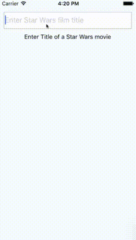
A pure JS autocomplete component for React Native written in TypeScript. Use this component in your own projects or use it as inspiration to build your own autocomplete.
Play around with the Example Snack
# Install with npm
$ npm install --save react-native-autocomplete-input

# Install with yarn
$ yarn add react-native-autocomplete-inputfunction MyComponent() {
const [ query, setQuery ] = useState('');
const data = useFilteredData(query);
return (
<Autocomplete
data={data}
value={query}
onChangeText={(text) => setQuery(text)}
flatListProps={{
keyExtractor: (_, idx) => idx,
renderItem: ({ item }) => <Text>{item}</Text>,
}}
/>
);
}Android does not support overflows (#20), for that reason it is necessary to wrap the autocomplete into a absolute positioned view on Android. This will allow the suggestion list to overlap other views inside your component.
function MyComponent() {
  return (
    <View>
      <View style={styles.autocompleteContainer}>
        <Autocomplete {/* your props */} />
      </View>
      <View>
        <Text>Some content</Text>
      </View>
    </View>
  );
}

const styles = StyleSheet.create({
  autocompleteContainer: {
    flex: 1,
    left: 0,
    position: 'absolute',
    right: 0,
    top: 0,
    zIndex: 1
  }
});| Prop | Type | Description |
|---|---|---|
| containerStyle | style | These styles will be applied to the container which surrounds the autocomplete component. |
| hideResults | bool | Set to true to hide the suggestion list. |
| data | array | An array of suggestion items. Any array with length > 0 will open the suggestion list and any array with length < 1 will hide the list. Customize item rendering via flatListProps.renderItem (defaults to Text(String(item))). |
| inputContainerStyle | style | These styles will be applied to the container which surrounds the textInput component. |
| listContainerStyle | style | These styles will be applied to the container which surrounds the result list. |
| onShowResults | function | onShowResults is called with a boolean indicating whether results are showing. |
| onStartShouldSetResponderCapture | function | onStartShouldSetResponderCapture will be passed to the result list view container (onStartShouldSetResponderCapture). |
| renderTextInput | function | Render a custom TextInput. Receives all TextInput props. |
| flatListProps | object | Custom props for the internal FlatList. data is managed by the component and style is merged with the default list style. |
| renderResultList | function | Render a custom result list component (defaults to FlatList). Receives the FlatList props. |
- By default the autocomplete will not behave as expected inside a
<ScrollView />. Set the scroll view's prop to fix this:keyboardShouldPersistTaps={true}for RN <= 0.39, orkeyboardShouldPersistTaps='always'for RN >= 0.40. (#5). Alternatively, you can use renderResultList to render a custom result list that does not use FlatList. See the tests for an example. - If you want to test with Jest add
jest.mock('react-native-autocomplete-input', () => 'Autocomplete');to your test.
Feel free to open issues or submit a PR!
# Install Dependencies
$ npm i

# Locally link the autocomplete package into the example project
$ npm link react-native-autocomplete-input -w starwarsmoviefinder

# Enable package rebuild on changes
$ npx nx watch --projects=react-native-autocomplete-input -- npm run build

# Run the example project
$ npm run start -w starwarsmoviefinder