Taken from https://developer.apple.com/tutorials/swiftui/creating-and-combining-views Apple content.
- 1. Create a New Project and Explore the Canvas
- 2. Customize the Text View
- 3. Combine Views Using Stacks
- 4. Create a Custom Image View
- 5. Use SwiftUI Views From Other Frameworks
- 6. Compose the Detail View
- 7. What’s "some" thing?
This tutorial guides you through building Landmarks - an app for discovering and sharing the places you love. You will start by building the view that shows a landmark's details.
To lay out the views, Landmarks uses stacks to combine and layer the image and text view components. To add a map to the view, you will include a standard MapKit component. As you refine the view's design, Xcode provides real-time feedback so you can see how those changes translate into code.
Download the Project files to begin building this project, and follow the steps below.
Create a new Xcode project that uses SwiftUI. Explore the canvas, previews, and the SwiftUI template code.
To preview and interact with views from the canvas in Xcode, and to use all the latest features describe throughout the tutorials, ensure your mac is running macOS Big Suer or later. (duh!)
- Open Xcode and either click "Create a new Xcode project" in Xcode's startup window, or choose
[File > New > Project]. - In the template selector, select iOS as the platform, select the App template, and then Click Next.
- Enter "Landmarks" as the product name, select "SwiftUI" for the interface and "SwiftUI App" for the life cycle, and click next. Choose a location to save the Landsmarks project on your mac.
- In the Project Navigator, select LandmarksApp.swift.
An app that uses the SwiftUI app life cycle has a structure that conforms to the App protocol. The structure's body property returns one or more scenes, which in turn provide content for display. The
@mainattribute identifies the app's entry point.
import SwiftUI

@main
struct LandmarksApp: App {
    var body: some Scene {
        WindowGroup {
            ContentView()
        }
    }
}- In the project navigator, select
ContentView.swift.
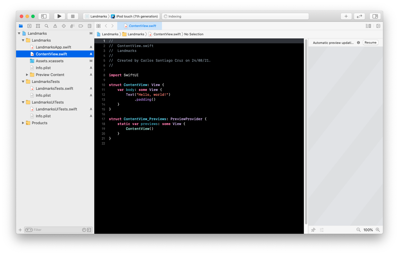
By default, SwiftUI views files declare two structures. The first structure conforms to the
Viewprotocol and describes the view's content and layout. The second structure declares a preview for that view.
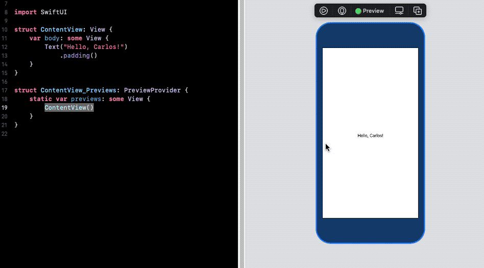
import SwiftUI

struct ContentView: View {
    var body: some View {
        Text("Hello, world!")
            .padding()
    }
}

struct ContentView_Previews: PreviewProvider {
    static var previews: some View {
        ContentView()
    }
}- In the canvas, click Resume to display the preview.
If the canvas is not visible, select
[Editor > Canvas]to show it.
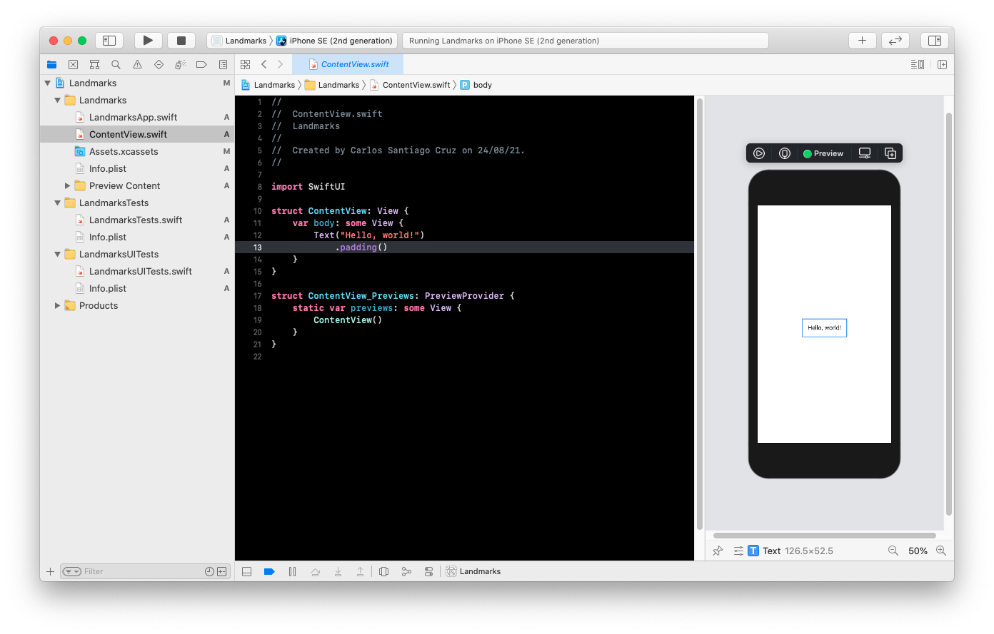
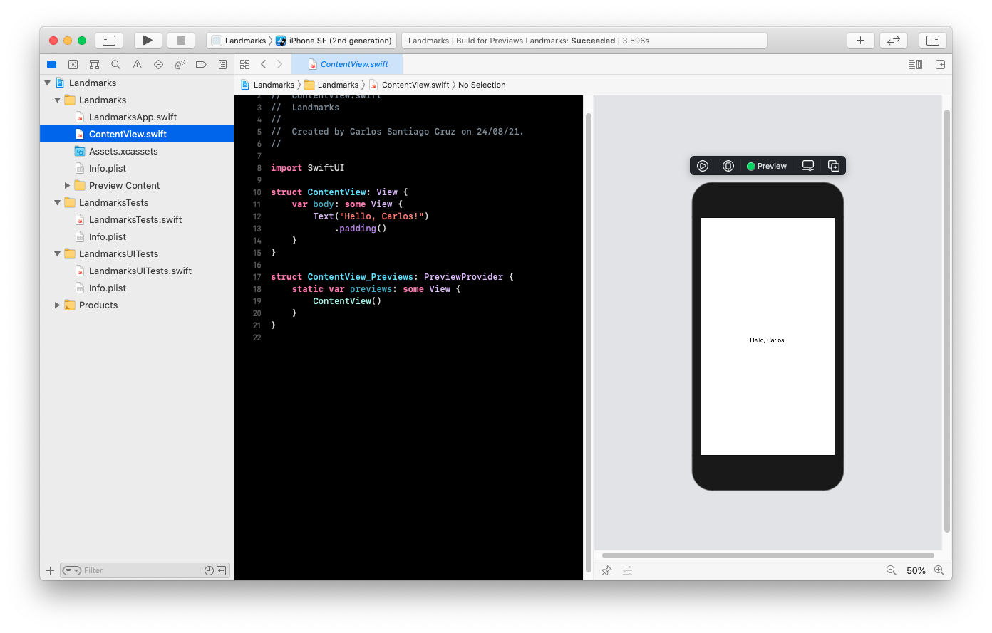
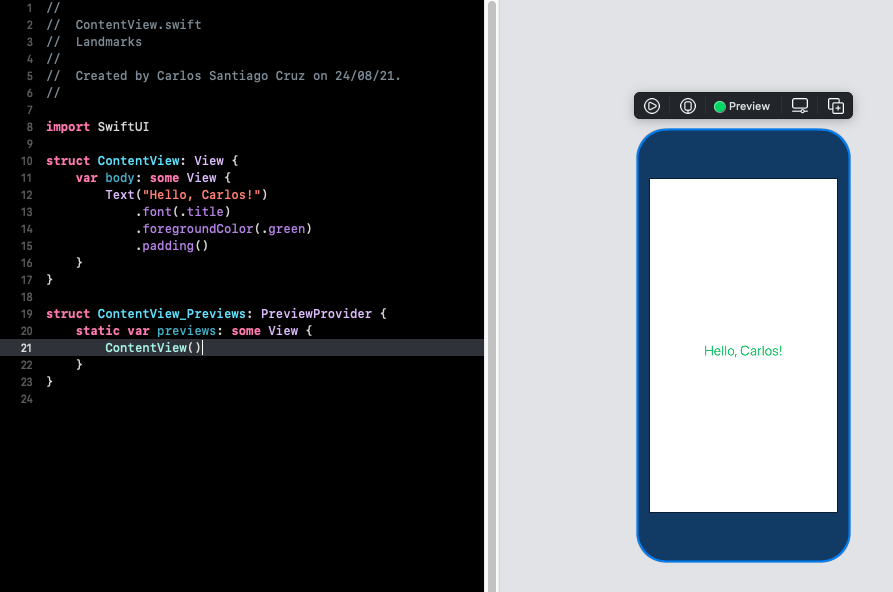
- Inside the body property, change "Hello, World!" to a greeting for yourself.
As you change the code in a view's body property, the preview updates to reflect your changes.
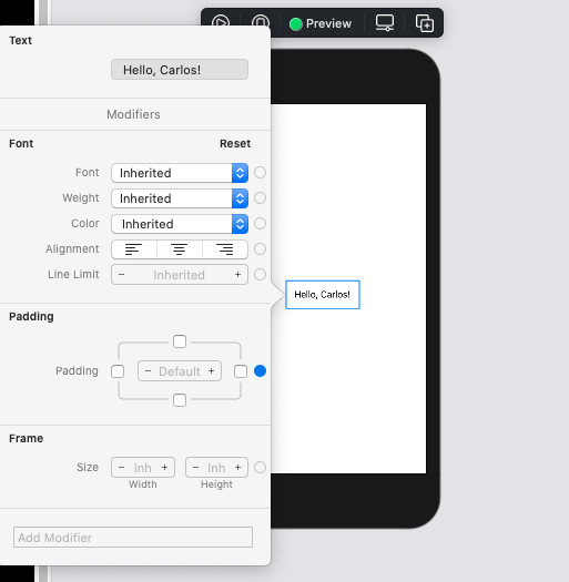
You can customize a view's display by changing your code, or by using the inspector to discover what's available and to help you write code.
As you build the Landmarks app, you can use any combination of editors: the source editor, the canvas, or the inspectors. Your code stays updated, regardless of which tool you use.
- In the preview, Command-click the greeting to bring up the structured editing popover, and choose "Show SwiftUI inspector".
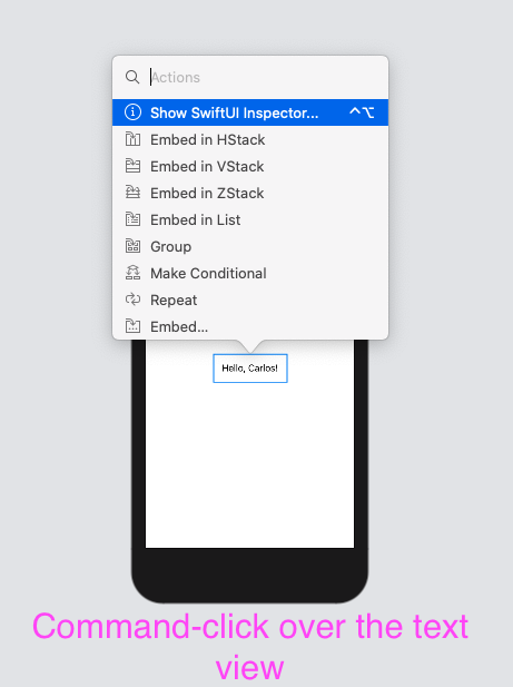
the popover shows different attributes that you can customize, depending on the type of view you inspect.
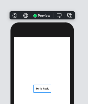
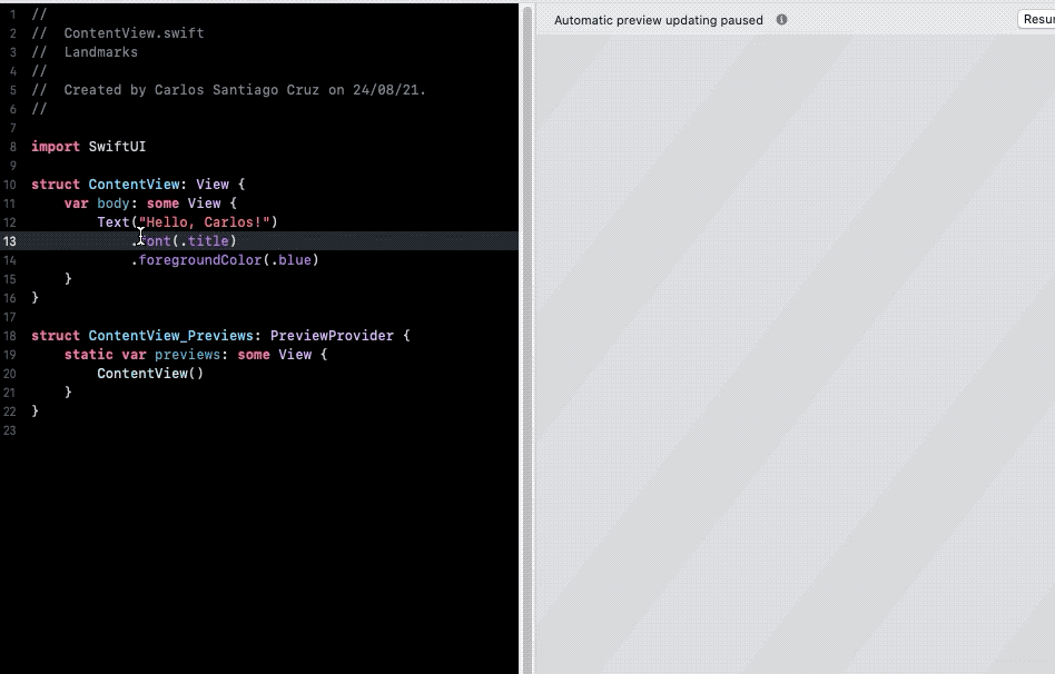
- Use the inspector to change the text to "Turtle Rock", the name of the first landmark you will show in your app.
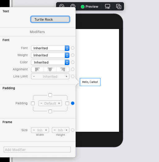
- Change the Font modifier to "Title"
This applies the system font to the text so that it responds correctly to the user's preferred font sizes and settings.
To customize a SwiftUI view, you call methods called modifiers. Modifiers wrap a view to change its display or other properties. Each modifier returns a new view, so it's common to chain multiple modifiers, stacked vertically.
- Edit the code by hand to change the
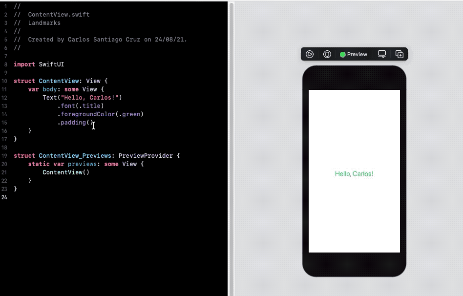
padding()modifier to theforegroundColor(.green)modifier, this changes the text's color to green.
Your code is always the source of truth for the view. When you use the inspector to change or remove a modifier, Xcode updates your code immediately to match.
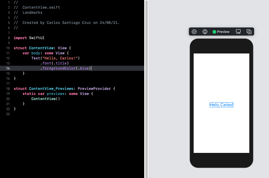
- This time, open the inspector by Command-clicking on the Text declaration in the code editor, and then choose "Show SwiftUI inspector" from the popover. Click the Color pop-up menu and choose Inherited to change the text color to blue now)
- Notice that Xcode updates your code automatically to reflect the change, removing for
foregroundColor(.green)modifier.
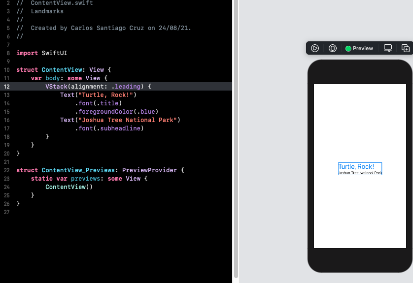
Beyond the title view you created in the previous section, you will add text views to contain details about the landmark, such as the name of the park and state it is in.
When creating a SwiftUI view, you describe its content, layout, and behavior in the view's body property; however, the body property only returns a single view. You can combine and embed multiple views in stacks, which group views together horizontally, vertically, or back-to-front.
In this section, you will use a vertical stack to place the title above a horizontal stack that contains details about the park.
You can use Xcode's structured editing support to embed a view in a container view, open an inspector, or help with other useful changes.
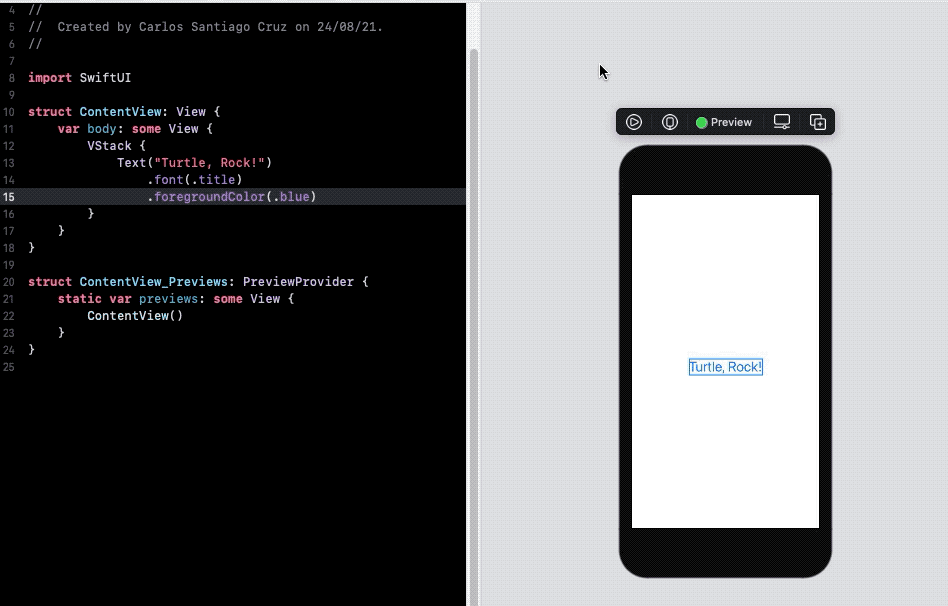
- Command-click the text view's initializer to show the structured editing popover, and then choose "Embed in VStack"
import SwiftUI

struct ContentView: View {
    var body: some View {
        VStack {
            Text("Turtle, Rock!")
                .font(.title)
                .foregroundColor(.blue)
        }
    }
}- Open the library by clicking the plus button (+) at the top-right of the Xcode window, and then drag a Text view to the place in your code immediately below the "Turtle Rock" text view.
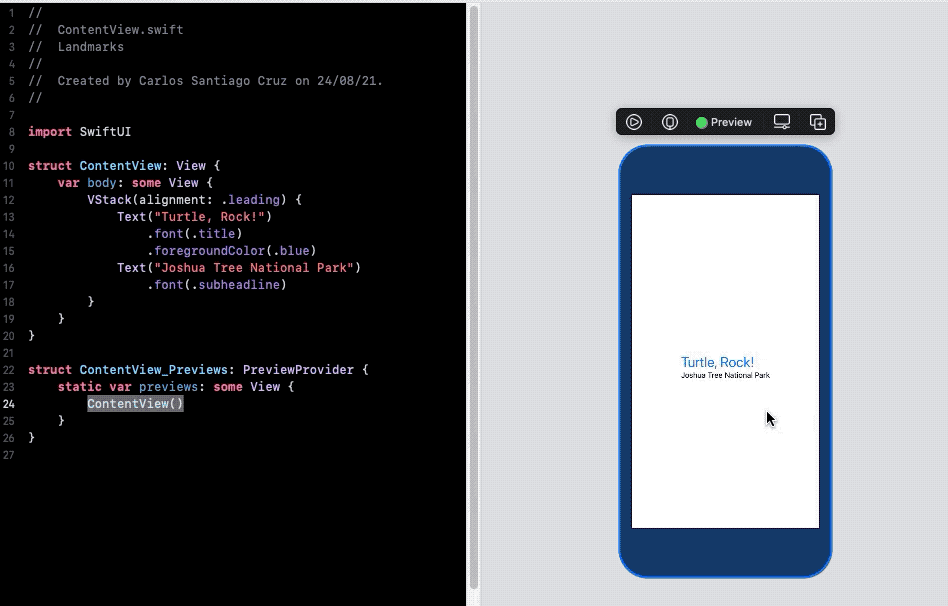
- Replace the Text view's placeholder text with "Joshua Tree National Park".
struct ContentView: View {
    var body: some View {
        VStack {
            Text("Turtle, Rock!")
                .font(.title)
                .foregroundColor(.blue)
            Text("Joshua Tree National Park")
        }
    }
}
Customize the location to match the desired layout.
- Set the location's font to subheadline
struct ContentView: View {
    var body: some View {
        VStack {
            Text("Turtle, Rock!")
                .font(.title)
                .foregroundColor(.blue)
            Text("Joshua Tree National Park")
                .font(.subheadline)
        }
    }
}- Edit the
VStackinitializer to align the views by their leading edges.
By default, stacks center their contents along their axis and provide context-appropiate spacing.
Next, you will add another text view to the right of the location, this for the park's state.
- In the canvas, Command-click, "Joshua National Park", and choose "Embed in HStack"
- Add a new text view after the location, change the placeholder text to the park's state, and then set its font to subheadline.
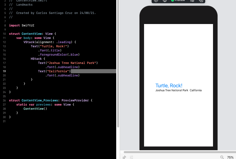
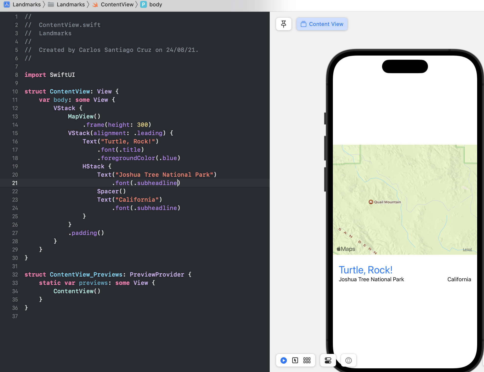
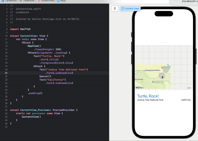
struct ContentView: View {
    var body: some View {
        VStack(alignment: .leading) {
            Text("Turtle, Rock!")
                .font(.title)
                .foregroundColor(.blue)
            HStack {
                Text("Joshua Tree National Park")
                    .font(.subheadline)
                Text("California")
                    .font(.subheadline)
            }
        }
    }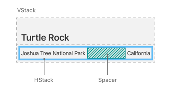
}- To direct the layout to use the full width of the device, separate the park and the state by adding a Spacer to the horizontal stack holding the two text views.
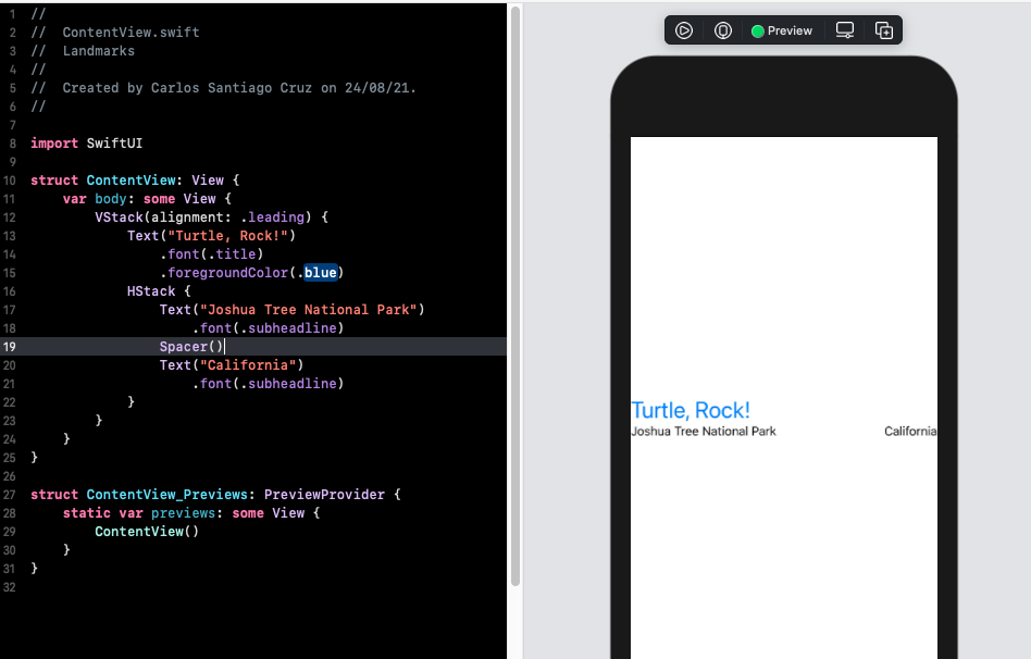
A spacer expands to make its containing view use all of the space of its parent view, instead of having its size defined only by its contents.
struct ContentView: View {
    var body: some View {
        VStack(alignment: .leading) {
            Text("Turtle, Rock!")
                .font(.title)
                .foregroundColor(.blue)
            HStack {
                Text("Joshua Tree National Park")
                    .font(.subheadline)
                Spacer()
                Text("California")
                    .font(.subheadline)
            }
        }
    }
}- Finally, use the
padding()modifier method to give landmark's name and details a little more space.
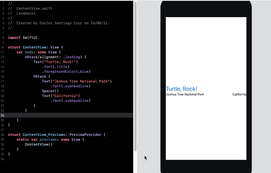
struct ContentView: View {
    var body: some View {
        VStack(alignment: .leading) {
            Text("Turtle, Rock!")
                .font(.title)
                .foregroundColor(.blue)
            HStack {
                Text("Joshua Tree National Park")
                    .font(.subheadline)
                Spacer()
                Text("California")
                    .font(.subheadline)
            }
        }
        .padding()
    }
}With the name and location views all set, the next step is to add an image for the landmark.
Instead of adding more code in this file, you’ll create a custom view that applies a mask, border, and drop shadow to the image.
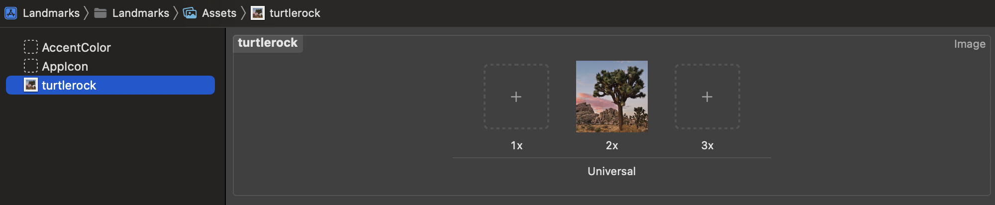
Start by adding an image to the project’s asset catalog.
Find turtlerock@2x.jpg in the project files’ Resources folder; drag it into the asset catalog’s editor. Xcode creates a new image set for the image.
Next, you’ll create a new SwiftUI view for your custom image view.
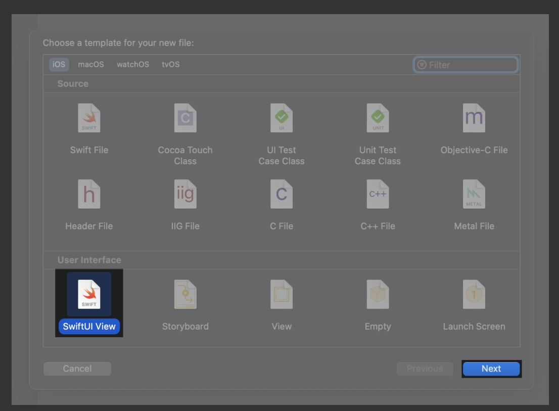
Choose File > New > File to open the template selector again. In the User Interface section, select “SwiftUI View” and click Next. Name the file CircleImage.swift and click Create.
You’re ready to insert the image and modify its display to match the desired design.
Replace the text view with the image of Turtle Rock by using the Image(_:) initializer, passing it the name of the image to display.
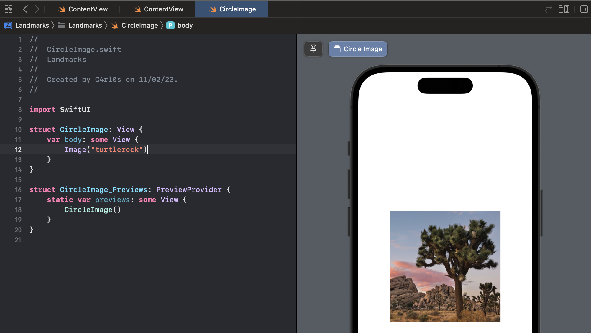
import SwiftUI

struct CircleImage: View {
    var body: some View {
        Image("turtlerock")
    }
}

struct CircleImage_Previews: PreviewProvider {
    static var previews: some View {
        CircleImage()
    }
}Add a call to `clipShape(Circle()){ to apply the circular clipping shape to the image.
The Circle type is a shape that you can use as a mask, or as a view by giving the circle a stroke or fill.
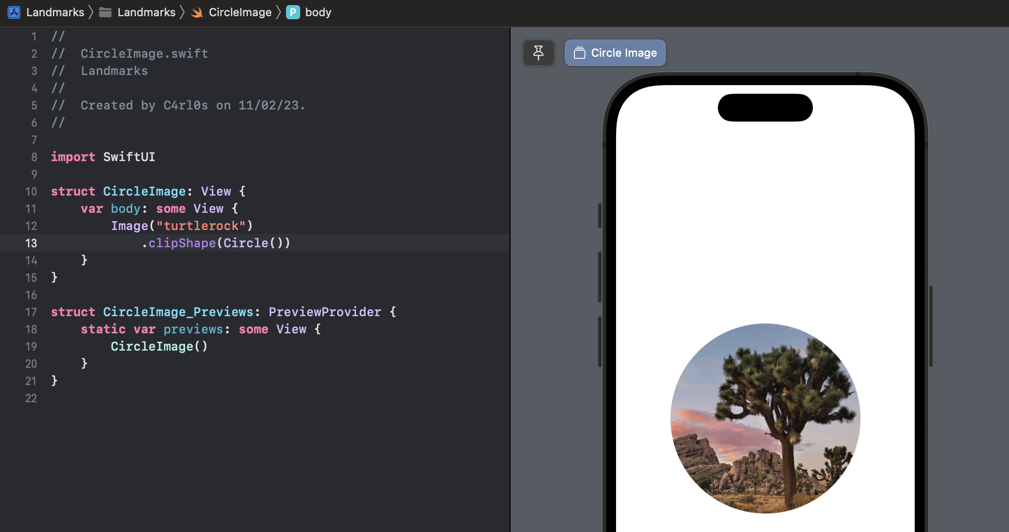
import SwiftUI

struct CircleImage: View {
    var body: some View {
        Image("turtlerock")
            .clipShape(Circle())
    }
}

struct CircleImage_Previews: PreviewProvider {
    static var previews: some View {
        CircleImage()
    }
}Create another circle with a gray stroke, and then add it as an overlay to give the image a border.
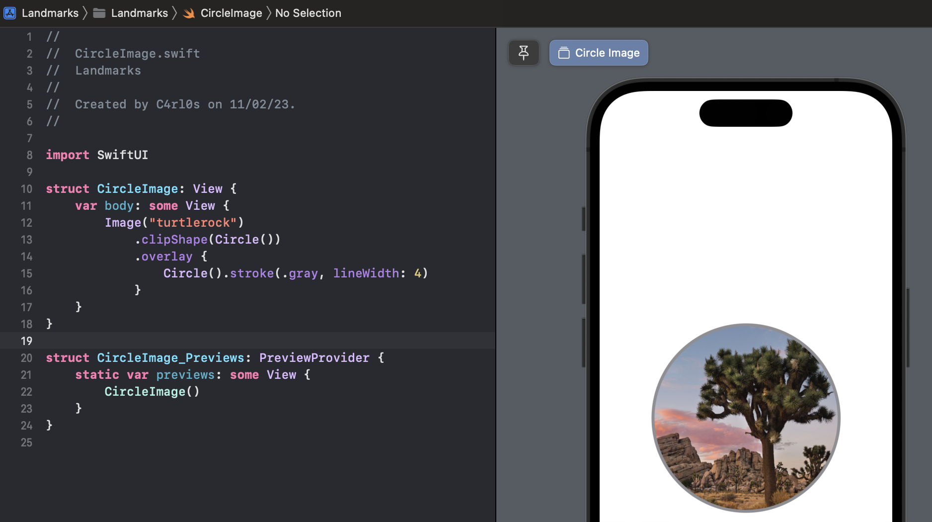
import SwiftUI

struct CircleImage: View {
    var body: some View {
        Image("turtlerock")
            .clipShape(Circle())
            .overlay {
                Circle().stroke(.gray, lineWidth: 4)
            }
    }
}

struct CircleImage_Previews: PreviewProvider {
    static var previews: some View {
        CircleImage()
    }
}Next, add a shadow with a 7 point radius.
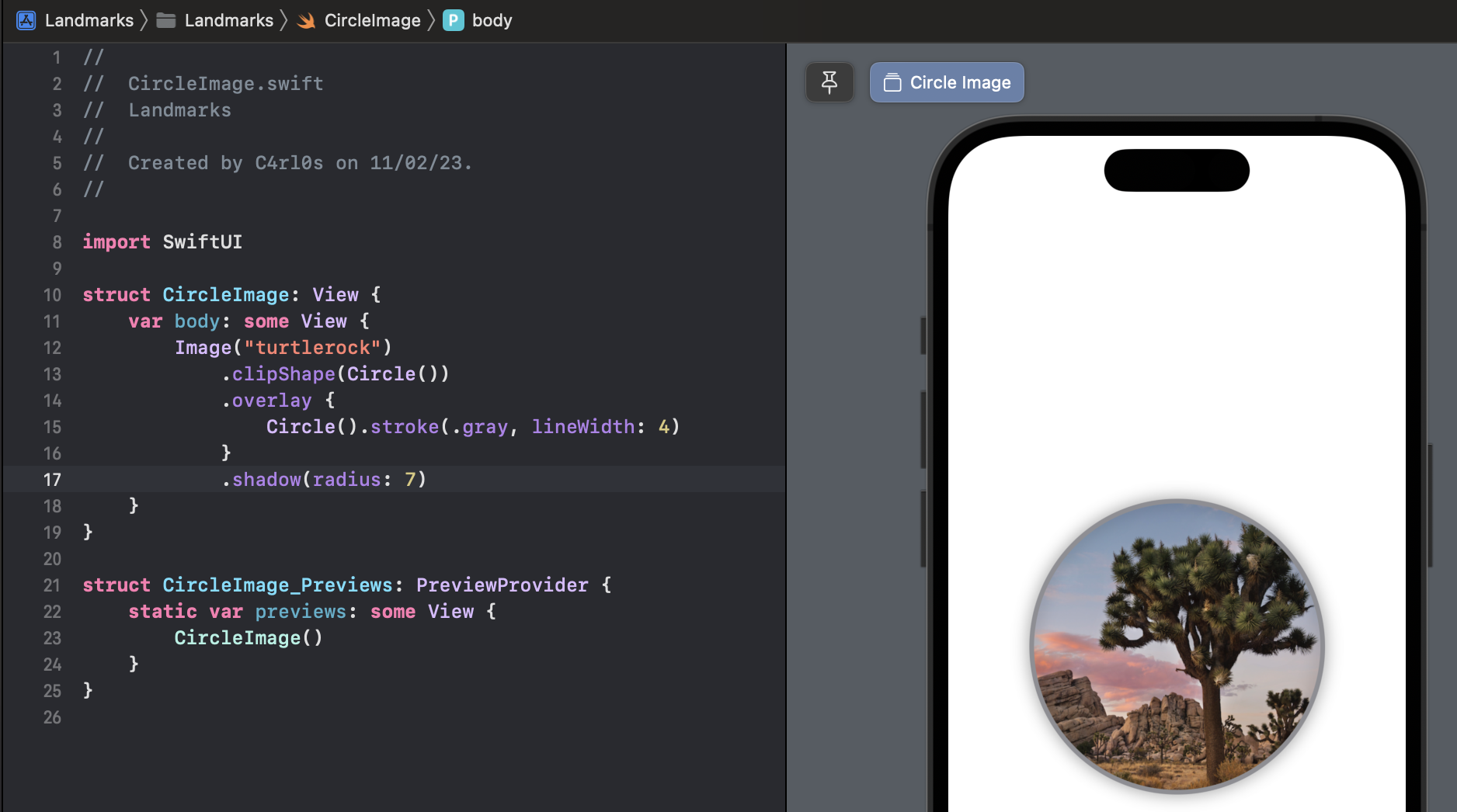
import SwiftUI

struct CircleImage: View {
    var body: some View {
        Image("turtlerock")
            .clipShape(Circle())
            .overlay {
                Circle().stroke(.gray, lineWidth: 4)
            }
            .shadow(radius: 7)
    }
}

struct CircleImage_Previews: PreviewProvider {
    static var previews: some View {
        CircleImage()
    }
}Switch the border color to white. This completes the image view.
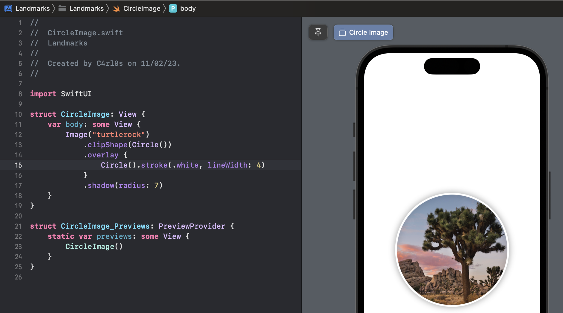
import SwiftUI

struct CircleImage: View {
    var body: some View {
        Image("turtlerock")
            .clipShape(Circle())
            .overlay {
                Circle().stroke(.white, lineWidth: 4)
            }
            .shadow(radius: 7)
    }
}

struct CircleImage_Previews: PreviewProvider {
    static var previews: some View {
        CircleImage()
    }
}Next you’ll create a map that centers on a given coordinate. You can use the Map view from MapKit to render the map.
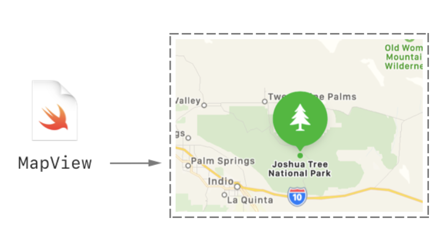
To get started, you’ll create a new custom view to manage your map.
Choose File > New > File, select iOS as the platform, select the “SwiftUI View” template, and click Next. Name the new file MapView.swift and click Create.
Add an import statement for MapKit.
import SwiftUI
import MapKit
When you import SwiftUI and certain other frameworks in the same file, you gain access to SwiftUI-specific functionality provided by that framework.
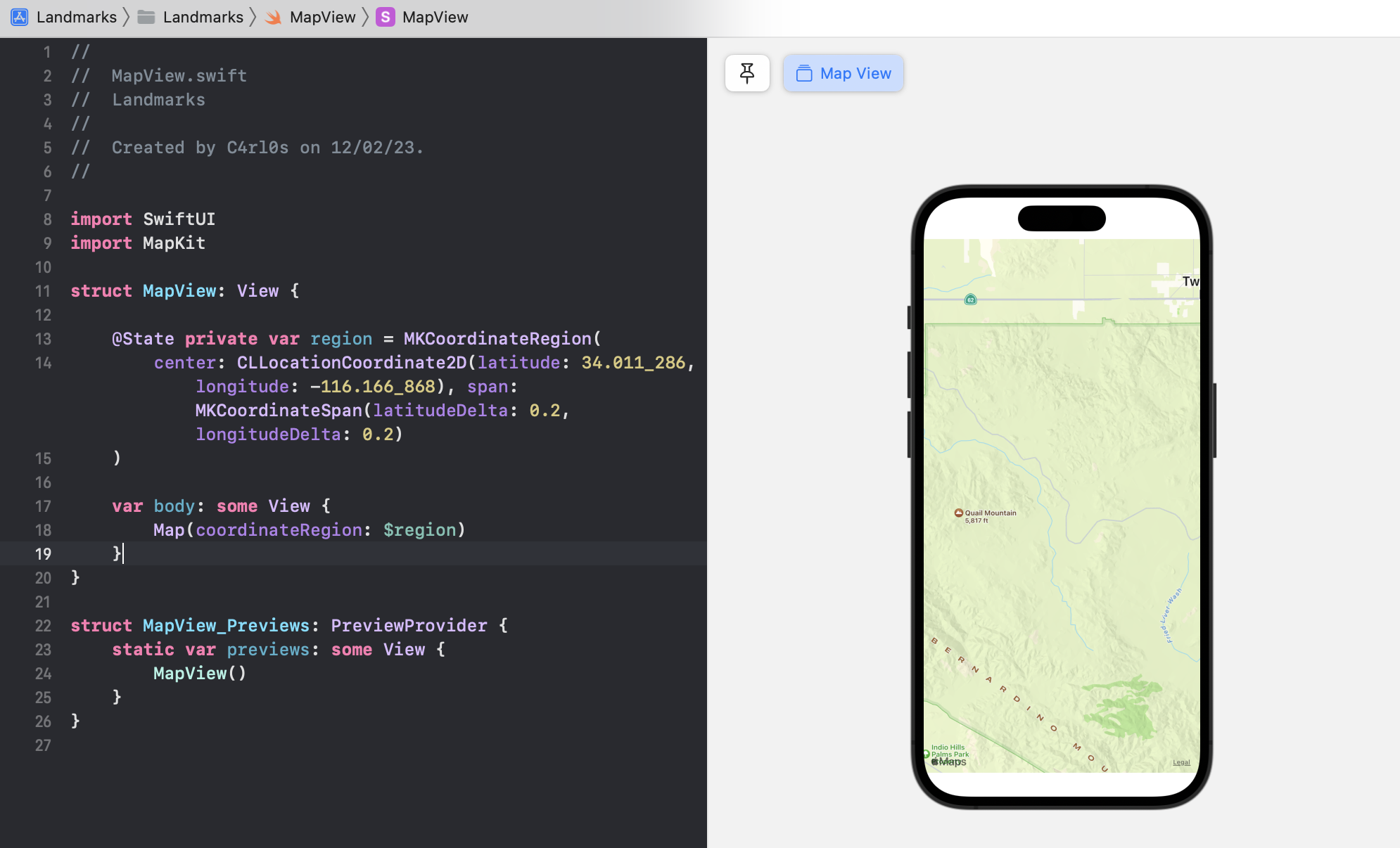
Create a private state variable that holds the region information for the map.
import SwiftUI
import MapKit

struct MapView: View {

    @State private var region = MKCoordinateRegion(
        center: CLLocationCoordinate2D(latitude: 34.011_286, longitude: -116.166_868), span: MKCoordinateSpan(latitudeDelta: 0.2, longitudeDelta: 0.2)
    )

    var body: some View {
        Text("Hello, World!")
    }
}

struct MapView_Previews: PreviewProvider {
    static var previews: some View {
        MapView()
    }
}
You use the @State attribute to establish a source of truth for data in your app that you can modify from more than one view. SwiftUI manages the underlying storage and automatically updates views that depend on the value.
Replace the default Text view with a Map view that takes a binding to the region.
By prefixing a state variable with $, you pass a binding, which is like a reference to the underlying value. When the user interacts with the map, the map updates the region value to match the part of the map that’s currently visible in the user interface.
import SwiftUI
import MapKit

struct MapView: View {

    @State private var region = MKCoordinateRegion(
        center: CLLocationCoordinate2D(latitude: 34.011_286, longitude: -116.166_868), span: MKCoordinateSpan(latitudeDelta: 0.2, longitudeDelta: 0.2)
    )

    var body: some View {
        Map(coordinateRegion: $region)
    }
}

struct MapView_Previews: PreviewProvider {
    static var previews: some View {
        MapView()
    }
}
When previews are in static mode, they only fully render native SwiftUI views. For the Map view, you’ll need to switch to a live preview to see it render.
Click Live Preview to switch the preview to live mode. You might need to click Try Again or Resume above your preview.
In a moment, you’ll see a map centered on Turtle Rock. You can manipulate the map in live preview to zoom out a bit and see the surrounding area.
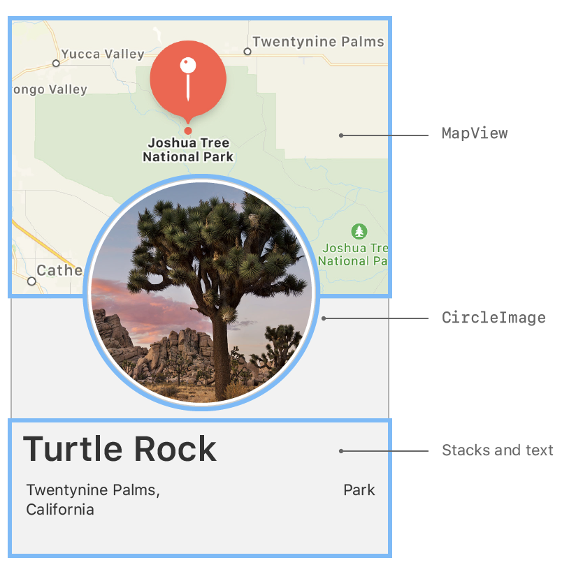
You now have all of the components you need — the name and place, a circular image, and a map for the location.
With the tools you’ve used so far, combine your custom views to create the final design for the landmark detail view.
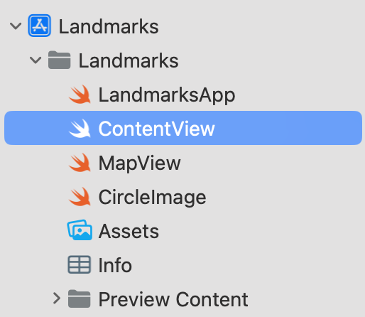
In the Project navigator, select the ContentView.swift file.
Embed the VStack that holds the three text views in another VStack.
import SwiftUI

struct ContentView: View {
    var body: some View {
        VStack {
            VStack(alignment: .leading) {
                Text("Turtle, Rock!")
                    .font(.title)
                    .foregroundColor(.blue)
                HStack {
                    Text("Joshua Tree National Park")
                        .font(.subheadline)
                    Spacer()
                    Text("California")
                        .font(.subheadline)
                }
            }
            .padding()
        }
    }
}

struct ContentView_Previews: PreviewProvider {
    static var previews: some View {
        ContentView()
    }
}Add your custom MapView to the top of the stack. Set the size of the MapView with frame(width:height:).
import SwiftUI

struct ContentView: View {
    var body: some View {
        VStack {
            MapView()
                .frame(height: 300)
            VStack(alignment: .leading) {
                Text("Turtle, Rock!")
                    .font(.title)
                    .foregroundColor(.blue)
                HStack {
                    Text("Joshua Tree National Park")
                        .font(.subheadline)
                    Spacer()
                    Text("California")
                        .font(.subheadline)
                }
            }
            .padding()
        }
    }
}

struct ContentView_Previews: PreviewProvider {
    static var previews: some View {
        ContentView()
    }
}
Click Live Preview to see the rendered map in the composed view.
You can continue editing the view while showing a Live Preview.
Add the CircleImage view to the stack.
MapView()
    .frame(height: 300)

CircleImage()To layer the image view on top of the map view, give the image an offset of -130 points vertically, and padding of -130 points from the bottom of the view.
These adjustments make room for the text by moving the image upwards.
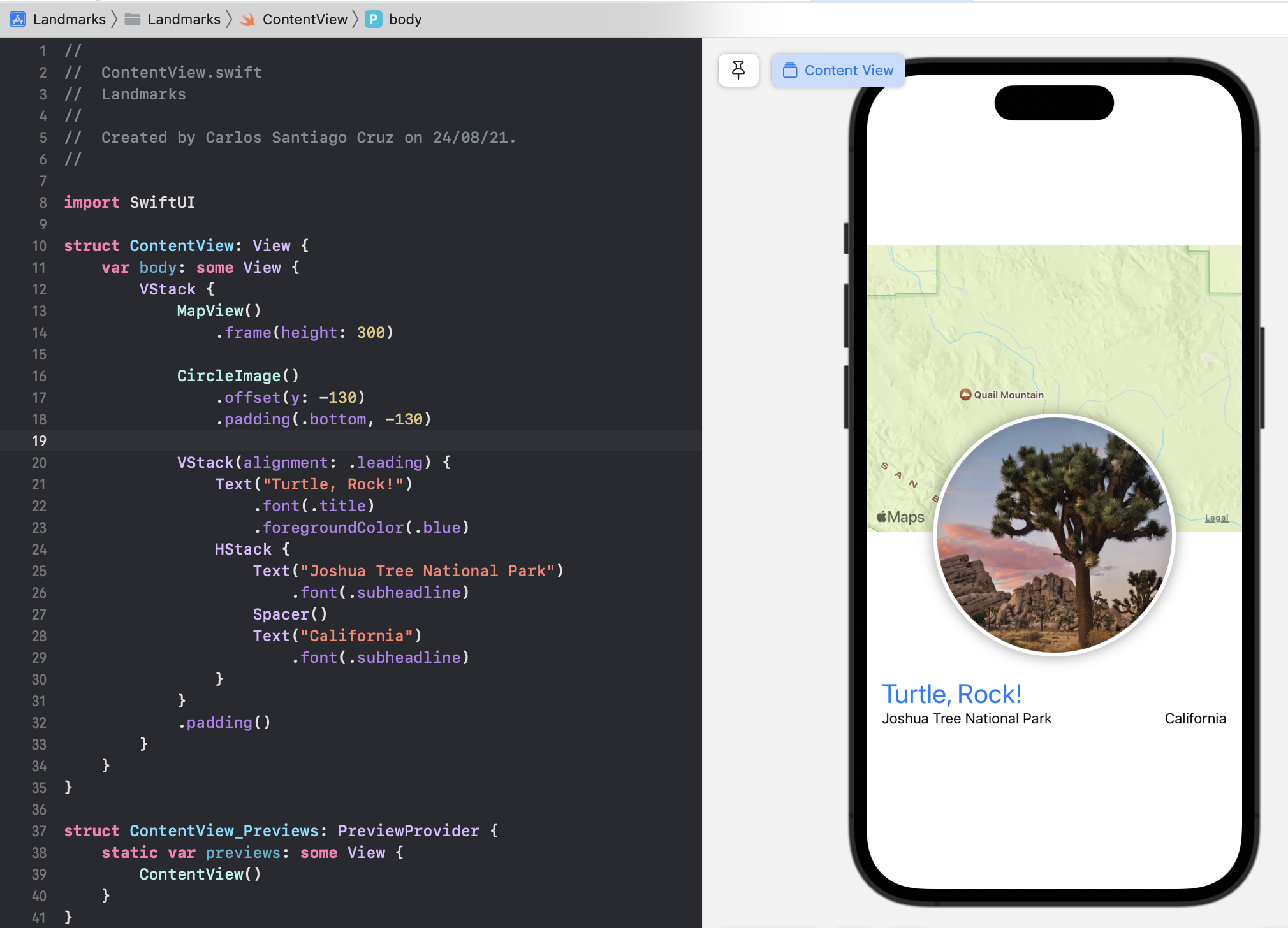
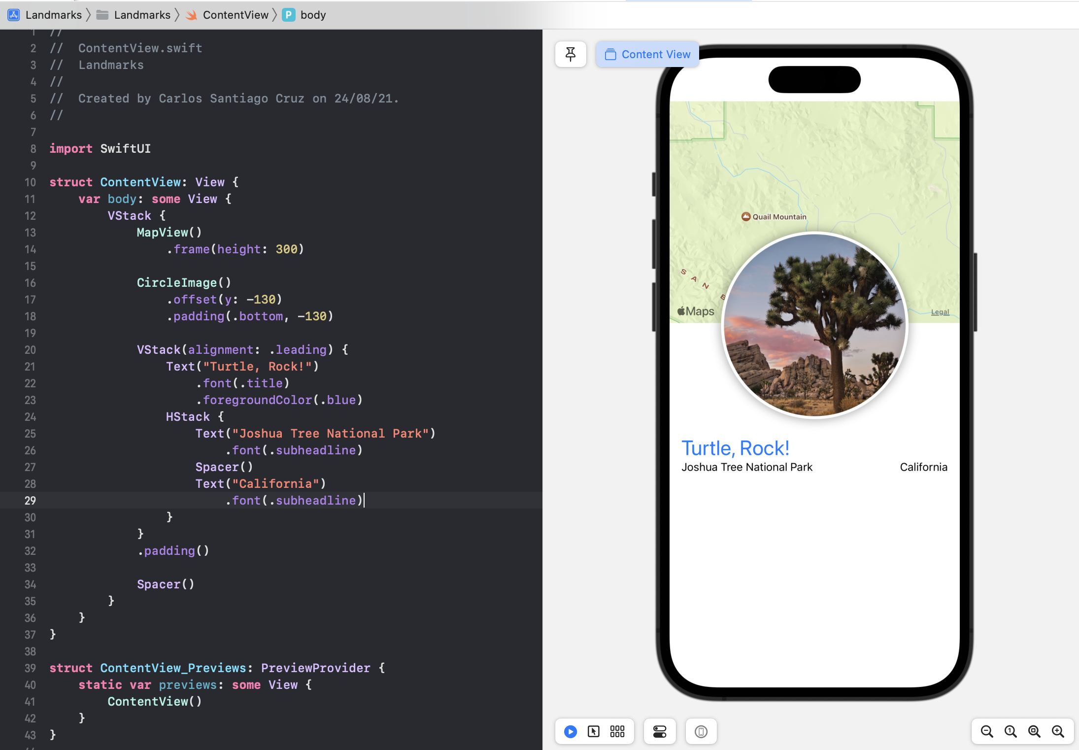
Add a spacer at the bottom of the outer VStack to push the content to the top of the screen.
VStack {
    MapView()

    CircleImage()

    VStack(alignment: .leading) {
    }

    Spacer()
}
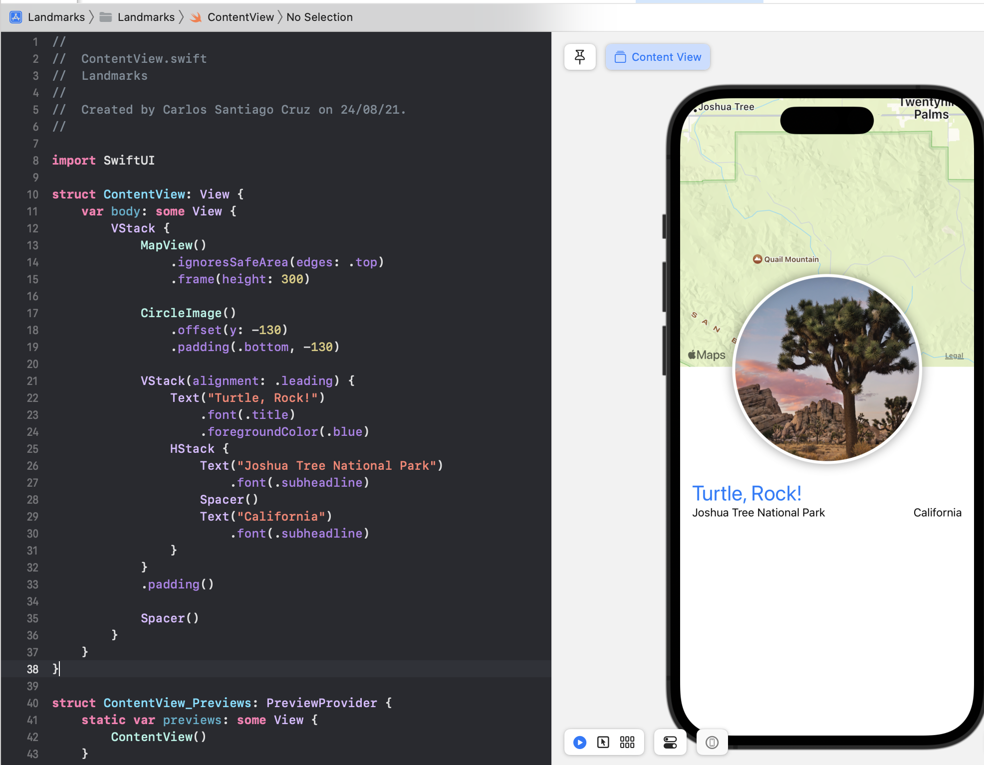
To allow the map content to extend to the top edge of the screen, add the ignoresSafeArea(edges: .top) modifier to the map view.
import SwiftUI

struct ContentView: View {
    var body: some View {
        VStack {
            MapView()
                .ignoresSafeArea(edges: .top)
                .frame(height: 300)

            CircleImage()
                .offset(y: -130)
                .padding(.bottom, -130)

            VStack(alignment: .leading) {
                Text("Turtle, Rock!")
                    .font(.title)
                    .foregroundColor(.blue)
                HStack {
                    Text("Joshua Tree National Park")
                        .font(.subheadline)
                    Spacer()
                    Text("California")
                        .font(.subheadline)
                }
            }
            .padding()

            Spacer()
        }
    }
}
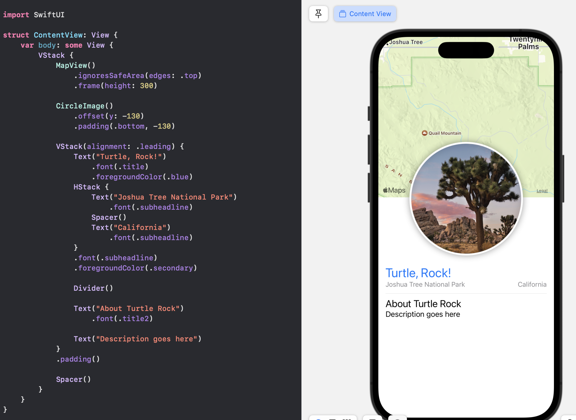
Add a Divider() and some additional descriptive text for the landmark.
struct ContentView: View {
    var body: some View {
        VStack {
            MapView()
                .ignoresSafeArea(edges: .top)
                .frame(height: 300)

            CircleImage()
                .offset(y: -130)
                .padding(.bottom, -130)

            VStack(alignment: .leading) {
                Text("Turtle, Rock!")
                    .font(.title)
                    .foregroundColor(.blue)
                HStack {
                    Text("Joshua Tree National Park")
                        .font(.subheadline)
                    Spacer()
                    Text("California")
                        .font(.subheadline)
                }

                Divider()

                Text("About Turtle Rock")
                    .font(.title2)

                Text("Description goes here")
            }
            .padding()

            Spacer()
        }
    }
}Finally, move the subheadline font modifier from each Text view to the HStack containing them, and apply the secondary color to the subheadline text.
struct ContentView: View {
    var body: some View {
        VStack {
            MapView()
                .ignoresSafeArea(edges: .top)
                .frame(height: 300)

            CircleImage()
                .offset(y: -130)
                .padding(.bottom, -130)

            VStack(alignment: .leading) {
                Text("Turtle, Rock!")
                    .font(.title)
                    .foregroundColor(.blue)
                HStack {
                    Text("Joshua Tree National Park")
                        .font(.subheadline)
                    Spacer()
                    Text("California")
                        .font(.subheadline)
                }
                .font(.subheadline)
                .foregroundColor(.secondary)

                Divider()

                Text("About Turtle Rock")
                    .font(.title2)

                Text("Description goes here")
            }
            .padding()

            Spacer()
        }
    }
}
When you apply a modifier to a layout view like a stack, SwiftUI applies the modifier to all the elements contained in the group.
HStack {
    Text("Joshua Tree National Park")
        .font(.subheadline)
    Spacer()
    Text("California")
        .font(.subheadline)
}
.font(.subheadline)
.foregroundColor(.secondary)
Adding the keyword some in front of a return type indicates that the return type is opaque.
Opaque types are frequently referred to as reverse generic types. But that’s kind of hard to understand without any more explanation. So let’s try to go step-by-step and recall generics first.
I have four base notes about Generics
- 5 Generics
- Swift and Generics
- 22 Generics in the Real World
- Swift documentation: Opaque and Boxed Types
Generic types are basically placeholders you can use when you want to declare functions that work with multiple types. We use protocols to describe (or constrain) what a generic type can do without exposing its actual type. Generic types hide the actual type of a value within a function’s implementation.
Opaque types are frequently referred to as reverse generic types.
Opaque types are the reverse in that the outside world doesn’t exactly know the type of a function’s return value. But inside the function’s implementation, you do know exactly what concrete types you’re dealing with.
- With a generic type, the caller of the function determines the concrete type of the placeholder (“outside”).
- With opaque types, the implementation determines the concrete type (“inside”).
Swift provides two ways to hide details about a value’s type: opaque types and boxed protocol types. Hiding type information is useful at boundaries between a module and code that calls into the module, because the underlying type of the return value can remain private. Opaque types preserve type identity — the compiler has access to the type information, but clients of the module don’t.
import UIKit

protocol Shape {
    func draw() -> String
}

struct Triangle: Shape {
    var size: Int
    func draw() -> String {
       var result: [String] = []
       for length in 1...size {
           result.append(String(repeating: "*", count: length))
       }
       return result.joined(separator: "\n")
    }
}

let smallTriangle = Triangle(size: 3)
print(smallTriangle.draw())

struct FlippedShape<T: Shape>: Shape {
    var shape: T
    func draw() -> String {
        let lines = shape.draw().split(separator: "\n")
        return lines.reversed().joined(separator: "\n")
    }
}

let flippedTriangle = FlippedShape(shape: smallTriangle)
print(flippedTriangle.draw())

struct JoinedShape<T: Shape, U: Shape>: Shape {
    var top: T
    var bottom: U
    func draw() -> String {
       return top.draw() + "\n" + bottom.draw()
    }
}

let joinedTriangles = JoinedShape(top: smallTriangle, bottom: flippedTriangle)
print(joinedTriangles.draw())

struct Square: Shape {
    var size: Int
    func draw() -> String {
        let line = String(repeating: "*", count: size)
        let result = Array<String>(repeating: line, count: size)
        return result.joined(separator: "\n")
    }
}

func makeTrapezoid() -> some Shape {
    let top = Triangle(size: 2)
    let middle = Square(size: 2)
    let bottom = FlippedShape(shape: top)
    let trapezoid = JoinedShape(top: top, bottom: JoinedShape(top: middle, bottom: bottom))
    return trapezoid
}
let trapezoid = makeTrapezoid()
print(trapezoid.draw())
The makeTrapezoid() function in this example declares its return type as some Shape; as a result, the function returns a value of some given type that conforms to the Shape protocol, without specifying any particular concrete type.