ENH: Enhance toggle button design and layout #32
Conversation
|
It would be great if either @AakashGfude or @chrisjsewell could give this a quick look to see if:
|
 choldgraf
changed the title
choldgraf
changed the title
|
Looks like a reasonable improvement to me @choldgraf, Do you think we can utilize the grey area of |
|
Good question - this could certainly be configurable in Sphinx. Though ideally you'd be able to map class names to promote text (eg so .hide-input would map to "Show cell input" and .hide-output would map to "Show cell output"). That might be possible to configure is the copybutton_selector could be a dictionary of "selector: text" mappings |
|
Not exactly based on changes in this PR. But might be low-hanging fruit. I think we can leverage the |
This sounds like a good idea. |
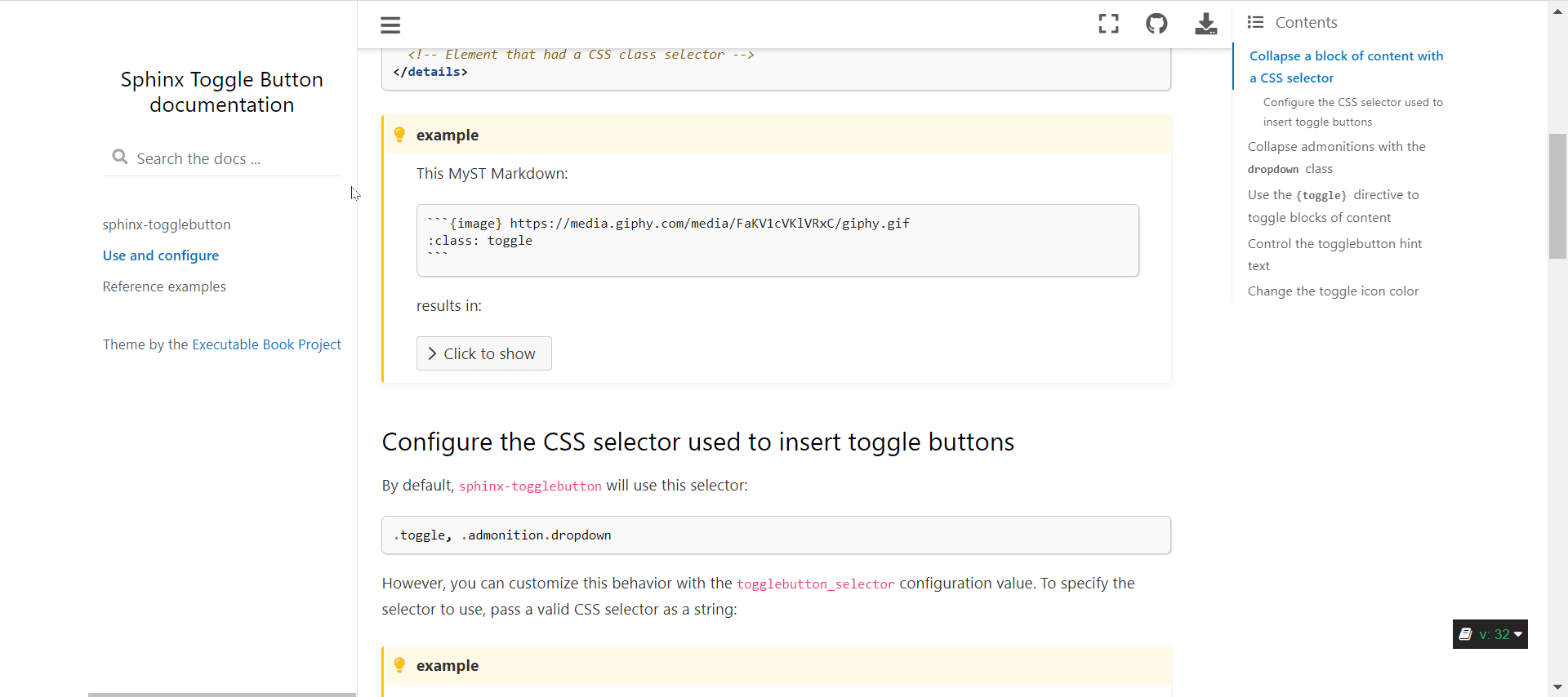
QuestionAnother option we discussed was to use an ellipsis as the open/close button. For example, here's a not-quite-polished ellipsis in action:
Benefits:
Cons:
Preferences?Anybody have opinions in either direction? (would also love thoughts from folks like @psychemedia @pradyunsg @mmcky if they have any opinions :-) ) |
Doesn't feel intuitive. Quite less "designy" in my opinion. |
|
The rotateable chevron looks great to me! It seems like the right long-term design choice. It's been sort of magic how the toggle button has worked across the different themes well - it would be nice if that was still possible. That seems to be one nice thing about doing it in pure-javascript (though I don't know how generalizable the sphinx-build side is?) I'll test with sphinx_rtd_theme when I can. |
|
Update: it works and looks very nice with sphinx_rtd_theme. The only possible thing is the color of the button: it would be nice if it could adopt the color of the font of the title. I've seen this with SVG buttons before, but I'd say it's not a big enough of an issue to make it worth it (text+button works well for color accessibility). |
|
@choldgraf I am +1 on the chevron. I think they look really nice and I like visual cues they provide. The elipsis is one of the design choices in many iOS apps I actually don't like :-) |
|
I don't really like the ellipsis - it's no overly suggestive (to me) of what happens next... I wonder if a "drop-up" mechanic would work, where there is an indicator eg top right of an output cell that appears on hover and then lets you click to view the code above the output cell, or even below the output cell (a bit like a caption, with the code explaining the above...) |
|
Thanks for the feedback everybody, that is super helpful. It sounds like the dropdown is the way to go. I wonder if there's a way we can make it take up less visual space and still use the dropdown slider. What if we reduced the width to max at 25% of the page, then it would look like the following, what do people think?
or even with the arrow on the left, like a traditional details button?
Also @psychemedia I love your idea for some kind of hover-able menu to toggle the display...I think that might require more assumptions about the structure than we can make in sphinx-togglebutton, but maybe we can special case that in myst-nb somehow? |
|
Yep cheers, as I reference a lot in https://sphinx-design.readthedocs.io/en/furo-theme/, https://material.io is Google's user interface best practice and is a great reference point, and also https://material-ui.com/, https://getbootstrap.com/ and https://primer.style/ (but looking good) |
Update: more compact toggle buttonAfter some feedback from you all (and others on twitter) I've made the block-level toggle button more compact. here are the changes:
Here's a gif of the new behavior:
I think that this one is ready to go from my end, unless there is other low-hanging fruit others would like to suggest. I'll leave it for a day or two to give others a chance to comment or make suggestions! |
 AakashGfude
left a comment
AakashGfude
left a comment
AakashGfude
left a comment
There was a problem hiding this comment.
Looks smooth @choldgraf .🚀
|
How easy would it be to optionally allow user customisable toggle messages at a local or global level? |
|
It looks very nice! Thanks for all of your work on this. |
|
@psychemedia - the toggle button message is already customizable at a global level (see https://sphinx-togglebutton--32.org.readthedocs.build/en/32/use.html#control-the-togglebutton-hint-text). At a local level, I can think of two ways we could do this (in a follow up PR probably):
Thanks all for your comments - Unless others suggest we should hold off merging, I'll try and take another look at the code today and will give it a merge if I can't find anything major to improve. |
choldgraf
changed the title
This makes a few major design updates to our toggle buttons with the following goals:
<details>where possible, to simplify the toggling processMajor updates
Using chevrons for buttons
This swaps out our "+/-" sign to instead use a chevron
>that rotates. We had some discussion of this in the EBP meeting today and everybody agreed this was a nicer pattern than the+/-combo we were using before.cc @rkdarst as this might change the behavior of your admonitions slightly. Let me know what you think!
Old behavior
New behavior
The non-admonition toggle button will now wrap elements in a
<details>blockIf somebody puts a CSS class with a toggle button selector, then it will be wrapped in a
<details>block and hidden by default. Note that this is done with JS, and likely a better long-term fix is to make this happen on the Sphinx build side, but this is meant to be a step in the right direction.Old behavior
New behavior
closes #28
closes #26