fix(v2): update SearchPage styling, fix appearance in dark mode#3837
fix(v2): update SearchPage styling, fix appearance in dark mode#3837lex111 merged 5 commits intofacebook:masterfrom
Conversation
|
Deploy preview for docusaurus-2 ready! Built without sensitive environment variables with commit 77b53b3 |
|
Deploy preview for docusaurus-2 ready! Built without sensitive environment variables with commit 350e9f8 |
|
Deploy preview for docusaurus-2 ready! Built without sensitive environment variables with commit 706409f |
|
This is how full focus/active style looks when it was fully based on the Docsearch CSS variables, but I personally don't liked the background color of unselected element. In the other hand implementing border color change (on previous mentions interactions) might be a good idea, but this behavior will differ from the search input in modal, which is stylized as always focused.
|
I don't like this, it feels like inputs are always in focus/hover state. Typically, similar styling is used for outline property (which I actually plan to do in Infima, CSS outline based on the primary color). Moreover, resetting an outline is very bad practice. |
@lex111 This was exactly my concern which I had stated in the comment above, you should explain why it's a bad approach and why you don't like this to Algolia devs, since they are the authors of DocSearch styling, not me. 😉 So I'm going to push the alternative interaction styling, which I have proposed above, since you have not recommended other alternatives. |
|
I got you, but Algolia search is a third-party project, although the search page uses the Algolia API, this is our feature, so we style it according to our styles (i.e. those defined in Infima), and not follow Algolia design guidelines. |
I can agree that it is Docusaurus code, but this plugin is 100% related and was created only to be used with Alogia, as even the package name suggest - Also this sentence is not true according to the search modal, which is not styled by Infima in any way, you only overwrite some DocSearch CSS variables to match the colors and the default structure and design of modal in not altered in any way.
But there is currently almost no styling (in/from Infima), and as stated before, inputs are looking incorrect in dark mode. |
Updated previewWith borders (inset shadow) transition and no background altering. |
@lex111 Can you elaborate more on the Infima default inputs styling, what do you have in mind? I'm was not able to find any mention about input styles in the Infima docs: Only traces about that some styling exist in Infima are variables like:
But they are not general variables, they were created specifically for the |
|
I understand what you want to do, but it's better to add dark mode support for input in Infima itself, rather in search page component. Especially now box-shadow is almost useless, because it is overlapped by the outline. |
|
@Simek thank you! |
@lex111 That was the reason why I have disabled the outline in the initial version, but I have put it back as you suggested that is a bad practice. I also don't like the appearance of box-shadow and outline used at the same time. Maybe you will have a better idea how to improve this within incorporation of Infima styling. Also I have got one more question, what is the reason behind using italic style for the result item summary? AFAIK there are no other italic styled text in |
The solution is really simple - just use
I don’t remember exactly why I did this, maybe I was inspired by some other search page. So maybe we should remove this, but I'm not sure about that. |
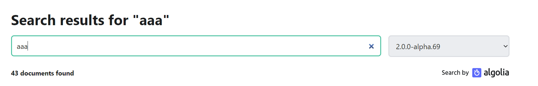
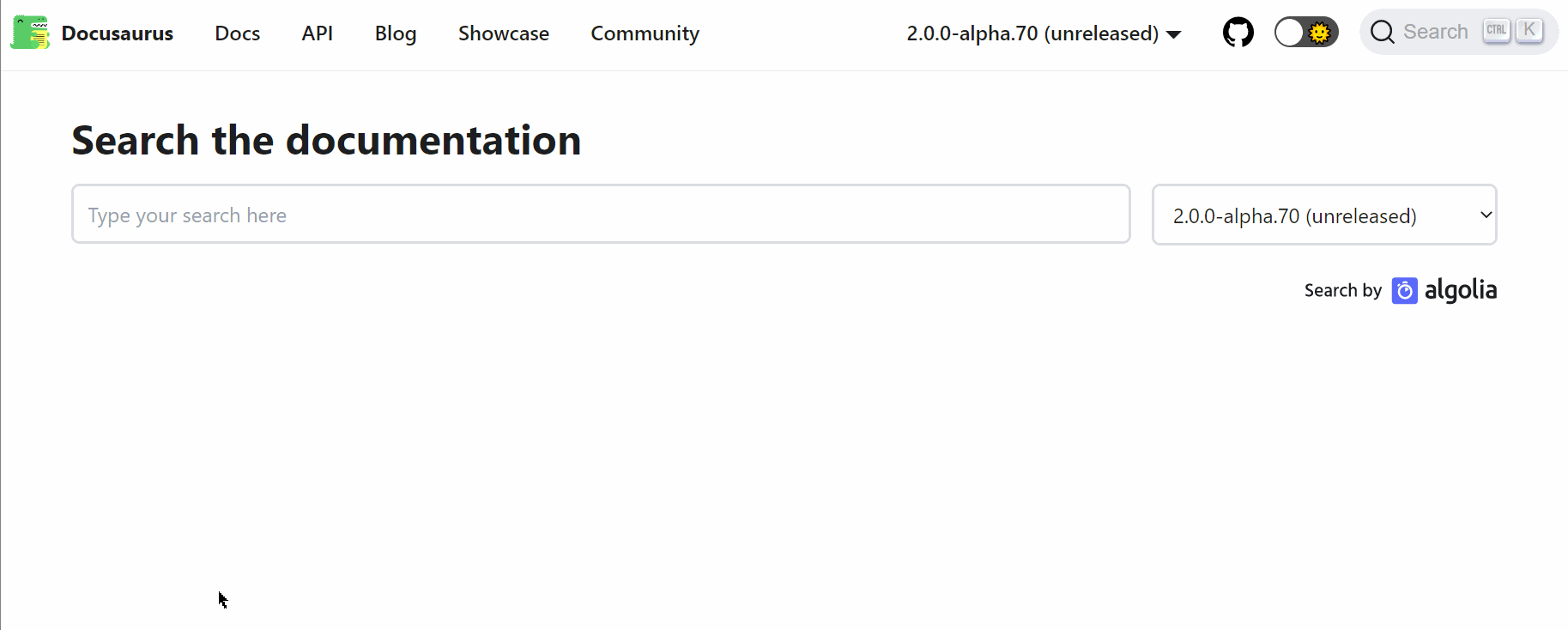
Motivation
Currently
SearchPagestyling feels a bit plain and in addition to that inputs and separator lines do not change appearance between the modes.This PR updates the
SearchPagecomponent and introduces the following changes:content) possible through CSSHave you read the Contributing Guidelines on pull requests?
Yes.
Test Plan
The changes have been tested using Docusaurus V2 website locally.
Preview
Mobile
Related PRs