Skip to content

Wins mobile margins#1928

Merged
Aveline-art merged 8 commits intohackforla:gh-pagesfrom
anonymousanemone:wins-mobile-margins
Aug 10, 2021
Merged

Wins mobile margins#1928
Aveline-art merged 8 commits intohackforla:gh-pagesfrom
anonymousanemone:wins-mobile-margins

Conversation

@anonymousanemone
Copy link
Member

Fixes #1908

What changes did you make and why did you make them ?

  • replaced wins-card-mobile.svg with a new svg that does not include shadows as part of the .svg
  • added shadows to wins-card-mobile.svg using css in _about.scss instead
  • added about-card-accomplishments because wins-card-desktop had it, but mobile didn't

Screenshots of Proposed Changes Of The Website (if any, please do not screen shot code changes)

Visuals after changes are applied

after

Visuals before changes are applied

Screen Shot 2021-07-12 at 12 44 44 PM

@github-actions github-actions bot added P-Feature: About Us https://www.hackforla.org/about/ role: front end Tasks for front end developers Complexity: Medium status: Help Wanted Internal assistance is required to make progress labels Jul 12, 2021
@anonymousanemone anonymousanemone removed the status: Help Wanted Internal assistance is required to make progress label Jul 12, 2021
jbubar
jbubar previously requested changes Jul 12, 2021
Zak234
Zak234 previously approved these changes Jul 16, 2021
Copy link
Contributor

@Zak234 Zak234 left a comment

Choose a reason for hiding this comment

The reason will be displayed to describe this comment to others. Learn more.

The changes you made look good and seem to be working. I'm pretty sure this isn't related to your issue but I noticed when I was checking your code changes through different phone resolutions that for a lot of the other phone resolutions besides iphone X that the wins-card is off-center. Should this be a new issue?

@Aveline-art
Copy link
Member

@Zak234 Can you attach screenshots of what you are seeing vs the appearance of the mobile view on Figma?

@erikaBell erikaBell requested a review from jbubar July 17, 2021 20:56
Copy link
Member

@abuna1985 abuna1985 left a comment

Choose a reason for hiding this comment

The reason will be displayed to describe this comment to others. Learn more.

Following up on @Zak234 comment. It looks great on desktop/mobile view. It seems the tablet view just aligns to the left.

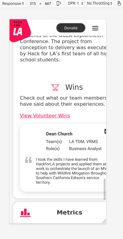
Click to see Tablet view (iPad) of About page (Accomplishments)

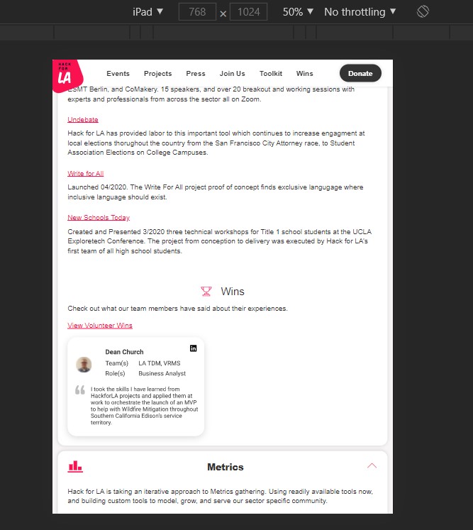
It looks like the the card flexbox converts to column in tablet view and since we are providing a width to the svg, it aligns to the left (start). So maybe add styling for tablet view (line 604-618).

@Zak234
Copy link
Contributor

Zak234 commented Jul 21, 2021

Screen Shot 2021-07-21 at 1 29 14 AM

Screen Shot 2021-07-21 at 1 29 57 AM

Screen Shot 2021-07-21 at 1 30 23 AM

Screen Shot 2021-07-21 at 2 23 46 AM

@anonymousanemone
Copy link
Member Author

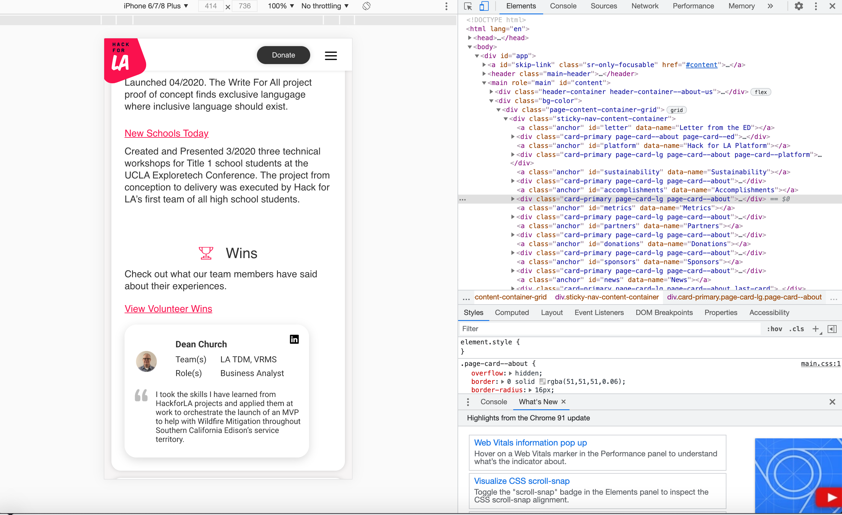
I've centered the image for "below tablet" which is when the screen is under 768px, but should I also center the image for when it is "bigger than tablet" but less than desktop? Here's how it looks:
Below tablet:
image
Over tablet:
image

@Aveline-art Aveline-art requested a review from abuna1985 July 31, 2021 05:44
@anonymousanemone anonymousanemone added the status: Help Wanted Internal assistance is required to make progress label Jul 31, 2021
@anonymousanemone
Copy link
Member Author

Ask design team about whether to center or do something else

@kristine-eudey
Copy link
Member

@anonymousanemone thanks for checking in about this. Please center the card for the "bigger than tablet" view as well.

@anonymousanemone anonymousanemone requested a review from Zak234 August 6, 2021 05:23
@anonymousanemone
Copy link
Member Author

I've made both of the changes requested above, please re-review! @jbubar @abuna1985

Copy link
Contributor

@Zak234 Zak234 left a comment

Choose a reason for hiding this comment

The reason will be displayed to describe this comment to others. Learn more.

Looks good!

Copy link
Member

@macho-catt macho-catt left a comment

Choose a reason for hiding this comment

The reason will be displayed to describe this comment to others. Learn more.

For the most part, changes on the page card itself looks good. Good job!

I also noticed that you've been working on this for a while, so props to you on that. However, I noticed one other thing that may not be in the jurisdiction of your issue/PR.

@Zak234 noticed it in one of his previous posts, but at a certain BP the parent cards are cutting off. This is due to the fact that flex (or any mobile responsive query) is not applied to the parent divs at specific BPs:

Click to see example

cut off below a certain bp

The fix would be to apply flex (or some sort of media query) on the parent divs for each section of the About page.

@Aveline-art @abuna1985 is it better to open up a new issue for this? Otherwise, I would be inclined to approve this issue.

@abuna1985 abuna1985 dismissed jbubar’s stale review August 9, 2021 07:14

changes have been correctly made

@abuna1985
Copy link
Member

abuna1985 commented Aug 9, 2021

@macho-catt Go ahead and create a new issue for adding margin to the parent divs of the About page. Once that is complete, add it to this pr as a comment and approve the pull request. Then I will merge it. Thank you.

@macho-catt
Copy link
Member

Opened a separate issue for the cutting off bug: #2077

@Aveline-art Aveline-art merged commit 24bc854 into hackforla:gh-pages Aug 10, 2021
Sign up for free to join this conversation on GitHub. Already have an account? Sign in to comment

Labels

Complexity: Medium P-Feature: About Us https://www.hackforla.org/about/ role: front end Tasks for front end developers status: Help Wanted Internal assistance is required to make progress

Projects

None yet

Development

Successfully merging this pull request may close these issues.

Remove additional space from wins-card-mobile.svg within WIns About page (mobile only)

7 participants