Projects filters 3744#4280
Conversation
…ainer for filters
|
Want to review this pull request? Take a look at this documentation for a step by step guide! From your project repository, check out a new branch and test the changes. |
 github-actions
bot
added
role: front end
github-actions
bot
added
role: front end
|
I left a note on the issue this is from #3744 (comment) |
github-actions
bot
removed
the
Draft
|
Filter-Toolbar padding was reduced(by ~35%). I left a decent chunk there because I'm trying to make it at the level it should be with the search bar when it is implemented. If I should move it up further, please let me know :) |
|
Availability: Tuesday and Thursday evenings |
|
Looks good. |
|
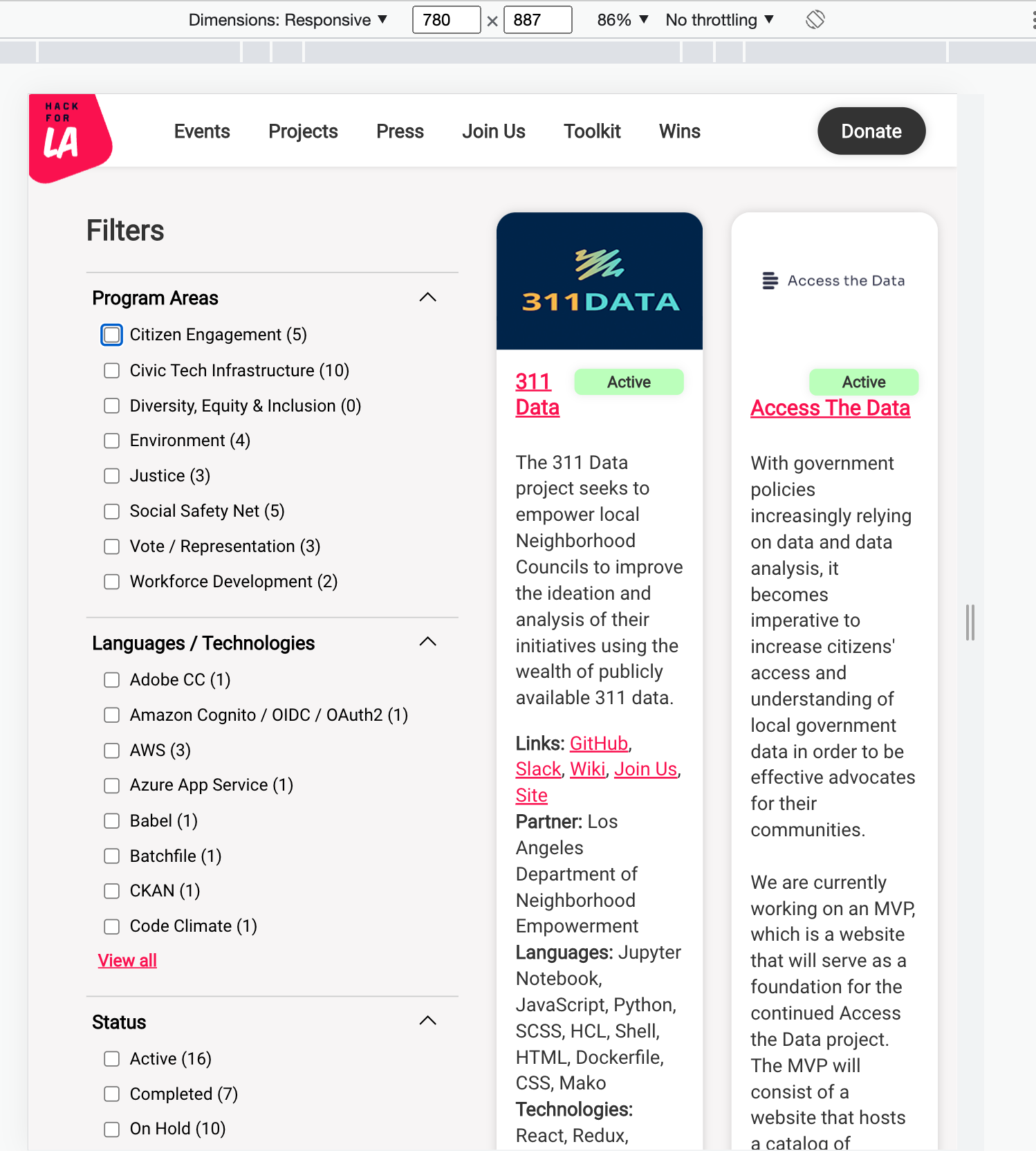
@chrismenke45 Great job on adding the filter! The styles look good to me, and the tab focus worked on different screen sizes—thanks for ensuring good accessibility for the UX! One thing I've noticed is that on medium-sized screens, the filter takes up half of the width (see screenshot for a screen width of 780px), and I wonder if that's the intended design. In my opinion, the filter shouldn't take more than 1/3 of the width, but that's subjective. I can't find a layout design in Figma that was made for medium-sized screens, nor have I found documentation that specifies the column ratio for the filter and cards. What are your thoughts on this?
|
|
Hi @bzzz-coding, |
|
Hi @bzzz-coding, |
|
@chrismenke45 and @sijiapitts thank you for your input! Since we don't have a design made for medium-sized screens, I think whichever design the team thinks works best for this screen size would work. |
|
Hi @bzzz-coding |
 roslynwythe
left a comment
roslynwythe
left a comment
roslynwythe
left a comment
There was a problem hiding this comment.
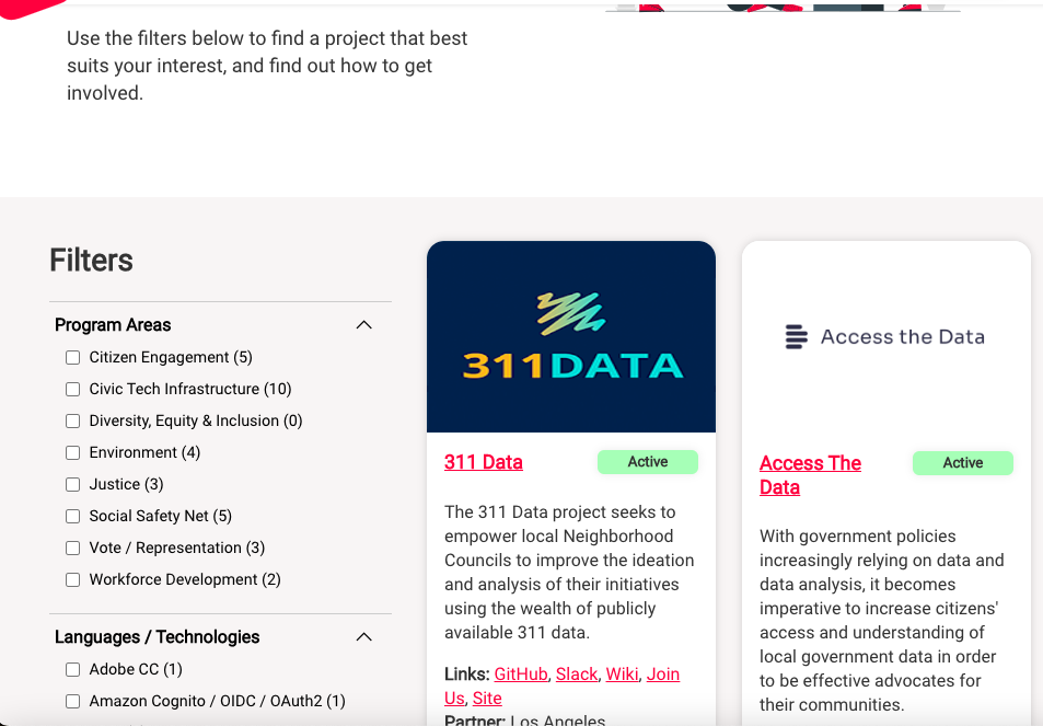
Hi @chrismenke45 now in desktop view there is too much space between the filter and cards:
|
@chrismenke45 I was wondering if using aspect ratios or adjusting the column span would be a more responsive approach than setting a fixed pixel width. For instance, if the grid has three equal-width columns, the filter could occupy one column, while the two cards could span two columns each. That being said, you have also put in a lot of effort towards this issue. Since there was no design provided for medium-sized screens, I am unsure whether adjusting layouts for such screens falls within the scope of this current issue. @roslynwythe, what are your thoughts on this? |
|
@bzzz-coding & @roslynwythe,
Let me know what you think |
|
@chrismenke45 Thank you for proposing different solutions! I'm not an expert on frontend, but I do remember using something like |
|
@chrismenke45 @bzzz-coding I am not inclined to request further development on this PR for the sake of the medium size screens. I would prefer that we restore the desktop view to match the Figma design and leave the mid-size screen view as it was. You could create an ER to deal with the mid-sized screens. But I'm not the dev lead, so if either of you feel otherwise, please ask Justin to take a look. |
|
@chrismenke45 @roslynwythe I'm fine with the previous layout too and would approve the PR if you decide to change it back. Just let me know. Excellent job! |
 bzzz-coding
left a comment
bzzz-coding
left a comment
bzzz-coding
left a comment
There was a problem hiding this comment.
@chrismenke45 Excellent job on adding the filter section to the page🌟!
Thank you for problem-solving and being flexible about different approaches to resolve an issue. 🙌
|
@bzzz-coding @roslynwythe |
roslynwythe
left a comment
roslynwythe
left a comment
There was a problem hiding this comment.
Great work @chrismenke45 on quite a challenging large issue. You've implemented a powerful live filtering feature, complete with dynamic filter lists that are very usable and look great. The PR is well formed and you responded to all requests thoughtfully and patiently. Thank you!
4 participants
Fixes #3744
What changes did you make and why did you make them ?
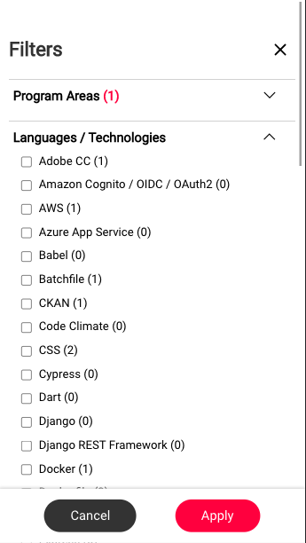
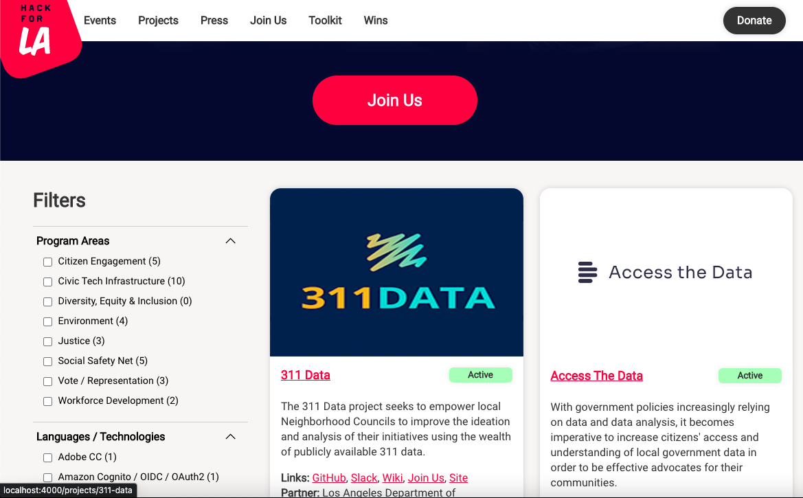
Screenshots of Proposed Changes Of The Website
Visuals before changes are applied
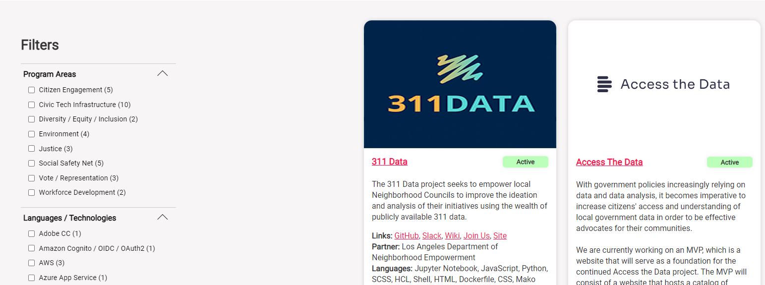
Desktop Layout Before ChangedVisuals after changes are applied
Desktop Layout After Changed
Mobile Layout After Changed
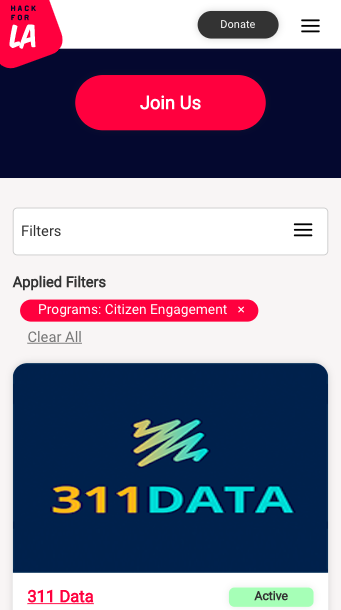
Mobile Layout After Changed (Filter Pop up)