Improve event page button design #534
Merged
Conversation
This file contains hidden or bidirectional Unicode text that may be interpreted or compiled differently than what appears below. To review, open the file in an editor that reveals hidden Unicode characters.
Learn more about bidirectional Unicode characters
Collaborator
Author
|
Hey @Eficnbo, could you take a look at this PR so it doesn't get lost? :) This one is pretty straightforward, just some small button changes. Thanks! |
Sign up for free
to join this conversation on GitHub.
Already have an account?
Sign in to comment
2 participants
Add this suggestion to a batch that can be applied as a single commit.
This suggestion is invalid because no changes were made to the code.
Suggestions cannot be applied while the pull request is closed.
Suggestions cannot be applied while viewing a subset of changes.
Only one suggestion per line can be applied in a batch.
Add this suggestion to a batch that can be applied as a single commit.
Applying suggestions on deleted lines is not supported.
You must change the existing code in this line in order to create a valid suggestion.
Outdated suggestions cannot be applied.
This suggestion has been applied or marked resolved.
Suggestions cannot be applied from pending reviews.
Suggestions cannot be applied on multi-line comments.
Suggestions cannot be applied while the pull request is queued to merge.
Suggestion cannot be applied right now. Please check back later.
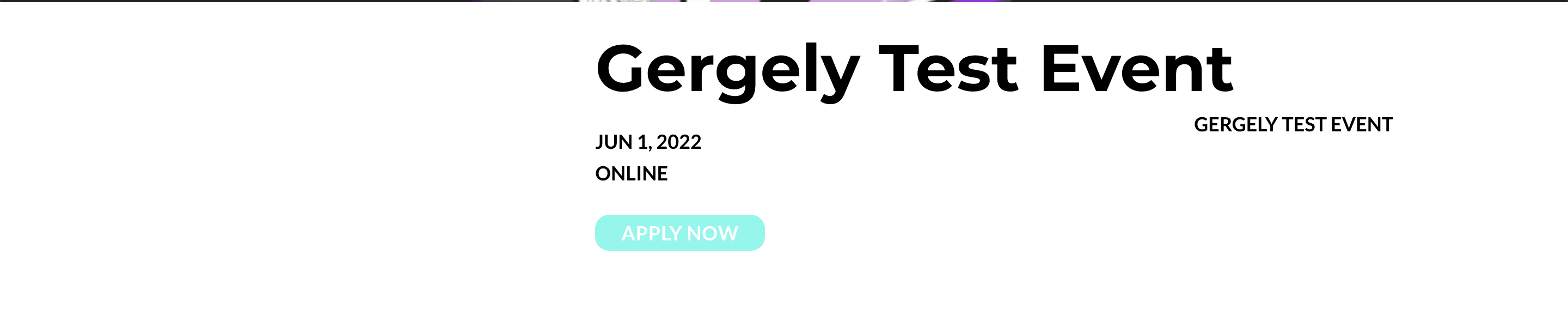
This change improves the design of the CTA button on the event detail pages. The current issue is that these buttons look like links/text and they are not discoverable.
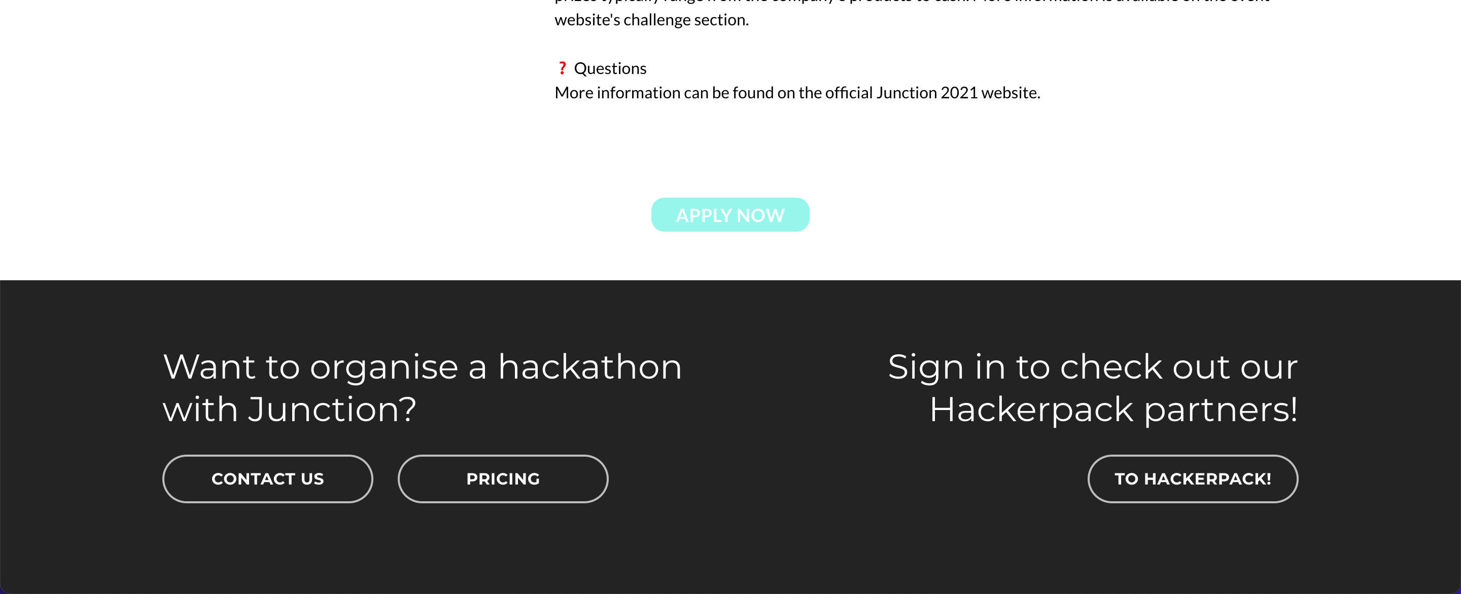
With these changes, they'll look more like buttons and they'll be customizable via the event theme settings. Further, this adds an extra CTA section below the event details text, so the button is shown twice on the page to increase CTR.
Button now has a background and padding:
Button re-appears on the bottom of the page: