


A native keyboard-aware composer for React Native chat applications. Built specifically for AI chat interfaces like ChatGPT and v0, where content needs to react intelligently to keyboard and input changes.
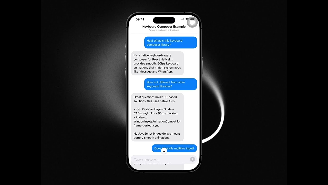
Click to watch demo · Smooth keyboard animations with auto-growing input and content-aware positioning.
In chat applications, keyboard handling is notoriously difficult:
- When should content push up vs the keyboard overlay content?
- How do you maintain the gap between the last message and composer as the input grows?
- What happens when the user scrolls while the keyboard is open, then closes it?
This library solves all of that with native implementations that handle the edge cases.
- 💬 Built for chat UIs - Content reacts correctly to keyboard open/close
- 📏 Smart content positioning - Knows when to push content up vs overlay
- ⌨️ Auto-growing input - Composer expands with text, content adjusts accordingly
- 🔄 Scroll-to-bottom button - Appears when you scroll away from latest messages
- 📱 iOS & Android parity - Same behavior on both platforms
- 🎛️ Streaming support - Built-in stop button for AI streaming responses
- 🌙 Dark mode support - Automatically adapts to system theme
- 👆 Gesture support (iOS) - Swipe down to dismiss keyboard, swipe up to open
pnpm add @launchhq/react-native-keyboard-composer
# or
npm install @launchhq/react-native-keyboard-composer
# or
yarn add @launchhq/react-native-keyboard-composer
For Expo managed projects, run:
npx expo prebuildimport {
KeyboardComposer,
KeyboardAwareWrapper,
} from "@launchhq/react-native-keyboard-composer";
function ChatScreen() {
const [composerHeight, setComposerHeight] = useState(48);
return (
<KeyboardAwareWrapper style={{ flex: 1 }} extraBottomInset={composerHeight}>
<ScrollView>{/* Your chat messages */}</ScrollView>
<View style={styles.composerContainer}>
<KeyboardComposer
placeholder="Type a message..."
onSend={(text) => handleSend(text)}
onHeightChange={(height) => setComposerHeight(height)}
onComposerFocus={() => console.log("Focused")}
onComposerBlur={() => console.log("Blurred")}
/>
</View>
</KeyboardAwareWrapper>
);
}import { KeyboardComposer } from "@launchhq/react-native-keyboard-composer";
function AIChat() {
const [isStreaming, setIsStreaming] = useState(false);
const handleSend = async (text: string) => {
setIsStreaming(true);
await streamAIResponse(text);
setIsStreaming(false);
};
return (
<KeyboardComposer
placeholder="Ask anything..."
isStreaming={isStreaming}
onSend={handleSend}
onStop={() => cancelStream()}
/>
);
}const [blurTrigger, setBlurTrigger] = useState(0);
// Call this to dismiss keyboard
const dismissKeyboard = () => setBlurTrigger(Date.now());
<KeyboardComposer
blurTrigger={blurTrigger}
// ...other props
/>;The main composer input component.
| Prop | Type | Default | Description |
|---|---|---|---|
placeholder |
string |
"Type a message..." |
Placeholder text |
minHeight |
number |
48 |
Minimum height in dp/points |
maxHeight |
number |
120 |
Maximum height before scrolling |
sendButtonEnabled |
boolean |
true |
Whether send button is enabled |
editable |
boolean |
true |
Whether input is editable |
autoFocus |
boolean |
false |
Auto-focus on mount |
blurTrigger |
number |
- | Change value to trigger blur |
isStreaming |
boolean |
false |
Shows stop button when true |
onChangeText |
(text: string) => void |
- | Called when text changes |
onSend |
(text: string) => void |
- | Called when send is pressed |
onStop |
() => void |
- | Called when stop is pressed |
onHeightChange |
(height: number) => void |
- | Called when height changes |
onKeyboardHeightChange |
(height: number) => void |
- | Called when keyboard height changes |
onComposerFocus |
() => void |
- | Called when input gains focus |
onComposerBlur |
() => void |
- | Called when input loses focus |
style |
StyleProp<ViewStyle> |
- | Container style |
Wrapper component that handles keyboard-aware scrolling.
| Prop | Type | Default | Description |
|---|---|---|---|
pinToTopEnabled |
boolean |
false |
Enables pin-to-top + runway behavior (see below) |
extraBottomInset |
number |
0 |
Bottom inset (typically the current composer height) |
scrollToTopTrigger |
number |
0 |
Change value to arm pin-to-top for the next append |
style |
StyleProp<ViewStyle> |
- | Container style |
children |
ReactNode |
- | Should contain a ScrollView |
Pin-to-top is opt-in and is controlled via KeyboardAwareWrapper (not KeyboardComposer).
When pinToTopEnabled is true:
- The next user message append is pinned to the top of the viewport.
- A non-scrollable runway is created below it so streamed assistant responses can grow without the content snapping around.
- While streaming grows content, the wrapper keeps the pinned position stable unless the user manually scrolls away.
When pinToTopEnabled is false (or omitted), the wrapper behaves like a normal keyboard-aware chat wrapper (no runway/pinning).
You can toggle pinToTopEnabled at runtime; disabling it clears any active runway/pin state.
Despite the name, scrollToTopTrigger is used to arm pin-to-top for the next content append (use a counter or Date.now()).
Module constants for default values:
import { constants } from "@launchhq/react-native-keyboard-composer";

console.log(constants.defaultMinHeight); // 48
console.log(constants.defaultMaxHeight); // 120
console.log(constants.contentGap); // 32The library automatically handles spacing between your content and the composer:
| Constant | iOS (pt) | Android (dp) | Description |
|---|---|---|---|
CONTENT_GAP |
24 | 24 | Gap between last message and composer |
COMPOSER_KEYBOARD_GAP |
8 | 8 | Gap between composer and keyboard |
Note: While both platforms use the same numerical values, the visual spacing may appear different due to how each platform handles safe areas, scroll content insets, and keyboard positioning. iOS typically shows more visible gap due to its safe area and scroll inset calculations.
If you need more space between your content and the composer, add paddingBottom to your scroll content:
<ScrollView
  contentContainerStyle={{
    paddingBottom: 16, // Extra space above composer
  }}
>
  {/* Your messages */}
</ScrollView>The KeyboardComposer should be placed inside KeyboardAwareWrapper with absolute positioning for proper keyboard animation:
<KeyboardAwareWrapper style={{ flex: 1 }} extraBottomInset={composerHeight}>
  <ScrollView>{/* Content */}</ScrollView>

  {/* Composer - positioned absolutely, animated by native code */}
  <View style={styles.composerContainer}>
    <View style={[styles.composerWrapper, { height: composerHeight }]}>
      <KeyboardComposer ... />
    </View>
  </View>
</KeyboardAwareWrapper>

const styles = StyleSheet.create({
  composerContainer: {
    position: 'absolute',
    left: 0,
    right: 0,
    bottom: 0,
    paddingHorizontal: 16,
    paddingBottom: 16, // Or use safe area insets
  },
  composerWrapper: {
    borderRadius: 24,
    backgroundColor: '#F2F2F7',
    overflow: 'hidden',
  },
});The library handles three key scenarios:
- Keyboard opens - Content pushes up to keep the last message visible above the composer
- Input grows/shrinks - As you type multiple lines, content scrolls to maintain the gap between your last message and the composer
- Keyboard closes - If you scrolled while the keyboard was open, content adjusts to prevent awkward gaps
- iOS: Uses
keyboardLayoutGuide(iOS 15+) withCADisplayLinkfor frame-accurate positioning - Android: Uses
WindowInsetsAnimationCompatfor synchronized keyboard tracking
| Platform | Support |
|---|---|
| iOS | ✅ Native implementation |
| Android | ✅ Native implementation |
| Web | ❌ Not supported |
The composer supports intuitive swipe gestures on the input field:
| Gesture | Action |
|---|---|
| Swipe down | Dismisses the keyboard |
| Swipe up | Focuses the input and opens the keyboard |
These gestures provide a natural way to control the keyboard without reaching for the keyboard dismiss button or tapping outside.
- React Native 0.71+
- Expo SDK 48+ (for Expo projects)
- iOS 15+
- Android API 21+
If you’re contributing to this repo (or running the example/ app locally), see CONTRIBUTING.md for a clear breakdown of:
- Running the example against the published npm package (consumer mode)
- Running the example against the local package source (native development mode)
To test this package locally in another project:
This approach works with any package manager and doesn't require workspaces.
1. Link to the local package in your package.json:
{
  "dependencies": {
    "@launchhq/react-native-keyboard-composer": "file:../react-native-keyboard-composer"
  }
}
Adjust the path to point to where you cloned the package.
2. Configure Metro to watch the external package:
In your app's metro.config.js:
const path = require("path");
const { getDefaultConfig } = require("expo/metro-config");

const config = getDefaultConfig(__dirname);

// Path to the local package
const keyboardComposerPath = path.resolve(
  __dirname,
  "../react-native-keyboard-composer" // Adjust path as needed
);

// Watch the external package folder for changes
config.watchFolders = [keyboardComposerPath];

// Map the package name to the local path
config.resolver.extraNodeModules = {
  "@launchhq/react-native-keyboard-composer": keyboardComposerPath,
};

module.exports = config;
3. Install dependencies:
npm install
# or
yarn install
4. Rebuild native code (required for native modules):
npx expo prebuild --clean
npx expo run:ios
# or
npx expo run:android
Now any changes to the package will be reflected immediately in your app.
If you're using pnpm workspaces in a monorepo setup:
1. Add the package to your workspace:
In your project's pnpm-workspace.yaml:
packages:
  - apps/*
  - ../react-native-keyboard-composer # Adjust path as needed
2. Use workspace protocol in package.json:
{
  "dependencies": {
    "@launchhq/react-native-keyboard-composer": "workspace:*"
  }
}
3. Configure Metro (same as Option A step 2 above)
4. Install dependencies:
pnpm installNow any changes to the package will be reflected immediately in your app.
When you're ready to publish:
cd react-native-keyboard-composer
pnpm run build
npm publish --access publicIn the consuming app's package.json, change:
{
  "dependencies": {
    // From:
    "@launchhq/react-native-keyboard-composer": "workspace:*"

    // To:
    "@launchhq/react-native-keyboard-composer": "^0.1.0"
  }
}Remove the package from pnpm-workspace.yaml:
packages:
  - apps/*
# Remove: - ../react-native-keyboard-composerpnpm installAdd these scripts to your consuming app's package.json for easy switching:
{
  "scripts": {
    "use-local-keyboard": "pnpm pkg set dependencies.@launchhq/react-native-keyboard-composer=workspace:* && pnpm install",
    "use-published-keyboard": "pnpm pkg set dependencies.@launchhq/react-native-keyboard-composer=^0.1.0 && pnpm install"
  }
}Contributions are welcome! Please read our contributing guidelines before submitting a PR.
If you find this library helpful, consider supporting its development:
MIT © LaunchHQ