Skip to content

Add Core Usage Metrics Components to Storybook#8401

Merged
Monkeychip merged 8 commits into
masterfrom
add-components-storybook
Mar 2, 2020
Merged

Add Core Usage Metrics Components to Storybook#8401
Monkeychip merged 8 commits into
masterfrom
add-components-storybook

Conversation

@Monkeychip
Copy link
Copy Markdown
Contributor

This PR is a follow up of the Core Usage Metrics project, released in 1.4. For that project, we created 3 new components. This PR adds those components to Storybook.

Additionally, this PR:
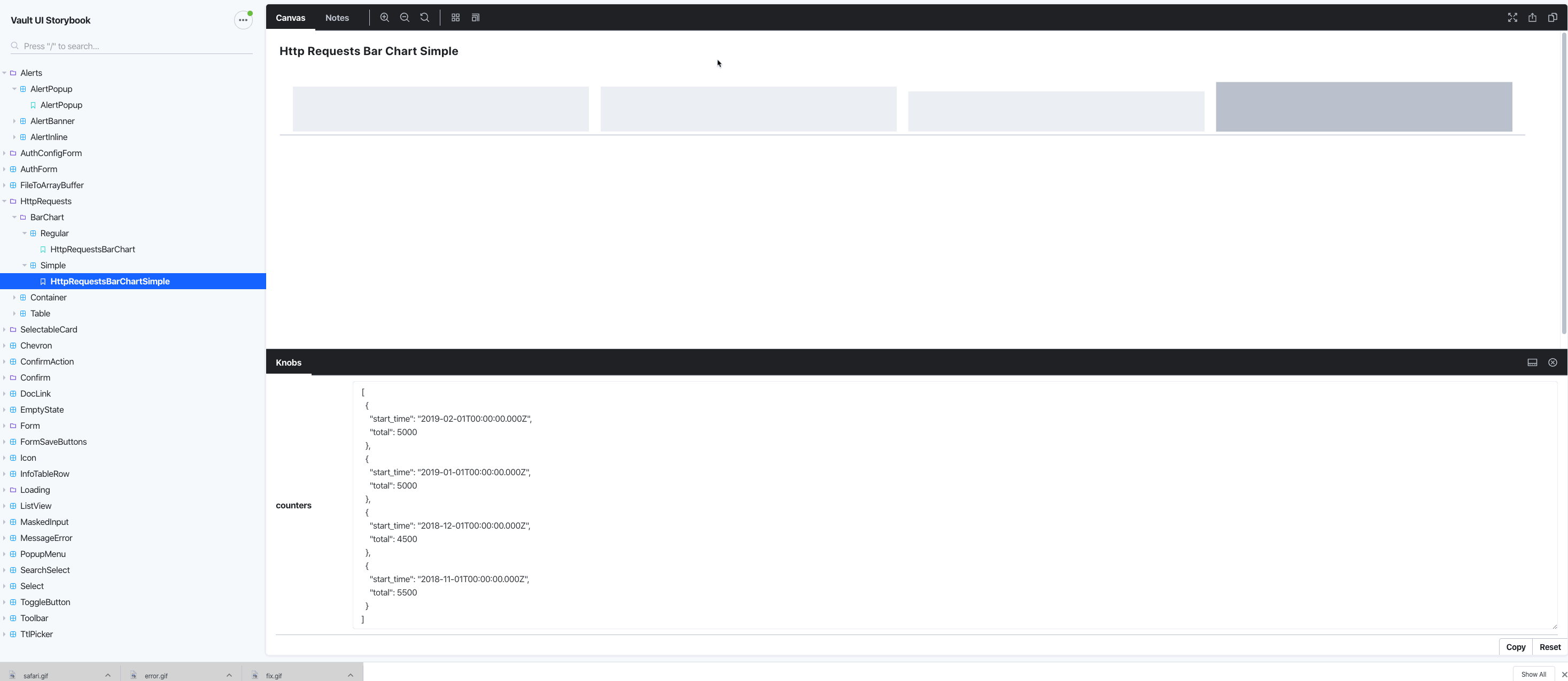
  • Changes the name of the component HttpRequestsBarChartSmall to HttpRequestsBarChartSimple. This makes more sense when viewing from Storybook. See screenshot.

  • My prettier configuration automatically reformatted the http-requests-bar-chart.stories.js file. I agree with the formatting changes, and so am committing them in this PR.

  • I double-checked that the renamed component still shows on the UI as it did before.

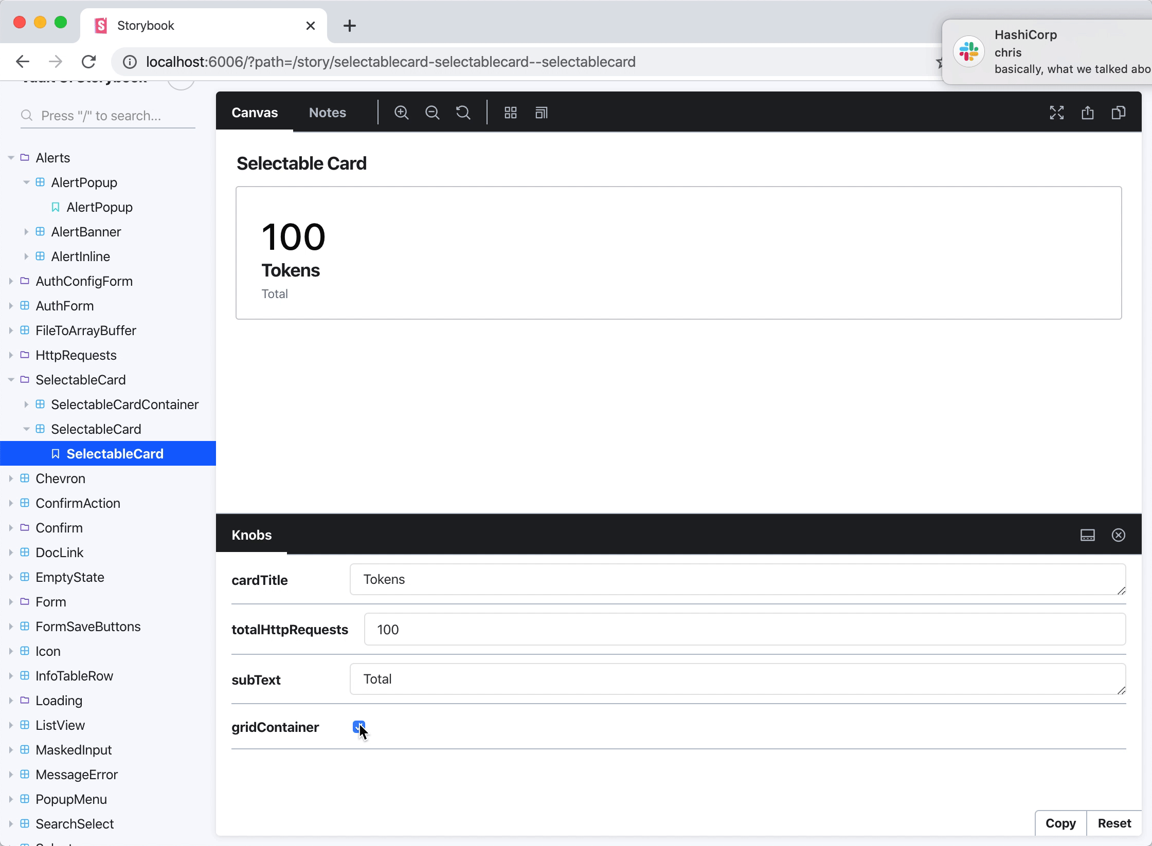
Here is a gif of the 3 new components on Storybook.

Also, I believe this should be a 1.4.1 milestone, but let me know if that's incorrect.

@Monkeychip Monkeychip added the ui label Feb 20, 2020
@Monkeychip Monkeychip added this to the 1.4.1 milestone Feb 20, 2020
@Monkeychip Monkeychip requested review from a team and andaley February 20, 2020 19:03
Comment thread ui/app/components/selectable-card.js
Comment thread ui/stories/selectable-card-container.md Outdated
@Monkeychip Monkeychip requested a review from andaley February 21, 2020 17:07
@Monkeychip Monkeychip requested a review from chelshaw February 21, 2020 18:06
@andaley
Copy link
Copy Markdown
Contributor

andaley commented Feb 21, 2020

thank you for adding these to storybook! this is great.

while reviewing this PR, i noticed 2 things from playing with the gridContainer prop on SelectableCard and SelectableCardContainer:

the first is that the gridContainer prop doesn't change the view of the SelectableCard (or at least, not that i can tell). so maybe this prop should be removed from the knobs section on the SelectableCard page in Storybook? since it seems like that prop is only relevant when the component itself is rendered in context (i.e. inside a SelectableCardContainer). totally up to you, though.

the second is that toggling gridContainer breaks the layout of the SelectableCards when the component is rendered in isolation (i.e. in Storybook, and without all the css from the actual Metrics page). i don't think this needs to change in the scope of this PR, but it's something to keep in mind if/when we use this component in other places -- the component will need to be refactored a bit to work in various settings.

you can see examples of this here:
storybook

anyway, just sharing these observations here for posterity. definitely not blockers, so i'll go ahead and approve!

andaley
andaley previously approved these changes Feb 21, 2020
@Monkeychip
Copy link
Copy Markdown
Contributor Author

@noelledaley These are great comments, thank you. I went ahead and removed gridContainer knob from the selectable-card.

@Monkeychip Monkeychip merged commit 3e29ba9 into master Mar 2, 2020
@Monkeychip Monkeychip deleted the add-components-storybook branch March 2, 2020 17:12
@Monkeychip Monkeychip modified the milestones: 1.4.1, 1.4 Mar 2, 2020
Monkeychip added a commit that referenced this pull request Mar 2, 2020
* add core usage metrics components to storybook, rename component from small to simple

* remove const from js file

* remove grid container knob from selectable-card
Monkeychip added a commit that referenced this pull request Mar 2, 2020
* add core usage metrics components to storybook, rename component from small to simple

* remove const from js file

* remove grid container knob from selectable-card
Sign up for free to join this conversation on GitHub. Already have an account? Sign in to comment

Labels

Projects

None yet

Development

Successfully merging this pull request may close these issues.

3 participants