[Suggestion] changing hud/gui image to new one + ko-kr.json korean language fix #283
Description
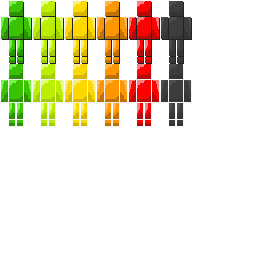
No offense & just my opinion, Since I felt that the simple_health.png gui design was very ugly, so I edited the image.
I thought that the outline was too thick, so I removed them and added some 1px stroke which looks like shadow.
HUD/GUI Images:
Complete PNG File
PSD File
NOTE: Of course you can edit this file because the original copyright belongs to you. the image is resized to twice bigger (256x256, original 128x128, just letting you know)
++ language fix (ko-kr.json)
JSON File
origianl:
"firstaid.gui.sleep_heal_amount": "잠이 체력의 %s%를 회복시킵니다"
fixed:
"firstaid.gui.sleep_heal_amount": "잠이 체력의 %s%%를 회복시킵니다"
system recognized the '%' after 's' as the placeholder(or somewhat idk about the exact name) which was intended to display the 'percent' symbol. so i fixed that to '%%'.