-
Notifications
You must be signed in to change notification settings - Fork 13.4k
feat(input): add start and end slots #28397
New issue
Have a question about this project? Sign up for a free GitHub account to open an issue and contact its maintainers and the community.
By clicking “Sign up for GitHub”, you agree to our terms of service and privacy statement. We’ll occasionally send you account related emails.
Already on GitHub? Sign in to your account
Changes from all commits
d2bb3e4
1792644
47163b5
affd46e
ac2be10
ba03215
02bd324
dc814d3
2401b70
91721a5
ea352dd
4381cb5
62cd6f0
File filter
Filter by extension
Conversations
Jump to
Diff view
Diff view
There are no files selected for viewing
| Original file line number | Diff line number | Diff line change |
|---|---|---|
|
|
@@ -305,6 +305,9 @@ | |
|
|
||
| flex-grow: 1; | ||
|
|
||
| // ensure start/end slot content is vertically centered | ||
| align-items: center; | ||
|
|
||
| width: 100%; | ||
| } | ||
|
|
||
|
|
@@ -624,9 +627,7 @@ | |
| /** | ||
| * This makes the label sit above the input. | ||
| */ | ||
| :host(.input-label-placement-stacked) .label-text-wrapper, | ||
| :host(.has-focus.input-label-placement-floating) .label-text-wrapper, | ||
| :host(.has-value.input-label-placement-floating) .label-text-wrapper { | ||
| :host(.label-floating) .label-text-wrapper { | ||
| @include transform(translateY(50%), scale(#{$form-control-label-stacked-scale})); | ||
|
|
||
| /** | ||
|
|
@@ -635,3 +636,14 @@ | |
| */ | ||
| max-width: calc(100% / #{$form-control-label-stacked-scale}); | ||
| } | ||
|
|
||
| // Start/End Slots | ||
| // ---------------------------------------------------------------- | ||
|
|
||
| ::slotted([slot="start"]) { | ||
| margin-inline-end: $form-control-label-margin; | ||
|
Contributor
There was a problem hiding this comment. Choose a reason for hiding this commentThe reason will be displayed to describe this comment to others. Learn more.
Contributor
There was a problem hiding this comment. Choose a reason for hiding this commentThe reason will be displayed to describe this comment to others. Learn more. Oh actually it looks like the padding was removed in the test template. Any particular reason for this?
Contributor
Author
There was a problem hiding this comment. Choose a reason for hiding this commentThe reason will be displayed to describe this comment to others. Learn more. I just thought it looked nicer 😆 With the default padding added to the margins, it looks like there's a ton of empty space around the icons. I'll revert the padding so the behavior is more clear.
Contributor
There was a problem hiding this comment. Choose a reason for hiding this commentThe reason will be displayed to describe this comment to others. Learn more. Oh I see why you added it 😂 
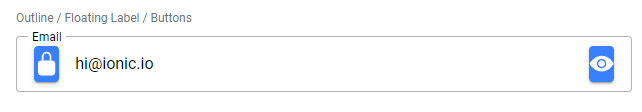
Yeah that does look strange. We might want to consider adding some internal styles to account for this. cc @brandyscarney might have ideas on how best to achieve this. I'd expect the start button to line up with the stacked label at the very least.
Member
There was a problem hiding this comment. Choose a reason for hiding this commentThe reason will be displayed to describe this comment to others. Learn more. I looked into this a bit and is there a reason we are recommending buttons for both slots? In the Material Design web catalog they use plain icons. The latest Material Design web components does include a button in the end slot for their "Password" field, although their padding is nonexistent, but I suspect it just hasn't been properly designed yet. Maybe we should add some styles for slotted icons to make them appear larger and match? Here is what I see with an In addition, maybe we could style the :host(.button-has-icon-only) .button-native {
@include padding(0);
aspect-ratio: 1;
border-radius: 50%;
}Changing the icon in the start slot back to a button, with the above styles, gives me: This still looks a bit off because of the left padding, but if we reduce that it also moves the notch. We could remove the left margin for button and get it a bit closer: I think we should focus more on aligning icons in the start slot with the label though. It doesn't seem to be a typical pattern to have a button slotted at the start. Thoughts?
Contributor
Author
There was a problem hiding this comment. Choose a reason for hiding this commentThe reason will be displayed to describe this comment to others. Learn more. That's a good point that a button in the start slot isn't going to be a common use case. I didn't make the test page with recommended patterns in mind -- the buttons were mostly to check the focus behavior -- but I agree that the icons should be the priority, at least as far as the start slot goes. That said, I'm hesitant to add too much built-in styling since I don't want devs to have to deal with potentially unwanted extra "magic," especially since they can add their own styling to the slotted content. For example, if we removed the padding from icon-only buttons by default, that would make non-clear buttons look odd: Maybe we just adjust the test to make it seem less like I'm trying to recommend using clear buttons in both slots?
Member
There was a problem hiding this comment. Choose a reason for hiding this commentThe reason will be displayed to describe this comment to others. Learn more. It should still look fine with the CSS I added above: but I understand if we don't want to add custom styles just for this. I do think we should consider it in the future though, because Material Design 3 has a section dedicated to icon buttons that looks like the above: https://m3.material.io/components/icon-buttons/overview Maybe this is something we could add for our Material Design 3 work. Their spec doesn't show buttons in an input at all so yeah I am fine with pushing this off: https://m3.material.io/components/text-fields/specs We can also push off styling icons in an input but I think we should revisit that for MD3 too.
Contributor
Author
There was a problem hiding this comment. Choose a reason for hiding this commentThe reason will be displayed to describe this comment to others. Learn more. We decided to handle this as part of a separate ticket, starting with this spike: https://ionic-cloud.atlassian.net/browse/FW-5645 |
||
| } | ||
|
|
||
| ::slotted([slot="end"]) { | ||
| margin-inline-start: $form-control-label-margin; | ||
| } | ||
| Original file line number | Diff line number | Diff line change |
|---|---|---|
|
|
@@ -20,6 +20,8 @@ import { getCounterText } from './input.utils'; | |
| * @virtualProp {"ios" | "md"} mode - The mode determines which platform styles to use. | ||
| * | ||
| * @slot label - The label text to associate with the input. Use the `labelPlacement` property to control where the label is placed relative to the input. Use this if you need to render a label with custom HTML. (EXPERIMENTAL) | ||
| * @slot start - Content to display at the leading edge of the input. (EXPERIMENTAL) | ||
| * @slot end - Content to display at the trailing edge of the input. (EXPERIMENTAL) | ||
| */ | ||
| @Component({ | ||
| tag: 'ion-input', | ||
|
|
@@ -363,7 +365,7 @@ export class Input implements ComponentInterface { | |
| const { el } = this; | ||
|
|
||
| this.legacyFormController = createLegacyFormController(el); | ||
| this.slotMutationController = createSlotMutationController(el, 'label', () => forceUpdate(this)); | ||
| this.slotMutationController = createSlotMutationController(el, ['label', 'start', 'end'], () => forceUpdate(this)); | ||
| this.notchController = createNotchController( | ||
| el, | ||
| () => this.notchSpacerEl, | ||
|
|
@@ -684,18 +686,42 @@ export class Input implements ComponentInterface { | |
| } | ||
|
|
||
| private renderInput() { | ||
| const { disabled, fill, readonly, shape, inputId, labelPlacement } = this; | ||
| const { disabled, fill, readonly, shape, inputId, labelPlacement, el, hasFocus } = this; | ||
| const mode = getIonMode(this); | ||
| const value = this.getValue(); | ||
| const inItem = hostContext('ion-item', this.el); | ||
| const shouldRenderHighlight = mode === 'md' && fill !== 'outline' && !inItem; | ||
|
|
||
| const hasValue = this.hasValue(); | ||
| const hasStartEndSlots = el.querySelector('[slot="start"], [slot="end"]') !== null; | ||
|
|
||
| /** | ||
| * If the label is stacked, it should always sit above the input. | ||
| * For floating labels, the label should move above the input if | ||
| * the input has a value, is focused, or has anything in either | ||
| * the start or end slot. | ||
| * | ||
| * If there is content in the start slot, the label would overlap | ||
| * it if not forced to float. This is also applied to the end slot | ||
| * because with the default or solid fills, the input is not | ||
| * vertically centered in the container, but the label is. This | ||
| * causes the slots and label to appear vertically offset from each | ||
| * other when the label isn't floating above the input. This doesn't | ||
| * apply to the outline fill, but this was not accounted for to keep | ||
| * things consistent. | ||
| * | ||
| * TODO(FW-5592): Remove hasStartEndSlots condition | ||
| */ | ||
| const labelShouldFloat = | ||
| labelPlacement === 'stacked' || (labelPlacement === 'floating' && (hasValue || hasFocus || hasStartEndSlots)); | ||
|
|
||
| return ( | ||
| <Host | ||
| class={createColorClasses(this.color, { | ||
| [mode]: true, | ||
| 'has-value': this.hasValue(), | ||
| 'has-focus': this.hasFocus, | ||
| 'has-value': hasValue, | ||
| 'has-focus': hasFocus, | ||
| 'label-floating': labelShouldFloat, | ||
|
Contributor
Author
There was a problem hiding this comment. Choose a reason for hiding this commentThe reason will be displayed to describe this comment to others. Learn more. Open to alternative ideas for the name of this class.
Member
There was a problem hiding this comment. Choose a reason for hiding this commentThe reason will be displayed to describe this comment to others. Learn more. I think this name makes sense. We tend to do select-disabled
select-expanded
radio-checked
radio-disabledIf you really wanted to you could add [`radio-label-placement-${labelPlacement}`]: true, |
||
| [`input-fill-${fill}`]: fill !== undefined, | ||
| [`input-shape-${shape}`]: shape !== undefined, | ||
| [`input-label-placement-${labelPlacement}`]: true, | ||
|
|
@@ -704,9 +730,16 @@ export class Input implements ComponentInterface { | |
| 'input-disabled': disabled, | ||
| })} | ||
| > | ||
| <label class="input-wrapper"> | ||
| {/** | ||
| * htmlFor is needed so that clicking the label always focuses | ||
| * the input. Otherwise, if the start slot has something | ||
| * interactable, clicking the label would focus that instead | ||
| * since it comes before the input in the DOM. | ||
| */} | ||
| <label class="input-wrapper" htmlFor={inputId}> | ||
averyjohnston marked this conversation as resolved.
Show resolved
Hide resolved
|
||
| {this.renderLabelContainer()} | ||
| <div class="native-wrapper"> | ||
| <slot name="start"></slot> | ||
| <input | ||
| class="native-input" | ||
| ref={(input) => (this.nativeInput = input)} | ||
|
|
@@ -761,6 +794,7 @@ export class Input implements ComponentInterface { | |
| <ion-icon aria-hidden="true" icon={mode === 'ios' ? closeCircle : closeSharp}></ion-icon> | ||
| </button> | ||
| )} | ||
| <slot name="end"></slot> | ||
| </div> | ||
| {shouldRenderHighlight && <div class="input-highlight"></div>} | ||
| </label> | ||
|
|
||


Uh oh!
There was an error while loading. Please reload this page.