MRG, DOC: Better website style #7532
Conversation
Codecov Report
@@            Coverage Diff             @@
##           master    #7532      +/-   ##
==========================================
- Coverage   90.20%   85.60%   -4.61%
==========================================
  Files         452      452
  Lines       82153    82987     +834
  Branches    13115    13116       +1
==========================================
- Hits        74109    71042    -3067
- Misses       5209     9260    +4051
+ Partials 2835 2685 -150 |
|
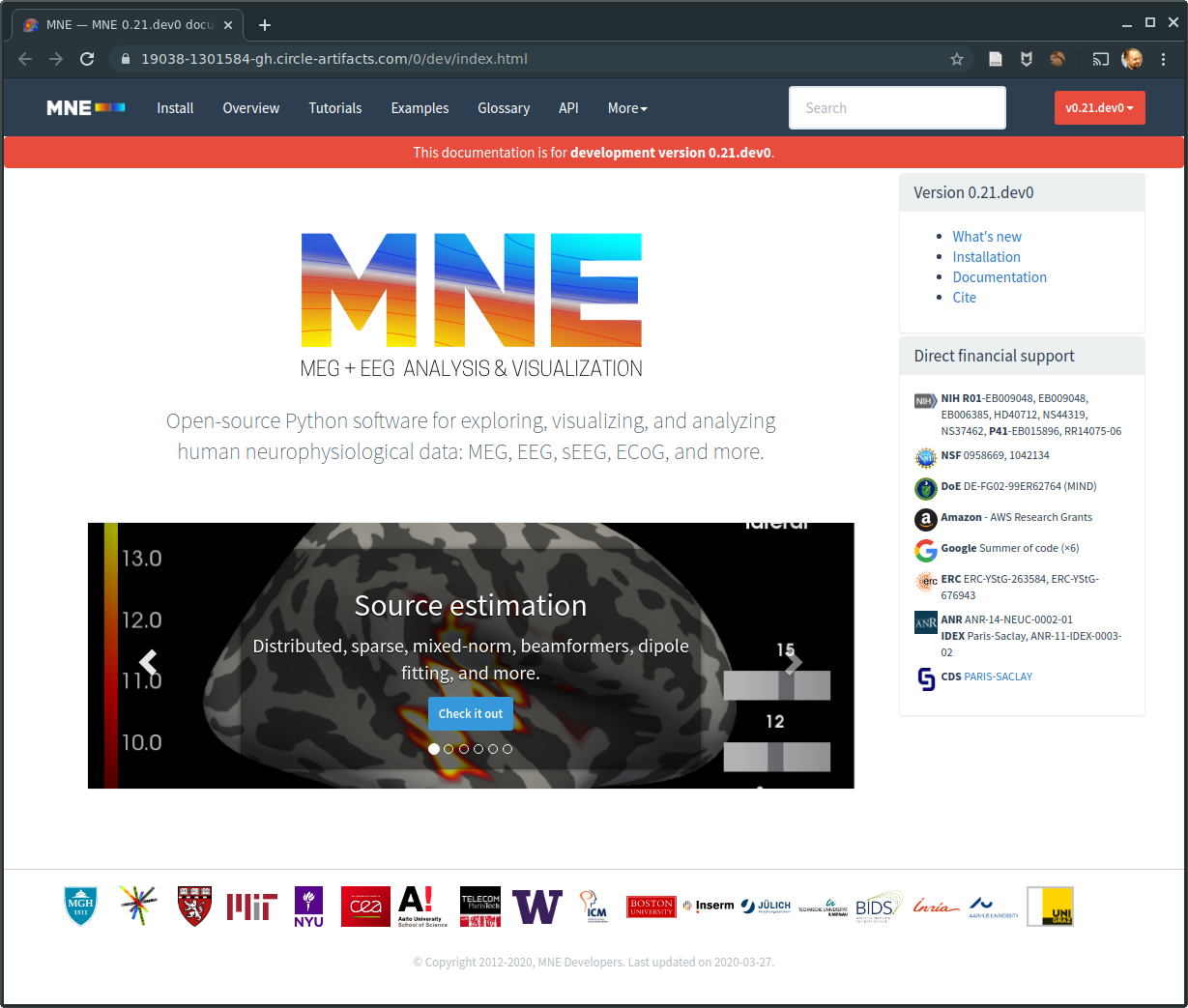
for discussion https://19018-1301584-gh.circle-artifacts.com/0/dev/index.html an alternative is to put horizontally the links and put the funding at the very bottom. I'll let others iterate |
|
I don't like the Whats's New etc links are still in the footer, should be much more visible, i.e. farther up… |
|
If they aren't in the header or footer then you just want them only on the main page? |
|
I think I'd like to have |
|
Yes we can have dropdowns but they effectively hide the content. I guess it's a matter of priorities what gets a top-level link and what gets stuffed in a drop-down. You could argue that "Get help" is more important than "Whats New" so I'm not sure why "Whats New" should get a top-level one, for example. The trend from looking at just scikit-learn and Panda's landing pages does seem to be keeping links toward the top and not the bottom, though. I'll play around with some things and see what could work. Maybe:
Thinking about it , it doesn't seem entirely necessary to have |
Totally agree. Regarding the rest, I will have to think a little. In the comment above I just threw in the first thing that came to my mind… but yeah feel free to experiment a little, happy to give you feedback :) |
I also agree that whats_new doesn't need to be on every page. |
+5 on this one. |
|
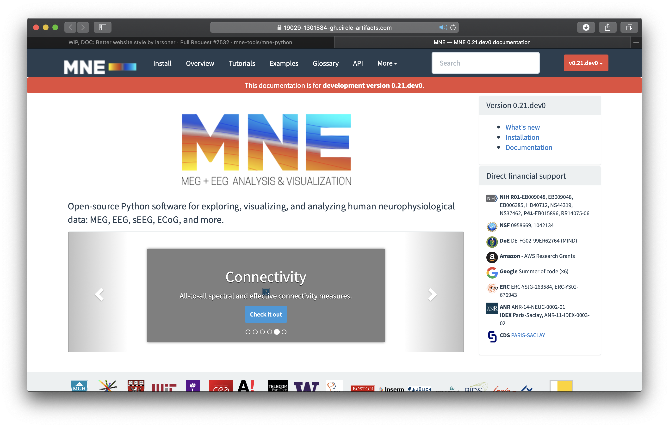
I like it better https://19029-1301584-gh.circle-artifacts.com/0/dev/index.html |
|
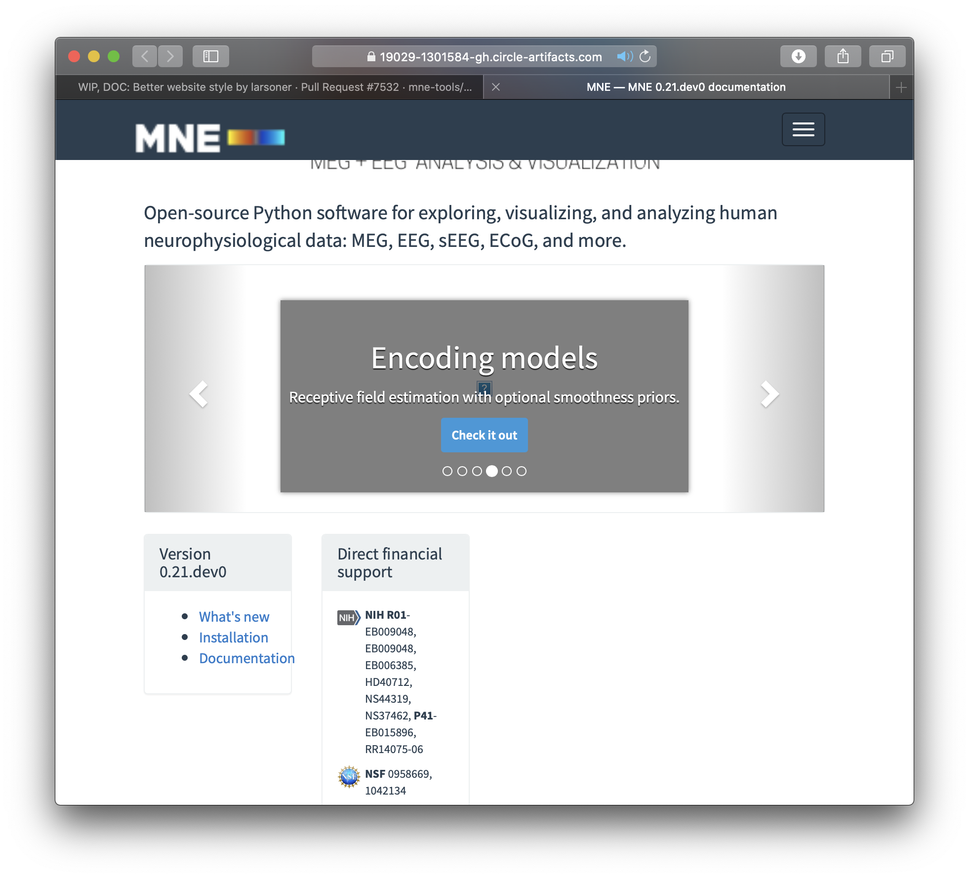
I like how it looks on my Mac when the browser window is in fullscreen mode: But already slightly reducing the width of the window makes the "Version 0.21.dev0" and "Direct financial support" boxes jump to an unexpected position (bottom), and the "Version 0.21.dev0" box becomes too narrow:
In fact, I first checked this out on my iPad and thought the CSS was broken, bc it looks like this in both, landscape and portrait mode:
|
|
I would be "useful" to have the cite page visible ...
… |
a05db36 to
43e1998
Compare
|
Sorry, coming late to this thread. IDK what the original complaint/problem was that this is trying to fix, but:
|
|
@drammock I did some flex layout changes, feel free to try on mobile again if it's easy |
|
Also, any chance we could use a higher-res version of the MNE logo? |
|
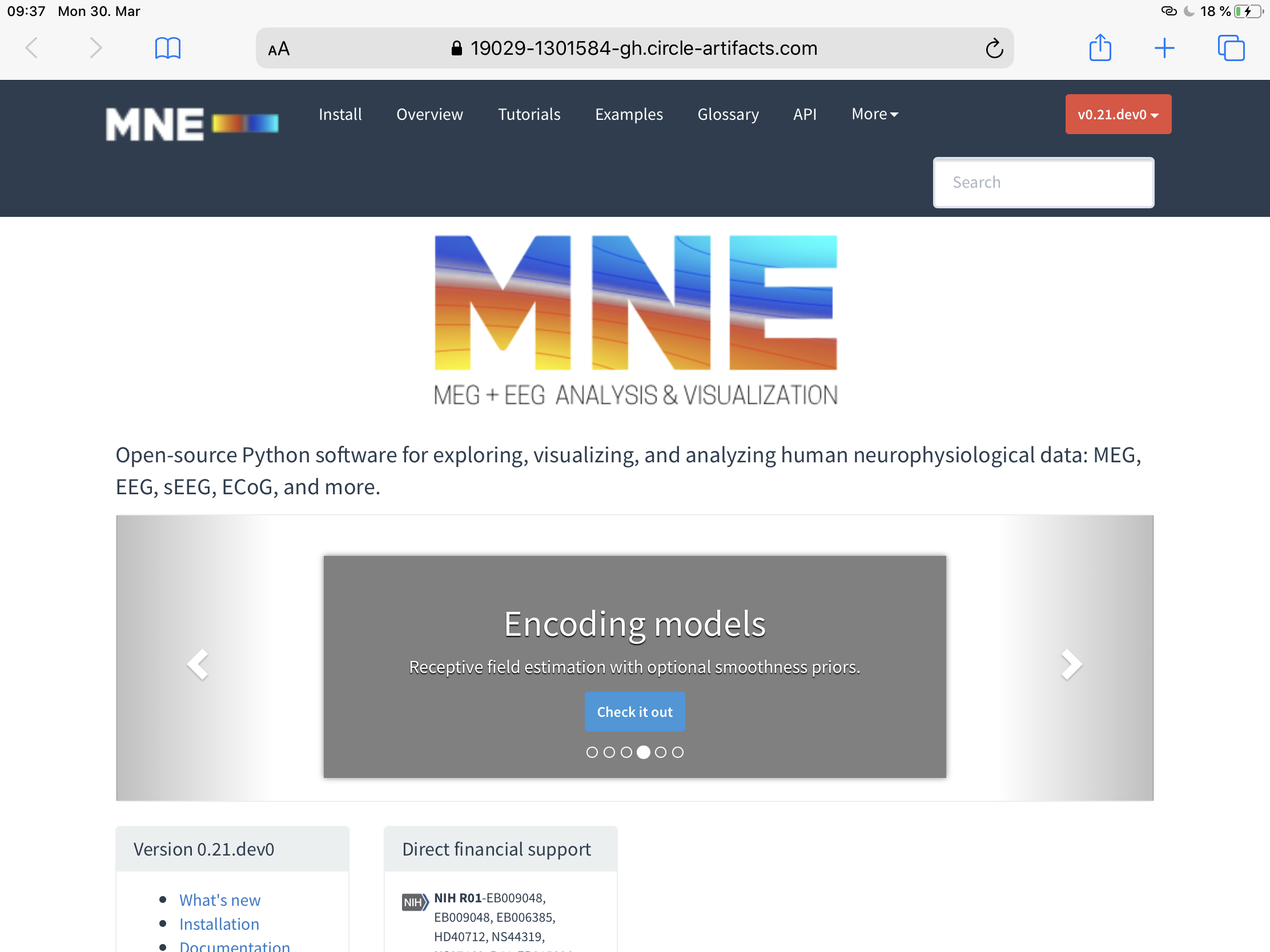
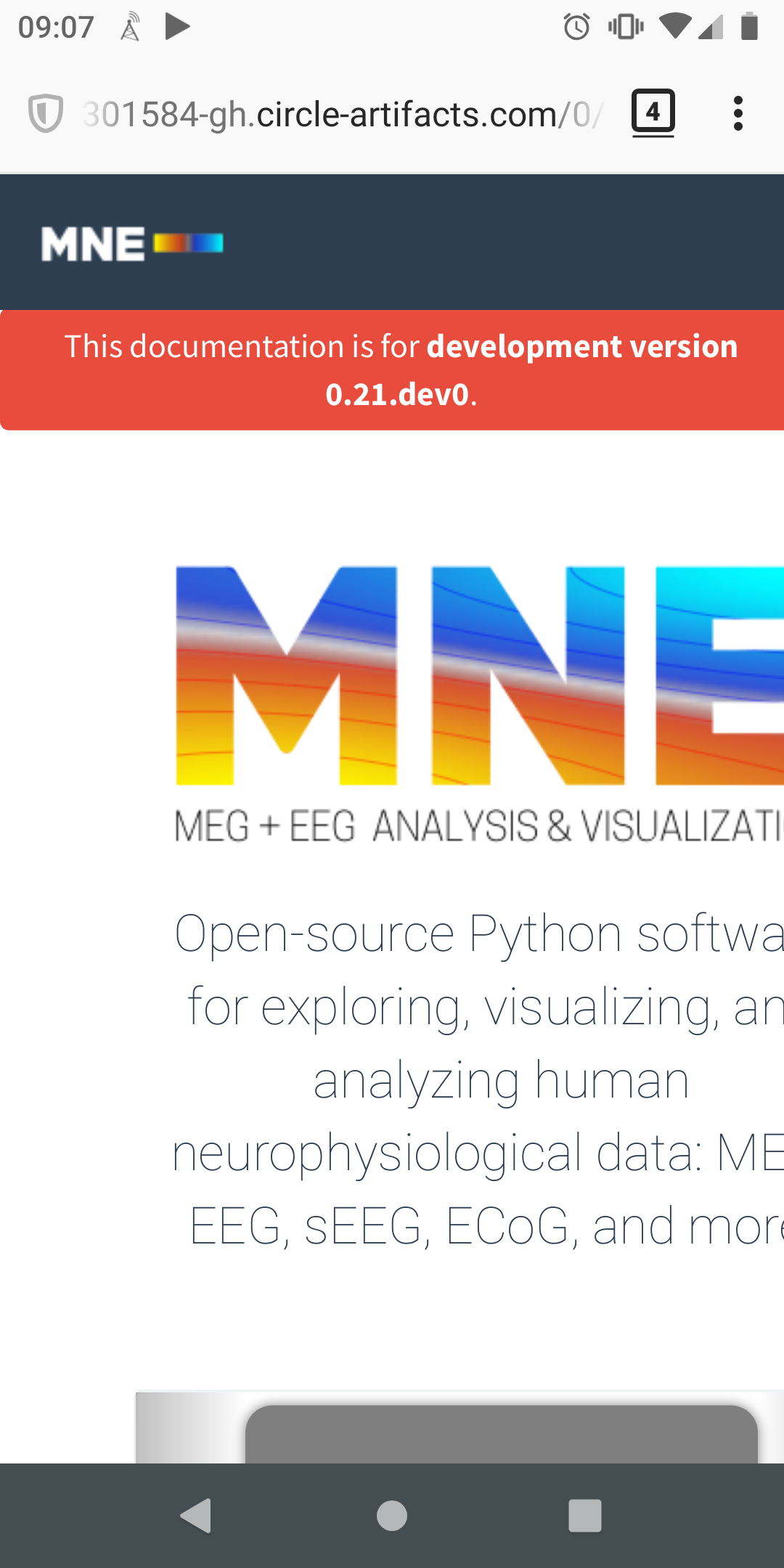
still seeing this on mobile:
This is what I see after pinching to zoom out:
|
|
Okay mobile issues should be fixed on this one |
|
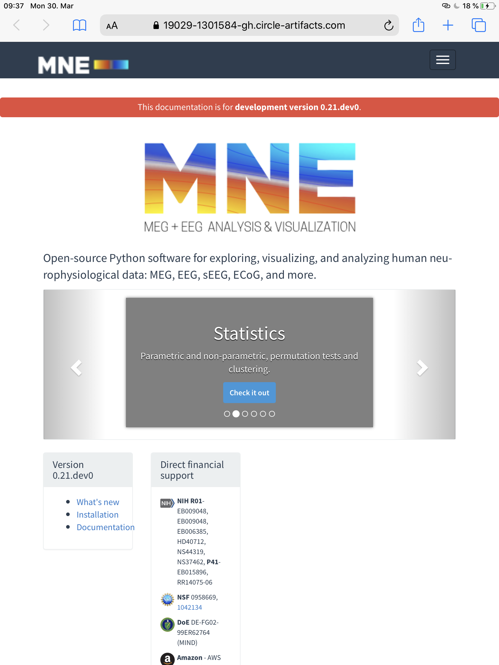
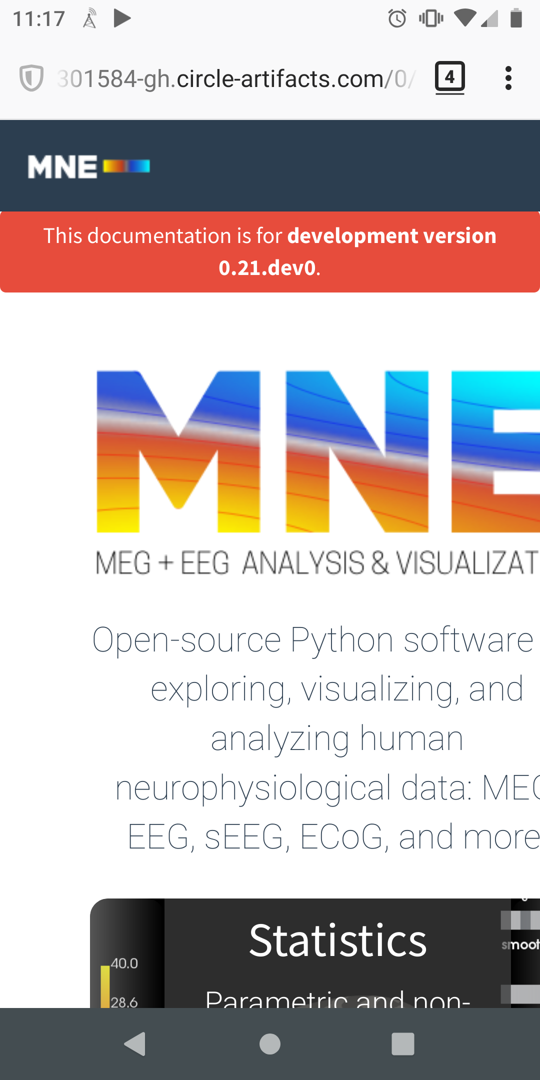
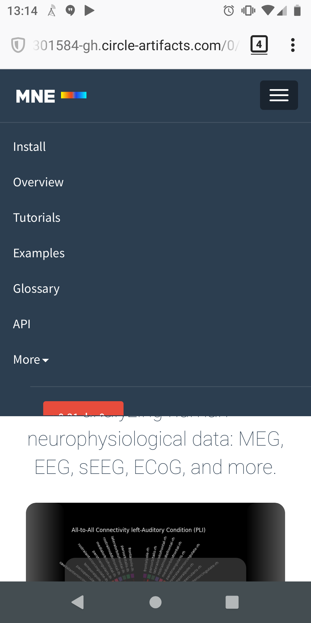
much better! One last request: here's what happens on mobile when opening the hamburger menu: version number and search box are hidden. Can we tighten up the vertical spacing on that menu? Or some other solution?
|
@drammock looks like this happens in master as well, but I tracked down a fix for it. This should work now: https://19046-1301584-gh.circle-artifacts.com/0/dev/index.html I think I'm happy enough with the progress here to set to MRG |
|
@larsoner There's still a small glitch regarding the "Version" box width, as can be seen in this video: Or is this intended? :) |
|
The video is private so I can't view it, but I took a guess at the problem after playing around and hope it's fixed |
|
I think it’s all good for me now! |
|
Very nice, thanks @larsoner! |
|
only error here is CodeCov, so I'll go ahead and merge this one. Thanks again @larsoner! |
whats_newto the documentation overview pageTodo:
@agramfort do you think it helps?