WIP: Add basic tool bar with unicode symbols #7592
Conversation
|
I prefer unicode so no need to add any file in the repo.
… |
|
works like a charm for me! |
|
(I honestly think this looks so much worse than the SVG icons you had in the other PR… Looks like a proof of concept in comparison, but not like a refined UI. just my 2 ct) |
|
@agramfort @larsoner Why is it such a big deal to ship with a few tiny SVGs? Honest question :) |
|
So, regarding which toolbar looks better, this one or the SVG one – maybe it is just a matter of taste. But if the reasoning behind using an (imho) inferior UI design is technical limitations (e.g. keeping the sdist slightly smaller or sth), I really believe this decision should be reconsidered. TimeViewer is quickly gaining in features and is already one of the BIG selling points of our 0.20 release. It will only continue to get even more useful and at one point will be the "face" of MNE when it comes to source analysis. I think it's important that this face is looking as great as possible: a beautiful app creates a better UX and higher user affinity! UI eye candy is really important to many users (and me personally – hey, I'm using a Mac for a reason ;)) Just my… USD 2.00, this time, I suppose ;) |
|
looking at the size of this diff:
https://github.com/mne-tools/mne-python/pull/7592/files
it seems easier to maintain (1 file) and yes it keeps the sdist small.
… |
Codecov Report
@@            Coverage Diff             @@
##           master    #7592      +/-   ##
==========================================
+ Coverage   90.05%   90.14%   +0.08%
==========================================
  Files         452      452
  Lines       83035    83065      +30
  Branches    13127    13129       +2
==========================================
+ Hits        74780    74880     +100
+ Misses       5403     5353      -50
+ Partials 2852 2832 -20 |
|
It really looks like a KDE or Gnome app from 20 years ago on my computer. It's hideous. I don't like it. 😭
|
|
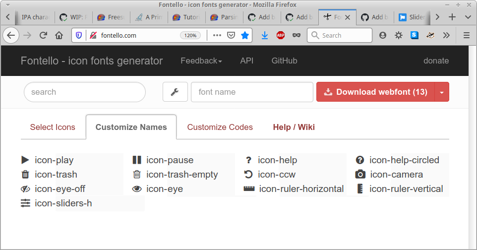
Maybe I missed it, but why is FontAwesome not an option? If distribution size is the only concern, it is possible to create a derivative font with only the icons we need (e.g., online tool fontello does this). |
I proposed FA somewhere but I think it hasn't been considered / discussed yet :) Thanks for bumping this, this could really be a middle ground? :) |
|
How big was the size diff, looks like it has been force-pushed over? +1 for the trim-font idea from @drammock. It will keep |
|
Just for a "newcomer", why is the repo & sdist size so crucial? Users download the sdist… how many times a year? And I clone the full repo only when I move to a new computer. Why is size so important in 2020, where we have TB hard drives and fast internet connections? |
|
I also think that file sizes in the kB range shouldn't matter in 2020. Moreover, SVG icons are much smaller than a font; MNELAB's icons are between 186 bytes and 2 kB. In addition, SVG icons are text files and thus better suited for version control than binary (font) files (although I doubt that we will ever change SVG icons). |
|
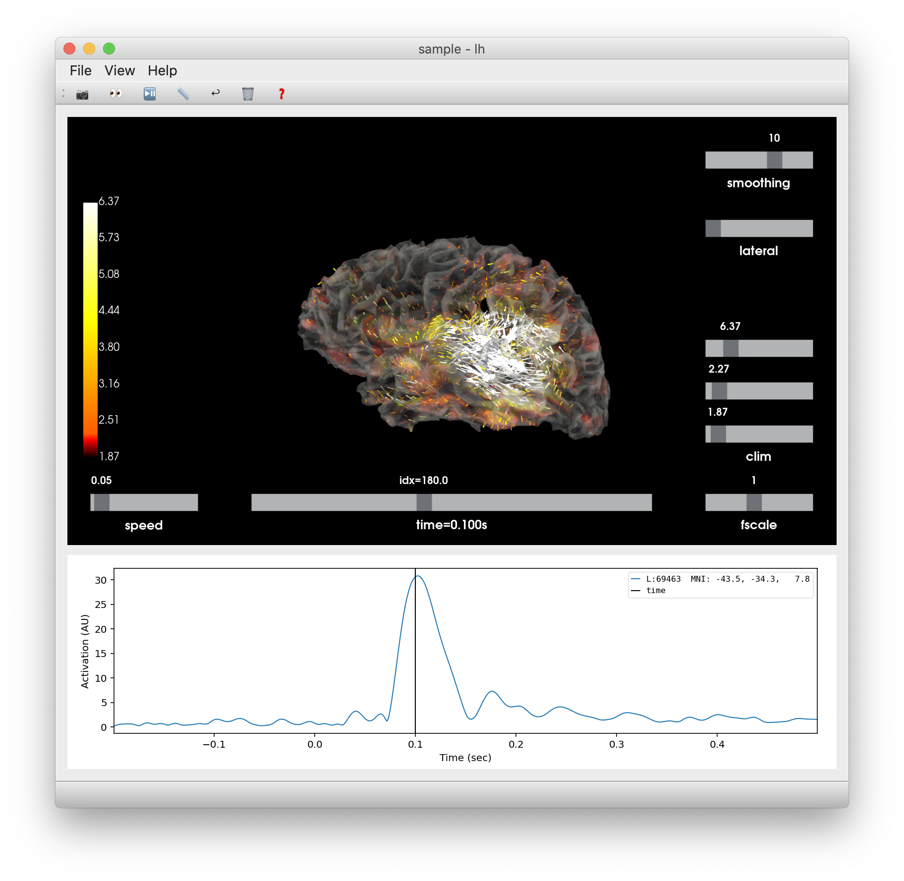
Are people happy with these? I included 2 options for "help", 2 options for "trash", and 3 options for "scale" (personally I like the sliders best for that one) |
|
Your idea looks very promising @drammock and I really want to see how it looks but I do not know how to integrate it. Do you create a new font that should be loaded by PyQt? |
|
@GuillaumeFavelier you can take this JSON config file and load it into the Fontello website, to pick up where I left off. It will provide fonts in TTF, WOFF, WOFF2, EOT, and SVG format. I'm assuming PyQt can handle at least one of those. |
|
I have the impression that rather than saving a day of work to different
people by trying to KISS
i now create more work. I will just say "be pragmatic" and keep in mind
that timing is not negligible
… |
I see what you mean, and sorry if I've been utilizing everybody's time here a little too much too :\ But I think that UI design is extemely crucial to make users happy. No-one enjoys using ugly or badly designed applications. I mean, there's a reason why big companies like Apple conduct extensive studies on their new products to finetune the UI and ensure good UX. Therefore I, personally, think that any time to discuss UI eye candy is time very well spent, if the goal is to increase the MNE adoption rate :) |
|
I 100% agree with @hoechenberger. In my limited Qt experience, (SVG) icon files are the standard way to create icons. I've never seen someone use characters from special fonts. I'd just use the SVGs from the previous issue, they look good and weigh only a few kB. |
|
Also, I'd try to make sure that the app looks as native as possible. This means that the menu bar should not be attached to the window, but should go in the global menu bar at the top of the screen. |
|
do what you think is best. I remove my vote from the polling booth
… |
|
I would propose to merge this for now and improve later. Any objection? |
|
Current status:
I would, therefore, like to suggest to close this one in favor of a re-opened (and merged :)) #7589 :) The work has already been done there, and we could move forward with a solution to which, to my understanding, we all could agree on (or at least feel "neutral" towards) Edit |
|
I agree with @hoechenberger. I also want to add that if we have to bundle a new font this will take much more space than all SVG icons we're ever going to need. Still in the kB range though so not even important. |
|
I won't vote again but please don't spend days on this...
… |
|
+100 on moving ahead! @GuillaumeFavelier the stage is yours. 👌 |
|
Let's continue the effort on #7589 then |
This PR, following a discussion with @hoechenberger and strongly inspired by cbrnr/mnelab#61, adds a tool bar with useful bindings to the features of _TimeViewer:
It's also an item of #7162 since it adds buttons to the interface.
This is not compatible with #7589