[docs] Final polish on Base docs - formatting and style consistency#33156
[docs] Final polish on Base docs - formatting and style consistency#33156mapache-salvaje merged 58 commits intomui:masterfrom mapache-salvaje:base-small-fixes
Conversation
 mapache-salvaje
added
docs
mapache-salvaje
requested review from
michaldudak,
mnajdova and
oliviertassinari
mapache-salvaje
requested review from
danilo-leal,
michaldudak,
mnajdova,
oliviertassinari and
siriwatknp
and removed request for
michaldudak and
mnajdova
mapache-salvaje
added
docs
mapache-salvaje
requested review from
michaldudak,
mnajdova and
oliviertassinari
mapache-salvaje
requested review from
danilo-leal,
michaldudak,
mnajdova,
oliviertassinari and
siriwatknp
and removed request for
michaldudak and
mnajdova
 danilo-leal
left a comment
danilo-leal
left a comment
danilo-leal
left a comment
There was a problem hiding this comment.
Looks amazing to me-scanned it through a couple of times and nothing stood out.
Awesome work 🙌
|
Thanks @danilo-leal! Maybe @mnajdova and/or @michaldudak could give this one last review to make sure it's all good before merging? It's a big one so I want to make sure we have many sets of eyes on it. |
 mnajdova
left a comment
mnajdova
left a comment
mnajdova
left a comment
There was a problem hiding this comment.
I could just find two issues around missing slots in the slots section. The rest look splendid :)
 michaldudak
left a comment
michaldudak
left a comment
michaldudak
left a comment
There was a problem hiding this comment.
Great work, @samuelsycamore, I really like it! I do have just two comments.
| Hooks _do not_ support [slot props](#slot-props), but they do support [customization props](#customization). | ||
|
|
||
| :::info | ||
| Hooks give you the most room for customization, but require more work to implement. |
There was a problem hiding this comment.
I recently realized another use case for hooks - if you're building a component library that can be customized further by developers (e.g. using the componentsProps prop), use hooks. Unstyled components are better suited to build "closed" libraries (that's why we use hooks to build Joy components, for example).
There was a problem hiding this comment.
Do you think this is worth mentioning on all pages? Or maybe it would be better suited for the Usage page?
There was a problem hiding this comment.
I suppose having it just on the Usage page should be enough.
|
Just applied the suggestions from @mnajdova's last review. I think this is ready to go finally! 🤞 |
|
I think it's time to merge this beast! There will always be more room for improvement, but I think we've established a very strong template here that I'd like to start applying across all product documentation. |
 oliviertassinari
left a comment
oliviertassinari
left a comment
oliviertassinari
left a comment
There was a problem hiding this comment.
A great step forward 👍
| Hooks give you the most room for customization, but require more work to implement. | ||
| With hooks, you can take full control over how your component is rendered, and define all the custom props and CSS classes you need. | ||
|
|
||
| You may not need to use hooks unless you find that you're limited by the customization options of their component counterparts—for instance, if your component requires significantly different [structure](#component-slots). |
There was a problem hiding this comment.
Would this be better?
| You may not need to use hooks unless you find that you're limited by the customization options of their component counterparts—for instance, if your component requires significantly different [structure](#component-slots). | |
| You may not need to use hooks unless you find that you're limited by the customization options of their component counterparts—for instance, if your component requires a significantly different [structure](#component-slots). |
| ## Introduction | ||
|
|
||
| ```js | ||
| `ButtonUnstyled` replaces the native HTML `<button>` element. |
There was a problem hiding this comment.
It could be interesting to explain why (The value proposition for a developer to replace a native button) Or maybe it's better to say "extends" it.
| <p class="description">The ClickAwayListener component detects when a click event happens outside of its child element.</p> | ||
|
|
||
| `ClickAwayListener` is a utility component that listens for click events outside of its child. | ||
| ## Introduction |
There was a problem hiding this comment.
Is the plan to add this ## Introduction in the rest of the docs? It seems that in Material UI we have systematically skipped it (the introduction content was left to be described under the h1), it's not consistent.
There was a problem hiding this comment.
Yes, I think we should apply this format across the Material UI docs as well.
| To make your badge accessible, you must provide a full description with `aria-label`, as shown in the demo below: | ||
|
|
||
| {{"demo": "AccessibleBadges.js", "defaultCodeOpen": false}} | ||
| {{"demo": "AccessibleBadges.js"}} |
There was a problem hiding this comment.
I think that we could keep the preview disabled. It doesn't explain how the feature works, so I feel noise for developers
| {{"demo": "AccessibleBadges.js"}} | |
| {{"demo": "AccessibleBadges.js", "defaultCodeOpen": false}} |
| ## Component size | ||
|
|
||
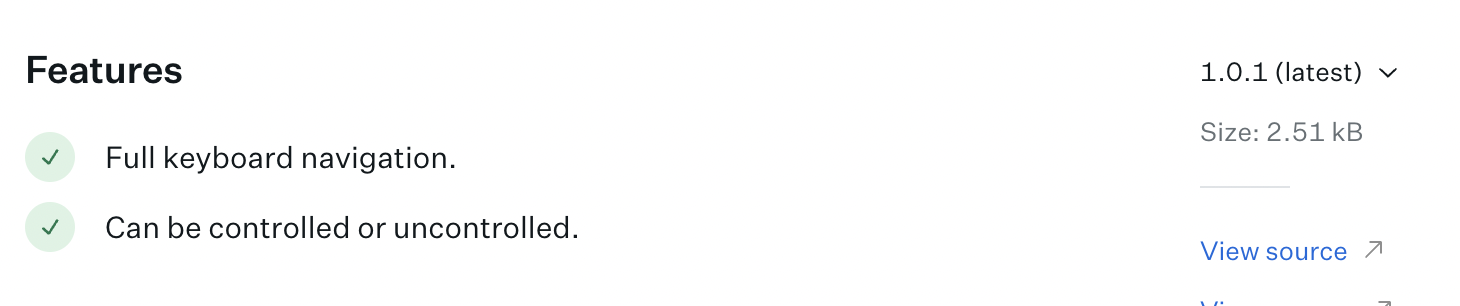
| - 📦 [2.0 kB gzipped](https://bundlephobia.com/package/@mui/base@latest) |
There was a problem hiding this comment.
In the future, we could use Bundlephobia, https://bundlephobia.com/api/exports-sizes?package=@mui/base@5.0.0-alpha.90 and show the value associated with what we export,
| ``` | ||
|
|
||
| {{"component": "modules/components/ComponentLinkHeader.js", "design": false}} | ||
| ### Basics |
There was a problem hiding this comment.
When landing on https://deploy-preview-33156--material-ui.netlify.app/base/react-badge you need to scroll a lot before you can find an actual demo of the component or one that you can copy and paste into your project. It contrasts with what we had before https://mui.com/base/react-badge/ or https://www.radix-ui.com/docs/primitives/components/tooltip. So I conclude that we miss an introduction demo, maybe under ### Basics?
There was a problem hiding this comment.
This is reinforced by this feedback https://mui-org.slack.com/archives/C0170JAM7ML/p1659457895980239?thread_ts=1658732401.469249&cid=C0170JAM7ML
There was a problem hiding this comment.
That is a good point. We could definitely use a basic intro demo here, and probably for some other Base components as well.
There was a problem hiding this comment.
I will raise this discussion at the next team meeting, seeing
- https://reshaped.so/content/docs/components/switch
- https://headlessui.com/react/switch
- https://www.radix-ui.com/docs/primitives/components/switch

it feels nice to see a full demo first before everything else. It can even then turn into an SEO hack https://www.notion.so/mui-org/Page-image-generator-75bc177fefe64c0b899a42a6f919a907.
|
Regarding #33156 (comment), Radix seems to do it:
cc @michaldudak, I think it's great to communicate to the developers that bundle size is a key constraint in how components are designed. |
…ui#33156)

Co-authored-by: Olivier Tassinari <olivier.tassinari@gmail.com>
6 participants
https://deploy-preview-33156--material-ui.netlify.app/base/react-badge/
This is the final (?) follow up to #32072 to polish the existing Base documentation and implement consistent formatting and style.
This PR covers all component pages in the Base docs, as well as one tiny tweak to the Overview page to fix the title. Changes include:
<p>descriptions for SEOtitlefor SEOThe primary purpose of this final round of polishing is to establish a universal template for component pages that we could use when writing and revising pages going forward. It looks like this:
Once we're satisfied with this template, we can move on to apply it to all component pages across MUI's products. I believe this will significantly improve the overall experience of our docs.
This final pass turned out to be a much bigger undertaking than I anticipated so I'm sure there are tiny details I've missed! The big-picture formatting is what I'm most concerned with here.