[docs-infra] Add header to editable code blocks#37648
[docs-infra] Add header to editable code blocks#37648gitstart wants to merge 6 commits intomui:masterfrom GitStartHQ:MUI-37556
Conversation
Co-authored-by: seunexplicit <48022904+seunexplicit@users.noreply.github.com>
Netlify deploy previewhttps://deploy-preview-37648--material-ui.netlify.app/ Bundle size report |
Co-authored-by: seunexplicit <48022904+seunexplicit@users.noreply.github.com>
|
@danilo-leal This is ready for review |
|
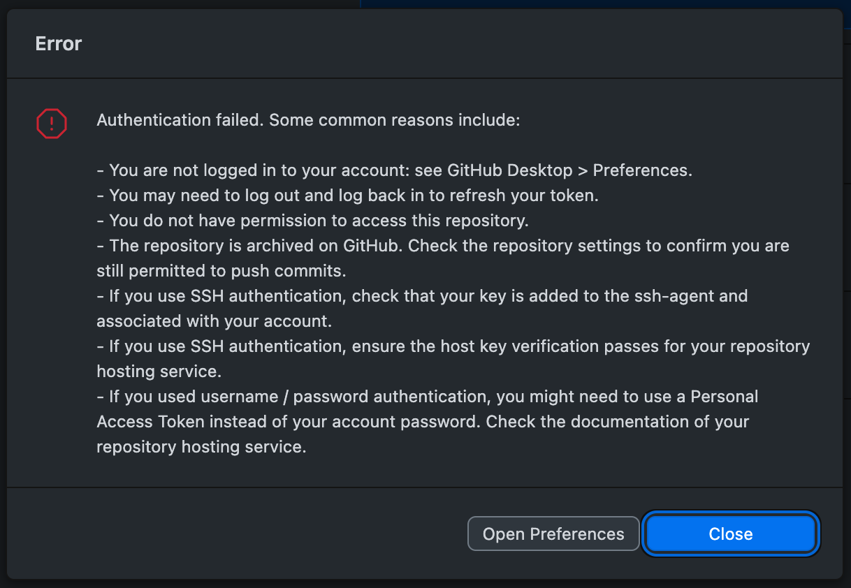
@gitstart Nice, thanks for contributing ⎯ really appreciate it! I can't commit to this PR, though, am getting an authentication error for some reason, would you know why? 
|
Hi @danilo-leal, not sure what the issue could be, but you can state any adjustment you want to make, and I can implement it from my end. |
 danilo-leal
left a comment
danilo-leal
left a comment
There was a problem hiding this comment.
Alrighty, send the changes I was about to push in the form of a review!
Co-authored-by: seunexplicit <48022904+seunexplicit@users.noreply.github.com>
Your changes have been implemented @danilo-leal |
|
That's great ⎯ thanks a lot, @gitstart! 🙏 However, through further reflection, even though it looks great, I'm starting to question whether this is a good thing to add to the code blocks. My train of thought is: We thought about adding this header initially to solve the issue of the overlapping scrollbar with the "Copy" button. Adding the "Editable code" text was an extra thing to take advantage of the header and also communicate that better. Visitors currently learn that these blocks are editable by hovering them and seeing a thicker border and the cursor text indication. Given it's not incredibly difficult to hover over the code blocks even by accident and eventually end up learning that, I'm wondering if the added visual weight of more textual elements on the UI + the size increase of the larger demo container is ultimately worth it. I also started to wonder if there's an alternative solution for the overlapping scrollbar with the Copy button that doesn't necessarily involve adding new elements to the code block. 🤔 cc @zanivan & @DavidCnoops wanna hear from y'all ⎯ what do you think about it? |
|
I like the idea in theory but I think the execution needs a little work. This spacing looks a little wonky to me, for example:
|

|
Yeah 😅 But wouldn't worry about it too much here as there's another PR (#37664) that's refining this button and even changing it to an icon button instead! |
Just a thought I had when reading the discussion: Would it be more interesting to highlight the expandable aspect of the code? If I compare the two aspects I've
From time to time we get docs feedback such as
|
|
Yeah, that makes sense to me! They don't sound like mutually exclusive problems, though ⎯ we could go after promoting both of these functionalities given how important they are. |
|
I quite like this solution. The 'editable code' copy in the header is IMO definitely useful, as it's otherwise not immediately apparent the box is in fact editable. I'd also keep the 'copy' button visible at all times (i.e. not only when the box is hovered) as it makes the copy functionality more discoverable and its slightly more convenient to quickly copy something this way (you don't have to first hover to target the button). Finally I wouldn't add the border on hover as it doesn't really add anything in my opinion. Also a very small nitpick: the copy button is currently slightly misaligned vertically, as already mentioned by Sam 🙈. |

|
Cool, thanks for the feedback! Having the copy button stay visible without hovering definitely makes sense 🤙 Don't worry about the alignment of the copy button, though ⎯ there's another PR that's tweaking its style and can also tweak its positioning to stay fixed! That's how it will look like: 
|
|
Just leaving my 2 cents here: I believe that if the copy button stays, like the Danilo's last message shows, I see no need for the Moreover, I resonate with @alexfauquette: If we were to add more visual complexity to this component, maybe highlighting the expandable aspect of the code would be more worthy. |
|
Great point about expanding code blocks—it feels like that's a different kind of action than, say, viewing the demo on CodeSandbox, which sits at the same level of interaction currently. |
|
Awesome, thanks y'all for the feedback! I think I'm leaning towards not heaving the header as the editable aspect can be communicated through other elements and thus avoiding having an additional element in the overall demo container hierarchy. The other points mentioned here (i.e. copy button positioning + promoting the expandability of the code block) will be touched on a different PR. @gitstart really appreciate you for working on the PR up and collaborating! I'll be closing this one for one but definitely hoping to see you contributing more in the future 🤘 |
Closes #37556
This code was written and reviewed by GitStart Community. Growing great engineers, one PR at a time.