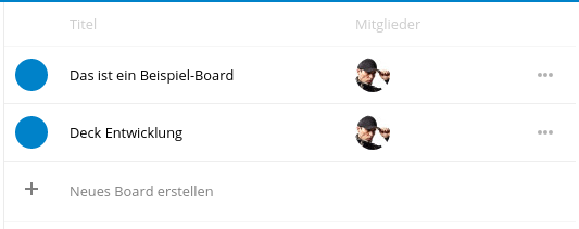
some design changes in board list #182
Conversation
Signed-off-by: Artem Anufrij <artem.anufrij@live.de>
it looks very nice in combination with #181 |
Codecov Report
@@           Coverage Diff           @@
##           master     #182   +/-   ##
=======================================
  Coverage   76.12%   76.12%
=======================================
  Files          33       33
  Lines         955      955
=======================================
  Hits          727      727
Misses 228 228 |
 juliusknorr
left a comment
juliusknorr
left a comment
juliusknorr
left a comment
There was a problem hiding this comment.
@artemanufrij Thanks for that change :)
Two minor issues:
- The first and the last separator line have a different color compared to the others
- The column heading is a bit to light compared to the files app
Both seem to be caused by the following css rule:
#boardlist tr:last-child td {
     opacity: 0.5;
}
|
@juliushaertl done |
| <div class="hint"></div> | ||
| <div class="app-popover-menu-utils" ng-if="b.deletedAt == 0"> | ||
| <button class="icon icon-more button-inline" title="More actions"></button> | ||
| <button class="icon icon-more button-inline" title="<?php p($l->t('More actions')); ?>"></button> |
|
Great @artemanufrij. Thank you :) |
| } | ||
|
|
||
| #boardlist td .app-popover-menu-utils button { | ||
| opacity: 0.3; |
There was a problem hiding this comment.
I don't really see the point in using 4 different opacity levels. Difference between 0.3 and 0.5 or 0.5 and 0.7 is barely noticable and it doesn't give away any additional message to the user.
I'm working on cleaning up opacity definitions in nextcloud/server and the idea is to use 0.5 and 1 for most of the situations, and I think this is a perfect example. Triple-dot button should have 50% opacity normally and 100% when hovered/focused/selected wherever it is used.
| } | ||
|
|
||
| #boardlist td .app-popover-menu-utils:hover button { | ||
| opacity: 0.7; |
There was a problem hiding this comment.
Part of the above comment - opacity:1
In the long term, this should all be moved into .button-inline and .button-inline:hover, .button-inline: focus.
There was a problem hiding this comment.
@pixelipo currently it has same behavior like files
There was a problem hiding this comment.
That doesn't make it correct, @artemanufrij - plus it gives us a third opacity behaviour for the same button:
- triple-dot in navigation bar: 0.5->1
- triple-dot on card: 0.25->1
- triple-dot on board list: 0.3->0.7
I will make a PR to Files to fix it there as well.
There was a problem hiding this comment.
@pixelipo you are right... i focused only board list
Signed-off-by: Artem Anufrij artem.anufrij@live.de