Round off buttons 'pill style' like on the website #11943
Conversation
|
Am a bit sceptic about this, since text boxes are not in this pill design ... |
|
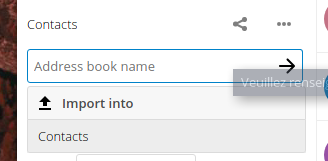
There is some css magic to do for the rounded white borders (see https://user-images.githubusercontent.com/925062/47232684-a3d36a80-d3d0-11e8-9cc9-f6807d545c56.png) It looks not ok with the antialiasing :) Otherwise I really like it. ❤️ Though it will be indeed a bit odd with the inputs. |
@MariusBluem yeah, I was also wondering about this. The reason I didn’t do the inputs yet is because traditionally only the search field is rounded like that. I would keep the inputs as they are for now, we can still adjust. (But even on our website I find it odd that the input fields are pill-style.)
Yeah – I think a big factor of this is cause that specific screenshot was made with 150% zoom. It looks better normally.
Sorry, my installation is busted atm because of a maintenance mode issue, can’t do more screenshots right now. :\ (But for the joined inputs nothing should change – the icon-confirm should be floating on the right of the input, without background so you don’t even see it’s round.) |
Yes, but the input also have a focus and active state, so this is not exactly like that :) |
|
@skjnldsv @ChristophWurst so, could you approve? :) |
 skjnldsv
left a comment
skjnldsv
left a comment
There was a problem hiding this comment.
The inline input + confirm has still the proper design :)
Let's get this in!
ca1b857 to
6d0cc69
Compare
|
Rebased! |
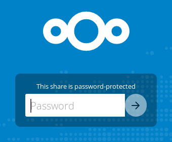
Not everywhere, although this may be a problem specific to the share authentication page: |
|
@danxuliu nice catch!! :) |

Fixed, see #11943 (comment) :)
|
Failures seem to be unrelated as far as I can see? |
6d0cc69 to
6d10849
Compare
Signed-off-by: Jan-Christoph Borchardt <hey@jancborchardt.net>
Signed-off-by: Jan-Christoph Borchardt <hey@jancborchardt.net>
6d10849 to
5ba75e7
Compare
|
JSUnit failure is due to codecov issue. |
Just like @Espina2 did on the website and also suggested for the app some time ago, so all credit to him! 🎉
This works very well with our form language, with the logo, and especially with the upcoming font change to Nunito: #11932
(That’s all the screenshots for now cause I ran into a maintenance mode I can’t recover from …)
Please review @nextcloud/designers and let me know if you find any non-pilled buttons.