Add formatting help modal (Fixes #1941) #2001
Conversation
 mejo-
added
feature: formatting
mejo-
force-pushed
the
enh/help_modal
branch
2 times, most recently
from
mejo-
added
feature: formatting
mejo-
force-pushed
the
enh/help_modal
branch
2 times, most recently
from
d366893 to
e933b54
Compare
mejo-
changed the title
|
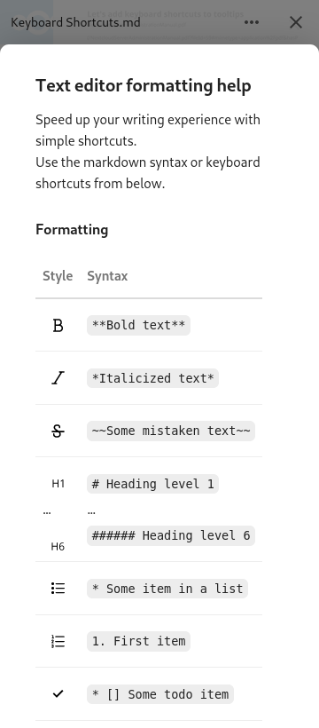
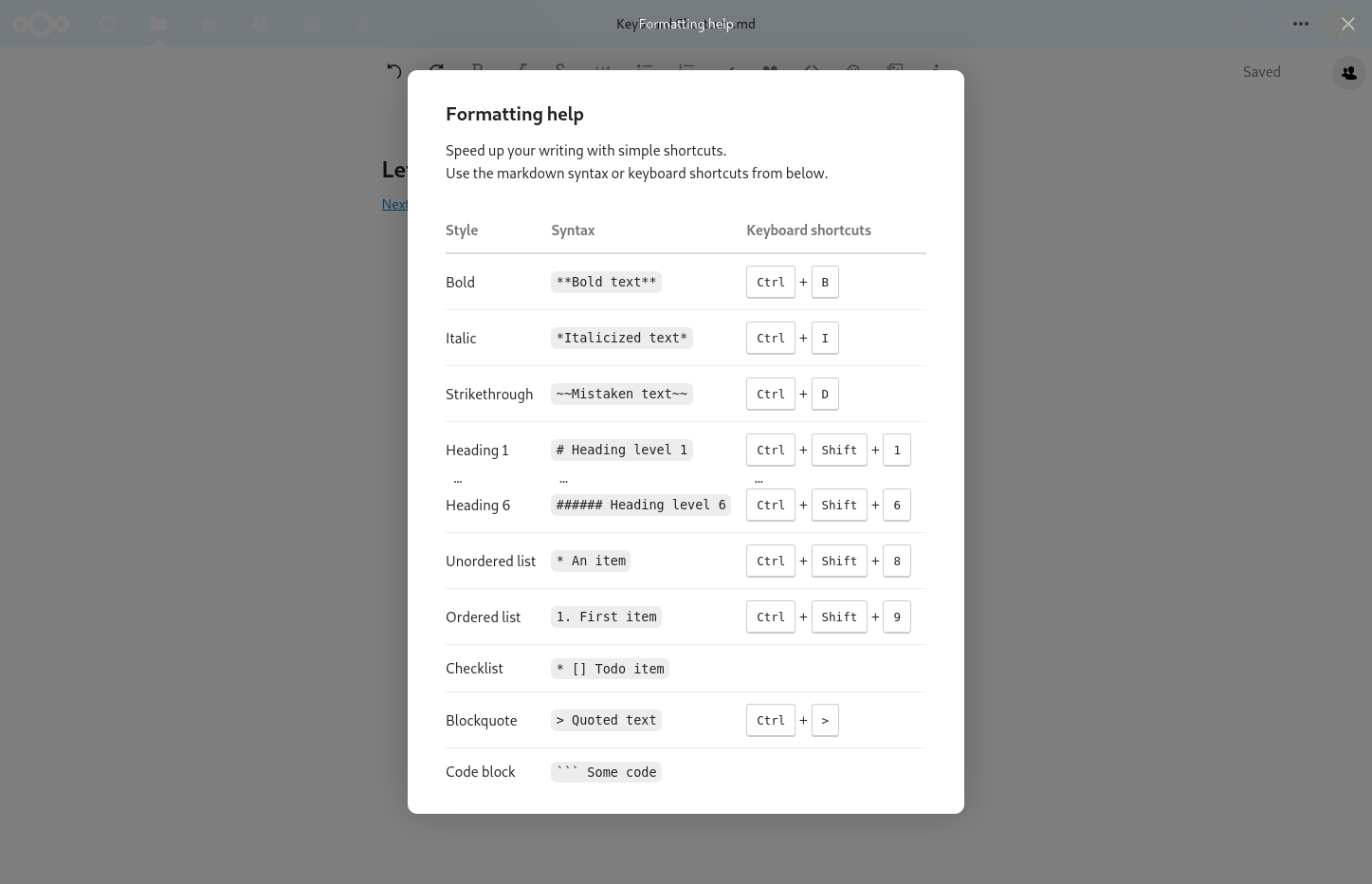
After playing around with examples below the table I finally decided to get rid of them altogether. It's just too much information for such a short overview in a modal and toggling between syntax view and formatted view really doesn't work well for formats like heading1. Especially Cc @nimishavijay |
mejo-
requested review from
azul,
jancborchardt,
julien-nc,
juliusknorr,
luka-nextcloud and
nimishavijay
|
How does it look like on very small display sizes? E.g. 360px wide? |
mejo-
force-pushed
the
enh/help_modal
branch
2 times, most recently
from
45c82cd to
218e919
Compare
Good question :) See the updated screenshot in the PR description above. It's not super smooth there, you have to scroll from left to right to read the full syntax. Do you have a good idea how to improve the mobile experience? |
Maybe hide the keyboard shortcuts column and make the modal full-screen on such small screens? |
Keyboard shortcuts are already hidden on mobile 😊 And modals alread have full width on mobile per default. The non-used space on both sides seems to come from the invisible prev/next elements. If I override their width to 0, the button to close the modal is no longer visible 😞 |
Strange! |
|
Looks very nice now! :) Only thing: Would be better to put the button as last item of the fornatting bar instead of next to sharing. That way on narrower viewports it doesnt take a space but gets ellipsized away, as it also isnt always needed. :) |
|
This looks great! I particularly like the i next to the save indicator as the trigger. Just a minor note: The description on mobile still talks about keyboard shortcuts. How about using the icons instead of words for the style in mobile? That would also serve as an explaination for the icons. Something like this (with the icons from the menu bar on the left obviously):
This way people would also know it's the same thing as that button. |
 mejo-
force-pushed
the
enh/help_modal
branch
from
mejo-
force-pushed
the
enh/help_modal
branch
from
218e919 to
bf8a56a
Compare
Agreed, done so now:
|
So I suppose this doesn't work either? |
Yep, that indeed works, but as written the button to close the modal is hidden in this case (it's not really hidden, but it's white on white). Also, being able to click into the prev/next areas for closing the modal is no longer possible. Do you have a good idea how to tackle this? 🤔 |
I think it will be already resolved with vue 5.0 due to my changes here: https://github.com/nextcloud/nextcloud-vue/pull/2126/files#diff-907877e92ada6bf9340562928a4046f5a937f4985041a4f2e3981313538f8f5dR679-R697 |
Signed-off-by: Jonas Meurer <jonas@freesources.org>
mejo-
force-pushed
the
enh/help_modal
branch
from
bf8a56a to
1048884
Compare
Uh nice, that helped a lot! Thanks @szaimen 😊 I'm now setting I updated the screenshots above. |
Signed-off-by: Jonas Meurer <jonas@freesources.org>
mejo-
force-pushed
the
enh/help_modal
branch
from
1048884 to
d9f451e
Compare
Nice idea! I gave it a try, but found the written style ("Bold", ...) to be much clearer. Now that all content fits on mobile screens (at least for english), I'd prefer to keep it that way. Here's how it looked with the buttons:
|
Signed-off-by: Jonas Meurer <jonas@freesources.org>
Signed-off-by: Jonas Meurer <jonas@freesources.org>
 jancborchardt
left a comment
jancborchardt
left a comment
jancborchardt
left a comment
There was a problem hiding this comment.
Except the "Show formatting help" → "Formatting help" as mentioned @mejo- this is super nice work design-wise! :)
 juliusknorr
left a comment
juliusknorr
left a comment
juliusknorr
left a comment
There was a problem hiding this comment.
Very nice 👍 Good to go from my side
Signed-off-by: Jonas Meurer <jonas@freesources.org>
mejo-
force-pushed
the
enh/help_modal
branch
from
0c045ce to
669a2e7
Compare
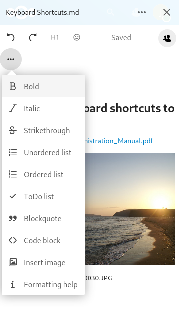
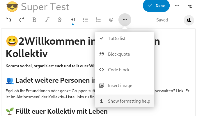
Desktop
Full screen:
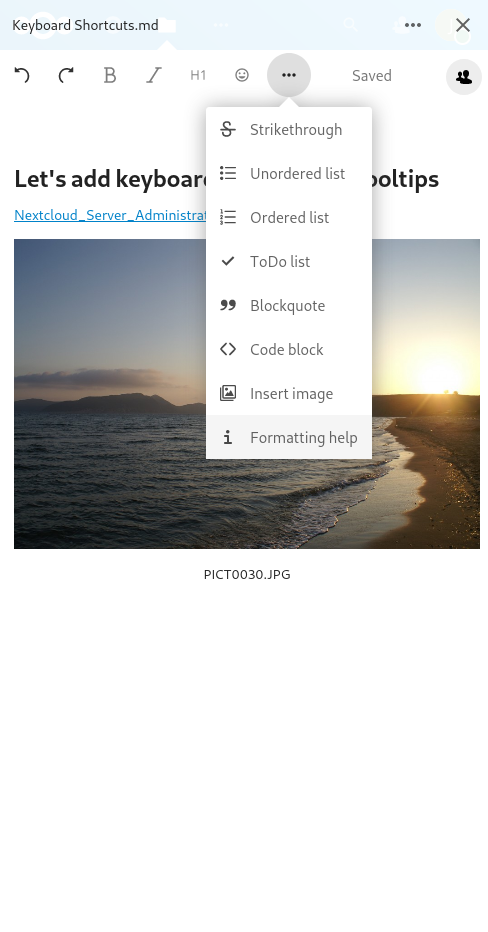
Toolbar on wide screen:

Toolbar on narrow screen:
Mobile
Toolbar: