LX-309 Modify CAPA choicegroup problems to make custom radio/checkboxes possible #21215
Conversation
|
Thanks for the pull request, @pomegranited! I've created OSPR-3760 to keep track of it in JIRA. JIRA is a place for product owners to prioritize feature reviews by the engineering development teams. Feel free to add as much of the following information to the ticket:
All technical communication about the code itself will still be done via the GitHub pull request interface. As a reminder, our process documentation is here. |
 openedx-webhooks
added
needs triage
open-source-contribution
openedx-webhooks
added
needs triage
open-source-contribution
 pomegranited
changed the title
pomegranited
changed the title
|
@pomegranited Thank you for your contribution. Please let me know once it is ready for our review. |
openedx-webhooks
added
waiting on author
|
@wittjeff Can you give this a look as soon as you can? |
|
Hi @pomegranited ! What you have submitted looks OK but there are a few additional things to consider:
|
|
Awesome, thank you for your reply @wittjeff ! I was mainly worried about the |
Totally agree. Added with 4f5836d.
I agree that we should be showing "Correct" or "Incorrect" text along with the status icon -- the icon by itself is ambiguous. EDIT
Currently, the text that's shown on hover is a "tooltip", not an "alt" text, and they read rather nicely:
Do you want these tooltips removed?
Done with 47d30ef -- see screenshots in PR description.
Could you? I'm getting confused about which borders you mean, and want to make sure I get the colours right. Thank you! |
 openedx-webhooks
added
engineering review
and removed
waiting on author
pomegranited
force-pushed
the
jill/capa-dom
branch
2 times, most recently
from
openedx-webhooks
added
engineering review
and removed
waiting on author
pomegranited
force-pushed
the
jill/capa-dom
branch
2 times, most recently
from
4fb6b78 to
a1bb62a
Compare
|
This is ready for your review @symbolist . Just waiting on a couple of things before I can complete @wittjeff 's requests above:
|
pomegranited
changed the title
 symbolist
left a comment
symbolist
left a comment
symbolist
left a comment
There was a problem hiding this comment.
@pomegranited Thanks! I have tested this out and left a few comments.
symbolist
left a comment
symbolist
left a comment
There was a problem hiding this comment.
@pomegranited Thanks!
- I tested this by working through various capa problems with a keyboard and screenreader.
- I read through the code
- I tested that the UI can be used with a keyboard only (tab order, keyboard controls).
- Includes documentation. N/A
|
@natabene This is ready for edX review. As noted above, I still have a couple of outstanding changes requested by @wittjeff , but am waiting on his reply there. |
|
@marcotuts Do you want to have a look before this goes to engineering? |
|
|
Thanks @wittjeff ! I went ahead and removed the tooltips. |
|
@marcotuts The switch to symbol+text is not a strict accessibility requirement though I think it is stronger for understanding, so really a usability thing. Is there a problem with i18n? 22px has been suggested as a minimum touch target size in other contexts so that was just a nudge in that direction (not strictly needed here because the whole input+label region is active, but made with future consistency in mind). I see your meeting request, can wait til then to discuss if you'd prefer. edit: discussion of icons & text: If there is a screen real estate scarcity concern, I'm intrigued by the notion of "progressive reduction." |
|
@pomegranited: Nice! I'm starting code review now, but it looks like the sandbox isn't working. Is it possible to get it restarted? As is always the case when we're playing in Capa-land, my main concern is what this means for compatibility with existing content. Are there corresponding Studio docs that need to be updated? Thank you! |
 ormsbee
added
engineering review
and removed
product review
ormsbee
added
engineering review
and removed
product review
|
Thanks @ormsbee !
Yep, I've built a new one, so those links should work now.
The sandbox has the standard DemoX course on it, so you can see that it works with old imported problems.
There's no XML changes here, just GUI, so there may be some out-of-date screenshots in the docs? But no change to the author instructions or anything like that. |
|
I am way too swamped to test this week. If you'd like to try out my usual set of courses, here's the Tarballs for Testing folder. I would especially check the more unusual assessment tricks in Grape Ape and the "better basic problems" bit in Studio Advanced. |
 ormsbee
left a comment
ormsbee
left a comment
ormsbee
left a comment
There was a problem hiding this comment.
Sorry for the delay. I was looking at a couple of things last week on my local but ran into some devstack issues. Please merge/squash/put-awesome-commit-message, and I'll merge.
|
Hello! It looks like my comment was never submitted here after @wittjeff and I met. :( For now, the summary I would give is that we should revert the visual changes identified in the comment above: https://github.com/edx/edx-platform/pull/21215#issuecomment-515595848 (For example, we should not add / show the additional "Correct" / "Incorrect" text to the right of the per-input option feedback check marks / x marks.) In other words, there should be no visual change in this PR relating to this part of the CAPA experience other than behind the scenes div / layout changes necessary to support styling. If this summary doesn't make the list of required change reversions clear let me know! If it makes things easier I am happy to jump on a call / time block to discuss this and make sure we speed up response times for this change. |
pomegranited
force-pushed
the
jill/capa-dom
branch
2 times, most recently
from
bd5d9d3 to
877d534
Compare
|
@marcotuts I've removed the "Correct" / "Incorrect" text added here, so the only remaining visual changes are:
I've provisioned a fresh sandbox, so you can preview these changes. The Capa Demo course has samples of all the permutations I could think of -- show answer, reset, show/hide correctness -- and has the usual demo accounts: https://pr21215.sandbox.opencraft.hosting @ormsbee Have rebased on latest master and squashed down to a single commit. We have some LX frontend changes that are hinging on this, and so the timing is a little tricky. We'd really appreciate if this could be merged and deployed to stage.edx.org ASAP, and if all goes ok there, to edx.org before Monday's LX launch. Do you think that's possible? CC @symbolist |
|
Hi Jill thanks for the details on what has changed, I left a few thoughts below: 1.) Status icon for radio problems is moved down below the problem, to the same place it is shown for checkbox problems. If that is the case I think this is fine, though I'm not actually sure if this is necessarily a step forward here? I'm curious if in-context is actually better than the messages below, and that the status below is best used for when there is both in-context and overall scores (especially if the status is different as with partial credit cases). I'm ok with this change though, no action necessary just calling out my thought process on this one. 2.) Radio buttons and checkbox problems are slightly larger, 22x22px. 3.) "Submit" button changes to "Resubmit" when attempts > 0. |
|
I'm re-reviewing after each code commit to try to save roundtrip time. From the code perspective, this is still good. @marcotuts: So as long as the "Resubmit" text is change, we're good to merge? |
pomegranited
force-pushed
the
jill/capa-dom
branch
from
877d534 to
4acf40d
Compare
Yes, that's the change made here.
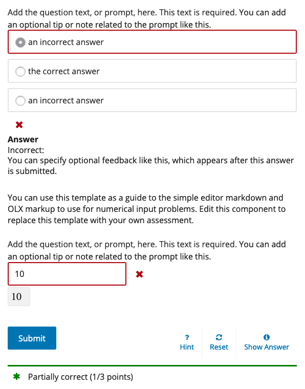
The aim here was for consistency, and we couldn't change the checkbox problems to use in-context status markers without exposing partial correctness of those answers, which would dramatically change the way learners interact with checkbox problems. (E.g., if I have 2 attempts available, I'd tick all the options first, and then it shows me which ones are correct.) The per-problem status area is the same even for multi-problem partial credit cases -- partial correctness is shown at the very bottom (see Show Correctness > Checkbox & Radio & Numeric for a working example):
I've reverted this change with The sandbox is also updated, so you can verify the change. |
by making CAPA <input> elements siblings of their <label>s, instead of children.

Also:

* Moves radio submitted status block down below the problem
  to match the checkbox problem status blocks.
* Marks submitted choicegroup answers with a class
pomegranited
force-pushed
the
jill/capa-dom
branch
from
4acf40d to
fb981bf
Compare
|
Your PR has finished running tests. There were no failures. |
|
Thank you so much @pomegranited for the changes here! I can commit to having an internal T&L review / check on the items you backed out of this PR to see what it would take to reconsider items such as the resubmit button text, captured in the diff above. This looks good to go from my standpoint! |
|
@pomegranited 🎉 Your pull request was merged! Please take a moment to answer a two question survey so we can improve your experience in the future. |
|
Thanks for your help and advice here @wittjeff @marcotuts @ormsbee ! |
|
EdX Release Notice: This PR has been deployed to the staging environment in preparation for a release to production on Thursday, September 12, 2019. |
|
EdX Release Notice: This PR has been deployed to the production environment. |
10 participants
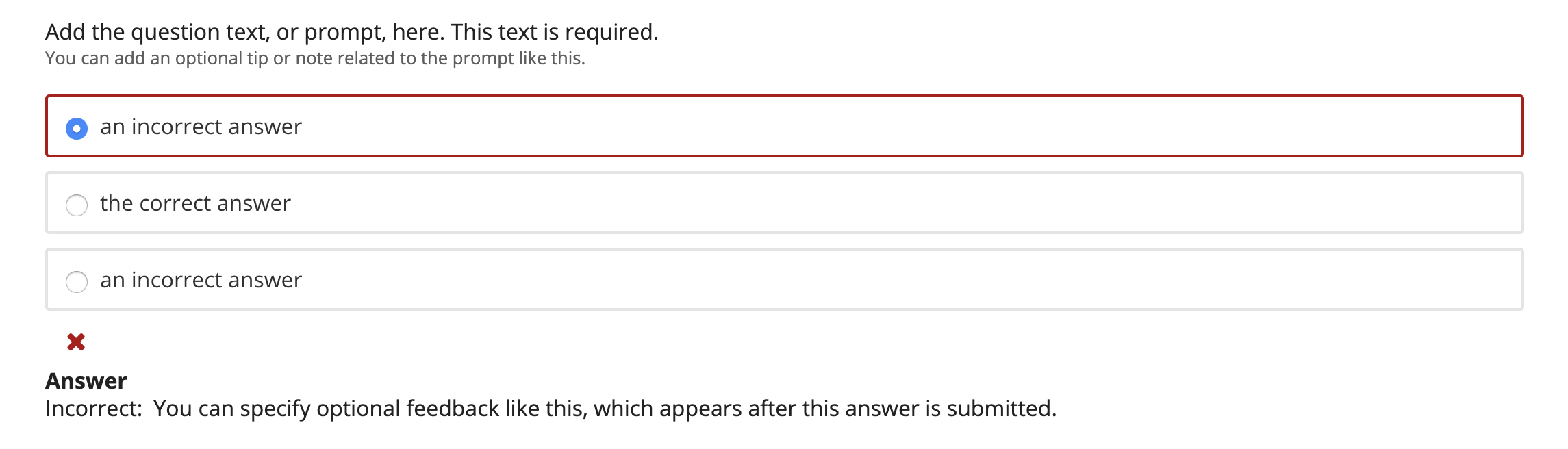
The LabXchange project requires custom styling of the radio/checkbox problems, which, due to the element structure, could not be done with CSS alone. We made some changes to the DOM to facilitate these customizations, which this PR submits upstream:
<input>items out of their<label>, to be siblings, as is already done in Paragon.This is required so that CSS selectors which target the dynamic attributes of the input element, e.g.:
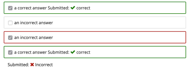
:hasyet. See stackoverflow thread for more info..statusicon out of the radio button label.This makes the status display more consistent with the checkbox multiple choice items (see screenshot below).
submittedclass to mark radio/checkbox items which were submitted as answers during the previous attempt.This allows us to style these options differently in LabXchange.
JIRA tickets: OSPR-3760
Screenshots:
Status icon for radio button problems moved below, to make consistent with checkbox multiple choice items:
Sandbox: Redeploying
Merge deadline: ASAP
Testing instructions:
honor@example.com/edxEnsure that you can answer all the questions using the keyboard alone, and that the radio button and checkbox problems are all labeled clearly.
Ensure that the correct/incorrect/submitted status is conveyed clearly to all users.
Reviewers
CC @ormsbee