fix(secondary-tabs): refactor the secondary tabs into nested structure#906
fix(secondary-tabs): refactor the secondary tabs into nested structure#906jeff-phillips-18 merged 1 commit intopatternfly:masterfrom dabeng:sec-tabs
Conversation
src/less/tabs.less
Outdated
|
|
||
| .tab-pane { | ||
| > .nav-tabs-pf { | ||
| font-size: @font-size-base; |
There was a problem hiding this comment.
This would break existing consumers. The tab-pane class would need to be added to the parent of all existing nav-tabs-pf instances.
There was a problem hiding this comment.
I agree with @jeff-phillips-18. We should only update the css files for this issue. The updates we make to core should not require changes to the html that is currently defined, because we don't want to break current implementations that use that html structure.
The main issue with the current css is this selector .nav-tabs+.nav-tabs-pf because it requires a very specific html structure that we can't reproduce in react.
To fix this, we should keep this selector .nav-tabs+.nav-tabs-pf so that we don't break current implementations, but also include an additional class-based selector that will apply the same styles font-size: @font-size-base;. See another comment further down with specific suggestions on this change...
Then to fix this issue in the react Tabs component, add a class nav-tabs-pf-secondary to the react Tabs component so that the runtime html of your storybook resembles this:
...
<div id="secondary-tabs-1">
  <ul role="tablist" class="nav nav-tabs nav-tabs-pf nav-tabs-pf-secondary">
...
| } | ||
| } | ||
| } | ||
| + .nav-tabs-pf { |
There was a problem hiding this comment.
... and then following up to my previous comment, you should be able to change the following selector:
+ nav-tabs-pf
to this:
+ .nav-tabs-pf, .nav-tabs-pf-secondary
But please make similar updates in the .scss file, and then please test that they actually work.
Thanks for making this update!
There was a problem hiding this comment.
Thanks a lot for your lighter solution. While, I found that this solution can not work in secondary tabs of patternfly-react because the less sentence + .nav-tabs-pf, .nav-tabs-pf-secondary will produce the following css settings:
.nav-tabs .nav-tabs-pf-secondary, .nav-tabs+.nav-tabs-pf {
    font-size: 12px;
}There was a problem hiding this comment.
Thanks for pointing that out, @dabeng! You're right.
I played around with the css locally, and this is what I had to do to get it to work (in the .scss version)...
In the following structure:
.nav-tabs {
  ...
  + nav-tabs-pf {
    ...
  }
}
Remove the selector + nav-tabs-pf and it's styles so that it isn't nested inside .nav-tabs. Move this selector to a separate block. This will require that you change + nav-tabs-pf to .nav-tabs + nav-tabs-pf, but you will also add the .nav-tabs-pf-secondary class to this selector, so that you end up with something like this:
.nav-tabs {
...
}
.nav-tabs + .nav-tabs-pf, .nav-tabs-pf.nav-tabs-pf-secondary {
  font-size: $font-size-base;
  > li:first-child > a {
    padding-left: 15px;
    &:before {
      left: 15px !important;
    }
  }
}
This solution maintains both selectors—the original selector for supporting the original patternfly core solution and the new selector for supporting the patternfly-react solution. This will result in runtime css that looks like this:
.nav-tabs + .nav-tabs-pf, .nav-tabs-pf.nav-tabs-pf-secondary {
    font-size: 12px;
}
There was a problem hiding this comment.
Awesome 👍 Appreciated 😊
There was a problem hiding this comment.
@dabeng, I'm so sorry. I made a mistake in my original comment. I often will pull selectors out of a nested structure to make sure I get the right selectors, and then put them back in the nested structure if possible. But this time I forgot to put the selectors back into the nested structure.
We still want the following structure:
.nav-tabs {
  ...
  + nav-tabs-pf {
    ...
  }
}
But to get the selectors we need for the secondary tabs, we would modify it like this:
.nav-tabs {
  ...
  + nav-tabs-pf, &.nav-tabs-pf-secondary {
    ...
  }
}
|
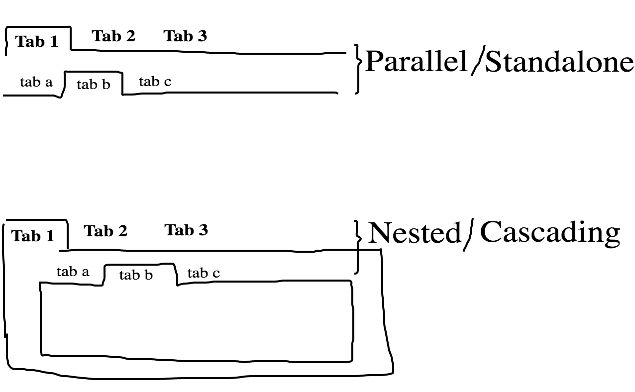
Hi @jeff-phillips-18 , the following picture demonstrates what the PR has done. IMO, the top one confuses users because secondary tabs don't make any response when toggling primary tabs. However, I‘v seen the many application cases of the bottom one. I remember that there are lots of such nested secondary tabs in Errata when I contributed front-end code to it. |
|
In patternfly-react secondary tabs, I need the following css settings: .nav-tabs-pf.nav-tabs-pf-secondary {
font-size: 12px;
}or .tab-pane .nav-tabs-pf-secondary {
font-size: 12px;
}or .tab-pane .nav-tabs-pf.nav-tabs-pf-secondary {
font-size: 12px;
}Sorry @jgiardino , I'm a JS programmer and not good at Less, Sass, css style priority 😞. Could you help me to choose a sensible solution ? Thanks in advance 😊 |
|
Hi @dabeng, I responded to your question with an inline comment. Hopefully this makes sense :-) However, there has been discussion with @mcarrano on Slack regarding what the expected interaction should be with secondary tabs. We'd like to get input from @kybaker on this one before moving forward, so that we can confirm if our expectations for how this component works actually match the original intended design for the component. |
|
Hi @jgiardino , I have updated css files according to new comments. |
|
@dabeng Could you add to the existing tabs test page or create a new secondary-tabs test page? |
|
@dabeng I made a correction to my previous inline comments. Also, please move forward with finalizing the updates as we have discussed. I met with @kybaker and @mcarrano to discuss the expected interaction of the examples labeled ".nav-tabs + .nav-tabs-pf" on the Tabs test page. They agree that it is possible that designers would want to have the secondary tabs nested inside the tab panel for the primary nav. They have also requested that the updates we make to the css will continue to support the original html implementation. This is inline with the latest updates you have been making. |
|
@jgiardino @jeff-phillips-18 , please review the “.nav-tabs.nav-tabs-pf-secondary” example on the tabs test page |
|
@dabeng I like that you include an example showing the alternate html structure that is now possible. However, I have a concern regarding the js and interaction for this example. The interaction you have for the react tabs component works the way I expect it to. The interaction of the new example labeled .nav-tabs.nav-tabs-pf-secondary is inconsistent in interaction—when I click the nth primary tab, the nth secondary tab is also selected. This example is potentially confusing to developers/designers who are only looking at this example, especially due to the lack of design documentation.
@andresgalante @jeff-phillips-18 Do you have thoughts on this? |
|
I agree with this concern @jgiardino . When I click to a new primary tab, I would expect that the secondary tabs will change but the first one will always be selected by default. |
|
@dabeng I like having the interaction work correctly. Can you update such that the first of the secondary tabs is active by default? Would also be nice to use |
|
Ignore this comment from me above:
I'm fine with keeping the JS and interaction, as long as you fix the issues as @jeff-phillips-18 suggests. |
|
yep, I updated it again : ) @jeff-phillips-18 @jgiardino @mcarrano |
|
@dabeng Looking better. Though I am now second guessing myself. I don't see a reason for this version of tabs to have interaction (making the primary tab active on click) whereas none of the others not the secondary tabs have the same interaction. I'm ok with leaving it though. Could you update the rest of the tabs on this page to use |
|
OK , no problem. @jeff-phillips-18 |
|
The styling looks good to me. I'll defer to @mcarrano and @jeff-phillips-18 regarding the interaction. |
|
Yes, this looks right to me now, @jgiardino . Thanks, @dabeng |
5 participants
Description
This PR is targeted to fix issue.
Changes
Users can toggle different secondary tabs
Link to rawgit and/or image
Examples: Tabs under Widgets section