add/update component a11y docs #2893
Conversation
|
PF4 preview: https://patternfly-org-pr-2893-v4.surge.sh/v4 |
 seanforyou23
left a comment
seanforyou23
left a comment
seanforyou23
left a comment
There was a problem hiding this comment.
Good stuff! Love these doc enhancements :)
Left a few questions/comments, lemme know what you think!
| content. When the expandable content is detached from the expandable section toggle, the expandable content's `id` should be set as the value of the | ||
| expandable section toggle's `aria-controls` attribute. | ||
|
|
||
| The following props/attributes have been added for you or are customizable in PatternFly: |
There was a problem hiding this comment.
| The following props/attributes have been added for you or are customizable in PatternFly: | |
| The following props/attributes have been added for you and are customizable in PatternFly: |
|
|
||
| A **progress stepper** is used to provide information to the user about the state of their current progress on a multistep interaction. | ||
|
|
||
| **Keyboard users** should be able to use **Tab** and **Shift + Tab** navigate to and between progress steps with popovers. Keyboard users should |
There was a problem hiding this comment.
| **Keyboard users** should be able to use **Tab** and **Shift + Tab** navigate to and between progress steps with popovers. Keyboard users should | |
| **Keyboard users** use standard keyboard navigation (**Tab** and **Shift + Tab**) to move to and between progress steps with popovers. Keyboard users should |
| A **progress stepper** is used to provide information to the user about the state of their current progress on a multistep interaction. | ||
|
|
||
| **Keyboard users** should be able to use **Tab** and **Shift + Tab** navigate to and between progress steps with popovers. Keyboard users should | ||
| be able to open and close the popover on a progress step using **Enter** or **Space**. |
| **Keyboard users** should be able to use **Tab** and **Shift + Tab** navigate to and between progress steps with popovers. Keyboard users should | ||
| be able to open and close the popover on a progress step using **Enter** or **Space**. | ||
|
|
||
| **Screen reader users** should be able to discern the label, status, and optional description of every progress step. |
There was a problem hiding this comment.
Do you think its worth it to also mention if users should expect these contents to be announced via screen reader element cursor vs rotor menu (or whatever the equivalent is called in NVDA/JAWS)? Just wondering if it could be confusing to a newcomer that reads this and thinks "ok but how do I verify or ensure that SRU can discern this expectedly?".
If we mention specifically that this expectation is there for screen reader cursor (in this case), maybe it helps a developer understand how to answer the question of how to test that the expectation is met. Still trying to figure out best way to describe this and what exact language to recommend since these things are called differently between different readers.. but it's some food for thought if nothing else :)
There was a problem hiding this comment.
For NVDA/JAWS it might just be called "elements list"? Based on this screen shot of keyboard shortcuts from Deque, the task in the second column aligns with what the rotor does in VO (the first two columns are the same for their pages on NVDA and JAWS)

That said I think I'd agree in maybe explicitly stating in what way the info should be discernible via screen reader, re: screen reader/VO focus vs rotor/element list. This might involve doing a run-through of current a11y docs as well, but could be easier at this stage.
|
|
||
| **Tabs** allow users to navigate between views within the same page or context. | ||
|
|
||
| **Keyboard users** should be able to use **Tab** and **Shift + Tab** navigate to and between tabs. |
There was a problem hiding this comment.
| **Keyboard users** should be able to use **Tab** and **Shift + Tab** navigate to and between tabs. | |
| **Keyboard users** should be able to use standard keyboard user navigation (**Tab** and **Shift + Tab**) to move to and between tabs. |
I keep pushing for this mention of the phrase "standard keyboard navigation" with the specifics in parenthesis to emphasize that this is standard/common interaction and not specific or custom. My hope is that we'll get to a point where these navigation techniques are known well enough that we can simplify a lot of places where we make this kind of reference in the docs and eventually just say "standard keyboard user nav" vs "screen reader cursor nav" vs "screen reader shortcut nav", etc. Hope it makes sense :)
| browser focus. Whenever a disabled tab needs to be able to receive browser focus, such as in the case of | ||
| disabled tabs with a tooltip, set `aria-disabled` to true. | ||
|
|
||
| **Screen reader users** should be made aware that the tabs interactable, and which tab is currently active using |
There was a problem hiding this comment.
| **Screen reader users** should be made aware that the tabs interactable, and which tab is currently active using | |
| **Screen reader users** should be made aware that the tabs are interactable, and which tab is currently active using |
| Additionally, it should be noted that jump links are often used on pages with so much content that the page scrolls. It should be true that | ||
| **Up** and **Down** arrow keys should be able to scroll the content. | ||
|
|
||
| **Screen reader users** should be made aware that the jump links are interactable, and which jump link is currently active using |
There was a problem hiding this comment.
"made aware" - maybe we could instead say "announced on screen reader cursor focus" or something like that? These elements don't show up in VO rotor menu, so I think the screen reader cursor is the only way it will be announced, does that sound right or make sense?
There was a problem hiding this comment.
It looks like the links in the Jump Links page aren't in VO rotor due to not having an href passed in. Once that gets passed in they show up. Though via the rotor there's no indication which is active, so adding the verbiage regarding "on focus" I'd agree could be worth adding for that.
|
|
||
| | React component | React prop | Which HTML element it appears on in markup | Explanation | | ||
| |-----------------|-----------------|----------------------------------------------|---------------------------------------------------------------| | ||
| | JumpLinks | aria-label | nav.pf-c-jump-links aria-label | Labels the nav to reflect the current nav description. | |
There was a problem hiding this comment.
If possible, I would love to draw more attention to this prop for this component.. it's not required, but when multiple jump links (or any nav/landmark region for that matter) exist on a page it becomes impossible to distinguish between them without navigating to each one individually and interacting with it to see what's inside.. for example see this screenshot.. maybe we don't really need to adjust the docs, but instead tweak the examples to include a unique aria-label like "basic jump links example" and "centered jump links example", etc. What do you think?
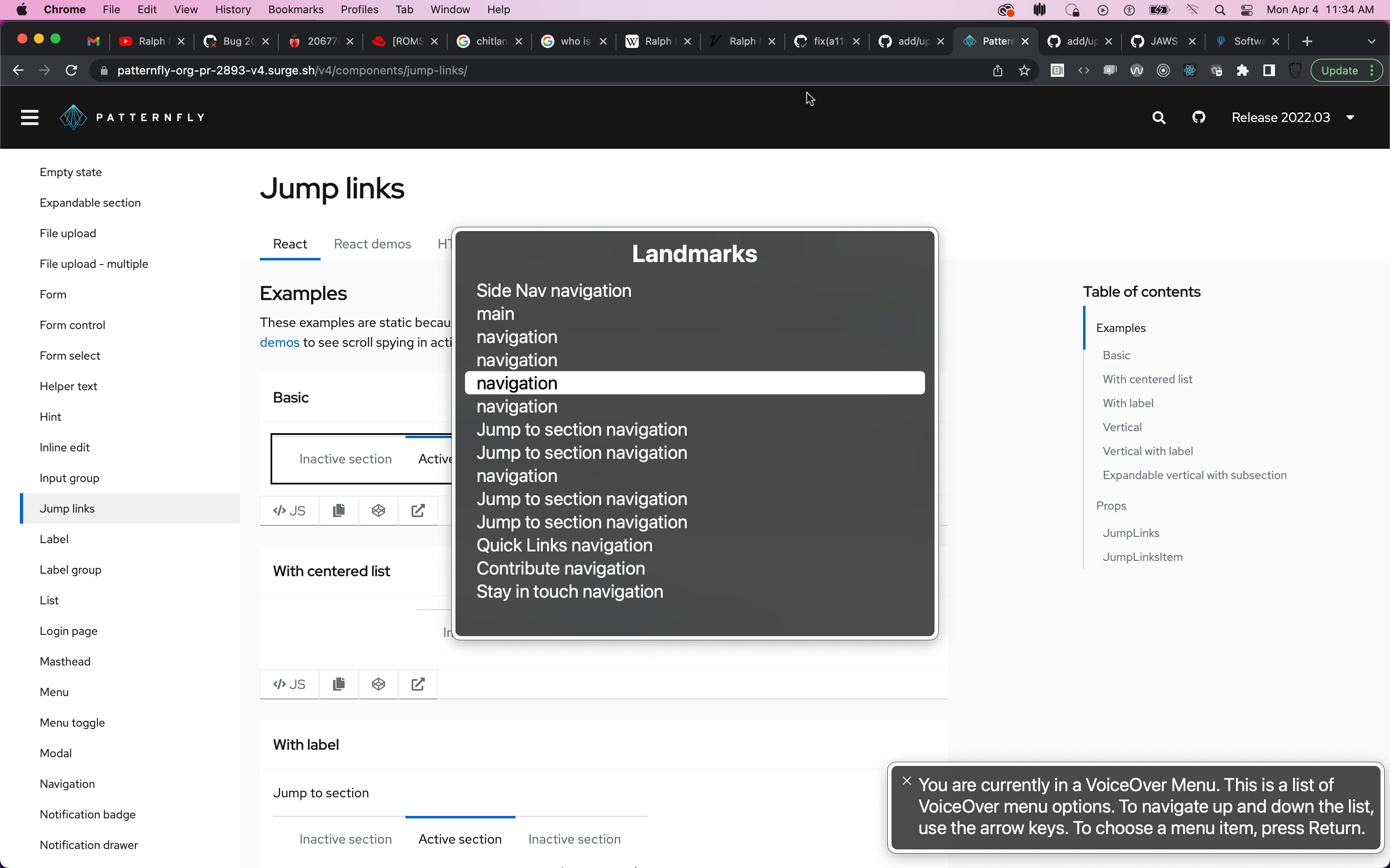
There was a problem hiding this comment.
I'd be in agreement on this as well.
| ### Scrollable elements | ||
| Any elements with horizontal or vertical scroll need to be accessible via keyboard. It may be necessary to ensure every | ||
| container with an overflow rule and content which could possibly grow larger than its parent's height to have | ||
| `tabindex=0`. This will ensure that parent can capture browser focus and be scrolled using the arrow keys. Some browsers |
There was a problem hiding this comment.
When we add tabIndex="0" to an inactive element, like a div container for example, we turn this element into an interactive element - for interactive elements, it's important to ensure a well crafted accessible name exist.
If we only add tabIndex, and do not also ensure an accessible name is explicitly set, screen readers may not treat this content as expected
The main issue is that the container element with non-negative tabIndex will now be registered as an element in the form controls rotor menu, but the label for this element will be driven by whatever text content exist inside the container, which is variable and probably not suitable to use as a single label to name/describe the region's purpose.
That said, even if you're just using standard keyboard nav or screen reader cursor nav (and not rotor) the effect is the same.
Could we just also mention that when adding tabIndex in this scenario, it would also be good to add an aria-label that describes what the element is? I think that would do it..
|
|
||
| No props need to be added or modified for badge accessibility. | ||
|
|
||
| As a caution, badges can be styled using a variety of colors. Relying on color alone to communicate information causes barriers to |
There was a problem hiding this comment.
I wonder if it's worth making a simple suggestion of what to do instead, in case users were planning to do this "rely on color alone"...
Since the badge doesn't get an accessible name and isn't focusable, maybe we can just suggest to ensure there is adequate contextual information provided in the surrounding UI parts to convey the unit of measure for the number in the badge in case it isn't obvious?
Or maybe could just mention to consider using label with icon if the badge count alone isn't intuitive enough?
There was a problem hiding this comment.
To build off this comment, could it be worth including a quick example of when a consumer might typically try to use color alone to convey what information?
My first thoughts were along the lines of using badge colors only to signify what is or isn't read, or having text elsewhere state "... see the red badge icon" (in a similar vein as form "required" labels that might say "required fields are in red").
There was a problem hiding this comment.
I agree with these above comments. When reading it, I also thought something more action oriented would be better like "Do not rely on color alone to communicate" because I think it's clearer for those skimming the docs.
I think an example image could be powerful as well. Perhaps we could show badges or labels with just using color but through another lens (what it looks like when you have this eye condition, etc). I think Eric's idea of required labels being in red (but they all look the same to another user) would be really informative. I remember that was effective when we were talking about chart a11y.
 thatblindgeye
left a comment
thatblindgeye
left a comment
thatblindgeye
left a comment
There was a problem hiding this comment.
Awesome job on these. I think I mainly had comments on several things, with a few suggested changes sprinkled in.
|
|
||
| No props need to be added or modified for badge accessibility. | ||
|
|
||
| As a caution, badges can be styled using a variety of colors. Relying on color alone to communicate information causes barriers to |
There was a problem hiding this comment.
To build off this comment, could it be worth including a quick example of when a consumer might typically try to use color alone to convey what information?
My first thoughts were along the lines of using badge colors only to signify what is or isn't read, or having text elsewhere state "... see the red badge icon" (in a similar vein as form "required" labels that might say "required fields are in red").
|
|
||
| For **Keyboard users** there are a number of considerations which must be made concerning tab order and focus management. | ||
| - Keyboard users should be able to navigate to and through the jump links using **Tab** and **Shift + Tab**. | ||
| - Keyboard users should also be able to select a jump link using **Enter** and **Space**. |
There was a problem hiding this comment.
For links, wouldn't the expected behavior be to only be able to use the Enter key to select them?
| Additionally, it should be noted that jump links are often used on pages with so much content that the page scrolls. It should be true that | ||
| **Up** and **Down** arrow keys should be able to scroll the content. | ||
|
|
||
| **Screen reader users** should be made aware that the jump links are interactable, and which jump link is currently active using |
There was a problem hiding this comment.
It looks like the links in the Jump Links page aren't in VO rotor due to not having an href passed in. Once that gets passed in they show up. Though via the rotor there's no indication which is active, so adding the verbiage regarding "on focus" I'd agree could be worth adding for that.
|
|
||
| | React component | React prop | Which HTML element it appears on in markup | Explanation | | ||
| |-----------------|-----------------|----------------------------------------------|---------------------------------------------------------------| | ||
| | JumpLinks | aria-label | nav.pf-c-jump-links aria-label | Labels the nav to reflect the current nav description. | |
There was a problem hiding this comment.
I'd be in agreement on this as well.
| |---|---|---|---| | ||
| | Label | closeBtnProps | .pf-c-label | Customize the props on the close button of the label. For example, to change the `aria-label`, pass `closeBtnProps={{'aria-label': 'new label'}}` to the Label component. | | ||
|
|
||
| As a caution, labels can be styled using a variety of colors. Relying on color alone to communicate information causes barriers to |
There was a problem hiding this comment.
Just wanted to highlight this to go along with the comments from the Badge file as they might pertain here as well.
| **Keyboard users** should be able to use **Tab** and **Shift + Tab** navigate to and between progress steps with popovers. Keyboard users should | ||
| be able to open and close the popover on a progress step using **Enter** or **Space**. | ||
|
|
||
| **Screen reader users** should be able to discern the label, status, and optional description of every progress step. |
There was a problem hiding this comment.
For NVDA/JAWS it might just be called "elements list"? Based on this screen shot of keyboard shortcuts from Deque, the task in the second column aligns with what the rotor does in VO (the first two columns are the same for their pages on NVDA and JAWS)
That said I think I'd agree in maybe explicitly stating in what way the info should be discernible via screen reader, re: screen reader/VO focus vs rotor/element list. This might involve doing a run-through of current a11y docs as well, but could be easier at this stage.
| The aria-label provided to each step should indicate all information being communicated by the progress step's icon, including the variant and the completed status. | ||
| Screen reader users should also be able to discern whether a step has an associated popover they can trigger and the contents of that popover. |
There was a problem hiding this comment.
The previous line is also tied into this comment, but I wanted to keep this separate from the comments already shared on that one.
Could lines 11-13 of the file for screen reader users be linked more to a single thought, rather than sort of coming off as somewhat separate ones? Roughly something along the lines of:
| The aria-label provided to each step should indicate all information being communicated by the progress step's icon, including the variant and the completed status. | |
| Screen reader users should also be able to discern whether a step has an associated popover they can trigger and the contents of that popover. | |
| **Screen reader users** should be able to discern the label, status, and optional description of every progress step via the `aria-label` prop. This should include all information being communicated by the progress step's icon, such as the variant and the completed status, as well as whether the step has an associated popover they can trigger. Screen reader users should also be able to access the contents of any popover associated with a step. |
Of course taking into account if any changes are made based on the comments above.
| Keyboard users should also be able to select tab using **Enter** and **Space**. Disabled tabs cannot receive | ||
| browser focus. Whenever a disabled tab needs to be able to receive browser focus, such as in the case of | ||
| disabled tabs with a tooltip, set `aria-disabled` to true. |
There was a problem hiding this comment.
Minor suggested tweaks here.
| Keyboard users should also be able to select tab using **Enter** and **Space**. Disabled tabs cannot receive | |
| browser focus. Whenever a disabled tab needs to be able to receive browser focus, such as in the case of | |
| disabled tabs with a tooltip, set `aria-disabled` to true. | |
| Keyboard users should also be able to select a tab using **Enter** and **Space**. Disabled tabs cannot receive | |
| browser focus by default. Whenever a disabled tab needs to be able to receive browser focus, such as in the case of | |
| disabled tabs with a tooltip, use the `isAriaDisabled` prop instead of `isDisabled`. |
thatblindgeye
left a comment
thatblindgeye
left a comment
There was a problem hiding this comment.
Latest updates look good! Regarding a template for a11y docs, I think merging them in if there are no other issues would be fine, and simply applying the template to them once that is completed and approved. These additions/updates would be great to convey in the present rather than holding them off I think.
| **Note:** Whenever multiple navigation elements are present on a page, an aria-label is highly recommended. Screen reader users | ||
| navigating a page via an elements list or rotor menu will be unable to distinguish between the various navigation elements. Using an aria-label | ||
| in these cases allows the user to differentiate between the navigation elements without navigating to and interacting with each one individually | ||
| to determine its contents. The following image demonstrates the lack of information when aria-labels are not present: |
There was a problem hiding this comment.
No other comment other than 🎉 for this verbiage
| via the `aria-label` prop. This should include all information being communicated by the progress step's icon, such as | ||
| the variant and the completed status, as well as whether the step has an associated popover they can trigger. Screen | ||
| reader users should also be able to access the contents of any popover associated with a step. | ||
|
|
There was a problem hiding this comment.
So I think that we probably need to add an "Accessibility Application" section or whatever we're planning on calling it here. (I think we've called it different things on different a11y pages.)
When we look at the progress stepper react demos, we're creating a live region that we're announcing the progress with. This should probably be explained in the a11y docs:
     <div className="pf-screen-reader" aria-live="polite">
          {steps[currentStep] && `On ${steps[currentStep].title}.`}
          {steps[currentStep - 1] && `${steps[currentStep - 1].title} was successful.`}
     </div>
     <ProgressStepper>
          {steps.map((step, index) => {
            let variant = 'pending';
            let ariaLabel = 'pending step';
            if (index < currentStep) {
              variant = 'success';
              ariaLabel = 'completed step, step with success';
            } else if (index === currentStep) {
              variant = 'info';
              ariaLabel = 'current step';
            }
|
|
||
| No props need to be added or modified for badge accessibility. | ||
|
|
||
| As a caution, badges can be styled using a variety of colors. Relying on color alone to communicate information causes barriers to |
There was a problem hiding this comment.
I agree with these above comments. When reading it, I also thought something more action oriented would be better like "Do not rely on color alone to communicate" because I think it's clearer for those skimming the docs.
I think an example image could be powerful as well. Perhaps we could show badges or labels with just using color but through another lens (what it looks like when you have this eye condition, etc). I think Eric's idea of required labels being in red (but they all look the same to another user) would be really informative. I remember that was effective when we were talking about chart a11y.
 nicolethoen
force-pushed
the
various_a11y_docs
branch
from
nicolethoen
force-pushed
the
various_a11y_docs
branch
from
aff55a4 to
8ae5200
Compare
| Additionally, when adding tabIndex in this scenario, it would also be beneficial to add an aria-label that describes the scrollable element. | ||
| Some screen reader users navigate page elements via an element list or rotor menu and the default label for these scrollable elements | ||
| will be driven by whatever text content exists inside the container. This generated label may not be suitable to describe the regions purpose, and | ||
| would likely be better described with a simple aria-label. |
There was a problem hiding this comment.
All of this has looked great!! I think my only question/concern I've thought of recently is that I've noticed that axe has been flagging us more recently for "aria-label attribute is not well supported on a div with no valid role attribute." For example, our wizard. I've had a hard time finding anything official that is very explicit about this, the axe issue's impact level is put at "unknown", and I've personally never experienced issues when using an aria-label on something like a div without a role. However, I wonder if it's worth making a note about it? Very open to opinions about this one because I think it's a more recent axe rule.
There was a problem hiding this comment.
Does JAWS have that issue where a div or span doesn't have an aria-label announced? At least for aria-describedby JAWS didn't announce it when I was testing Tooltip out on a div.
I think it could be worth making a note about aria-labels on elements like div or span not being well supported, especially if there's conflicting behaviors depending on the screen reader. Additionally, could it be worth mentioning aria-labelledby, for when the scrollable region has a heading and that can be linked to as the accessible name, or would just aria-label suffice here?
There was a problem hiding this comment.
Maybe when we open and begin tackling an issue to address the use of aria-labels on divs or other places where that issue is flagged, we can also update these docs. As far as I can tell, axe is flagging it as 'needs review' and on the wizard examples, it make sense that - because of the rotor menu navigation as spaxman noted - these situational uses passes review (for me). WDYT?
There was a problem hiding this comment.
That's a fair point. I suppose between aXe only telling us it isn't "well supported" and Jessie not having had any issues/not finding anything official (I also haven't really had much issues other than some potential JAWS behavior, but that would require more specific testing), it could be worth waiting to see if we hear about any issues/come across any resources about it down the line.
If we were to add anything now, something along the lines of "This may not be well supported in some circumstances, but because of X, Y, and Z we are opting to do this" might be better, but I'd be okay holding off on adding any verbiage about it for now. Worse case is one of us tests or comes across something a few days from now and update the docs then.
There was a problem hiding this comment.
I actually did a little more reading and found this blog: https://www.tpgi.com/short-note-on-improving-usability-of-scrollable-regions/
it lead me to read up on use of role='region' and using that role seems to remove the warnings. What do you think?
https://developer.mozilla.org/en-US/docs/Web/Accessibility/ARIA/Roles/region_role
There was a problem hiding this comment.
role="region" could work! Testing the codepen in that article + throwing together something quick on one of our components worked well in VO when applying tabindex, role, and aria-label to a div.
thatblindgeye
left a comment
thatblindgeye
left a comment
There was a problem hiding this comment.
Looks good! Some nitpicks/questions/comments below in specific areas. One general comment is in instances where attributes/props are mentioned outside of the props/attributes table, perhaps we should wrap those in backticks to differentiate them from other text.
| Additionally, when adding tabIndex in this scenario, it would also be beneficial to add an aria-label that describes the scrollable element. | ||
| Some screen reader users navigate page elements via an element list or rotor menu and the default label for these scrollable elements | ||
| will be driven by whatever text content exists inside the container. This generated label may not be suitable to describe the regions purpose, and | ||
| would likely be better described with a simple aria-label. |
There was a problem hiding this comment.
Does JAWS have that issue where a div or span doesn't have an aria-label announced? At least for aria-describedby JAWS didn't announce it when I was testing Tooltip out on a div.
I think it could be worth making a note about aria-labels on elements like div or span not being well supported, especially if there's conflicting behaviors depending on the screen reader. Additionally, could it be worth mentioning aria-labelledby, for when the scrollable region has a heading and that can be linked to as the accessible name, or would just aria-label suffice here?
| will automatically make any scrollable element focusable to ensure keyboard accessibility as long as they have a | ||
| non-negative tabindex. | ||
|
|
||
| Additionally, when adding tabIndex in this scenario, it would also be beneficial to add an aria-label that describes the scrollable element. |
There was a problem hiding this comment.
Slight tweak suggestion:
| Additionally, when adding tabIndex in this scenario, it would also be beneficial to add an aria-label that describes the scrollable element. | |
| Additionally, when adding tabIndex in this scenario, it can also be beneficial to add an aria-label that describes the scrollable element, similar to how a heading describes a section of content. |
Thoughts being that maybe it will paint a clearer picture for how to use aria-label for this use-case.
|  | ||
|
|
||
| Figure 2. | ||
|
|
||
|  |
There was a problem hiding this comment.
Question: For these images, did you by chance use Chrome's vision deficiencies emulation?
Nitpick: I'd say images for a11y docs should either be placed in this images directory as done for this doc, or placed inside the corresponding component like the jump links has.
There was a problem hiding this comment.
I used a chrome extensions called 'A11y - color blindness empathy test'.
| | React component | React prop | Which HTML element it appears on in markup | Explanation | | ||
| |-------------------------|-----------------------|------------------------------------------------|-------------------------------------------------------------------------------| | ||
| | ExpandableSection | contentId | .pf-c-expandable-section__content | Id of the expandable section, associates this content with its toggle button. | | ||
| | ExpandableSection | toggleContent | .pf-c-expandable-section__toggle-text | Aria-label for the Context Selector Search button | |
There was a problem hiding this comment.
This item should be removed; it mentions context selector, but I also don't believe the expandable section toggleContent prop is a11y specific.
|
|
||
| | React component | React prop | Which HTML element it appears on in markup | Explanation | | ||
| |-----------------|-------------|--------------------------------------------|-----------------------------------| | ||
| | ProgressStep | aria-label | .pf-c-progress-stepper__step | Progress step for screen readers. | |
There was a problem hiding this comment.
For the explanation, maybe something more along the lines of, "Provides an accessible label describing the variant and status of the progress step," or something that conveys what the aria label is doing.
|
|
||
|
|
||
| **Note:** When using a progress stepper in an application, it's also wise to consider how to best summarize the overall progress | ||
| state to a screen reader user. The [basic progress stepper demo]('components/progress-stepper/react-demos#basic') |
There was a problem hiding this comment.
Not sure if it's just because it's a preview build, but this link doesn't redirect correctly.
 nicolethoen
force-pushed
the
various_a11y_docs
branch
from
nicolethoen
force-pushed
the
various_a11y_docs
branch
from
8ae5200 to
dd67a49
Compare
thatblindgeye
left a comment
thatblindgeye
left a comment
There was a problem hiding this comment.
🎉 awesome work on all of these updates
* add/update component a11y docs

* update info on accessible scrollable content

* update per review

* add images and code examples

* resize image

* more updates after review
5 participants
Closes:
#2682 - progress stepper a11y docs
#2593 - tabs a11y docs
#2824 - expandable section a11y docs
#2825 - jump links a11y docs
#2814 - update badge a11y docs to discuss colors (updated label docs additionally with the same)
#2880 - add information about scrollable content being keyboard accessible