feat(Dropdown next): Added the next version of the dropdown component #7955
Conversation
|
Preview: https://patternfly-react-pr-7955.surge.sh A11y report: https://patternfly-react-pr-7955-a11y.surge.sh |
 tlabaj
requested review from
jessiehuff,
kmcfaul,
mcarrano,
mcoker and
thatblindgeye
tlabaj
requested review from
jessiehuff,
kmcfaul,
mcarrano,
mcoker and
thatblindgeye
 kmcfaul
left a comment
kmcfaul
left a comment
kmcfaul
left a comment
There was a problem hiding this comment.
Aside from below, one other general thing I've noticed is that the popper menu has a higher z-index than the table of contents (when it is collapsed for narrower windows) which maybe isn't expected? The old dropdown at least was behind it. This would be true for all popper menus, not just here.
| onSelect?: (event?: React.MouseEvent<Element, MouseEvent>, itemId?: string | number) => void; | ||
| /** Callback to for when the component needs to change the open state of the menu. | ||
| * If this is not provided the component will not close the menu when tab or escape are clicked. */ | ||
| onIsOpenChange?: (isOpen: boolean) => void; |
There was a problem hiding this comment.
Remove 'to' from description.
The prop name/description is a little unclear to me. If this is representing the situations when the menu is closing (via keypress or click out) like it appears, would onClose or shouldClose work better?
Or have some extra props and create onTab(isOpen), onEscape(isOpen), and onOutsideClick(isOpen) to break out each separate behavior for the user in case they want finer control? We can also potentially leave the closing behavior as the default and only override it when the props are present rather than the other way around.
There was a problem hiding this comment.
Yeah this is a tough one. I named it that because it allows the change the open status as related to the isOpen prop. On close does not describe that. Neither do the onTab(isOpen) or onEscape(isOpen)function names.
There was a problem hiding this comment.
I updated the comment. I don't know if that is more clear.
 mcarrano
left a comment
mcarrano
left a comment
mcarrano
left a comment
There was a problem hiding this comment.
This looks good @tlabaj . But just a couple nits...
- I see what the toggle for "Plain menu" is doing, but why would we ever want that? Would it be more useful to show an example of a plain toggle?
- If we are only going to show one example of a grouped menu, I'd prefer that it use dividers between the groups.
I can remove the checkbox. I don't know if it is worth showing the plain toggle since the consumer passes the toggle in to the component.
I will add dividers. |
 thatblindgeye
left a comment
thatblindgeye
left a comment
thatblindgeye
left a comment
There was a problem hiding this comment.
Some stuff below is a bit more nitpicky, so let me know what you think. Otherwise I'm really liking this "next" implementation!
packages/react-core/src/next/components/Dropdown/DropdownGroup.tsx
Outdated
Show resolved
Hide resolved
packages/react-core/src/next/components/Dropdown/DropdownGroup.tsx
Outdated
Show resolved
Hide resolved
packages/react-core/src/next/components/Dropdown/DropdownItem.tsx
Outdated
Show resolved
Hide resolved
packages/react-core/src/next/components/Dropdown/examples/DropdownBasic.tsx
Outdated
Show resolved
Hide resolved
|
I opened a follow up issue for adding testing #7964 |
 mcoker
left a comment
mcoker
left a comment
mcoker
left a comment
There was a problem hiding this comment.
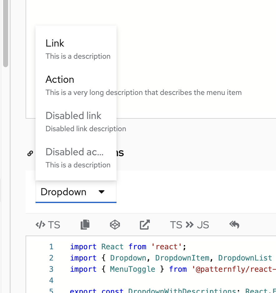
A couple of things I noticed
- The menu item text is getting cut off
-
- The "with descriptions" dropdown is full width, I'm assuming to accommodate the long menu item text, which overflows the container if it isn't full width:
-
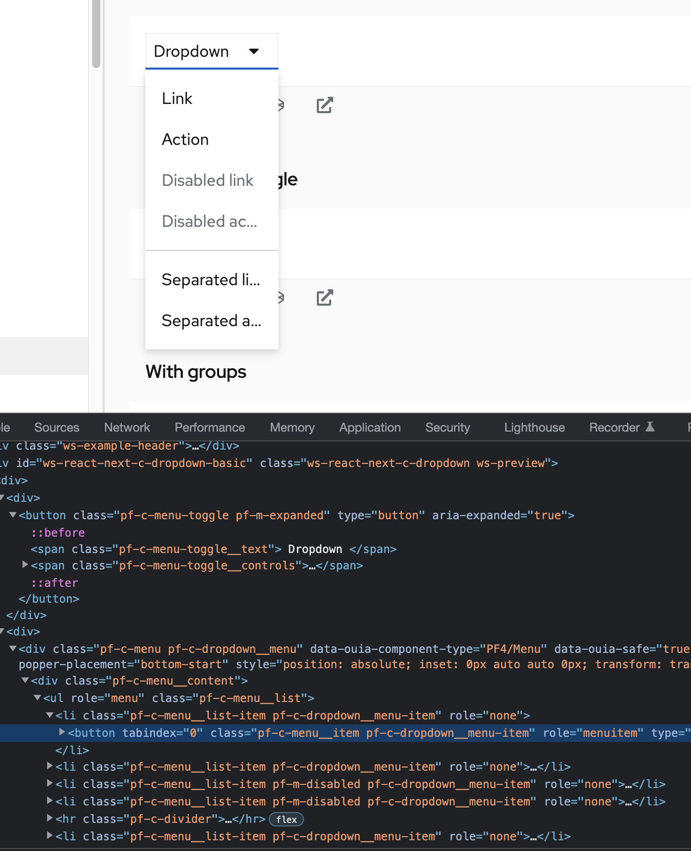
- The dropdown classes aren't on all items. IMO I think we should decide whether we want to have individual menu classes (dropdown, select, etc) used to build the menu toggle + menu components or not, and if so, I'd probably advocate to have a dropdown class for every element we have a menu/menu-toggle class for (or maybe just a dropdown class on the parent menu and menu toggle component elements), and for those classes not to reference the existing dropdown styles - that would be new for customizing/theming these "next" components.
-
I don't think this is a blocker, unless they're easy fixes. I brought up something about consistency between these components below that I think could be used to solve these issues.
Should we apply dropdown styles to the new dropdown? If not, I will remove them.
@tlabaj I can see two sides:
- Having dropdown classes (either at the parent level, or on everything - the parent, toggle, and menu)
- makes the "dropdown" unique and can be uniquely themed/styled.
- gives us the ability to add some code or elements that just work in the dropdown, and don't have to be in the menu or menu toggle any time anyone uses those components, whether they're creating a dropdown or not.
- Not having classes, and this component basically just being a demo of the toggle + menu that we package and build in default functionality for, keeps it modular, simple, consistent, etc. A user could still add a class to their dropdown if they want to customize something in a dropdown.
I think I would prefer the latter, and just have this be a bundle of the toggle + menu. However it might mean that we likely need to figure out any differences we have between the different types of menus and see if we can normalize them (get rid of the differences), or if we want to keep any of the differences, if we need unique classes to be managed in the CSS for that. For example, one difference that I see that's probably causing an issue in this PR is the difference between the dropdown toggle & menu width versus the select toggle & menu width.
In both menus, the menu will be as wide as the toggle by default, but can grow wider than the toggle if there is a lot of content in the menu. However the dropdown toggle will only be as wide as the content inside of it, and the and the select toggle will fill the width of the container it's in (<MenuToggle isFullWidth />). In this dropdown component, the user has to specify their toggle. I think that implies that - if the default toggle size or whatever is different between the different types of menus, we need to document that default for consistency and rely on users creating it properly (ie, using isFullWidth for the correct menu).
- Could lead to inconsistencies - unintentional or intentional ones based on personal preference that we wouldn't necessarily recommend
- If our defaults change, it may be on users to make that change - ie, use another prop or whatever is needed.
We could also do something like use the "dropdown" component to .setProperty() any --pf-c-menu[-toggle]--[MinWidth or whatever] vars to handle any small CSS defaults for these individual components, but then we could be handling a fair amount of CSS in the JS and I'm not sure if that's ideal. Also, I don't know that we could set a --pf-c-menu-toggle--[...] var if the user specifies their own <MenuToggle />?
If these different types of menus presented the same, I think that would mitigate all of this kind of stuff.
--
|
Your changes have been released in:
Thanks for your contribution! 🎉 |
8 participants
What: Closes #7322
This is a simple implementation of a dropdown using Menu under the hood.
The consumer will pass the toggle in so I did not wrap the menu toggle.
TODO: