led wizard tweaks #363
led wizard tweaks #363
Conversation
changing direction
This happened to me too I believe 😅
Yeah, I didn't change the existing names when I forked. There are some weird names/grammar mistakes etc. I would suggest "Grab (widget|zone) configuration", WDYT?
To me, something being grayed out is the consistent definition if disabled. However there's currently a white tone in the colors used for active zones... I'm against red text because it suggests an error. Maybe putting brackets around the number would help?
Well the history there is, initially there were only presets, and then I added the custom layout. The side count options only make sense for that. Maybe we should rethink the layout altogether in a way that makes the separation clearer. Like one space for global options (LED count, order), one for the preset selection with a - OR - and a third space for the custom button with its options. Custom could well be a label and then the button would be labeled apply. (Now one might think to press apply after a preset button, which is wrong).
I noticed this was disabled in the wizard at some point, but I don't know why this was done. There might be an edge case for this. One I can think of is the per-zone color adjustment, which will be overwritten in the next page currently. Having enable/disable makes sense on this page though, I agree. |
I don't have strong feelings about words I used, so if you think it's better, I'm ok with changing.
I would agree for a normal UI (or all white widgets), but here it looks drown out especially with small zones (unless you have a bunch of them in one place). Even the black isn't perfect, but at least it means "no light should come from here"
Initially I was thinking of adding "OFF" beside or under the number, but with high density LEDs it'll be cut off. So a different from the rest/bright color helped with that. I'm affraid brackets without an explanation on the same screen might be too cryptic.
Oh, I see
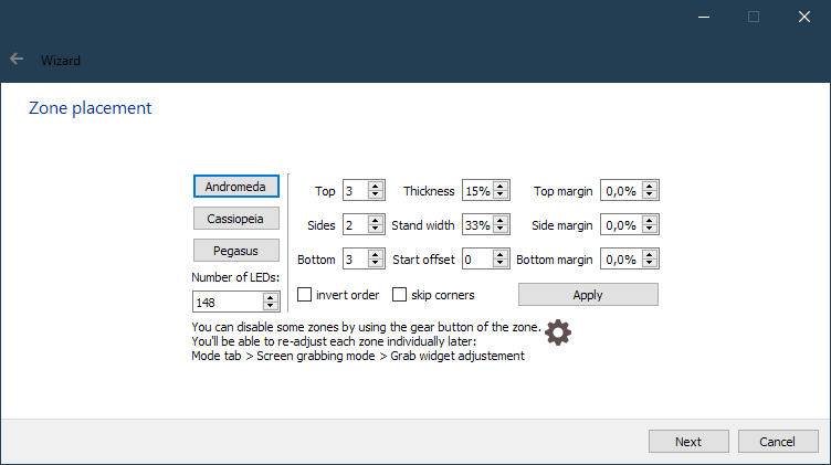
I don't know, I'm happy as is, maybe try it more :D but maybe I'm not seeing right what you are saying, maybe change in it designer and screenshot Edit: how about moving total LED number to the device page (previous one), this way we can warn better about the baud rate there and we wouldn't have a conflicting setting (that you don't need to adjust anyway as much as others) on the widget page, and wrap presets and customize in QGroupBoxes
Yeah that's why I split enable and coefs, you can choose either or both in code now. |
Well, in terms of color coefficient it's actually more powerful than the wizard. Adjustment is fine with me as well, but I find the test confusing. How do you like just "Grab widget adjustment"?
I agree with the high density argument. I have few enough zones (and enough screen estate) so it's not an issue in my testing - full black SGTM. We might consider making the dark blue and green colors a bit lighter to amplify the difference.
I'd rather not change the icon, because the meaning of the button doesn't change. Especially in full mode, where the cog also hides the custom color coefficients. Simply replacing the number with OFF is something I could imagine well.
I forgot that I implemented the presets as fillers for the custom profile. Most of your arguments make sense, let's keep it this way.
This has something going for it, except that changing the Top/Sides/Bottom will change the total number of LEDs actually used. How would you handle the disagreement there? Currently applying will change the total number, which is a nice way to show it. Not sure.
Oh right. I missed this in the review. Nice. |
"Grab widget adjustment" is fine. So how about displaying white widgets with unlocked coefs on coef page? (I don't know if it's hard technically)
but those are just the dark versions of the others so making them lighter will make them closer, maybe only keep the bright ones?
ok I'll test edit:
yeah
I was hoping that by that point the user is sure about the total number but...
opinion on this? |
We can do that, yeah. The small caveat is that clicking once on the global coef can mess up an hour's work of tweaking on each zone (also it might take some wiring work to make the coefs in the widgets show the right numbers, I'm not sure whether that'll be synchronized out of the box, but shouldn't be hard). I could live with either (keep as is or allow on global).
That would reduce the number of colors available. Having at least 10 different colros for the default 10 LEDs per Lightpack would be nice.
Yes I would also hope the user is sure by that point :P
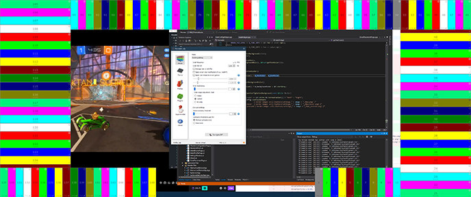
I would guess the window manager isn't meant for that many windows, but I think the fact that you're still taking screenshots at the same time makes everything worse.
Oh sorry. Yeah sure, that was inherited from the original software, I don't mind. Maybe the defaults should be more explicit here (or a reset button?) to help people pick the recommended option after experimenting with things? |
since
|
Software/src/GrabWidget.cpp
Outdated
| return true; | ||
| } | ||
|
|
||
| void GrabWidget::setAreaEanled(const bool enabled) |
|
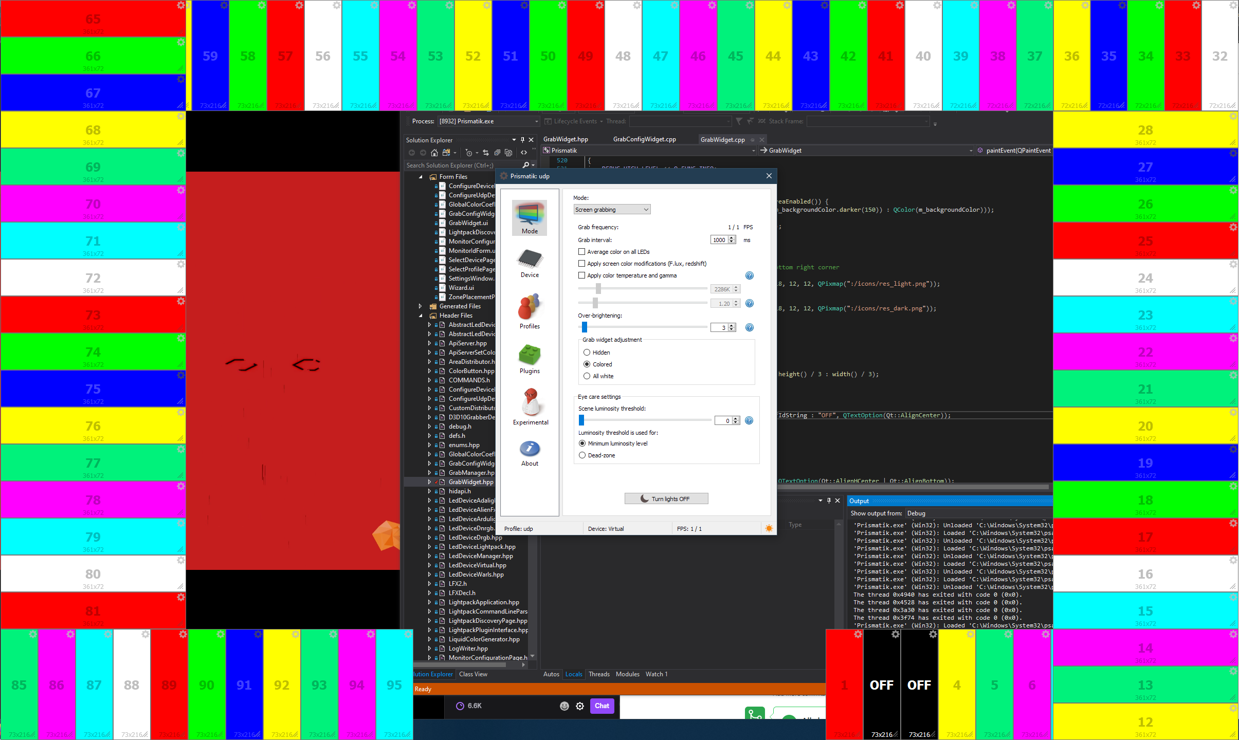
I tested on my TV setup with Lightpacks and the coef synchronization worked nicely. I did have some issues with disabled zones however. Another thing: toggling a disabled zone back on hides the number and resolution label. |
|
That sounds like you have minimum luminosity > 0, which does not care about disabling LEDs (by design I guess). I'm not able to reproduce the toggling issue on either platform, in both wizard and grab |
|
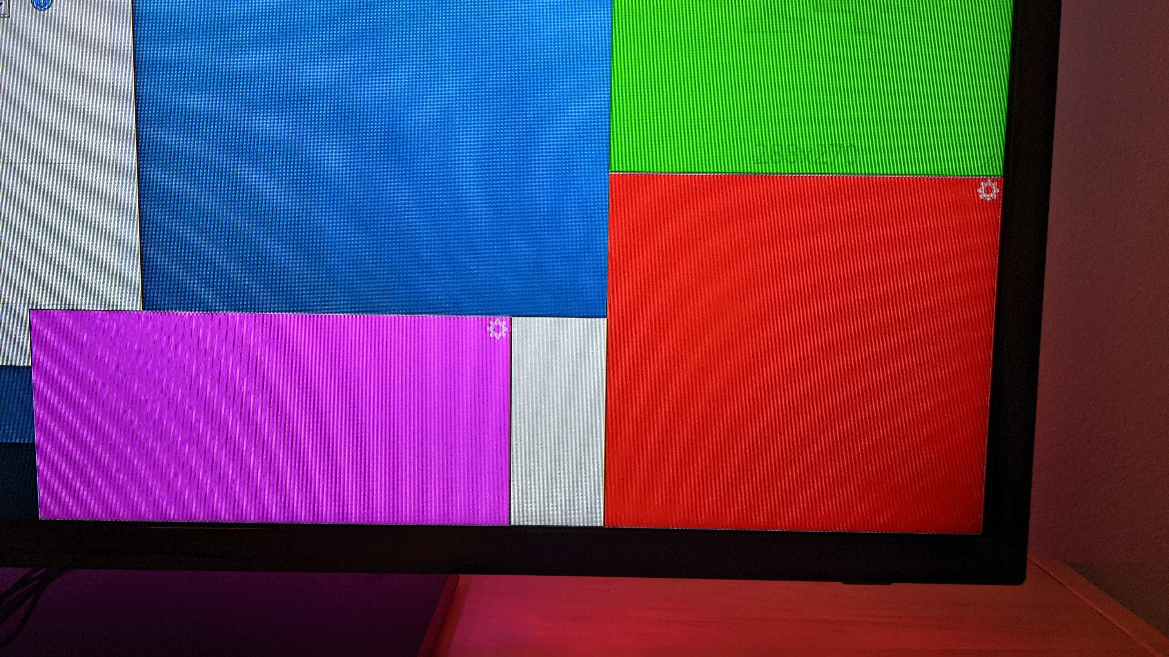
You're right, it looks like the luminosity was the issue (although the default is only 3, which is what I have on the desktop I compared to as well...). Can't test right now. The toggling turned out to be a contrast issue on the TV. The contrast is perfectly fine on my desktop monitor, but take a look at this (without any disabling or toggling): Anyway, after the typo fix this looks good to me :) |
|
(it's very visible even at 3) Last minute addition: being able to configure multiple displays (display select integrated to zone/coef pages) |
|
I don't have a multi-monitor setup to test, but the code looks reasonable and I guess you did ;) Thanks |
|
might fit with #280 |
Here I'm trying reduce some confusion around widgets that I saw
last two points are liked by Ambibox users
I was also thinking about renaming Experimental tab to Expert (or Advanced) and making it visible like other tabs, some people miss it (Profile tab might not be the best for UI stuff), and I'm not even sure what's experimental there, everything is very much in production use! What do you think?