

A modern, minimalistic chat UI kit designed specifically for AI applications built with Flutter. Create beautiful interfaces for ChatGPT, Google Gemini, Anthropic Claude, Llama, and other LLM-powered chatbots with features like streaming responses, markdown support, code highlighting, and extensive customization options.
Perfect for building AI assistants, customer support bots, knowledge base chatbots, language tutors, and any conversational AI application.
Development Status: This package is under active development. You may encounter breaking changes with each update as we improve the API and add new features. Please check the CHANGELOG before updating to a new version.
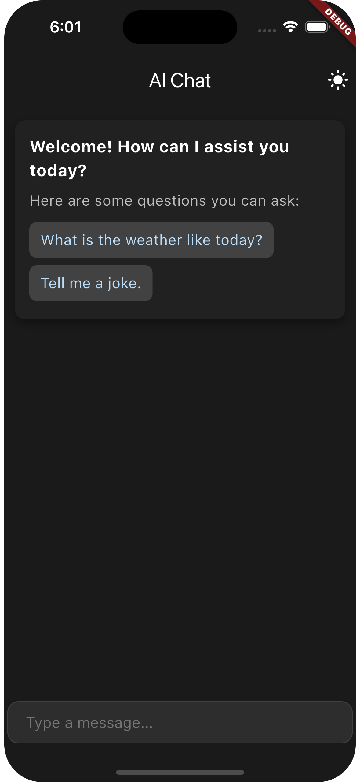
Dark Mode |
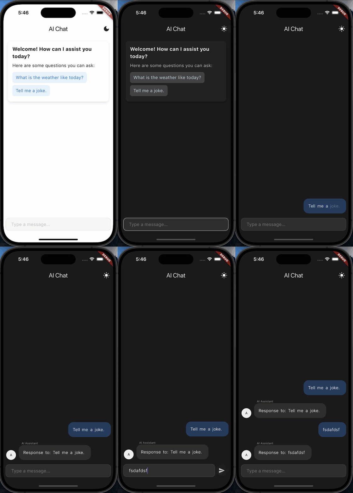
Chat Demo |
- 🎨 Dark/light mode with adaptive theming
- 💫 Word-by-word streaming with animations (like ChatGPT and Claude)
- 📝 Enhanced markdown support with code highlighting for technical content
- 🎤 Optional speech-to-text integration
- 📱 Responsive layout with customizable width
- 🌐 RTL language support for global applications
- ⚡ High performance message handling for large conversations
- 📊 Improved pagination support for message history
- 👋 Customizable welcome message similar to ChatGPT and other AI assistants
- ❓ Example questions component for user guidance
- 💬 Persistent example questions for better user experience
- 🔄 AI typing indicators like modern chatbot interfaces
- 📜 Streaming markdown rendering for code and rich content
- 💬 Customizable message bubbles with modern design options
- ⌨️ Multiple input field styles (minimal, glassmorphic, custom)
- 🔄 Loading indicators with shimmer effects
- ⬇️ Smart scroll management for chat history
- 🎨 Enhanced theme customization to match your brand
- 📝 Better code block styling for developers
This UI kit works seamlessly with:
- OpenAI (ChatGPT, GPT-4)
- Google (Gemini, PaLM)
- Anthropic (Claude)
- Mistral AI
- Llama 2/3
- Cohere
- And any custom AI/LLM API
Add this to your package's pubspec.yaml file:
dependencies:
  flutter_gen_ai_chat_ui: ^2.0.6
Then run:
flutter pub get
⚠️ Important: This package is under active development. We recommend pinning to a specific version in your pubspec.yaml to avoid unexpected breaking changes when you update. Always check the CHANGELOG before upgrading.
import 'package:flutter_gen_ai_chat_ui/flutter_gen_ai_chat_ui.dart';

class ChatScreen extends StatefulWidget {
  @override
  _ChatScreenState createState() => _ChatScreenState();
}

class _ChatScreenState extends State<ChatScreen> {
  final _controller = ChatMessagesController();
  final _currentUser = ChatUser(id: 'user', firstName: 'User');
  final _aiUser = ChatUser(id: 'ai', firstName: 'AI Assistant');
  bool _isLoading = false;

  @override
  Widget build(BuildContext context) {
    return Scaffold(
      appBar: AppBar(title: Text('AI Chat')),
      body: AiChatWidget(
        // Required parameters
        currentUser: _currentUser,
        aiUser: _aiUser,
        controller: _controller,
        onSendMessage: _handleSendMessage,

        // Optional parameters
        loadingConfig: LoadingConfig(isLoading: _isLoading),
        inputOptions: InputOptions(
          hintText: 'Ask me anything...',
          sendOnEnter: true,
        ),
        welcomeMessageConfig: WelcomeMessageConfig(
          title: 'Welcome to AI Chat',
          questionsSectionTitle: 'Try asking me:',
        ),
        exampleQuestions: [
          ExampleQuestion(question: "What can you help me with?"),
          ExampleQuestion(question: "Tell me about your features"),
        ],
      ),
    );
  }

  Future<void> _handleSendMessage(ChatMessage message) async {
    setState(() => _isLoading = true);

    try {
      // Your AI service logic here
      await Future.delayed(Duration(seconds: 1)); // Simulating API call

      // Add AI response
      _controller.addMessage(ChatMessage(
        text: "This is a response to: ${message.text}",
        user: _aiUser,
        createdAt: DateTime.now(),
      ));
    } finally {
      setState(() => _isLoading = false);
    }
  }
}AiChatWidget(
// Required parameters
currentUser: ChatUser(...), // The current user
aiUser: ChatUser(...), // The AI assistant
controller: ChatMessagesController(), // Message controller
onSendMessage: (message) { // Message handler
// Handle user messages here
},
// ... optional parameters
)AiChatWidget(
// ... required parameters
// Message display options
messages: [], // Optional list of messages (if not using controller)
messageOptions: MessageOptions(...), // Message bubble styling
messageListOptions: MessageListOptions(...), // Message list behavior
// Input field customization
inputOptions: InputOptions(...), // Input field styling and behavior
readOnly: false, // Whether the chat is read-only
// AI-specific features
exampleQuestions: [ // Suggested questions for users
ExampleQuestion(question: 'What is AI?'),
],
persistentExampleQuestions: true, // Keep questions visible after welcome
enableAnimation: true, // Enable message animations
enableMarkdownStreaming: true, // Enable streaming text
streamingDuration: Duration(milliseconds: 30), // Stream speed
welcomeMessageConfig: WelcomeMessageConfig(...), // Welcome message styling
// Loading states
loadingConfig: LoadingConfig( // Loading configuration
isLoading: false,
showCenteredIndicator: true,
),
// Pagination
paginationConfig: PaginationConfig( // Pagination configuration
enabled: true,
reverseOrder: true, // Newest messages at bottom
),
// Layout
maxWidth: 800, // Maximum width
padding: EdgeInsets.all(16), // Overall padding
)The package offers multiple ways to style the input field:
InputOptions(
  // Basic properties
  sendOnEnter: true,

  // Styling
  textStyle: TextStyle(...),
  decoration: InputDecoration(...),
)InputOptions.minimal(
hintText: 'Ask a question...',
textColor: Colors.black,
hintColor: Colors.grey,
backgroundColor: Colors.white,
borderRadius: 24.0,
)InputOptions.glassmorphic(
colors: [Colors.blue.withOpacityCompat(0.2), Colors.purple.withOpacityCompat(0.2)],
borderRadius: 24.0,
blurStrength: 10.0,
hintText: 'Ask me anything...',
textColor: Colors.white,
)InputOptions.custom(
decoration: yourCustomDecoration,
textStyle: yourCustomTextStyle,
sendButtonBuilder: (onSend) => CustomSendButton(onSend: onSend),
)The send button is now hardcoded to always be visible by design, regardless of text content. This removes the need for an explicit setting and ensures a consistent experience across the package.
By default:
- The send button is always shown regardless of text input
- Focus is maintained when tapping outside the input field
- The keyboard's send button is disabled by default to prevent focus issues
// Configure input options to ensure a consistent typing experience
InputOptions(
  // Prevent losing focus when tapping outside
  unfocusOnTapOutside: false,

  // Use newline for Enter key to prevent keyboard focus issues
  textInputAction: TextInputAction.newline,
)MessageOptions(
// Basic options
showTime: true,
showUserName: true,
// Styling
bubbleStyle: BubbleStyle(
userBubbleColor: Colors.blue.withOpacityCompat(0.1),
aiBubbleColor: Colors.white,
userNameColor: Colors.blue.shade700,
aiNameColor: Colors.purple.shade700,
bottomLeftRadius: 22,
bottomRightRadius: 22,
enableShadow: true,
),
)