Add row or column scaling option to matrixplot#512
Conversation
Especially when we visualize raw counts, sometimes it's hard to see the differences between DEGs and other genes in the heatmap since one value can simply dominate the entire heatmap. I think we can add a scaling option to matrixplot, which squashes expression values between 0 and 1 to make markers more pronounced.
|
Happy to merge this if @fidelram is happy with it, too! :) |
|
This is very useful! Thanks a lot. Would you mind adding a test in |
|
I was looking at the tests, and something made me think. If
Now with the new standardization option, values are squashed between 0 and 1 but the color scale is still diverging:
@fidelram Do you think that's ok, or should we switch back to viridis when |
|
Added tests, too. (Tests fail in my setup, though. RMS is usually around 50-60, rather than 15.) |
|
@gokceneraslan Tests with images are always problematic. I will take a look later. With respect to |
Default values of vmin/vmax looks ok for most datasets, but when we squash everything between 0 and 1, the negative scale doesn't make sense any more. Furthermore, even for max values (i.e. 1.0) colors will look dimmer than the color representing the max value. For example: sc.pl.rank_genes_groups_matrixplot(adata, n_genes=1, standard_scale='var', use_raw=False)generates
Color scale might be a bit confusing for some, IMHO. I think it makes more sense to switch back to default sequential colormap if We can merge this and play around with different datasets etc, too. |
|
Any thoughts @fidelram? |
|
I think we should remove the that uses the divergent colormap and keep things simpler. |
|
@fidelram Shall I do it in this PR or shall we merge this and address it in another PR? |
|
Let me see if I can make changes on top of your changes. But I think I need to make a new PR. |
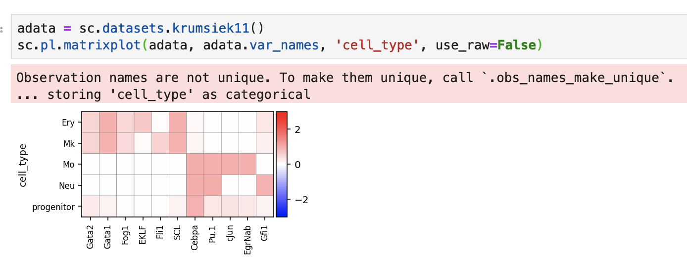
Especially when we visualize raw counts, sometimes it's hard to see the differences between the expression of one gene across cell types in the heatmap since one value can simply dominate the dynamic range of expression. I think we can add a scaling option to matrixplot, which squashes expression values between 0 and 1 to make markers more pronounced.
Heatmap of the raw values:
Heatmap of the logarithmized values (which also helps a bit but not for all genes):
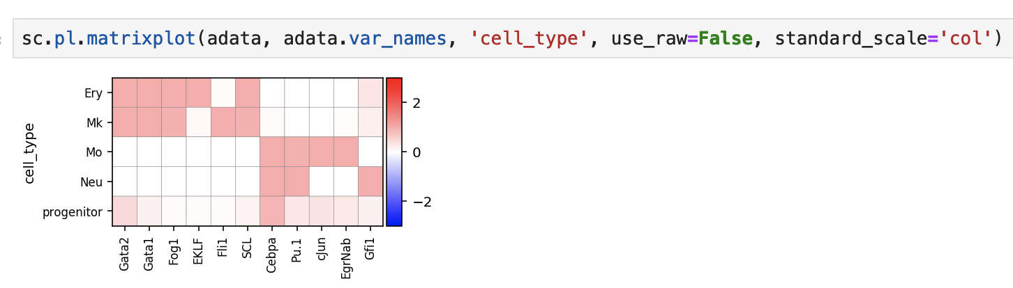
Heatmap of the col-normalized values:
PS: The option is actually borrowed from Seaborn (https://seaborn.pydata.org/generated/seaborn.clustermap.html).
PPS: There is an edge case such as division by zero. Also,
swap_axesoption makes 'row'/'col' naming a bit confusing. Let me know if you have suggestions about these or the standardization idea in general.