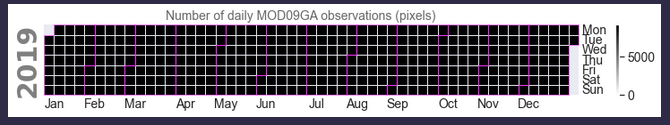
With a time-series whose frequency is
the following instructions
#pyplot.figure(figsize=(16,10), dpi= 80) ;
calplot.calplot(
    mod09ga_surface_reflectances['mod09ga_surface_reflectance_1'],
    how='count',
    suptitle='Number of daily MOD09GA observations (pixels)',
    suptitle_kws={'color':'dimgray', 'fontsize':14},
    vmin=0,
    cmap='gist_gray_r',
    fillcolor='whitesmoke',
    linewidth=0.5,
    edgecolor='magenta',
    monthlabeloffset=1,
    monthticks=True,
) ;
produce
 .
.
- Sticking to
how=count and some gray-scale color palette, how can this be made prettier? The colors do not help to distinguish between low and high counts.
- The vertical gap between the rows (day labels) is too small. And the color for
yticklabels cannot be modified. Unless I am wrong, currently there is no way to pass ax kwargs.
With a time-series whose frequency is

the following instructions
produce
 .
.
how=countand some gray-scale color palette, how can this be made prettier? The colors do not help to distinguish between low and high counts.yticklabelscannot be modified. Unless I am wrong, currently there is no way to passaxkwargs.