Forked & refactored of Mazzarolo's react-native-dialog, using latest implementations, and, avoids a needless dependency.
Forked from: https://github.com/mmazzarolo/react-native-dialog
A pure JavaScript React-Native dialog that follows closely the UI of its native counterpart while expanding its features.
- Support for iOS and Android (JavaScript API)
- A flexible declarative API
- Follows closely the UI of a native dialog/alert
- Can be used both as an alert and as an input prompt
- Can be injected with any component
Clone or download the library.
React-native-dialog exposes a set of components that can be used to build the UI of the dialog:
- Dialog.Container: This component is the root component of the dialog and all the other components should be nested inside it.
- Dialog.Title: A
Textcomponent styled as a native dialog title. - Dialog.Description: A
Textcomponent styled as a native dialog description. - Dialog.Button: A component styled as a native dialog button.
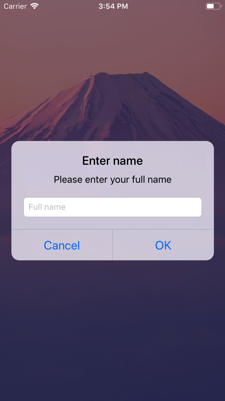
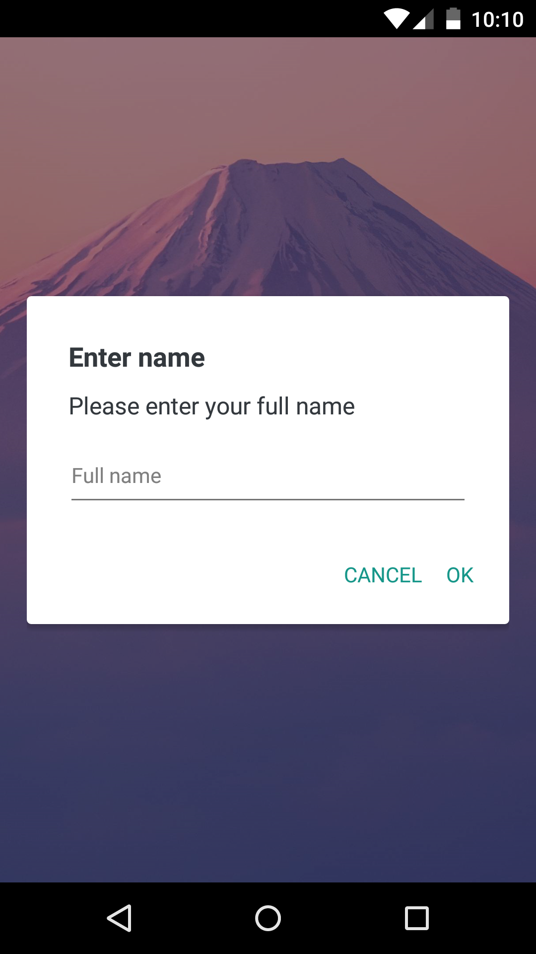
- Dialog.Input: A
TextInputcomponent styled as a native dialog input. - Dialog.Switch: A native
Switchcomponent with an optional label.
-
Import this library.
-
Create a dialog and nest its content inside of it:
return (
<View>
<Dialog.Container>
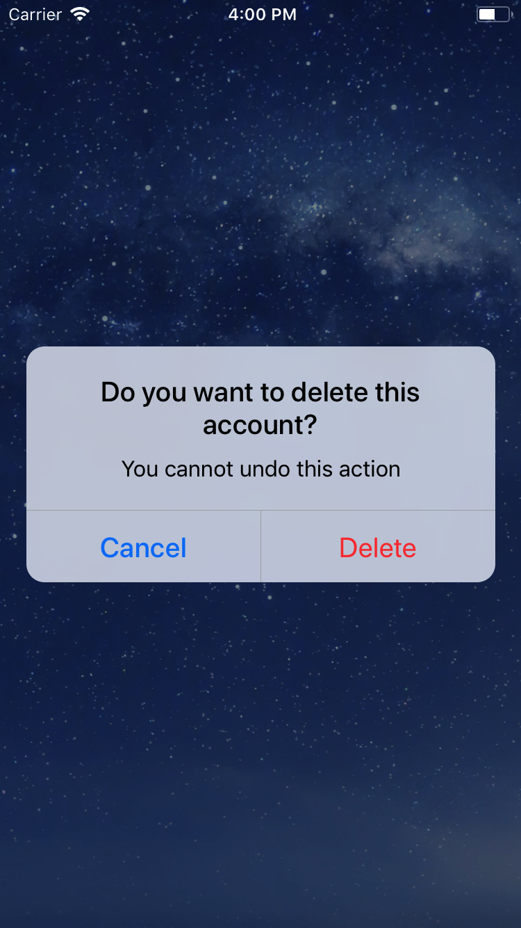
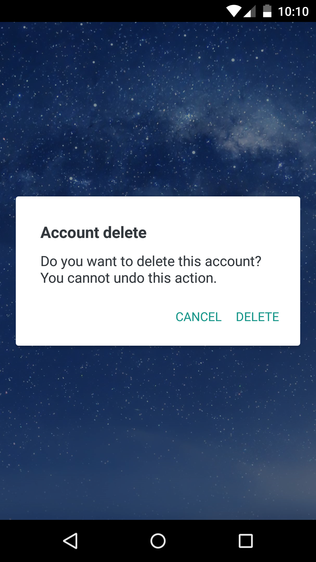
<Dialog.Title>Account delete</Dialog.Title>
<Dialog.Description>
Do you want to delete this account? You cannot undo this action.
</Dialog.Description>
<Dialog.Button label="Cancel" />
<Dialog.Button label="Delete" />
</Dialog.Container>
</View>
)- Then simply show it by setting the
visibleprop to true:
 return (
   <View>
     <Dialog.Container visible={true}>
       <Dialog.Title>Account delete</Dialog.Title>
       <Dialog.Description>
         Do you want to delete this account? You cannot undo this action.
       </Dialog.Description>
       <Dialog.Button label="Cancel" />
       <Dialog.Button label="Delete" />
     </Dialog.Container>
   </View>
 )
The visible prop is the only prop you'll really need to make the dialog work: you should control this prop value by saving it in your state and setting it to true or false when needed.
can be found here
| Name | Type | Default | Description |
|---|---|---|---|
| label | string | REQUIRED | The label text |
| color | string | #007ff9 on iOS, #169689 on Android |
The label color |
| bold | bool | false | Show the label with a bold font weight? |
| disabled | bool | false | Disable the button? |
| onPress | func | REQUIRED | Called when the button is pressed |
| Name | Type | Default | Description |
|---|---|---|---|
| children | string | REQUIRED | The description text |
| Name | Type | Default | Description |
|---|---|---|---|
| blurComponentIOS | node | A low-opacity | The blur component used in iOS |
| visible | bool | REQUIRED | Show the dialog? |
| children | node | REQUIRED | The dialog content |
| contentStyle | any | undefined | Extra style applied to the dialog content |
| headerStyle | any | undefined | Extra style applied to the dialog header |
| footerStyle | any | undefined | Extra style applied to the dialog footer |
| buttonSeparatorStyle | any | undefined | Extra style applied to the dialog button separator |
| Name | Type | Default | Description |
|---|---|---|---|
| label | string | undefined | The input floating label |
| wrapperStyle | any | undefined | The style applied to the input wrapper View |
| textInputRef | ref | undefined | Ref to the input |
Dialog.Input also accepts all the React-Native's TextInput component props.
| Name | Type | Default | Description |
|---|---|---|---|
| children | string | REQUIRED | The title text |
Dialog.Title also accepts all the React-Native's Text component props.
| Name | Type | Default | Description |
|---|---|---|---|
| label | string | undefined | The switch description text |
Dialog.Switch also accepts all the React-Native's Switch component props.
- Handle the UI for more than 2 iOS buttons
- Add even more components (a
Pickerfor example) - Add a documentation for implementing expo's
BlurView - Try to get as close as possible to the native dialogs
Thanks to the user @honaf who has kindly offered the react-native-dialog namespace.
Also thanks to the user @leecade who offered the namespace react-native-alert (which has not been used since "Dialog" seems to suit better this component).