Skip to content

Add CommunityMenu component and change MoreMenu to ContributeMenu#635

Merged
delucis merged 8 commits into
withastro:mainfrom
yanthomasdev:community-tab
Jun 3, 2022
Merged

Add CommunityMenu component and change MoreMenu to ContributeMenu#635
delucis merged 8 commits into
withastro:mainfrom
yanthomasdev:community-tab

Conversation

@yanthomasdev
Copy link
Copy Markdown
Member

What kind of changes does this PR include?

  • Minor content fixes (broken links, typos, etc.)
  • New or updated content
  • Translated content
  • Changes to the docs site code
  • Something else!

Description

This PR adds the new CommunityMenu component as part of our sidebar (sidebar expert here, btw) and changes MoreMenu to ContributeMenu.

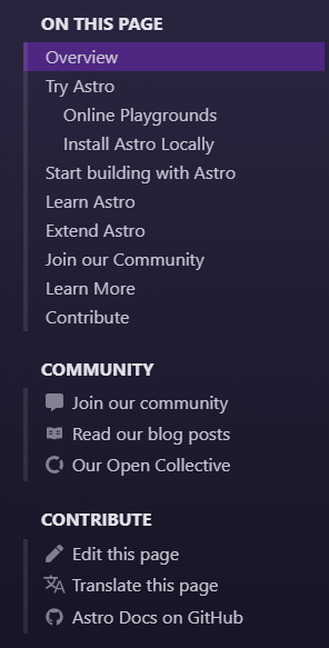
The new version looks like this:
image

I want to point out some of the stuff we can work on and improve here, based on our discussion earlier and my thoughts:

  • Maybe we can add CommunityMenu as part of the hamburger menu instead of placing it below "Contribute/More" on the mobile view?
  • What should come first? Contribute or Community?
  • Does "Join our community" below "Community" sounds redundant? Maybe we should change it for something like "Join our chat/Discord"?
  • Is the "Read our blog" icon good?

Note: We will need to update the other languages' ui.ts file because I changed some entries and added others.

@netlify
Copy link
Copy Markdown

netlify Bot commented May 23, 2022

Deploy Preview for astro-docs-2 ready!

Built without sensitive environment variables

Name Link
🔨 Latest commit 20ad53e
🔍 Latest deploy log https://app.netlify.com/sites/astro-docs-2/deploys/629a71804dccb400085feea1
😎 Deploy Preview https://deploy-preview-635--astro-docs-2.netlify.app
📱 Preview on mobile
Toggle QR Code...

QR Code

Use your smartphone camera to open QR code link.

To edit notification comments on pull requests, go to your Netlify site settings.

@delucis
Copy link
Copy Markdown
Member

delucis commented May 23, 2022

Great work!

  • I definitely conceived of “Community” in the left sidebar across views. (Are you allowed there, Yan? Or do you only have permission to roam on the right?!) I guess that might take some additional infrastucture work?

  • If that’s the case I guess order isn’t as important.

  • Maybe “Join us on Discord” would be a good label?

  • Love the blog icon!

@sarah11918
Copy link
Copy Markdown
Member

Firstly, I love these contributions @yan-thomas ! 🥳 My thoughts:

Maybe we can add CommunityMenu as part of the hamburger menu instead of placing it below "Contribute/More" on the mobile view?

Yes, whatever is in mobile view should be behind the hamburger menu. I think only the TOC makes sense for top of the page on mobile.

What should come first? Contribute or Community?

Slight preference for Community first, I think? I think it's def more important on mobile, but I think placement is less important. (Maybe the stuff at the END is more noticable, easier to reach etc.) So, Community is way more important on mobile. And I'm ok with however we translate that into placement.

Does "Join our community" below "Community" sounds redundant? Maybe we should change it for something like "Join our chat/Discord"?

Agreed. It should make it clear that it's taking the user to Discord. (On mobile, will clicking the link launch the app? I feel like that's something people should be prepared for, so mentioning Discord specifically on mobile is important, I think.

Is the "Read our blog" icon good?

It's cute! I like it! I'm also open if you find one you like better. :)

@yanthomasdev
Copy link
Copy Markdown
Member Author

yanthomasdev commented May 23, 2022

Thanks for the comments, @sarah11918 and @delucis!

I definitely conceived of “Community” in the left sidebar across views. (Are you allowed there, Yan? Or do you only have permission to roam on the right?!) I guess that might take some additional infrastructure work?

After a quick look at the code, I don't think it would be hard to make it part of LeftSidebar, the problem is that it would be part of the Learn/Reference tab and I don't feel like it would be right? Maybe if we made a clear distinction between what is part of the Learn/Reference Tab and "Community" using something like a divider with CSS pseudo-elements. (<hr> would also work visually, but AFAIK, it is not semantically recommended for stuff that isn't part of a paragraph). Another thing is that for this we would need to scroll all the way down just to see "Community", so it would be kinda hidden for most people, compared to having it be part of RightSidebar on desktop and part of the hamburger menu on mobile.

Agreed. It should make it clear that it's taking the user to Discord. (On mobile, will clicking the link launch the app? I feel like that's something people should be prepared for, so mentioning Discord specifically on mobile is important, I think.

On mobile, at least for me, it doesn't launch the app (only after you click "accept invite"), but on desktop, it automatically launches the app and it sure is annoying. Great point!

Yes, whatever is in mobile view should be behind the hamburger menu. I think only the TOC makes sense for top of the page on mobile.

I agree. Not sure what is the general feeling about where we should put "More", but I guess it is safe to also add it to the hamburger menu as part of this PR?

@delucis
Copy link
Copy Markdown
Member

delucis commented May 24, 2022

On the left I wondered if we could move these into the nav.ts file. Add an optional icon property to entries in en/nav.ts and update the menu renderer to handle external URLs. I think that would keep it in the learn tab?

@sarah11918
Copy link
Copy Markdown
Member

After a quick look at the code, I don't think it would be hard to make it part of LeftSidebar, the problem is that it would be part of the Learn/Reference tab and I don't feel like it would be right?

How much of a pain is it to have Community/Contribute be:
a) a part of LeftSidebar ONLY in views where the right sidebar is at the TOP of the page (so, only smaller mobile. I think tablet you might still get a right sidebar?)

OR

b) a separate unit itself that attaches itself after RightSidebar in some cases, and after LeftSidebar in other, so as not to make it actually PART of the LeftSidebar, ever?

@sarah11918 sarah11918 added the site improvement Some thing that improves the website functionality - ask @delucis for help! label May 24, 2022
@yanthomasdev
Copy link
Copy Markdown
Member Author

yanthomasdev commented May 26, 2022

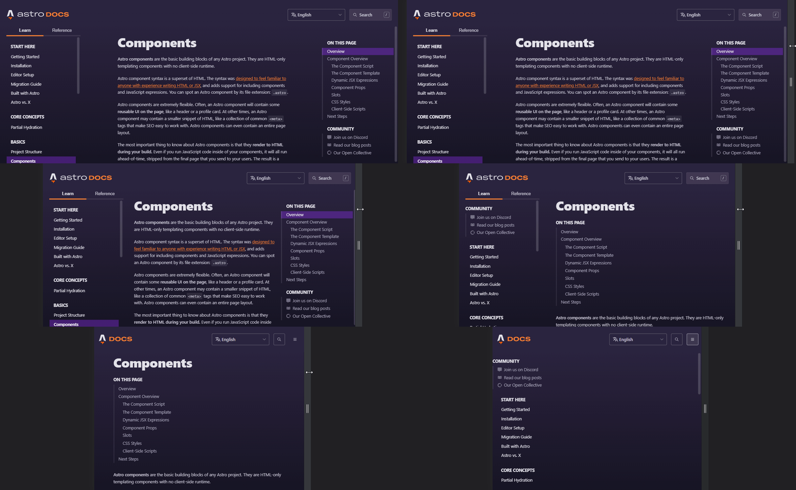
Just an update: I did manage to make CommunityMenu part of LeftSidebar when RightSidebar is invisible, the only thing left is to apply the right styles according to the viewport (And that's the part where I'm having a hard time, being unable to join the pieces in my mind on how to apply each style... 😅)

Here's the progress:
xq3z1TL

@sarah11918
Copy link
Copy Markdown
Member

I'm loving it!

We'll get some feedback whether it makes more sense to have community up top when it's on the Left or in the hamburger menu, or whether it should come after the page nav items. But, the general idea of moving like that is 🔥 !

@yanthomasdev
Copy link
Copy Markdown
Member Author

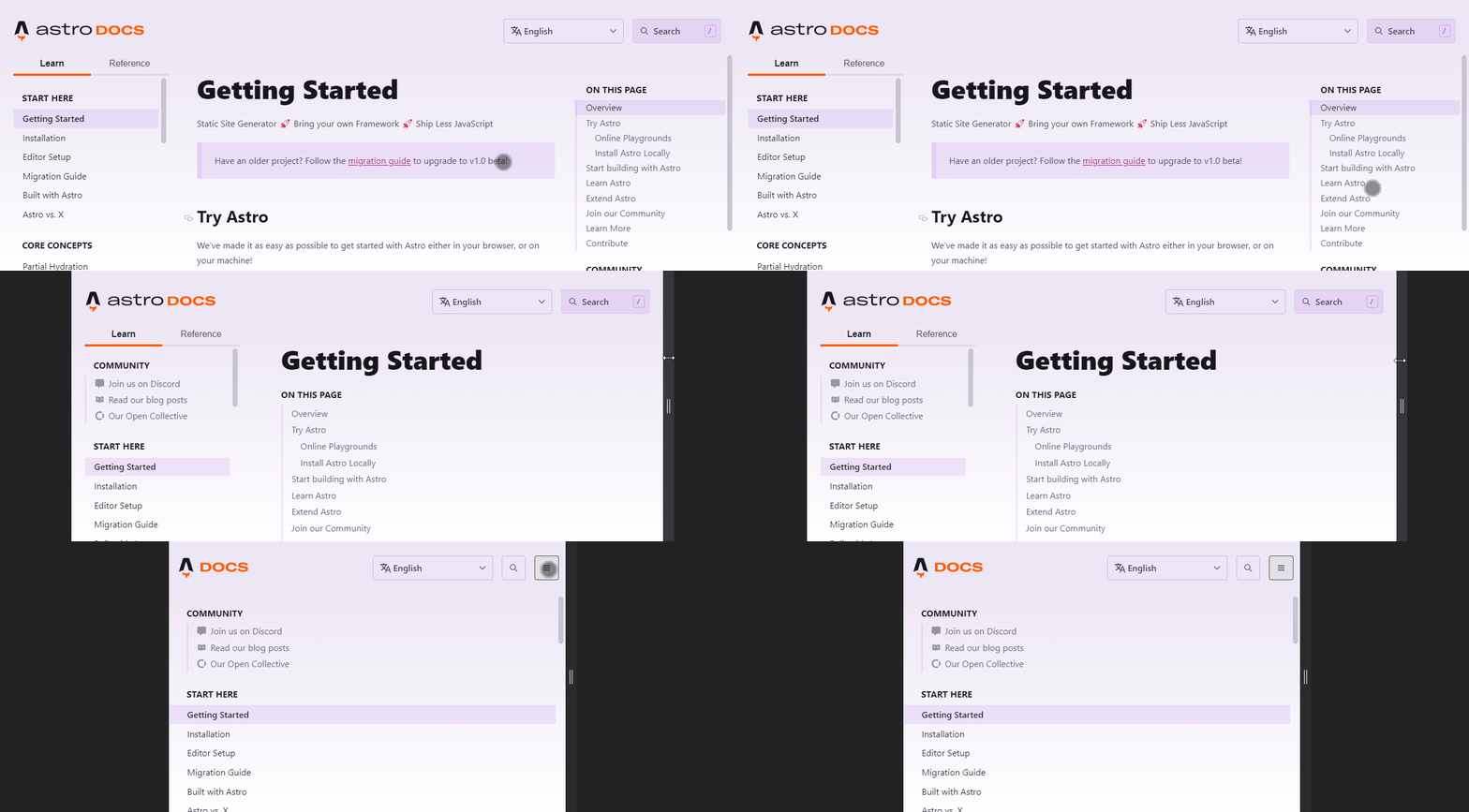
New gif with proper styles for each viewport:
W70tlIs

@delucis
Copy link
Copy Markdown
Member

delucis commented Jun 2, 2022

Hi @yan-thomas sorry for only getting to this now! (But I hear you recently completed a lot of work on… something… 🤔)

Are you still struggling as you mentioned above? Or is this figured out?

Visually I think this looks good, but I’m not sure about the order. I think it would make sense for Community to always be last in the sidebar (either on the left or right). Not because the Astro community comes last — 😬 — but because this section is a bit different, pointing to external sites.

So on the left you have Start Here, Core Concepts, Basics, etc. … Community
And on the right you have On this page, Contribute, Community

What do you think? Also, if the switching between left and right seems overly complex, we could also consider just having this always as part of the left sidebar and keep the right sidebar page-focused (including moving “Astro Docs on GitHub” to the community section).

@yanthomasdev
Copy link
Copy Markdown
Member Author

Are you still struggling as you mentioned above? Or is this figured out?

I figured it out, I had to do a little hack using :global() for CommunityMenu to be visible on different sidebars according to certain viewports though, so maybe there is an easier solution?

What do you think? Also, if the switching between left and right seems overly complex, we could also consider just having this always as part of the left sidebar and keep the right sidebar page-focused (including moving “Astro Docs on GitHub” to the community section).

Makes sense to me. I personally don't have a strong opinion on whether it should come first/last, so maybe we should gather others' opinion about this? It is pretty easy to change the order of what comes first/last in the sidebars, so I can show each possible order variation here.

@delucis
Copy link
Copy Markdown
Member

delucis commented Jun 2, 2022

Thanks @yan-thomas!

@sarah11918 What do you reckon? Community section to be last in the sidebars instead of first on the left / middle on the right like in the GIF above?

Comment thread src/components/LeftSidebar/LeftSidebar.astro Outdated
@sarah11918
Copy link
Copy Markdown
Member

@delucis @yan-thomas Yes, that was going to be my note: community should come AFTER any kind of table of contents (sitewide, or on this page)!

I am happy to leave the particulars of the stylings up to the two of you, if you want to move more quickly on that. BUT, strongly agree that if people are looking to navigate, they're going to want CONTENT first! 💜

@yanthomasdev
Copy link
Copy Markdown
Member Author

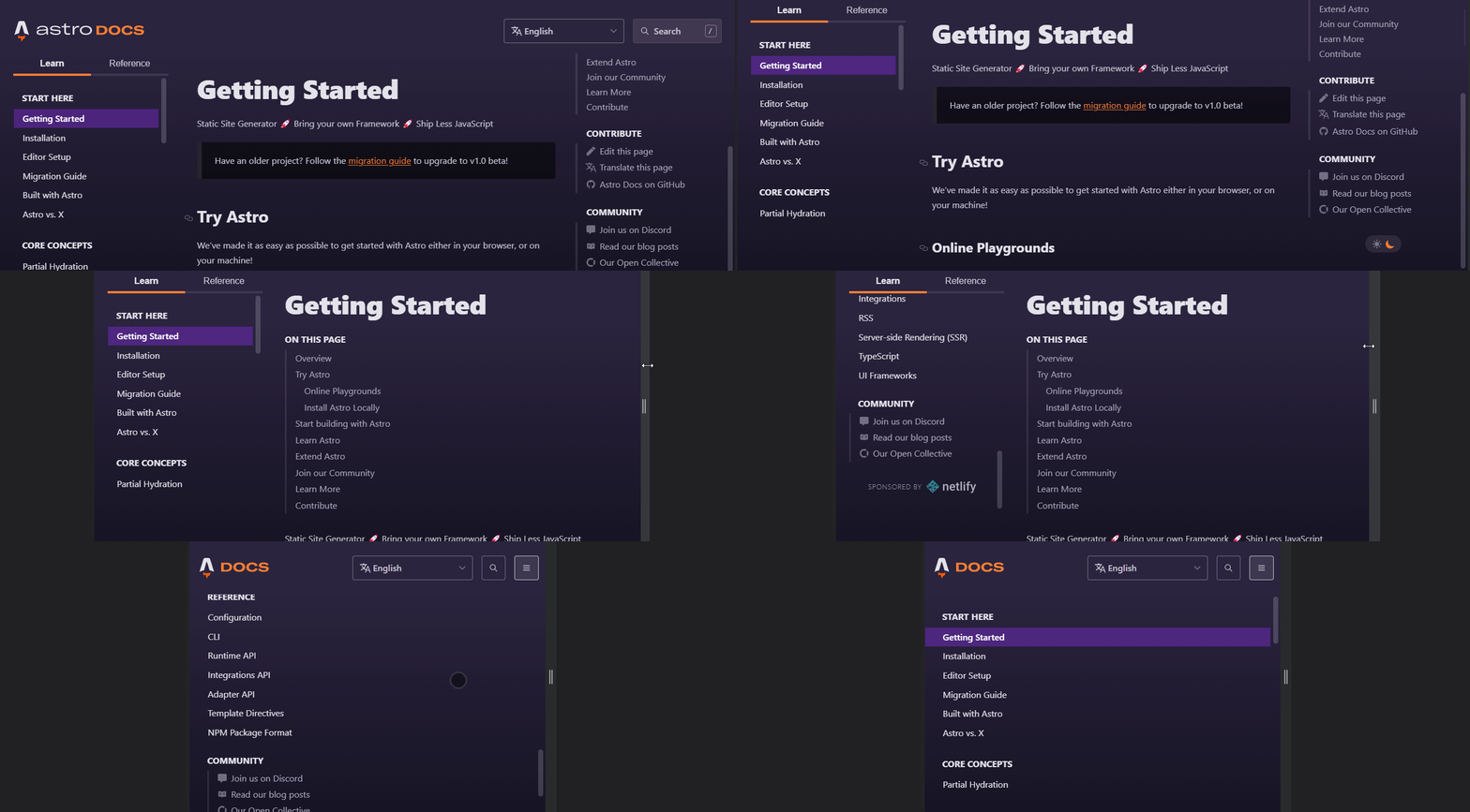
Here is the current version. Let me know if there's anything else we can improve!
WyhuKAx

@delucis
Copy link
Copy Markdown
Member

delucis commented Jun 3, 2022

Nice! I’ll see if I can move that style to CommunityMenu.astro but otherwise this looks great! Thanks Yan!

@sarah11918
Copy link
Copy Markdown
Member

LGTM! 💜

Sign up for free to join this conversation on GitHub. Already have an account? Sign in to comment

Labels

site improvement Some thing that improves the website functionality - ask @delucis for help!

Projects

None yet

Development

Successfully merging this pull request may close these issues.

3 participants