New medkit + briefcase sprites #20547
Conversation
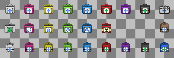
New medkit icons, similar to Bee but adapted to the weird array of medkits Yogs has (adapted). Also adds new briefcases.
|
weird question marks? if they aren't in game then why were they sprited? |
|
Those will be added in the future, they dont spawn in game + if they are already in the dmi file, less trouble
…On Fri, 6 Oct 2023, 15:15 Manatee, ***@***.***> wrote:
weird question marks?
—
Reply to this email directly, view it on GitHub
<#20547 (comment)>,
or unsubscribe
<https://github.com/notifications/unsubscribe-auth/A2EX7OUSTNJGYKEITLVMFH3X5775LAVCNFSM6AAAAAA5U3VGKCVHI2DSMVQWIX3LMV43OSLTON2WKQ3PNVWWK3TUHMYTONJQGY3DINJQHA>
.
You are receiving this because you authored the thread.Message ID:
***@***.***>
|
|
Over-designed does not mean better. |
I'd not say they are 'overdesigned', it's just a medkit that looks forward and not to the horizon. I do need to change the colouring though which I'm on it |
|
My issue is more so colour, why is brute sorta pinkish and burn yellow? |
brute kits are pink and burn kits are yellow in game currently. |
|
not a big fan of the color or the shape to be honest briefcase sprites are good though |
But they arent that shade of pink or yellow |
|
Colors will be changed, the shape though is that of a medkit, not sure whats the issue with it |
 cuackles
left a comment
cuackles
left a comment
There was a problem hiding this comment.

could you clean up the black line on the bottom so it doesnt look out of place
Lighter colors (more loyal to original ones), removes bottom line from hypokits.
…station into new-medkit-sprites
Minor tweaks, nothing else
|
Updated image: |

General kit has a darker outline, brute kit is even more pink now.
i definitely prefer the colours they sorta pop more, similar to how they used to be |
|
Not sure how much say I have here, but these sprites feel very out of place compared to the rest of the yogs artstyle. They aren't bad, but I very much prefer the ones we have right now over these ones. If you want to replace the medkits cause they're old, a more fitting design would be better. |
 ToasterBiome
left a comment
ToasterBiome
left a comment
There was a problem hiding this comment.
- I like the direction of the burn color, but I think it needs to be more gold, similar to how the originals looked.
- I like the updated oxygen colors, but again I think they need to be closer to the original color (as in the shitty sprites). I think you can make a nicer palette while starting with those two base colors.
Done as requested, made handle line a bit brighter on all medkits
Adds the alternative o2 kit to the file. Hopefully I didn't mess it up...
ToasterBiome
left a comment
There was a problem hiding this comment.
the medbriefcase and normal briefcase look not very good, for at least the normal briefcase can you make it look more like the original one in design?
Briefcase reverted to original design, darker outlines for most medkits.
This reverts commit 902740a.
Darker outlines for all medkits, readds the o2firstaid medkit sprite (dunno what happened), reverts briefcase design to old one.
Document the changes in your pull request
Resprites medkits and briefcases to have a more frontal vision.
I will be making some changes on color/lighting/whatever cuackles and biome force me to change from time to time. I kinda made 'em in a rush as well
Heavily inspired by Bee's boxkits! (except the suitcases, those are yogriginal™)
Why is this good for the game?
45 degree sprites are ancient, those sprites are smoother and look like futuristic medkits I believe. And why not!
Spriting
The ones marked aren't in-game AFAIK
Changelog
🆑 Time_URSS
imageadd: New medkit + briefcase sprites
/:cl: