Implement ReadTheDocs theme#2399
Conversation
Codecov Report
@@           Coverage Diff            @@
##           develop    #2399   +/-   ##
========================================
  Coverage    89.98%   89.98%
========================================
  Files          176      176
  Lines        22055    22055
  Branches      2896     2896
========================================
  Hits         19846    19846
  Misses        1612     1612
  Partials       597      597
Continue to review full report at Codecov.
|

|
After the second commit. Homepage
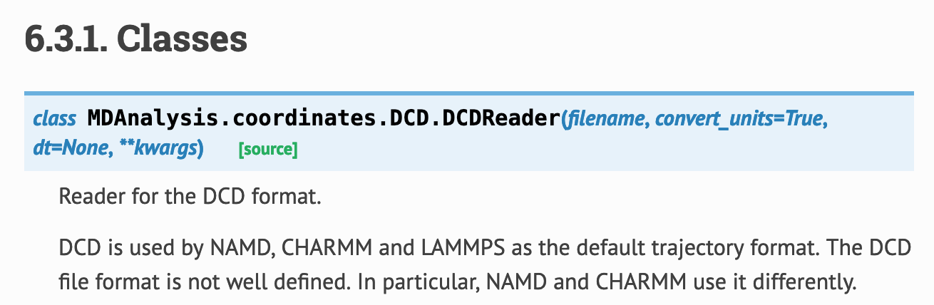
Class API
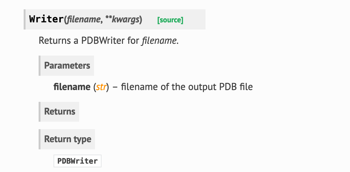
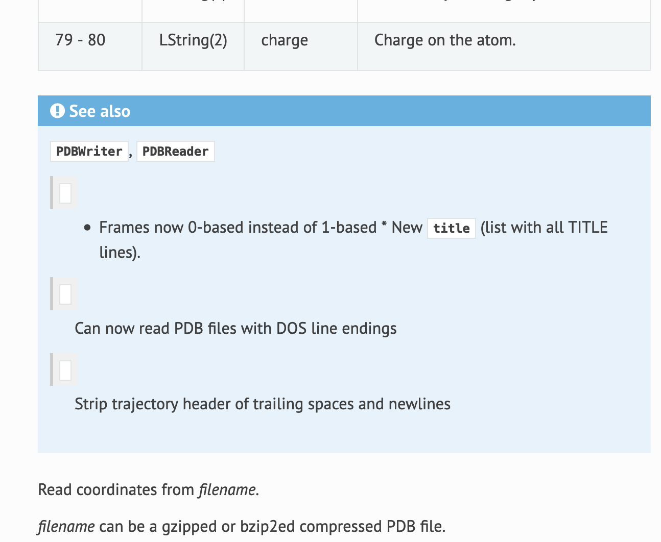
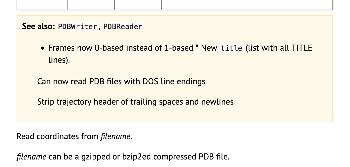
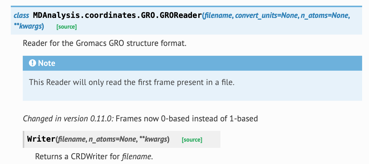
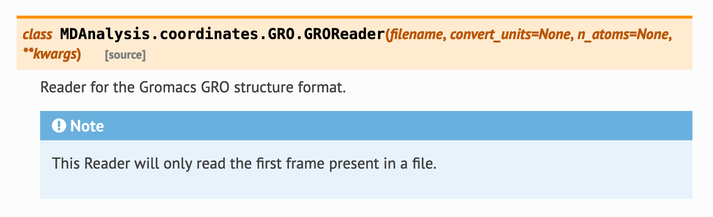
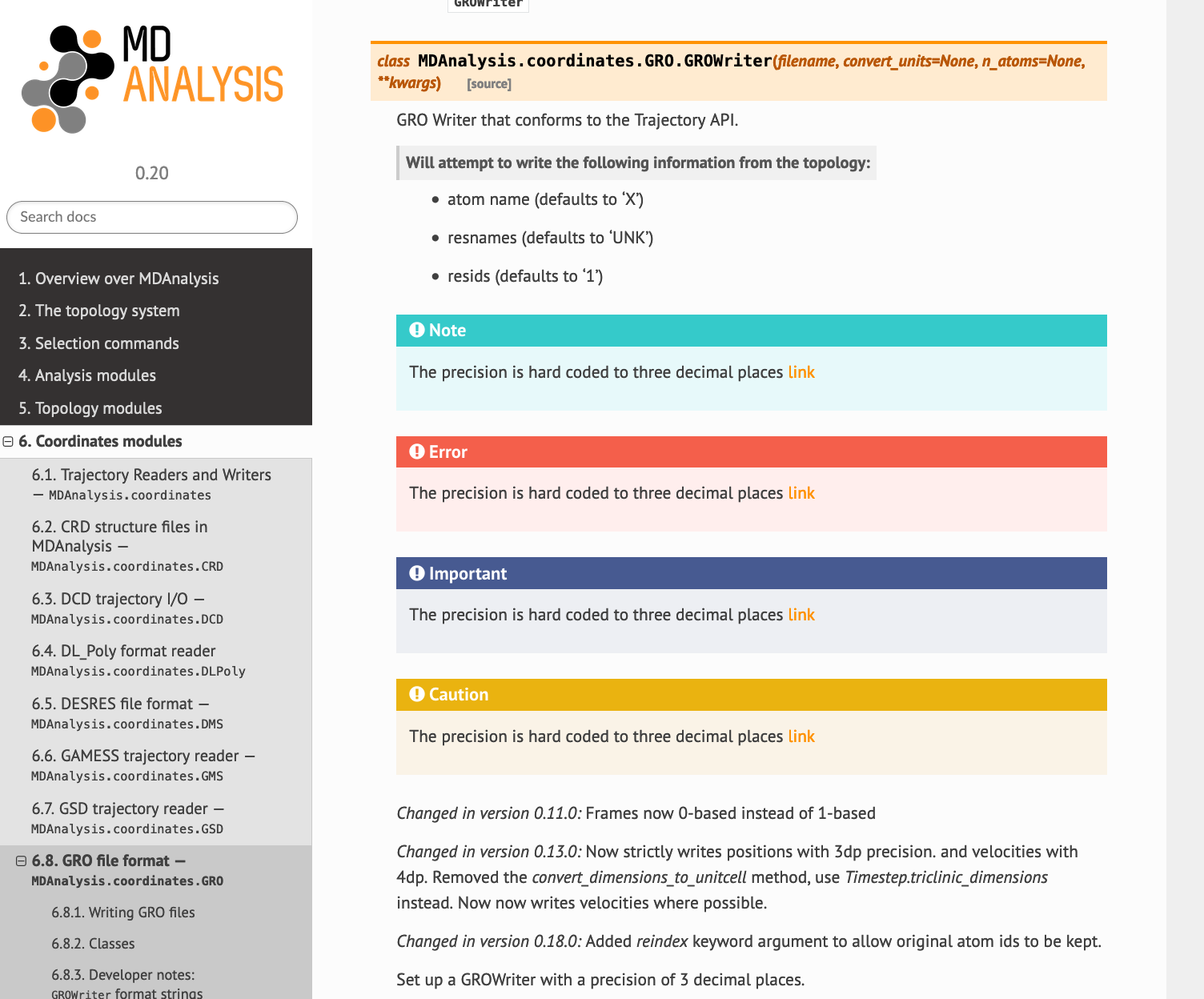
Some changes to docs need to be made to display properly. e.g. here is PDBReader in ReadTheDocs: The grey boxes are `..versionchanged`` directives. They're not displaying properly because RTD/Sphinx thinks they're in the See Also box. (This didn't display properly in alabaster either).
Other than the layout, I haven't changed the default colours of RTD. Class boxes are blue, parameters etc. are grey.
Returns and Return type are separate, a bit weird.
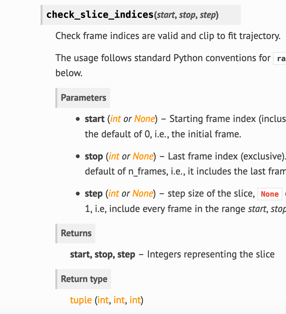
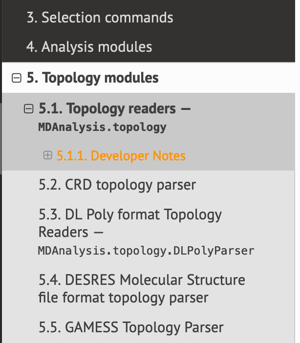
Sidebar
The orange links do not look good on lighter colours. Solutions: don't highlight them orange, or have different oranges for each background. Warning/important/caution boxes etcThese have been left as default colours.
|
|
IMHO this already looks much nicer than what we currently have!
I don't have any readability issues on any of my displays.
This is because for some (unknown?) reason, the
A matter of taste, I'd say... would be nicer though if this conformed to the way input parameters are listed. |
I did have a massive headache when building it, but the contrast is still a bit low with bright orange on a coloured background. Darker orange may work better if MDAnalysis is ok with adding to its colour scheme
I think that's only when the boxes are defined with underlines instead of the
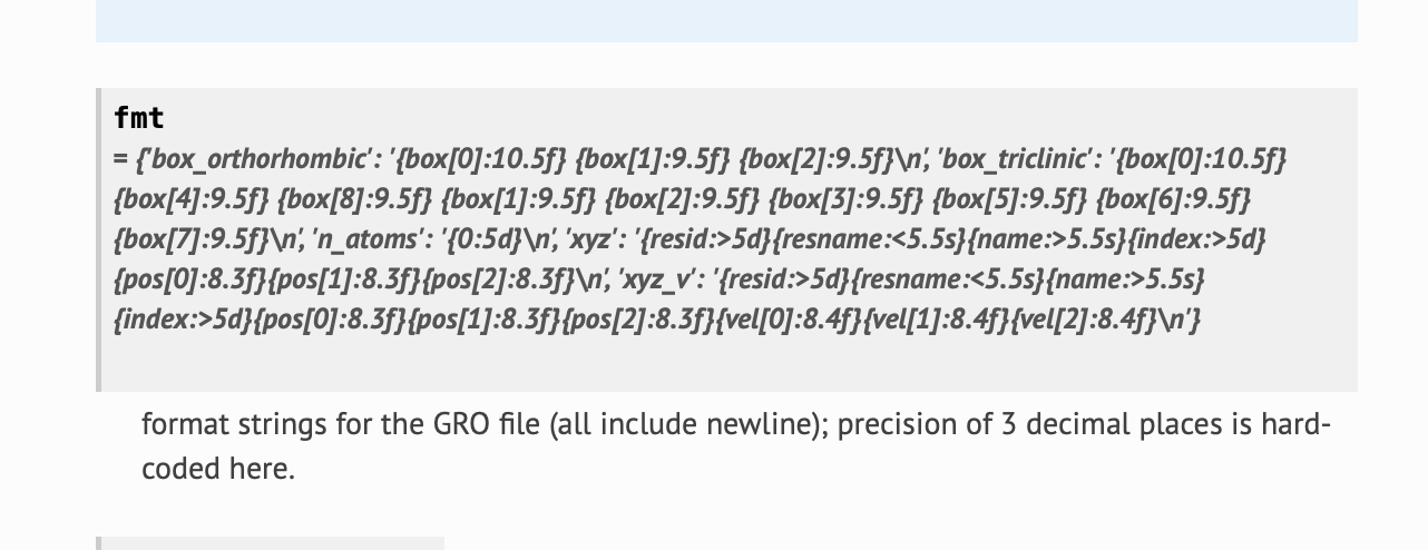
mdanalysis/package/MDAnalysis/coordinates/GRO.py Lines 167 to 175 in e110108 |

|
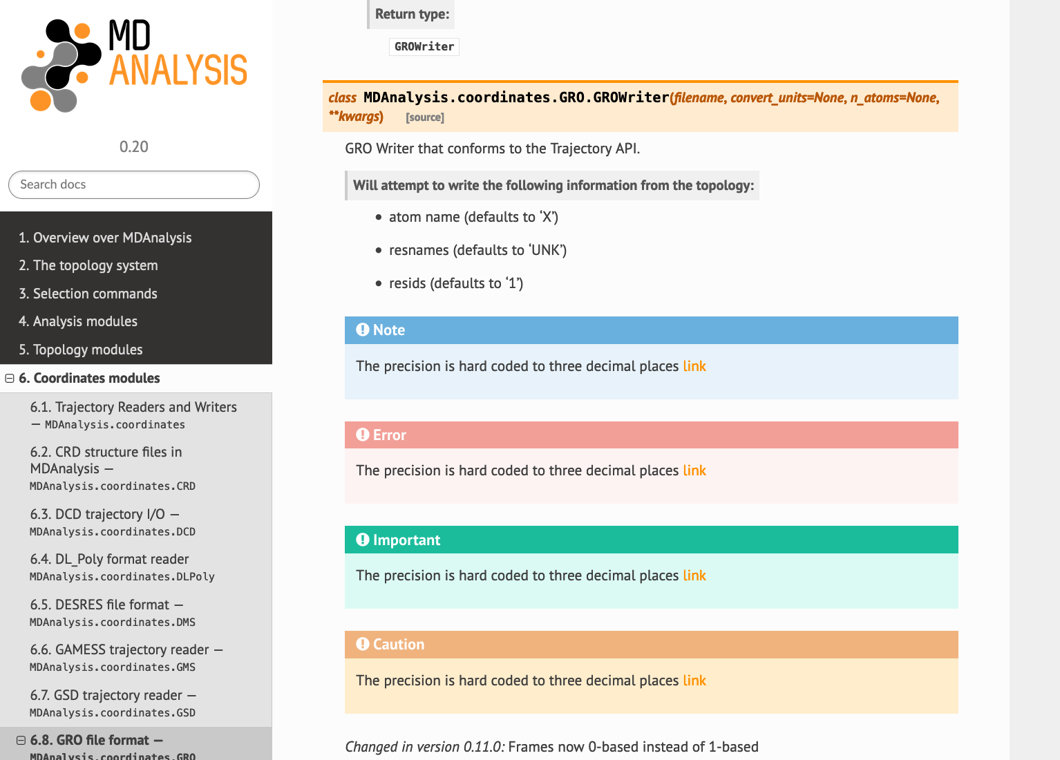
More on GROWriter -- this shows up... poorly... (using mdanalysis/package/MDAnalysis/coordinates/GRO.py Lines 292 to 302 in e110108 ReadTheDocs
Alabaster
|
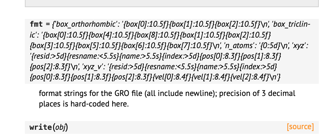
I somehow doubt that this should show up in the docs... I'd definitely prefer a link to the GROMACS gro specs here. |
We have been using I don't mind constant values showing up in the developer docs; I think the link to the GRO format is elsewhere (but could be repeated there). |
|
The |
Yes, but that's been like this before so I wouldn't say that this has to be changed in this PR – a nice-to-have for the future. |
Can we make the class boxes one of the standard MDA colors (orange, dark gray, black) ? – The blue does not look good in the page. Changing the blue in the class (and function?) headers to something in the scheme is my main critique – everything else is "nice to have". I'd also prefer a different color for the Notes boxes but the blue does highlight them. (Not a big fan of the green for Hint/Important either – but I think we barely use them anyway.) @lilyminium if you want to extend the color palette then please go for it! |
|
Sure, having hard-coded constants in the docs is certainly beneficial. The formatting just happens to look ugly as sin 😉
…On November 12, 2019 12:41:32 AM GMT+01:00, Oliver Beckstein ***@***.***> wrote:
> Anyway, good to know that Sphinx interprets #: like that!
We have been using `#:` throughout to document attributes and
module-level data, e.g.
https://www.mdanalysis.org/docs/documentation_pages/units.html#data
I don't mind constant values showing up in the developer docs; I think
the link to the GRO format is elsewhere (but could be repeated there).
--
You are receiving this because you commented.
Reply to this email directly or view it on GitHub:
#2399 (comment)
|
|
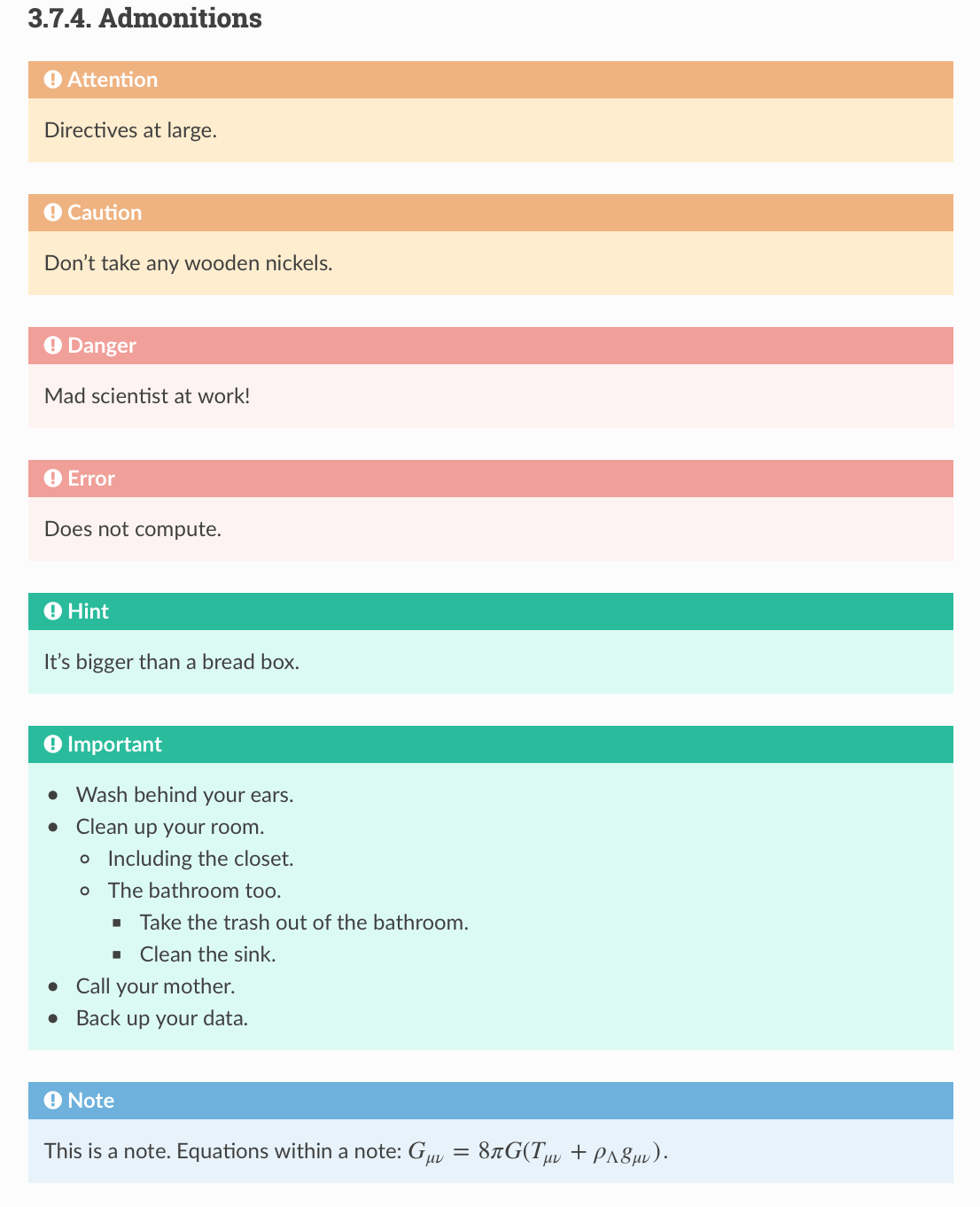
Just removing the sphinx Orange class boxes + (default) blue note box: Other possible colours:
Edit: swapping note vs important might be more in line with how much attention should be paid to each. Standard to compare:
|
I think it's more practical to keep the Maybe we can do something about the unappealing formatting later. |
|
I built this PR at https://lilyminium.github.io/mdanalysis/ for more convenient viewing. |
|
Great, thank you so much! |
|
When you have settled on the color scheme (and any other identity/branding choices that you make), could you please document it (e.g., wiki page and in the conf file) so that it is easy to use it elsewhere (namely, the home page)? |
|
The definition list in https://lilyminium.github.io/mdanalysis/documentation_pages/selections.html#simple-selections contains baby-blue highlights – I'd use the same orange as for class definitions. |
There was a problem hiding this comment.
This is a massive improvement – thanks.
My primary issue is with keeping the look and feel consistent, which boils down to the color scheme. I feel that the primary colors should remain orange, black, gray, white. (variations are fine) Red for warnings is good.
What I don't like yet are the blue or aqua boxes for
- See Also (eg https://lilyminium.github.io/mdanalysis/documentation_pages/analysis/align.html)
- definition lists (eg https://lilyminium.github.io/mdanalysis/documentation_pages/selections.html#simple-selections)
- functions (eg https://lilyminium.github.io/mdanalysis/documentation_pages/selections_modules.html#MDAnalysis.selections.get_writer)
- GUI elements (e.g. "Selections:Singlewords" in https://lilyminium.github.io/mdanalysis/documentation_pages/selections/vmd.html)
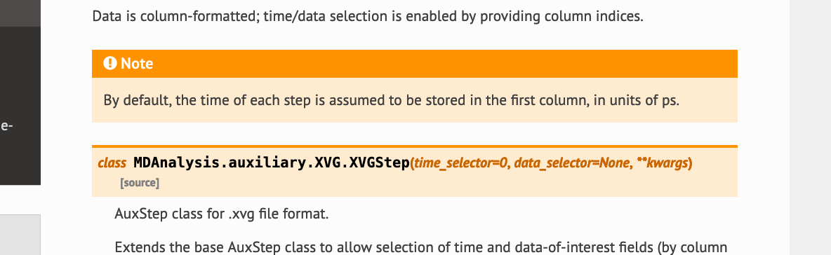
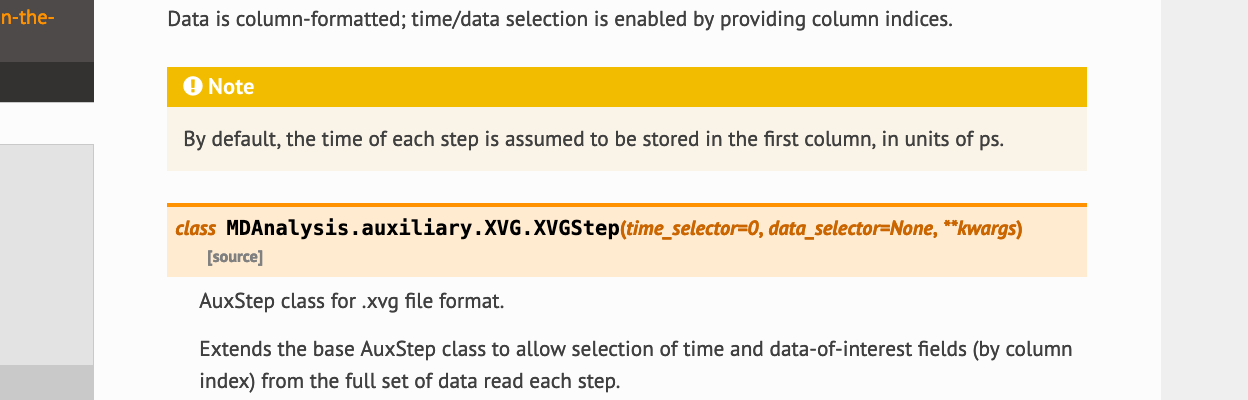
- Notes (eg https://lilyminium.github.io/mdanalysis/documentation_pages/auxiliary/XVG.html) – compare to the simple gray boxes in https://www.mdanalysis.org/mdanalysis/documentation_pages/auxiliary/XVG.html
- Important (example in PR)
Personally, I don't need so many different colors for notes/hints – just gray would do it for me. For the functions and definitions I would default to the orange used for classes (although one can make the point that we shouldn't over-use the "brand" color orange for everything). SeeAlso could be a light orange or yellow-ish.
Bottomline: I am open to colors that fit into the original scheme but I don't feel that blue/green/purple fit as they are complementary colors to orange-ish (in RYB) - see https://www.sessions.edu/color-calculator/ or https://color.adobe.com/create (more tools in (2)) – I'd more go for analogous colors although from what I'm reading (1) (2), picking two complementary colors to the primary or dominant color (orange for MDA) is what is often done for website themes. (I just don't feel it looks good here.)
Red as the exception for warnings is good, though.
Bottom-bottom line: I'll be ok with pretty much anything that doesn't include green/blue :-) (even though I really like those colors in other contexts).
Fair enough, the variety of boxes seemed to warrant lots of colours but it looks like you mostly use Notes and See Also.
See Also, Caution, and Important have been changed to yellow.
Functions are orange to match classes
These are now grey
These are also grey. Warnings/errors are still red.
I actually took the colours away here and made them bold. |
There was a problem hiding this comment.
I like the reorangenation.
When I look at https://lilyminium.github.io/mdanalysis/documentation_pages/auxiliary/XVG.html I feel that we should swap the colors for Notes and SeeAlso: Make the Note "ALARM!
yellow orange" and the SeeAlso "also-nice gray", please. In this way, the level of attention is drawn more to the Note (which are typically important).
EDIT: Based on discussion below: use orange for Notes.
Thanks!!
|
Orange might actually look nicer (the original RTD theme had note boxes and class boxes the same as well, I think). Thoughts?
|
I second that. |
|
Ok
… Am 13.11.2019 um 22:41 schrieb Johannes Zeman ***@***.***>:
Orange might actually look nicer
I second that.
—
You are receiving this because you commented.
Reply to this email directly, view it on GitHub, or unsubscribe.
|
|
Very nice work @lilyminium – any last minute changes that you want to get in? Otherwise this can be merged anytime. |
|
Btw, are you going to back-port the color changes (e.g. notes) to the UserGuide style, too? |
|
@orbeckst I will update the UserGuide to this, yes. No last minute changes I can think of! |
Fixes #2397
Changes made in this Pull Request:
PR Checklist