Conversation
|
Hi @ang-zeyu, seems like there's a problem with netlify preview that might need your help to configure on the netlify deployment page
|
|
Thanks for letting me know, https://deploy-preview-2038--markbind-master.netlify.app/ should work now. I sent you and @jonahtanjz an invite email as well in case. |
 jonahtanjz
left a comment
jonahtanjz
left a comment
jonahtanjz
left a comment
There was a problem hiding this comment.
Thanks @petermonky for tackling this issue 👍
Just one concern that I've commented on.
| <slot name="button"> | ||
| <a | ||
| class="dropdown-toggle" | ||
| class="dropdown-toggle nav-link" |
There was a problem hiding this comment.
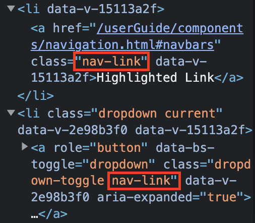
This component is also used by the navbar to create dropdowns.
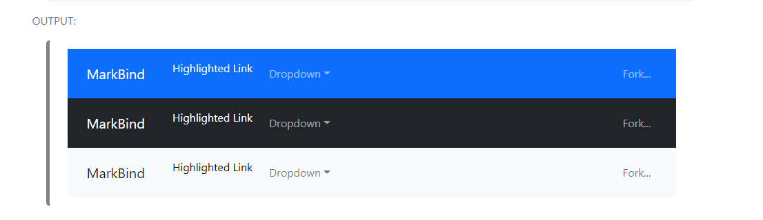
As dropdown component in navbar already has nav-link class, the padding is applied here twice.
Notice how the links are no longer aligned on the navbar due to having extra paddings.
The relevant code:
<navbar type="primary">
  <!-- Brand as slot -->
  <a slot="brand" href="/" title="Home" class="navbar-brand">MarkBind</a>
  <li><a href="/userGuide/components/navigation.html#navbars" class="nav-link">Highlighted Link</a></li>
  <!-- You can use dropdown component -->
  <dropdown header="Dropdown" class="nav-link">
    <li><a href="#navbars" class="dropdown-item">Option</a></li>
  </dropdown>
  <!-- For right positioning use slot -->
  <li slot="right">
    <a href="https://github.com/MarkBind/markbind" target="_blank" class="nav-link">Fork...</a>
  </li>
</navbar>There was a problem hiding this comment.
ahhh yes this is an issue, let me see if I can find a workaround for this 👍
There was a problem hiding this comment.
hi @jonahtanjz, I think it is okay to simply remove the nav-link classname from the dropdown element to remove the extra padding. i.e.
<navbar type="primary">
  <!-- Brand as slot -->
  <a slot="brand" href="/" title="Home" class="navbar-brand">MarkBind</a>
  <li><a href="/userGuide/components/navigation.html#navbars" class="nav-link">Highlighted Link</a></li>
  <!-- You can use dropdown component -->
  <dropdown header="Dropdown"> <!-- class="nav-link" removed -->
    <li><a href="#navbars" class="dropdown-item">Option</a></li>
  </dropdown>
  <!-- For right positioning use slot -->
  <li slot="right">
    <a href="https://github.com/MarkBind/markbind" target="_blank" class="nav-link">Fork...</a>
  </li>
</navbar>
the dropdown element element already wraps its anchor element with a nav-link anyway so I think the outer nav-link is safe to remove. I think this way the navbar elements would also be more consistent as the classname is only applied to the anchor elements within the navbar elements, dropdown or not:
I noticed that this would also affect the text colour of the anchor element and have accounted for it with another commit.
does this fix work, or is there a better approach?
There was a problem hiding this comment.
I think this approach is fine but one main concern is that currently, most of the MarkBind sites will have the nav-link class in the dropdown component. If we go with this approach, users will have to remove the class on their end in the next release, which will be considered sort of a "breaking" change in the UI.
One workaround that you can do for now is to have an overriding CSS within Dropdown.vue to remove the padding from nav-link on the outer <li> element. This should ensure that there will not be extra padding with or without the nav-link class on the dropdown component. Once we are ready to make a release with breaking changes, we can then remove this workaround.
Note: You will need to update the user guide as well under navbar to remove the class.
There was a problem hiding this comment.
I'm not sure if removing the nav-link class is the best way to go. Because that means that it won't use the bootstrap styling anymore and may not be consistent with the other elements that use the Bootstrap styling.
Should I still proceed to remove it anyway? @jonahtanjz
There was a problem hiding this comment.
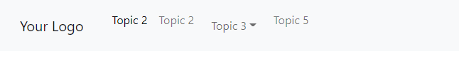
This is how tabs look like with the removal of the nav-link class from dropdown looks. Some styling can obviously be done but not sure it will be better than using the in built bootstrap
|
Hi @petermonky, checking if you are still keen to implement the last few comments/fixes as requested? |
|
Hi @MarkBind/contributors, please feel free to lend a hand here if possible to help continue the work by OP. |
5 participants
What is the purpose of this pull request?
Resolves #2037
Overview of changes:
Adjusts size of tabgroup buttons in tabset to match that of non-tabgroup buttons.
Anything you'd like to highlight/discuss:
nil
Testing instructions:
Confirm clickable region by hovering over tabgroup and non-tabgroup buttons in rendered page.
Proposed commit message: (wrap lines at 72 characters)
Unify tabset sizing across tabgroup and non-tabgroup buttons
Checklist: ☑️