🐛 Bug Report
The useDatePicker component and RangeCalendar use colors to indicate selected, unavailable, restricted, and spanning dates. There is a two-fold risk/bug here:
- When Windows High Contrast Mode / Contrast Themes / forced-colors mode is activated, the colors are all lost;
- This is a potential WCAG Success Criterion 1.4.1 Use of Color failure.
I encountered this in two date picker controls, which appear to be related:
🤔 Expected Behavior
When I switch into High Contrast Mode, the operating system assigns pre-defined system colors to certain types of content. Buttons get a specific border color, links get a specific link color, and so on. If the native controls are used (so <button> versus <div role="button">, for example). Custom styles such as background colors, shadows, and even gradients will go away.
However, the interface should still make it possible for me to visually distinguish the different states of a control. I should be able to visually identify each state while in High Contrast Mode.
😯 Current Behavior
All dates are exposed as white text on black (or system color text on system color background), as expected. But no icons, marks, shapes, or other indicators are added to compensate for the loss of color.
Here is the useDatePicker calendar showing disabled, unavailable, available and selected days using red, gray, white, and blue:
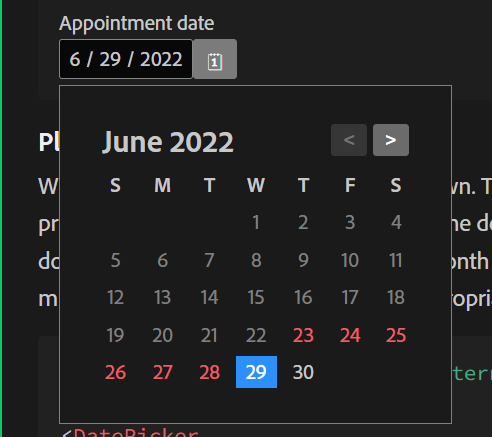
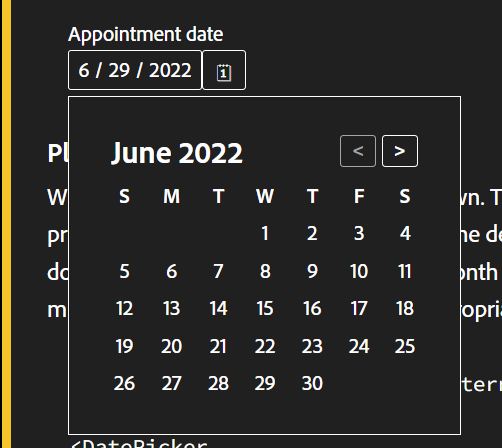
Here is the useDatePicker calendar with Windows 11 Contrast Themes active demonstrating how the disabled, unavailable, available and selected days use white (default) for all:
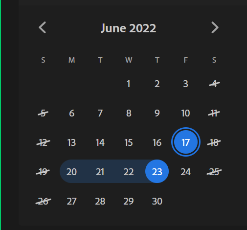
Here is the RangeCalendar showing available, weekend and the selected start, selected end, and spanning day using light gray, light gray with a slash, blue with a ring, blue, and subdued blue:
Here is the RangeCalendar demonstrating how the available, weekend and the selected start, selected end, and spanning days use white (default) text, with a black slash for weekends:
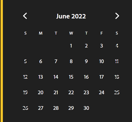
In those screen shots, the second image of each pair is in exactly the same state as the first — same selection, same everything.
I cannot visually tell which is available, which is selected, and so on.
💁 Possible Solution
Use methods other than solely color. Icons, shapes, borders, etc. can help and potentially satisfy the WCAG concern as well.
Do not rely on forced-color-adjust, partially because of support and partially because people who rely on WHCM can be adversely affected by the colors you might force.
🔦 Context
If I want to use this in a context where WCAG conformance is a requirement, this bug prevents it.
If I want to support any users of WHCM, they will be unable to use this control, so I cannot use it nor recommend it.
Sadly, I encounter this gap frequently. As a result, I have reference material linked from this post: WHCM and System Colors
🌍 Your Environment
| Software |
Version(s) |
| react-spectrum |
3.0.0 |
| Browser |
Chrome 102, Edge 102, Firefox 101 |
| Operating System |
Windows 10/11 |

🐛 Bug Report
The useDatePicker component and RangeCalendar use colors to indicate selected, unavailable, restricted, and spanning dates. There is a two-fold risk/bug here:
I encountered this in two date picker controls, which appear to be related:
https://react-spectrum.adobe.com/react-aria/useDatePicker.html#unavailable-dates
https://react-spectrum.adobe.com/react-spectrum/RangeCalendar.html
🤔 Expected Behavior
When I switch into High Contrast Mode, the operating system assigns pre-defined system colors to certain types of content. Buttons get a specific border color, links get a specific link color, and so on. If the native controls are used (so
<button>versus<div role="button">, for example). Custom styles such as background colors, shadows, and even gradients will go away.However, the interface should still make it possible for me to visually distinguish the different states of a control. I should be able to visually identify each state while in High Contrast Mode.
😯 Current Behavior
All dates are exposed as white text on black (or system color text on system color background), as expected. But no icons, marks, shapes, or other indicators are added to compensate for the loss of color.
Here is the useDatePicker calendar showing disabled, unavailable, available and selected days using red, gray, white, and blue:

Here is the useDatePicker calendar with Windows 11 Contrast Themes active demonstrating how the disabled, unavailable, available and selected days use white (default) for all:

Here is the RangeCalendar showing available, weekend and the selected start, selected end, and spanning day using light gray, light gray with a slash, blue with a ring, blue, and subdued blue:

Here is the RangeCalendar demonstrating how the available, weekend and the selected start, selected end, and spanning days use white (default) text, with a black slash for weekends:

In those screen shots, the second image of each pair is in exactly the same state as the first — same selection, same everything.
I cannot visually tell which is available, which is selected, and so on.
💁 Possible Solution
Use methods other than solely color. Icons, shapes, borders, etc. can help and potentially satisfy the WCAG concern as well.
Do not rely on
forced-color-adjust, partially because of support and partially because people who rely on WHCM can be adversely affected by the colors you might force.🔦 Context
If I want to use this in a context where WCAG conformance is a requirement, this bug prevents it.
If I want to support any users of WHCM, they will be unable to use this control, so I cannot use it nor recommend it.
Sadly, I encounter this gap frequently. As a result, I have reference material linked from this post: WHCM and System Colors
🌍 Your Environment