Introduce PeersIndicator component - An alternative design#128
Conversation
f0cd0e6 to
f00b1ef
Compare
|
Add blinking when no connection established yet. |
 jarolrod
left a comment
jarolrod
left a comment
There was a problem hiding this comment.
I prefer #127, but maybe this just needs a designers touch :)
ping: @GBKS @mouxdesign
 shaavan
left a comment
shaavan
left a comment
There was a problem hiding this comment.
I would agree with @jarolrod here,
Though this design style is synonym with the network strength a device is getting; I don't feel it suits very well according to our overall design system, at least not in the form it currently is.
Nonetheless, it is an interesting design choice, and I would love to hear @GBKS take on this.
|
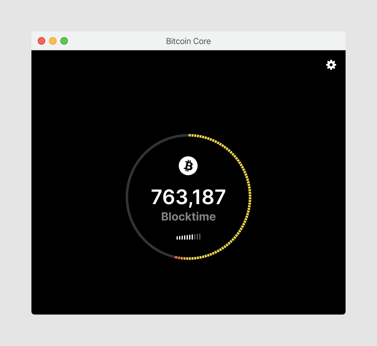
I think it could this style could work as well. Best to judge it in context of the full design, so I mocked it up here real quick (so much for getting my mind off of bitcoin over the vacation).
On a general note, 5 bars (or dots) feels easier to parse than 10 bars (or dots) both visually (have to look more closely to identify the amount of white bars when there are 10) and logically (what is the difference to me as a user between 6 and 7 bars?). |
|
Very much like the indicator idea provided by @GBKS as it fits in very well with the current design elements. Indeed 5 bars to show load time would perhaps indeed show better visually as well as being more accessible with users with visual limitations. Might be interesting to see how Christophs design looks with the bitcoin logo in orange and the loading bars in orange as well. Just an idea! For the wording itself..I'm just wondering if words like "your connection" or "network connection" may be an idea as well. |
|
This was closed because design suggestions are not to be made in this repo. To suggest a change to the design, an issue should be opened up here: https://github.com/BitcoinDesign/Bitcoin-Core-App/issues Discussion on this will be moved to: BitcoinDesign/Bitcoin-Core-App#21 |
Sorry, couldn't resist :)
Additional design feature: