[WIP] Implement onboarding workflow#43
Conversation
|
cc @Bosch-0 |
 promag
left a comment
promag
left a comment
There was a problem hiding this comment.
Pushed my suggestions to https://github.com/promag/gui-qml/tree/qml-43. See
Screen.Recording.2021-10-03.at.15.14.27.mov
@Bosch-0 @GBKS In regards to this video: Shouldn't the windows have a minimum size, and minimum amount of padding? |
Definitely, this is just to show that layouts are superior to anchors. |
|
@promag oh right, sorry! |
|
Co-authored-by: bosch <bosch5@pm.me>
21c9692 to
7fc49d7
Compare
| } | ||
|
|
||
| Button { | ||
| id: startButton |
| color: "black" | ||
| } | ||
|
|
||
| ColumnLayout { |
There was a problem hiding this comment.
It won't work. See https://doc.qt.io/qt-5/qml-qtquick-controls2-pane.html#content-sizing.
| } | ||
|
|
||
| ColumnLayout { | ||
| anchors.centerIn: parent |
There was a problem hiding this comment.
Not needed. If you want this vertically aligned while ensuring minimum height then do this:
contentItem: ColumnLayout {
    Item {
        Layout.fillHeight: true
    }
    // ... items here
    Item {
        Layout.fillHeight: true
    }
}
Same concept as https://doc.qt.io/qt-5/qspaceritem.html
| import QtQuick.Layouts 1.12 | ||
|
|
||
| Pane { | ||
| background: Rectangle { |
There was a problem hiding this comment.
Not needed? The window background is already black. To improve rendering time make background: null
There was a problem hiding this comment.
To improve rendering time make
background: null
Is it documented? (I failed to find out)
There was a problem hiding this comment.
Documentation for null or for rendering improvement?
There was a problem hiding this comment.
Documentation for null or for rendering improvement?
The former.
|
|
||
| Image { | ||
| Layout.alignment: Qt.AlignCenter | ||
| source: "image://images/app" |
There was a problem hiding this comment.
making a note that @Bosch-0 has a proposal for a new icon. It needs to be discussed at greater length with the community; if there is consensus we should use it: bitcoin-core/gui#199
There was a problem hiding this comment.
It's not just a new icon, there is also some changes to the watermark and thus overall logo. See this file for details: https://www.figma.com/file/c1V7b23n0LqRbVJlUkE1mn/Bitcoin-Core-App-Bosch?node-id=1850%3A44
There was a problem hiding this comment.
The new proposed icon is visually not centered in the circle. Can we address that, please?
Also, there are two oranges in the Figma file, Bitcoin Core orange and Bitcoin orange. They are slightly different, which one is the "right one"?
There was a problem hiding this comment.
I updated that awhile ago, looks visually centered to me?
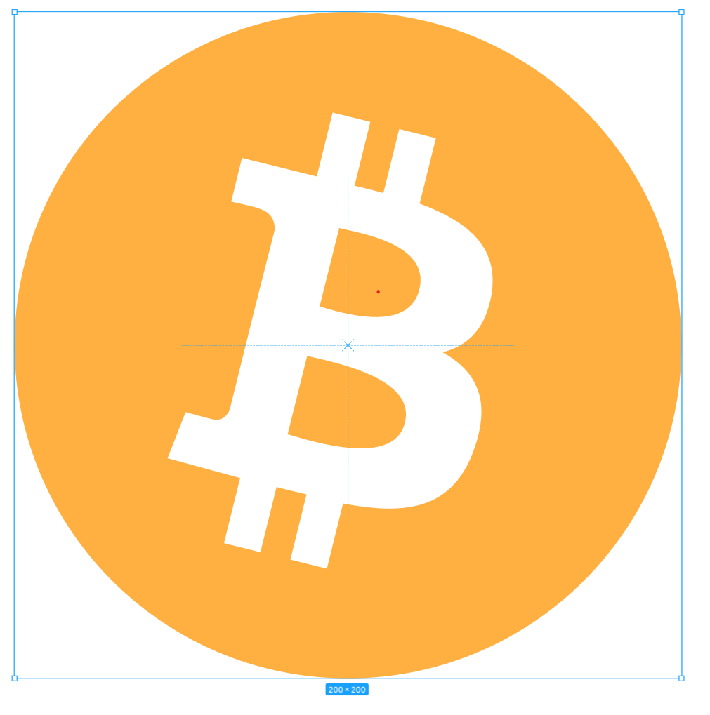
The Bitcoin Core orange is the primary orange, the Bitcoin orange is just there to illustrate the orange used by the Bitcoin logo - ill remove it from the stylesheet.
|
|
||
| Label { | ||
| Layout.maximumWidth: appTitle.width | ||
| text: "Be part of the Bitcoin network." |
There was a problem hiding this comment.
wrap in qsTr in preparation for translation support?
| text: "Be part of the Bitcoin network." | |
| text: qsTr("Be part of the Bitcoin network.") |
|
Really exciting work! Concept ACK |
|
Closing in favor of #124. |
This PR implements Bosch-0's design:
Based on #42, and only the last commit belongs to this PR.