Added updated bitcoin PNG / SVG icon#199
Conversation
| @@ -1,58 +1,11 @@ | |||
| <?xml version="1.0" encoding="utf-8"?> | |||
There was a problem hiding this comment.
Concept ACK
One thing I noticed with this Icon and the previous one is that there are visually obvious rough edges (for like of a better term, not a designer). They are less obvious on the old icon because it used a shadow effect. Now that we are doing away with the shadow effect, these rough edges are more obvious. How can we fix this? Here are some screenshots showing this behavior:
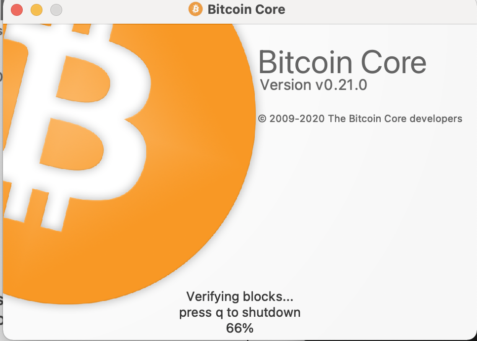
v0.21: Old Icon: rough edges on the ₿ and the outside of the circle
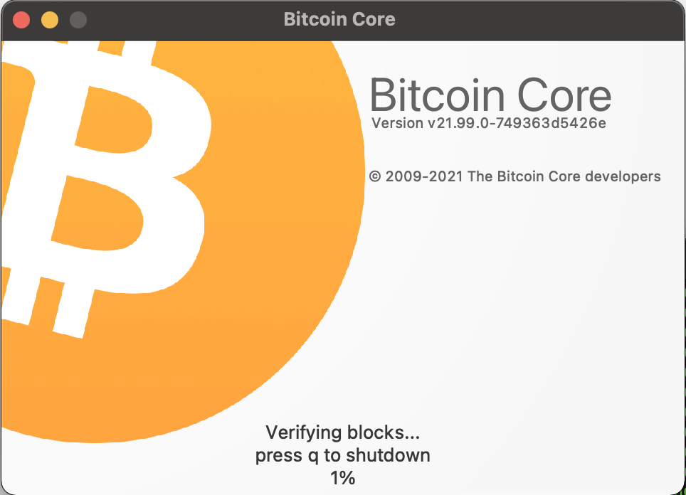
PR: New Icon: same rough edges
|
Concept ACK |
|
Concept ACK - test on 4k/HD displays needed. |
|
Shouldn't the |
|
@jarolrod - I believe these updates should be under their own PRs - this way any issues building for different platforms can be isolated to individual PRs. |
|
@RandyMcMillan This PR should handle the transition to a new Logo. The three other files need to be updated ( |
|
Concept ACK. @jarolrod about rough edges: looks like there's missing |
 shaavan
left a comment
shaavan
left a comment
There was a problem hiding this comment.
Concept ACK
The new Icon looks Great! And the simple 2D looks give it a modern and minimalistic touch. And the reduced size of the icon improves the efficiency of its loading.
I tested on all the networks, and I am attaching the screenshots of their new splash screens.
| Mainnet | Testnet |
|---|---|
 |
 |
| Regtest | Signet |
|---|---|
 |
 |
I was just curious if there was any specific reason behind changing the hex value of the color of the mainnet icon, lightening it a few shades?
I do see slight difference if I add pixPaint.setRenderHint(QPainter::SmoothPixmapTransform);
I tried to replicate what you suggested using the RenderHint but could not see any notable difference.
I tried two versions of the changes.
- With
QPainter::SmoothPixmapTransformandQPainter::Antialiasing:
diff --git a/src/qt/splashscreen.cpp b/src/qt/splashscreen.cpp
index 2292c01d6..629c924c2 100644
--- a/src/qt/splashscreen.cpp
+++ b/src/qt/splashscreen.cpp
@@ -71,6 +71,9 @@ SplashScreen::SplashScreen(const NetworkStyle* networkStyle)
     const QSize requiredSize(1024,1024);
     QPixmap icon(networkStyle->getAppIcon().pixmap(requiredSize));

+    pixPaint.setRenderHint(QPainter::Antialiasing,true);
+    pixPaint.setRenderHint(QPainter::SmoothPixmapTransform,true);
+

     pixPaint.drawPixmap(rectIcon, icon);
Result:

- With
QPainter::SmoothPixmapTransformandQPainter::Antialiasing+ UsingQIcon::paintinstead ofQPainter::drawPixmap
diff --git a/src/qt/splashscreen.cpp b/src/qt/splashscreen.cpp
index 2292c01d6..f4fd113af 100644
--- a/src/qt/splashscreen.cpp
+++ b/src/qt/splashscreen.cpp
@@ -71,7 +71,12 @@ SplashScreen::SplashScreen(const NetworkStyle* networkStyle)
     const QSize requiredSize(1024,1024);
     QPixmap icon(networkStyle->getAppIcon().pixmap(requiredSize));

-    pixPaint.drawPixmap(rectIcon, icon);
+    pixPaint.setRenderHint(QPainter::Antialiasing,true);
+    pixPaint.setRenderHint(QPainter::SmoothPixmapTransform,true);
+
+    QIcon ico;
+    ico.addPixmap(icon);
+    ico.paint(&pixPaint, rectIcon);
Result:

@Talkless, it would be helpful if you could share how you used the Renderhints to get the smoother version of icons. Thanks.
|
Is this still actual? |
|
I'd suggest moving all design related efforts to the https://github.com/bitcoin-core/gui-qml repo |
Closing here. |
In reference to #147 (comment) Added the visually updated bitcoin icon (also discussed #89), both the production PNG and source SVG version. It was requested that a seperate PR be open for the artwork change so here it is.
Images are the same dimensions as previous bitcoin.png file so should render fine in the GUI.
Also made some significant file size improvements without effecting image quality. bitcoin.png was optimized using optimize-png.py
Original bitcoin.png file size: 306 KB
New updated bitcoin.png file after optimizing: 21.4 KB
An overall 92.81% reduction.
The vector used is also much more simple (the blur on the original SVG added some extra complexity).
Left is original right is updated icon.