Fix Hack for LA Website Header and Nav Menu at Fractional Viewport Widths #3975
Description
Overview
As developers, we want to ensure that the website UI functions as intended at various viewport widths. We will need to fix the UI so that the header and the navigation menu are not displaced from the top of the page.
Size details
This issue could turn into a Medium size issue if making the changes ends up having unintended side effects. Do not self assign this issue if you are needing a slower on ramp to coding.
Details
This bug can be seen from any page on the Hack for LA website and may affect the layout of other elements on certain pages.
This bug occurs if the browser displays the viewport with fractional widths (e.g. 767.33px) on certain high-dpi devices.
This bug is due to how the breakpoints are set in the _layout.scss file. The breakpoints currently only account for integer viewport widths. Any fractional viewport widths that fall in-between the breakpoints are not accounted for causing the browser to not apply the intended styling for the elements.
For example, the breakpoints for $bp-tablet-up and $bp-below-tablet are set to min-width: 768px and max-width: 767px, respectively. We can interpret them as
$bp-tablet-up: Style for viewports >= 768px
$bp-below-table: Style for viewports <= 767px
or
767px <= x <= 768px
x can be thought of as 767px plus some fractional number (e.g. 767.33px). Any viewport width that falls in between 767 and 768 can cause the browser to not style the page like we want it to.
Home Page with the Header and Nav Menu Bug

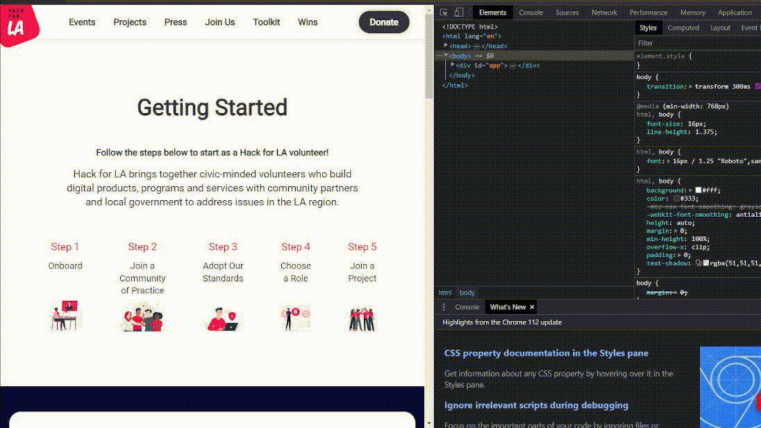
Getting Started page with the Header and Nav Menu Bug
Action Items
- Update the SASS variables containing “$bp-below-” in their name in the
_layout.scssfile to subtract .02 instead of 1. - Test and verify that the header and navigation menu on all Hack for LA website pages do not exhibit the bug.
- Test and verify that updates to the device width breakpoints do not have any unintended side effects on any elements on all of the pages on the website.
Resources/Instructions
- Hack for LA Homepage
- Reference this solution from Bootstrap
- _layout.scss file
- Range Context - W3C Media Queries Level 4 Specification
- Additional reading for a future solution we will implement. Also helpful to learn more on why the website is experiencing the issue.
- One way to replicate/test on Windows 10
-
select a display for testing
Details

-
set scaling for a monitor/ screen to 125% (or any other scaling % if 125% doesn't work for your setup)
Details

-
display the browser on that monitor with the 125% scaling
-
test to see if your browser width is displayed in fractions by changing the width between 767px and 768 px with the developer tools to see if the hamburger icon has a red box around it.
- Note 1: Chromium browsers display the fractions of the viewport width when you change it in the non-mobile testing view. In the mobile testing view, the width will be displayed as an integer but you can enter in a fractional number (e.g. 767.67) and it will change the viewport width to that number. Do note that it won't show the fraction component when you do this.
- Note 2: Firefox doesn't seem to display the fractional part of the width for both mobile and non-mobile testing views. The mobile testing view does not allow you to enter fractions. You will need to manually change the viewport width to see if the bug is present.
Chrome fractional width example - non-mobile testing view

Chrome fractional width example - mobile testing view

-