Conversation
|
@mui/joy: parsed: -0.47% 😍, gzip: +0.40% |
 siriwatknp
added
package: joy-ui
siriwatknp
force-pushed
the
joy/button-theme
branch
from
siriwatknp
added
package: joy-ui
siriwatknp
force-pushed
the
joy/button-theme
branch
from
7f3a4c8 to
04df07b
Compare
|
Ended up doing some tweaks to other files (the default theme and variantUtils)! I think it would be nice to add to the component preview page what they would like in dark mode. I tried doing it with a dark background but that just doesn't trigger the variants changing to the dark color scheme 😅 |
siriwatknp
force-pushed
the
joy/button-theme
branch
from
b24daf9 to
12d5c80
Compare
Added! |
| > & { | ||
| breakpoints?: BreakpointsOptions; | ||
| spacing?: SpacingOptions; | ||
| components?: Components; |
There was a problem hiding this comment.
add components here to prevent dependency cycle.
 mnajdova
left a comment
mnajdova
left a comment
mnajdova
left a comment
There was a problem hiding this comment.
From a styling perspective, I am only not sure about the warning color in light mode. It's too green for my eyes :)
| * The border-radius of the component. | ||
| * @default 'default' | ||
| */ | ||
| roundness: PropTypes.oneOf(['default', 'lg', 'md', 'sm', 'xl', 'xs']), |
There was a problem hiding this comment.
I am not sure about default as a value. I remember that at some point when we started on v5, we were actually replacing all default values for the props that we had. As far as I remember, the reasoning was the the default value is not a concrete value, we should rather have it be some specific value, like md. @mbrookes what are your thoughts on this?
There was a problem hiding this comment.
Good point, may be the roundness makes sense to not have default because some components can have different values. Ex, Switch might have initial roundness as xl whereas Button has 'md'.
There was a problem hiding this comment.
Exactly, and you can probably use the same argument for each prop, the default for one component may not be the same as the default for another, so I wouldn't add it as a key.
There was a problem hiding this comment.
Agree that "the default" should be a given size available in the scale (e.g md or sm) instead of default being a plus one value. I think this is a general approach that should be applied to all props, not only border radius, though!
There was a problem hiding this comment.
Do we really need a prop for this? Is it common for a UI to have multiple buttons with different border radiuses? It seems like it should be configured through the theme. There might be an argument to be made for a "shape" prop (square, rounded, round), but there's a lot to be said for not adding props prematurely.
There was a problem hiding this comment.
The initial intention for having shadow and radius props for all components is for API consistency, so the experience of using is the same across components. However, after discussing with Danilo, it is better not to have these props because:
- it encourages dev to make an inconsistent design which is not common for an application to have a different radius for a single component.
- we already have
sxprop API for one-time customization which can hook to the theme and use the token if needed. - more props, more maintenance afford.
shadow & radius props are removed, please review again.
Yeah, I'm also finding the yellow-600 on light mode not too great. But this is a tricky one because we're using the 600 shades as bg for the contained variants and if we lighten too much the yellows, the text will have to turn black to keep the contrast ratio which would make this a one-off case. I'll probably iterate a little more on the palette still - adding more colors, grey tones, etc. |
I vote for bg yellow with black text. It makes more sense and shows that the variant approach is quite flexible. |
mnajdova
left a comment
mnajdova
left a comment
There was a problem hiding this comment.
Don’t forget to update the warning color 😀
siriwatknp
force-pushed
the
joy/button-theme
branch
from
d3a59b7 to
6f848b2
Compare
| ### Manual | ||
|
|
||
| `yarn test:regresions:dev` will build all fixtures and render an overview page that lists all fixtures. | ||
| `yarn test:regressions:dev` will build all fixtures and render an overview page that lists all fixtures. |
There was a problem hiding this comment.
fix typo, nothing else.
Danilo has updated the colors, please check it out in the preview or sandbox. I think the colors should not block the PR in case we are not agreed on the color value. |
Probably just as well - I've been resisting commenting on the rest of the colors besides blue. 😅 |
But I thought this is the PR where we should discuss it, as it is about the button theme :D Should we look into the structure and API only? Could we then rename the PR title to: "[Joy] Buttom theme structure" or something similar? |
|
@siriwatknp @danilo-leal should we have clear steps about PR that we should expect when developing a Joy component? For example:
I would even say we should merge these two in one PR, otherwise, it's hard to know what to focus on when reviewing the PR, which means that we may even lose the opportunity to comment on something, just thinking that it is not a scope of the PR. |
|
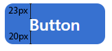
One thing I noticed is that on my screen (1.5x scaling) the button content doesn't look centered:
The distance between cap height and the top edge is 23px, but from baseline to the bottom edge there's just 20px. I'm not sure if anything can be done to work around this without affecting 1x and 2x screens, but I'll try to figure something out (I understand it may be harder for you if you don't have access to such a screen). |
|
|
||
| containedColor: `#fff`, | ||
| containedBg: `var(--joy-palette-${color}-500)`, | ||
| containedBg: `var(--joy-palette-${color}-600)`, |
There was a problem hiding this comment.
I'm wondering if it wouldn't be better to supply these values to the background property (instead of background-color). It would allow developers to override the theme with gradients (or even images, but I wouldn't consider it a popular use case).
There was a problem hiding this comment.
The idea of variant is to be applied globally (for most components). I think in case of gradient or image, it will be specific for component and as always developers can use the same theming API to do that. https://codesandbox.io/s/joy-cra-typescript-forked-be5uj?file=/src/App.tsx
However, if we see a real use case in the future we can also revisit this point.
What if we merge this PR and open another one with "[Joy] theme variant"? because variant is a global style and it is related to colors (I guess this will take a lot of time to refine to get the right one) and we can discuss only about variants (colors). This will give space for other components to continue to be developed on its own, otherwise we will be stuck in this PR. Now other component PRs does not need to take color into account because it will follow the system.
|
|
Spent the last couple of days chewing on @mnajdova's suggestion and I think it makes sense. Especially as Joy components will follow the global styling defined on the theme. Thus, we could try handling the next components PRs separately:
Each topic can have its rounds of iterations for nailing it down just right but trying to settle down on both at the same time is trickier. They definitely feed off each other but maybe it's better first to agree on a component API design - or at least on an initial draft to play around with - and later refine the visual aspect than the other way around. So, we could change this pull request title to Button API or something similar?! |
Sounds good to me! In the next component PR, I will try to make the scope smaller and more clear. (Actually, I have tried with the Button already 😂 I hope it will be easier for the next component) |
mnajdova
left a comment
mnajdova
left a comment
There was a problem hiding this comment.
I am happy with the changes 👌
6 participants
👉 Preview
👉 CodeSandbox
This PR will set a standard for the default style of each variant.
Styling APIs
Others
sxpropI am really not sure about transition property. I think we can postpone the transition discussion in this PR and update later.