Some issues with cancel button and delete icon when comments are edited #7281
Description
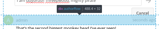
The Cancel button shown when a comment is edited overflows in the next comment, as can be seen in the screenshot below:
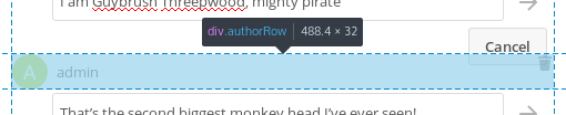
It is more evident when the next comment is also in edition mode, as in that case the Cancel button of the previous comment and the Delete icon of the next comment overlap:
Regarding the Delete icon, it is shown only when the cursor is on the comment element. As the Cancel button is a child of the comment element but is visually outside it that causes the Delete icon to appear when hovering on the Cancel button and disappear when moving the cursor to the sides of that button, which is a bit strange.
Besides that, the Delete icon is aligned to the top and right border of the comment element, and it has no padding nor margin. When the cursor enters the comment element on the top right the Delete icon appears immediately under the cursor, which also feels strange; it would be better if it had some margin so the icon appeared slightly before the cursor was on top of it.
Also, I have not tested it, but I guess that showing the Delete icon only when the cursor is on the comment could be problematic on touch screens. Similarly, the area to interact with the icon should be increased on touch screens, as 16x16 is not very usable in that case.
@nextcloud/designers