Fixes the usability issues with the comment section delete and edit #7800
Conversation
|
Also, while checking the code I could not find why we needed this - server/apps/comments/js/commentstabview.js Lines 526 to 532 in b248c53 |
Codecov Report
@@            Coverage Diff            @@
##             master    #7800   +/-   ##
=========================================
  Coverage          ?   53.58%
  Complexity        ?    23981
=========================================
  Files             ?     1442
  Lines             ?    80300
  Branches          ?        0
=========================================
  Hits              ?    43028
  Misses            ?    37272
Partials ? 0 |
Long messages are initially created with the |
|
@danxuliu - Thanks, it does work as intended. |
|
Summoning reviewers :) |
|
Would be happy to have feedback from the design team |
|
it would be much easier to review if the source branch would be in nextcloud/server |
 pixelipo
left a comment
pixelipo
left a comment
There was a problem hiding this comment.
- tooltip is now too high:
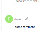
- Delete icon seems to jump around: before hover:
after hover:
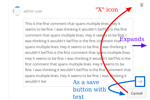
- I find this to be a big pile of mess:
- why are these 3 actions placed in a column instead of inline, like everywhere else in NC?
- if the should stay vertical, why are they not vertically aligned?
- why is cancel not an icon, too? "x" is the classic solution used across NC apps
apps/comments/css/comments.css
Outdated
|
|
||
| #commentsTabView .newCommentForm .message { | ||
| width: calc(100% - 81px); /* 36 (left margin) + 30 (right padding) + 15 (right padding of surrounding box) */ | ||
| width: calc(100% - 88px); |
There was a problem hiding this comment.
@Abijeet can you please leave a comment regarding where this number comes from?
apps/comments/css/comments.css
Outdated
| #commentsTabView .newCommentForm .message { | ||
| width: calc(100% - 81px); /* 36 (left margin) + 30 (right padding) + 15 (right padding of surrounding box) */ | ||
| width: calc(100% - 88px); | ||
| margin-left: 36px; |
There was a problem hiding this comment.
IMO, it's the parent div (newCommentForm) that should be moved 36px to the left
There was a problem hiding this comment.
If you make this margin 1 or 2 px smaller, then the .submit icon can fit without any absolute positioning
apps/comments/css/comments.css
Outdated
| width: calc(100% - 88px); | ||
| margin-left: 36px; | ||
| padding-right: 30px; | ||
| display: block; |
apps/comments/css/comments.css
Outdated
| } | ||
|
|
||
| #commentsTabView .newCommentForm .submit { | ||
| position: absolute; |
There was a problem hiding this comment.
lines 27-30 unnecessary (see my comments above)
apps/comments/css/comments.css
Outdated
| #commentsTabView .comment { | ||
| position: relative; | ||
| margin-bottom: 30px; | ||
| margin-bottom: 20px; |
There was a problem hiding this comment.
suggestion: add something like border-top: 1px solid $color-border; to have a better separation. In fact, if you add that, it becomes obvious that this line should really be padding: 10px 0;.
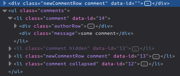
I also noticed that the .comment class is applied twice - once to the div.newCommentRow element and then again to it's li.comment children. This doesn't sound right....
There was a problem hiding this comment.
I also noticed that the .comment class is applied twice - once to the div.newCommentRow element and then again to it's li.comment children. This doesn't sound right....
In your screenshot the li is not a child of the div; the li is a child of the ul, which is a sibling of the div. If I am not mistaken the .comment class is fine that way, as it is applied to each comment in the list, and also to the "New comment" area.
I guess that the answer to those three questions is "because it was already that way before this pull request" ;-) Having said that, yes, I too think that those buttons could be improved. Maybe something like what @jancborchardt said would be good enough:
More specifically, I would replace the Edit button by the Cancel button with the classic "x". I think that makes sense from a behavioural point of view (same place for enter edition and exit edition), and this way it would be far enough from the delete button too to press it by mistake (although the delete button would still be near the confirm button...). |
|
@pixelipo - Thanks for the review on this one, I should have been a little more careful and thorough with my changes. I was unsure of making too many modifications.
Will do this from next time onwards. I'll also take care of the comments you've left on the code. Regarding re-adjusting the layout, what do you guys think of the following that I made after reviewing comments left by @jancborchardt and @danxuliu ,
|
|
@Abijeet Thanks a lot for taking care of all this! :-) Just a little note (for the future ;-) ) regarding the commits. When possible please try to use different commits for changes not related between them (for example, increasing the touch area of the icons and exiting the edition mode when saving a comment that was not modified). This makes easier to review the commits before merging them and, maybe more important, in some time in the future when someone needs to understand the code and how it evolved ;-) But do not worry too much about that; it is just one of my little nitpicks, most people do not seem to care about those things :-P
I would not change the send button in order to keep a consistent UI between sending a new comment and editing an existing one. I was thinking on something like this instead: However I have no special preference for that approach; it is just an additional idea. By the way, regarding
I have noticed that in Firefox, although it seems to be working fine in Chromium. I do not know if there is something wrong with the CSS or if it is a browser bug. |
|
Hi @danxuliu and @pixelipo, I've been a little more thorough with my changes this time and have taken some liberties. Here's a full set of issues that have been fixed,
Tests
Response to comments
I've undone my previous commits and tried to do this as much as I could for this pull request, but I'll be more careful from next time on wards.
This has been changed. Please check the images below.
Added comments
Done.
Removed and implemented without absolute positioning.
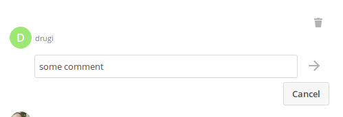
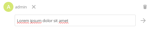
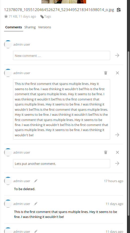
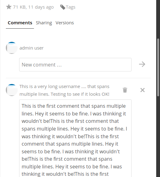
Changed to use padding. Added border-top but not for the new comment. Please check screenshot. Please let me know if there are any other changes, or anything else is not up-to the mark. ScreenshotsNormal mode
Edit mode
Long usernames
|
|
There are 3 icons without label, and especially the x and delete next to each other are confusing. Hence I'd put the Cancel and Delete into a 3-dot-menu, with labels. Otherwise great! :) |
|
Cancel shouldn't be hidden behind a 3-dot IMO because it's non-destructive, a default "get me out of here" action and should be the alternative to a simple "ESC" keyboard button action. On the other hand, delete button should not be visible while editing a comment. Instead it should be on the same level as the Edit button |
|
@jancborchardt - I agree with @pixelipo, I don't think the cancel button should go under a dropdown. Not sure where to put the delete button though, next to the edit? Would what @danxuliu suggested make more sense? |
|
I see no real need for the delete button while editing the text. How about adding a 3-dots-menu for the default view and add edit/delete to it. On the editing view we could just show the submit/cancel buttons then. |
|
I like the approach suggested by @juliushaertl, I'll go ahead with that. |
|
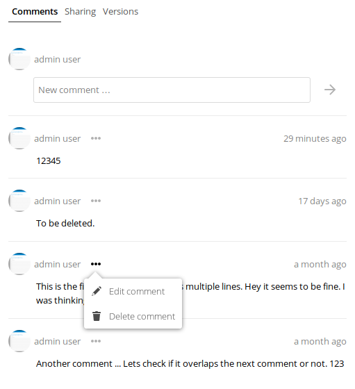
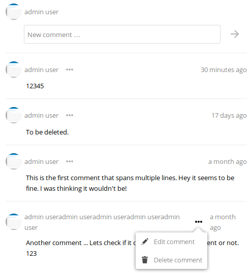
Hey all, I've made the changes. I've added a new View that is the dropdown for the edit and delete options under a menu. I've slight reservations about the code here. I figured keeping it simple and the modification to the minimum was the right way to go about it. Please let me know if you'd like me to change that or anything else. cc @nextcloud/designers ScreenshotsDropdown visible |
|
JSunit test are failing @Abijeet :) |
|
Thank you @skjnldsv. Sorry, I should have checked rather than assuming their failure was unrelated. Unfortunately it is the end of Sunday already. I will review and fix these this week. |
|
I think I've fixed the issues with the comments related test cases failing. Going to close and reopen the issue to force the test cases to run again. |
|
Hmph, the reopening did not retrigger the CI. @skjnldsv - Any ideas on how to proceed from here? It seems that the docker connection failed. |
|
@Abijeet you need to rebase to master and force push your work :) |
…open.

Now irrespective of the whether the comment has been modified we are going to go back to the view mode.

Signed-off-by: Abijeet <abijeetpatro@gmail.com>
…ents.

Signed-off-by: Abijeet <abijeetpatro@gmail.com>
1. Increased the size of the delete, edit, close and submit buttons to take up 44x44px.
2. Now showing the delete button at all times when editing to avoid usability issues with touch screens.
3. Edit icon is also shown at all times, rather than only on hover.
4. Reduced the gap between comments a wee bit.
5. Fixed issues with focus event now working properly for edit and delete.
6. Removed absolute positioning of elements for alignment.
7. Fixed issue with tooltips becoming too high due to padding around actions. Occurred due to my changes.
8. Changed the position of the submit and close icons.
9. Fixed issue with jumping of the delete icon in Firefox. Occurred due to my changes.
10. Fixed issue with wrapping of content due to long author names. Occurred due to my changes.
11. Fixed issue with longer comments not appearing properly. This might have occurred due to my changes.

Signed-off-by: Abijeet <abijeetpatro@gmail.com>
Signed-off-by: Abijeet <abijeetpatro@gmail.com>
Fixes #7281

- Added a new View to render the dropdown.
- Modified the existing code.

Signed-off-by: Abijeet <abijeetpatro@gmail.com>
Towards #7281

Signed-off-by: Abijeet <abijeetpatro@gmail.com>
Towards #7281

Also hiding the menu before triggering click action.

Signed-off-by: Abijeet <abijeetpatro@gmail.com>
Signed-off-by: Abijeet <abijeetpatro@gmail.com>
Also fixes scrutinizer warnings.

Signed-off-by: Abijeet <abijeetpatro@gmail.com>
|
@skjnldsv - Done, but that doesn't seem to have helped. |
|
@Abijeet yes it did, but our drone have a little issue! :) |
|
@skjnldsv - How do I get the CI to trigger again? |
Login on drone, right menu, restart. |
Failures are unrelated. |
| display: block; | ||
| /* width = 100% - (width of submit button (44px) + margin (3px) + inline-block gap) */ | ||
| width: calc(100% - 52px); | ||
| display: inline-block; |
There was a problem hiding this comment.
This causes the empty input to have a too big cursor in Safari:
See also this thread https://stackoverflow.com/a/9132362
I could also not figure out how to enforce this without the display: block;, font-size, line-heightand height all didn't worked out :/
There was a problem hiding this comment.
Once the first character is typed all is fine.
There was a problem hiding this comment.
@MorrisJobke - I'll check this over the weekend.
There was a problem hiding this comment.
Merged this and we should fix this little issue in #9150
There was a problem hiding this comment.
Got a new laptop and was setting it up. :) This kind of took a back seat.
 MorrisJobke
left a comment
MorrisJobke
left a comment
There was a problem hiding this comment.
Beside my little problem it looks good 👍 Would be still nice to get this resolved as well before we merge this.
Greetings,
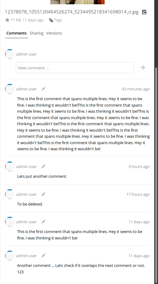
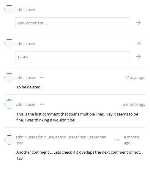
I've made the following changes in the comments section,
ulduring editing of comments.Please let me know if any modifications need to be made.
Images
Comment section
Editing a comment
Closes #7281
Signed-off-by: Abijeet abijeetpatro@gmail.com
/cc @nextcloud/designers