convert dropdown markup to pf4 #1629
Conversation
|
[APPROVALNOTIFIER] This PR is NOT APPROVED This pull-request has been approved by: priley86 If they are not already assigned, you can assign the PR to them by writing The full list of commands accepted by this bot can be found here. The pull request process is described here DetailsNeeds approval from an approver in each of these files:Approvers can indicate their approval by writing |
 openshift-ci-robot
added
the
size/L
openshift-ci-robot
added
the
size/L
| {_.map(actionButtons, (actionButton, i) => { | ||
| if (!_.isEmpty(actionButton)) { | ||
| return <button className={`btn ${actionButton.btnClass} co-action-buttons__btn`} onClick={actionButton.callback} key={i}>{actionButton.label}</button>; | ||
| return <Button variant="primary" onClick={actionButton.callback} key={i}>{actionButton.label}</Button>; |
There was a problem hiding this comment.
todo: we can look at PF4 Button variations for this when mapping actionButton.btnClass
http://patternfly-react.surge.sh/patternfly-4/components/button/
|
@priley86: The following tests failed, say
Full PR test history. Your PR dashboard. Please help us cut down on flakes by linking to an open issue when you hit one in your PR. DetailsInstructions for interacting with me using PR comments are available here. If you have questions or suggestions related to my behavior, please file an issue against the kubernetes/test-infra repository. I understand the commands that are listed here. |
| ]; | ||
|
|
||
| return <div className="co-namespace-bar__dropdowns"> | ||
| return <div className="co-namespace-bar__dropdowns pf-l-flex pf-m-justify-content-space-between pf-m-align-items-center"> |
There was a problem hiding this comment.
No flexbox utility classes please :)
We went down this road in the 3.x console and eventually removed them all. They have a lot of drawbacks.
- This is basically the same as inline styles, which is considered a bad practice.
- They don't play well with media queries.
- If we ever need a flexbox style that doens't have a utility, it's a lot of work to convert this to CSS.
Let's replace this with proper CSS definitions that follow BEM.
There was a problem hiding this comment.
+1 - i can see how this would be problematic if utility classes were reused in several places and then expected to change in only a few. Will refactor this to use custom classes that use BEM for now. PF4 may introduce more specific layout classes for namespace bar in the future.
| @import '~@patternfly/patternfly/layouts/Flex/flex'; | ||
| @import '~@patternfly/patternfly/utilities/Display/display'; | ||
| @import '~@patternfly/patternfly/utilities/Flex/flex'; | ||
|
|
| if(!autocompleteFilter){ | ||
| //use pf4 markup if not using the autocomplete dropdown | ||
| return <li key={itemKey}> | ||
| <button className="pf-c-dropdown__menu-item" id={`${itemKey}-link`} onClick={e => onclick(itemKey, e)}>{content}</button> |
There was a problem hiding this comment.
This probably will break enter key usage in most forms. Add type="button" so it's never treated as a submit button. We might need prevent default on the click event.
| const {itemKey, content, onclick, onBookmark, onUnBookmark, className, selected, hover, canFavorite, onFavorite, favoriteKey, autocompleteFilter} = this.props; | ||
| let prefix; | ||
|
|
||
| if(!autocompleteFilter){ |
There was a problem hiding this comment.
style nit, here and below
| if(!autocompleteFilter){ | |
| if (!autocompleteFilter) { |
| <div className="btn-dropdown__content-wrap"> | ||
| <span className="btn-dropdown__item"> | ||
| //render PF4 dropdown markup if this is not the autcomplete filter | ||
| if(autocompleteFilter){ |
There was a problem hiding this comment.
I'm hesitant to keep two totally separate markup structures for these two dropdowns, but I don't have a great suggestion. Do we have a long term plan for avoiding this?
There was a problem hiding this comment.
we will have to see if we can covert the Project/Namespace dropdown to something that resembles PF4. I have not attempted this yet, but I would probably save that one for last if possible...
| {isDeleting && <ResourceItemDeleting />} | ||
| </div> | ||
| {!isDeleting && <div className="co-actions"> | ||
| {!isDeleting && <div className="pf-l-flex pf-m-space-items-sm"> |
|
|
||
| const KebabItemEnabled: React.FC<KebabItemProps> = ({option, onClick}) => { | ||
| return <a href="#" onClick={(e) => onClick(e, option)} data-test-action={option.label}>{option.label}</a>; | ||
| return <button className="pf-c-dropdown__menu-item" onClick={(e) => onClick(e, option)} data-test-action={option.label}>{option.label}</button>; |
|
|
||
| const KebabItemDisabled: React.FC<{option: KebabOption}> = ({option}) => { | ||
| return <a className="disabled">{option.label}</a>; | ||
| return <button className="pf-c-dropdown__menu-item pf-m-disabled">{option.label}</button>; |
| return <div ref={this.dropdownElement} className="co-kebab" onMouseEnter={this.onHover} onFocus={this.onHover}> | ||
| <button type="button" aria-label="Actions" disabled={isDisabled} aria-haspopup="true" className="btn btn-link co-kebab__button" onClick={this.toggle} data-test-id="kebab-button"> | ||
| <span className="fa fa-ellipsis-v co-kebab__icon" aria-hidden="true"></span> | ||
| return <div ref={this.dropdownElement} className={classNames({'pf-c-dropdown': true, 'pf-m-expanded': this.state.active})} onFocus={this.onHover}> |
|
|
||
| KebabItems.displayName = 'KebabItems'; | ||
| ResourceKebab.displayName = 'ResourceKebab'; | ||
| ResourceKebab.displayName = 'ResourceKebab'; |
|
Create buttons on different pages now look drastically different.
|
|
The white button on the white page has very little contrast. I worry about accessibility because the outlines are so subtle. Someone with poor vision might not realize they're buttons. |
|
The different dropdown styles in the same form is jarring.
|
|
Another example:
|
|
The dropdown font is much larger than the input text. It looks mismatched. I was hoping to convert form controls together to keep visual consistency. This is one of the reasons I have been proposing working on the dropdowns separate from the table updates.
|
|
thanks for the thorough review @spadgett 🙏 - will try to review these items further today. |
This dropdown can be converted similarly. |
Same here - this dropdown has very similar markup to the others converted and we can just ensure the custom icon is rendered alongside. |
openshift-ci-robot
added
the
needs-rebase
|
@priley86: PR needs rebase. DetailsInstructions for interacting with me using PR comments are available here. If you have questions or suggestions related to my behavior, please file an issue against the kubernetes/test-infra repository. |
|
closing in favor of #1751 |
4 participants
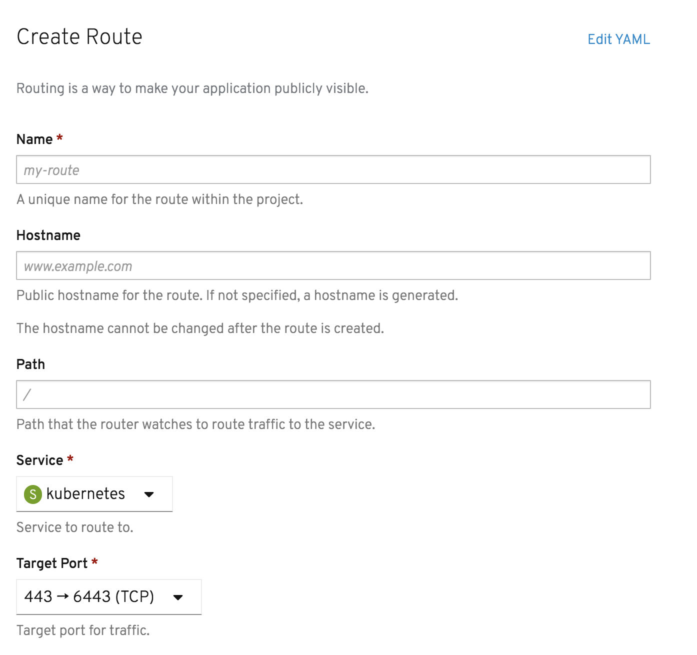
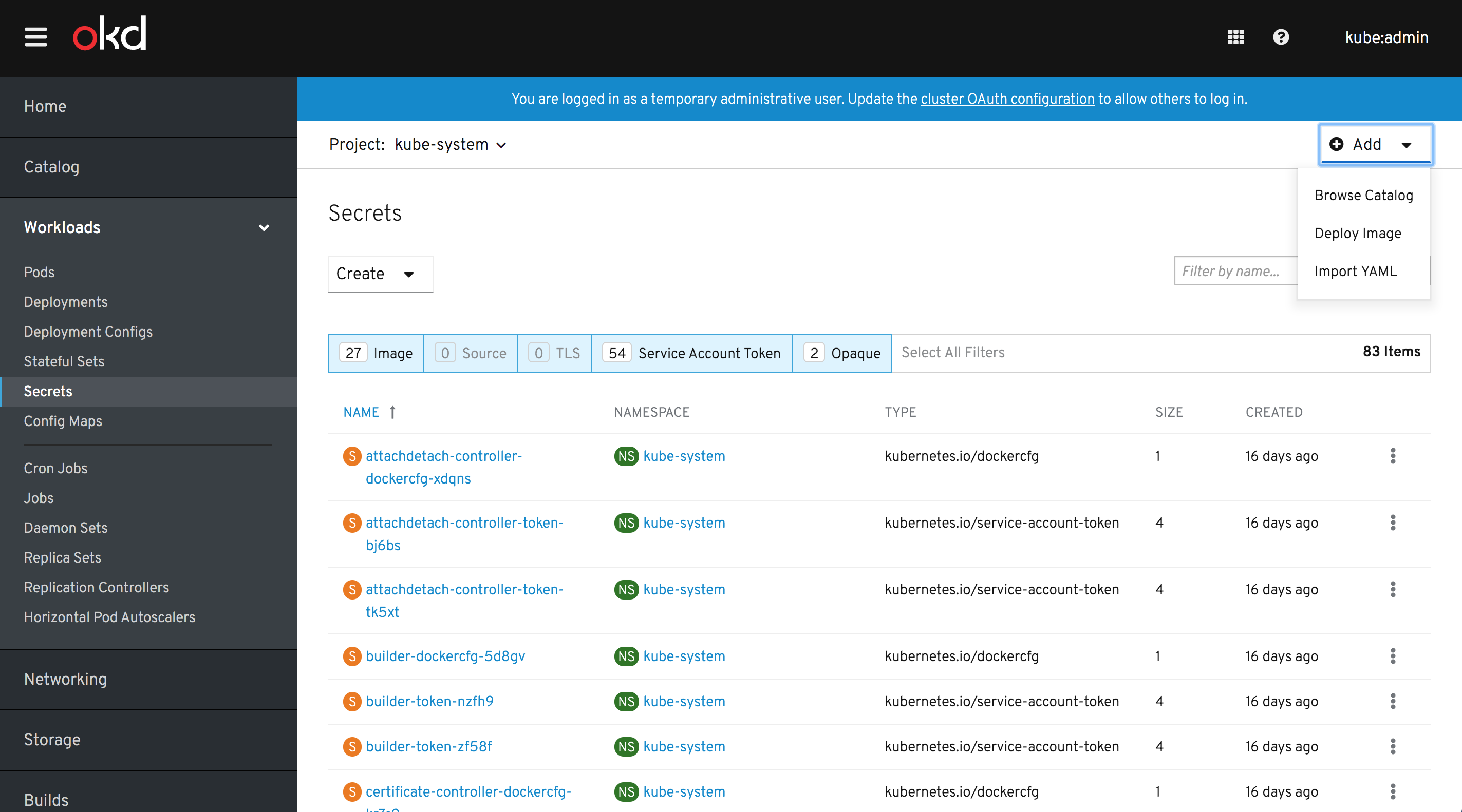
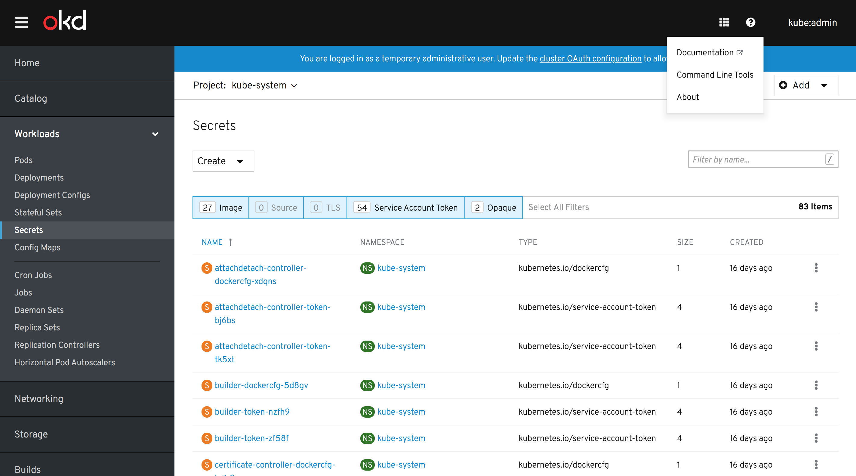
PR to convert existing dropdowns over to PF4 HTML/CSS. Conversions to PF-React JS would come later...
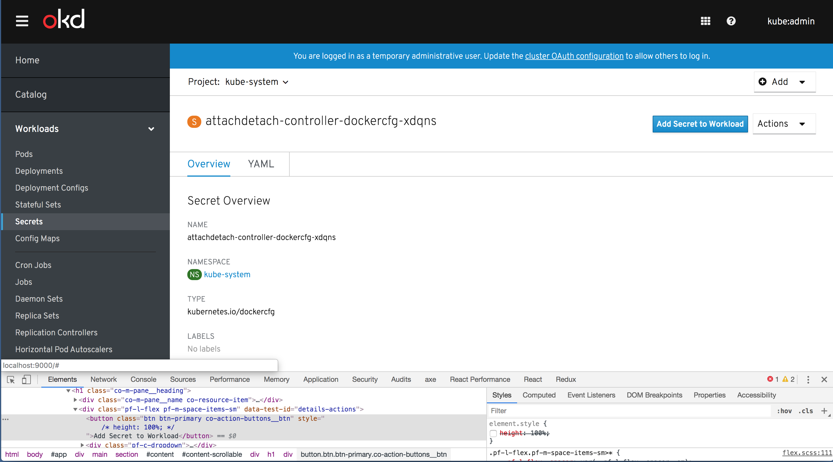
Actions Detail Dropdown
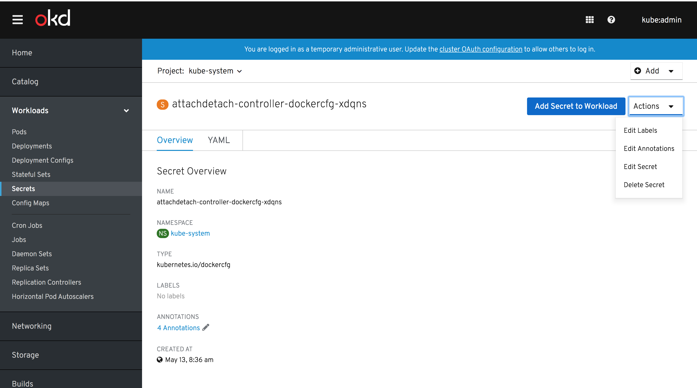
Note: if the "Add Secret to Workload" button remains unchanged and uses Bootstrap styles, it will not match PF4 Dropdown styles. Should we extend the scope of this to include PF4 Button conversion globally? That should not be terrible, even though we have a lot of BS3
<button>'s still.Update: An alternative which may work for now and allow us to avoid restyling all Button's now is just updating the
co-action-buttonstyles to beheight: 100%;. This would limit the scope of this to just Dropdown's.Without this, we have differently sized Buttons.
Projects Dropdown
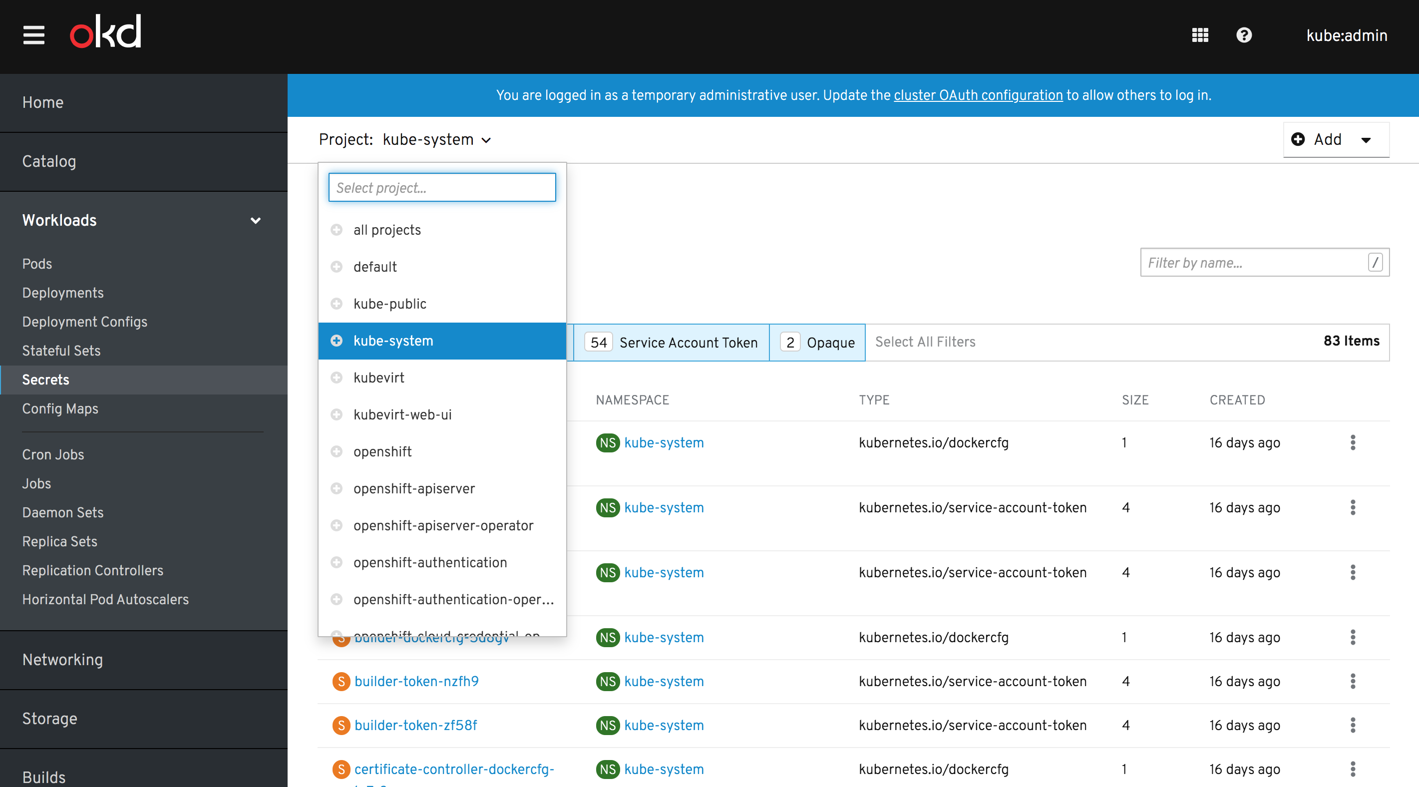
This one remains unchanged. It is an exception and does not follow the norm of the other Dropdowns, even though some code is shared. This is a better fit for the PF4 Context Selector i.m.h.o.
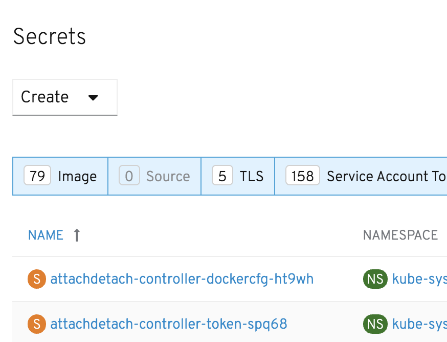
Add Dropdown
Kebab Dropdown
This is how it looks with the table as it is today. With the PF4 Table, see this comment
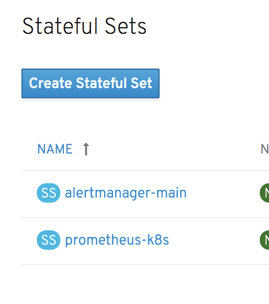
Create Dropdown
Masthead Dropdown
Made fonts 14px globally for menu items to match our interim font size standard. These would be affected too.
cc: @spadgett