feat(tabs): add the pf tabs component#112
feat(tabs): add the pf tabs component#112jgiardino merged 1 commit intopatternfly:masterfrom dabeng:tabs
Conversation
|
Thanks for implementing this, @dabeng! I did a quick pass at reviewing for keyboard support. The storybook example 'Tabs with dropdown' has some issues, where the dropdown menu is not keyboard accessible. It looks like this example is based on the react-bootstrap navbar component, but this component behaves differently. For example, the react-bootstrap navbar component:
However, in the storybook example 'Tabs with dropdown', this component:
Can you confirm if the storybook example 'Tabs with dropdown' is in fact based on the react-bootstrap navbar component? And if that is the case, do you know why the keyboard interaction is different between the two? |
|
@dabeng can we contribute any of these a11y enhancements easily upstream to React Bootstrap? Maybe that would be worth investigating for future contributions... |
|
Oooh, I just realized/remembered that there are two very similar react-bootstrap components, but they have different keyboard interactions:
And I'm guessing the storybook example for 'Tabs with dropdown' is based on react-bootstrap tabs with dropdown So these seem like our options for this:
Does anyone have any thoughts on how we should proceed with this one? |
|
Hi @jgiardino , tabs of react-bootstrap just followed WAI-ARIA Authoring Practices 1.1. Tab key is enabled in react-bootstrap navs because there are not tabpanels or tabpanes in this case. Tab key is disabled in react-bootstrap tabs with dropdown because there are usually focusable elements (typically links and form controls) within a tabpane or tabpanel like this demo shows. Instead, we turn to direction keys to toggle different tabs, and then arrow keys are disabled in component NavDropdown nested in TabContainer. I reviewed the following related materials. Hope they could be helpful for you too 😊 |
|
Thanks for adding the clarification and the references, @dabeng! Regarding your comment above:
Using arrow direction keys works as expected for the tabs. But the fact that they are "disabled in component NavDropdown nested in TabContainer" is a bug, because this behavior prevents keyboard access to the dropdown menu. For now, the recommendation on how to move forward with this PR is to:
We can later remove this note when the react-bootstrap component is fixed upstream. This recommendation is based on a discussion I had with some of the UXD members who contribute to other patternfly repos. |
|
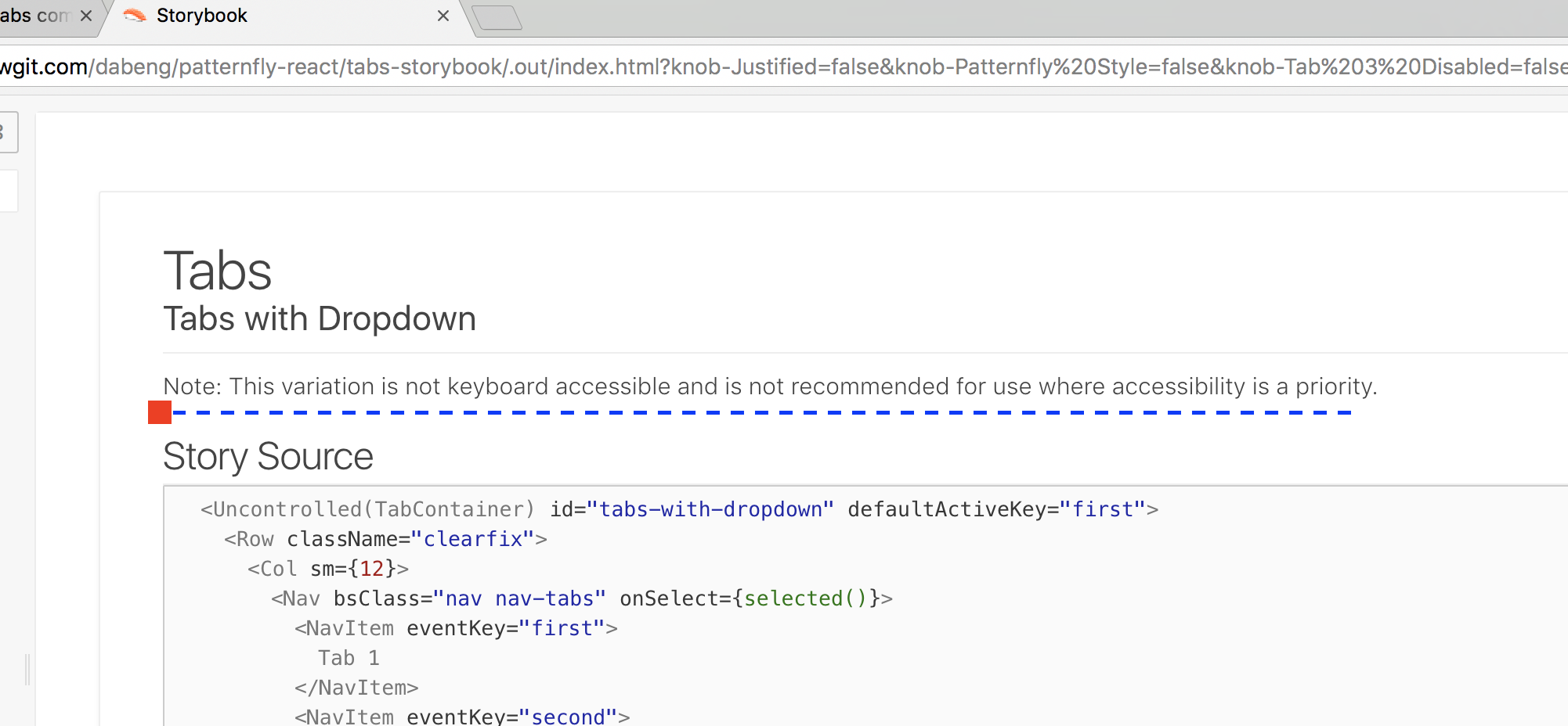
Hi @jgiardino , thanks a lot for your great recommendation. I have added the following notes for the story of "Tabs with Dropdown". |
|
Thanks for adding the note, @dabeng! After chatting with some of the other patternfly contributors, we'd like to have the patternfly-react storybook examples include as many of the patternfly examples as possible, but not include anything that is not documented as part of patternfly. I created this list of specific updates needed based on that guideline.
|
src/components/Tabs/Tabs.stories.js
Outdated
| Col, | ||
| Row, | ||
| } from '../../index'; | ||
| import { Nav, NavItem, NavDropdown, MenuItem } from 'react-bootstrap'; |
There was a problem hiding this comment.
Can we also export/extend these React Bootstrap components in src/index.js to be consistent with other React Bootstrap components used?
There was a problem hiding this comment.
I know we were just targeting Tabs w/ this PR, but I think it's good to go ahead and export/extend Nav components as the others if using them for these examples...
|
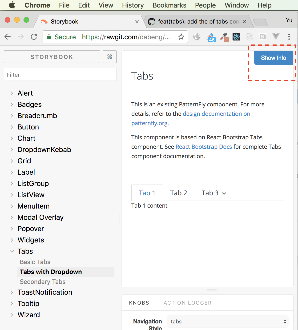
Hi @jgiardino , you need to click "show info" button to check notes content. Beside, I have updated the PR to add "patternfly style" and remove "pills style". @priley86 , I abandoned
|
src/components/Tabs/Tabs.stories.js
Outdated
|
|
||
| stories.addWithInfo( | ||
| 'Tabs with Dropdown', | ||
| 'Note: This variation is not keyboard accessible and is not recommended for use where accessibility is a priority.', |
There was a problem hiding this comment.
I think it's fine to include this note under Show Info, but my concern is that it's a little buried and can be easily missed.
Can we also add this note to the description for this storybook variation? So that it displays like this:
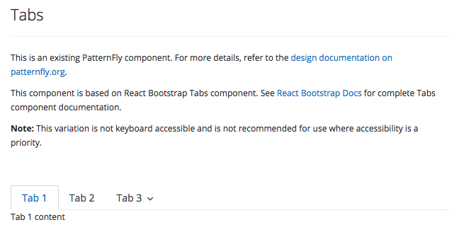
And can we add this description to just the Tabs with Dropdown example and not the other Tabs examples?
|
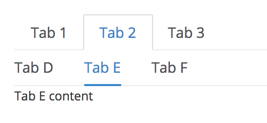
Thanks for pointing out where the note was. I included an inline comment above about this. I reviewed the secondary navigation again, and there are a couple of issues I noticed:
|
|
Hi @jgiardino , thanks for deep review.
    <TabContainer>
      <Nav>
        <NavItem>Tab 1</NavItem>
        <NavItem>Tab 2</NavItem>
        <NavItem>Tab 3</NavItem>
      </Nav>
      <TabContent animation>
        <TabPane>Tab 1 content</TabPane>
        <TabPane>Tab 2 content</TabPane>
        <TabPane>Tab 3 content</TabPane>
      </TabContent>
    </TabContainer>
|
|
@dabeng You're right in all of your points. For point # 1, this issue goes away with react 16, which may not be too far off for this repo. For now, my preference would be using a For points # 2 and 3, I agree with your points about the structure of the html not being semantic. The way your component implements the user interaction is correct. The true issue here is the way patternfly css selectors are written and the html structure that is expected—the css is too tightly coupled with the html structure instead of being applied purely by css classes. And your point about the html In my previous comment, I was wondering if there is a way to structure the components so that we can match the html structure that is expected by the patternfly css. In other words, can the tabs be implemented in a way that still provides the same hierarchical/nested behavior and interaction that you have now, even if their underlying structure isn't? I just wanted to double-check if we could resolve this issue in patternfly-react first. But if this isn't possible, please let me know and we can create an issue in patternfly core to update the css. (Although after you're previous comment, I'm definitely leaning more in favor of updating patternfly css instead) |
|
please rebase as #137 today changes comma settings. |
|
Hi @priley86 , I have rebased the PR to following the new comma settings. |
|
Sorry @jgiardino, I have no idea where to place the secondary tabs markup of Tab 2. On the other hand, if we just keep one secondary tabs, disable Tab 2 and Tab3, and remove all tab-panes, we can finally achieve the goal you described above. Do this solution make sense? |
|
@priley86 @jgiardino , any new concerns or comments about this PR? |
I'm sorry, I'm having trouble understanding this idea. Do you have an example (even if just a code snippet pasted in a comment)? Although, it seems like the html that is implemented in patternfly core cannot be reproduced exactly in patternfly-react. If that really is the case, we can merge this as it is and open an issue in patternfly core to update the css so that it works with the solution we're able to implement. What do you think? |
|
Hi @jgiardino , this is the demo which just includes nav section without tabcontent. And the following is source code: <div>
<Nav bsStyle="tabs" activeKey="1">
<NavItem eventKey="1" title="Tab 1">
Tab 1
</NavItem>
<NavItem eventKey="2" title="Tab 2">
Tab 2
</NavItem>
<NavItem eventKey="3" title="Tab 3">
Tab 3
</NavItem>
</Nav>
<Nav bsClass="nav nav-tabs nav-tabs-pf" activeKey="1.1">
<NavItem eventKey="1.1">Tab A</NavItem>
<NavItem eventKey="1.2">Tab B</NavItem>
<NavItem eventKey="1.3">Tab C</NavItem>
</Nav>
</div>Does this secondary tabs make sense? |
|
Thank you for the demo example. In the original storybook, the example included the ability to toggle the tab selection and show different contents. That example was great because it is pretty obvious for a product developer on how to consume the tabs and define the tab contents. My concern with the new example of secondary tabs is that it's no longer obvious how to define the tab contents. I also question if the css would be broken once the user implemented a tab panel for secondary nav. I think it's important to show how tab contents would be defined, but am interested in other opinions on this. If we do update the secondary navigation example to show tab contents, and the css no longer renders styles as they should, then I would suggest we merge this PR (with the tab contents and broken CSS*) and open an issue against patternfly core. *Just wanted to note that the CSS really isn't that bad in the original implementation. There are just a few missing styles but the component is still functional. |
|
Agreed @jgiardino. IMO the example should show the typical use of the tab component and the secondary tab components. I would rather see this mimic the Patternfly layout and examples as closely as possible. If there are then issues due to the Patternfly code base, those issues can/should be addressed there. |
|
yep - fine with this resolution. I think an upstream issue in Core is warranted if we can't address that here. We can always circle back later if need be... |
|
also @dabeng @jgiardino - we are using React 16.2 now, so fragments should be fine to address your earlier point... |
|
Hi @priley86 , I have rebase this PR , but when I introduced Fragment into tabs story as shown below: import React,{ Fragment } from 'react'; <Fragment>
<p>
<b>Note:</b>
This variation is not keyboard accessible and is not recommended for use
where accessibility is a priority.
</p>
<TabContainer id="tabs-with-dropdown" defaultActiveKey="first">
...
</TabContainer>
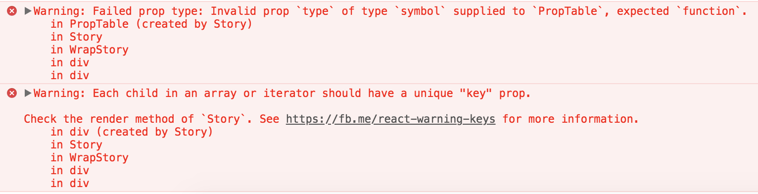
</Fragment>I always got the following warnings: |
|
You don't need the return [
<p key="note">
<b>Note:</b>
This variation is not keyboard accessible and is not recommended for use
where accessibility is a priority.
</p>,
<TabContainer id="tabs-with-dropdown" defaultActiveKey="first" key="container">
...
</TabContainer>
]; |
|
@dabeng After further discussion with @LHinson and @mcarrano, there's one more change we'd like to request. It wasn't obvious during our discussion that this component supported the Can we split out the tabs examples into the following list items in the Storybook navigation?: Tabs
|
|
|

4 participants
What:
This PR adds the PatternFly Tabs pattern. To be used to close #52 (Tabs) once done.
Why: Because #49 involves many dated code snippets and conflicts, I create new PR for component tabs.
How:
Providing a tabs story of patternfly-react storybook based on react-bootstrap tabs component.
@priley86 , @jgiardino please review Storybook.