chore(DashboardHeader): align DashboardHeader with core #7518
Conversation
|
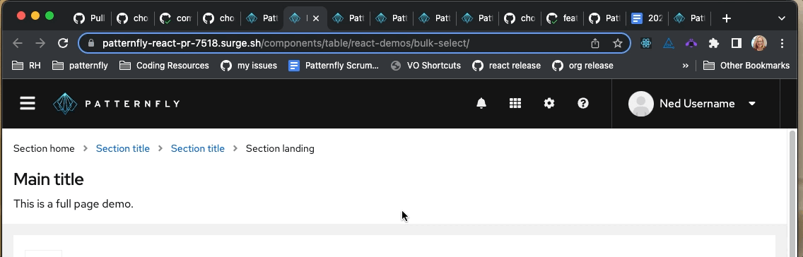
Preview: https://patternfly-react-pr-7518.surge.sh A11y report: https://patternfly-react-pr-7518-a11y.surge.sh |
 nicolethoen
left a comment
nicolethoen
left a comment
nicolethoen
left a comment
There was a problem hiding this comment.
Looks like the left/right padding in the masthead, as well as the image size of the PatternFly logo are both a little larger on the react dashboard wrapper than the core demos.
Also, should this update include updates to the masthead in the page demos? Those are the only full page demos, i believe, that don't use the dashboard wrapper.
There was a problem hiding this comment.
Thank you for your feedback @nicolethoen ! I think that gif is showing the difference between the react workspaces, i.e. on main vs on this branch. Did you mean to show the difference between the react and core workspaces?
I've increased the size of the masthead inset padding to match the size of the page inset as shown in the core demo, which might be causing the toolbar item spacing to look different by a few pixels. I've also increased the Brand/logo size to match the exact size in the core demos too.
I checked all the HTML elements and the components/styling all do seem to match core. Looks like the toolbar items are still a few pixels away from their placement in core though... would be awesome to get some opinions/feedback on this styling from the core folks! @mattnolting @mcoker
There was a problem hiding this comment.
Also, yes, it looks like we do need to update Page with the new DashboardWrapper @nicolethoen ! I've opened and assigned myself to #7526! Will plan to update those full screen demos with these changes once they are approved 👍
oh - you're right. I thought I had the core demo up... my bad. |
nicolethoen
left a comment
nicolethoen
left a comment
There was a problem hiding this comment.
It's looking great! The only other thing I'm noticing is that there is a missing kebab menu in the masthead at smaller screen widths
your PR:
core demo:
|
|
||
| const masthead = ( | ||
| <Masthead> | ||
| <Masthead inset={{ default: 'insetLg' }}> |
There was a problem hiding this comment.
The inset should change between mobile/desktop layouts - 16px (insetMd) on mobile (< 1200px or $pf-global--breakpoint--xl by default) and 24px on desktop (insetLg).
We manage that for the user here, if the page isn't set to use the resize observer to manage the breakpoint for mobile/desktop - https://github.com/patternfly/patternfly/blob/53539639ef305b90fcfe9576b6962d8c1a5247be/src/patternfly/components/Masthead/masthead.scss#L160-L162
That seems to imply that if using the resize observer, the user is expected to manage the masthead inset themselves? Or maybe that's an oversight and our resize observer code should apply the appropriate inset manually?
I think that CSS is a bit problematic though, because it isn't just the masthead that has a dynamic inset between mobile/desktop layout. The nav, page sections, table, data list, etc all have a dynamic inset managed by CSS at the mobile/desktop breakpoint. So unless the resize observer is changing all of those things, I think this is going to lead to inconsistent insets.
IMO we could just leave the insets as they are in the masthead to change at our default breakpoint (1200px/$pf-global--breakpoint--xl), which ties the insets to viewport size instead of the configurable layout change that can be set using the resize observer. Seems acceptable to me, and likely the easiest approach. FWIW with the upcoming major version release, design is on board with just using a single inset for all screen sizes, which would alleviate all of this.
@mattnolting you have done the resize observer work so far - wdyt?
There was a problem hiding this comment.
@mcoker this seems like an oversight. I agree that page insets should remain based on viewport width, as all other component insets are based on viewport width. Using a consistent page inset resolves these issues, which will be great to have when we can make the update, but until then, leaving the insets as they are and opening a Core issue to update the supporting CSS makes sense to me.
| alt="Fallback patternFly default logo" | ||
| > | ||
| <source media="(min-width: 768px)" srcSet="/assets/images/logo__pf--reverse-on-md.svg" /> | ||
| <source srcSet="/assets/images/logo__pf--reverse--base.svg" /> |
| </ToolbarItem> | ||
| </ToolbarGroup> | ||
| <ToolbarItem visibility={{ default: 'hidden', sm: 'visible', md: 'visible', lg: 'hidden' }}> | ||
| <ToolbarItem visibility={{ default: 'visible', sm: 'visible', md: 'visible', lg: 'hidden', xl: 'hidden' }}> |
There was a problem hiding this comment.
Untested, but I believe all but lg are needed - it should be visible by default, and once it's set at a breakpoint, it persists through subsequent breakpoints by default.
| <ToolbarItem visibility={{ default: 'visible', sm: 'visible', md: 'visible', lg: 'hidden', xl: 'hidden' }}> | |
| <ToolbarItem visibility={{ lg: 'hidden' }}> |
|
Your changes have been released in:
Thanks for your contribution! 🎉 |
7 participants
What: Closes #7429