Tutorial Styling Improvements#2852
Conversation
✅ Deploy Preview for astro-docs-2 ready!
To edit notification comments on pull requests, go to your Netlify site settings. |
|
Thanks for this, @yan-thomas! I'll ask @delucis to approve this, then we can move onto the i18nReady pages! |
 delucis
left a comment
delucis
left a comment
There was a problem hiding this comment.
Thanks for tackling this, Yan! I’ve left some suggestions as I think we’ll still want to polish this a bit more.
Leaving a note for myself that I also want to make sure i18n progress is synced across languages. That can happen in a later PR (but ideally before merging #2856).
| margin-top: 0.5rem; | ||
| } | ||
|
|
||
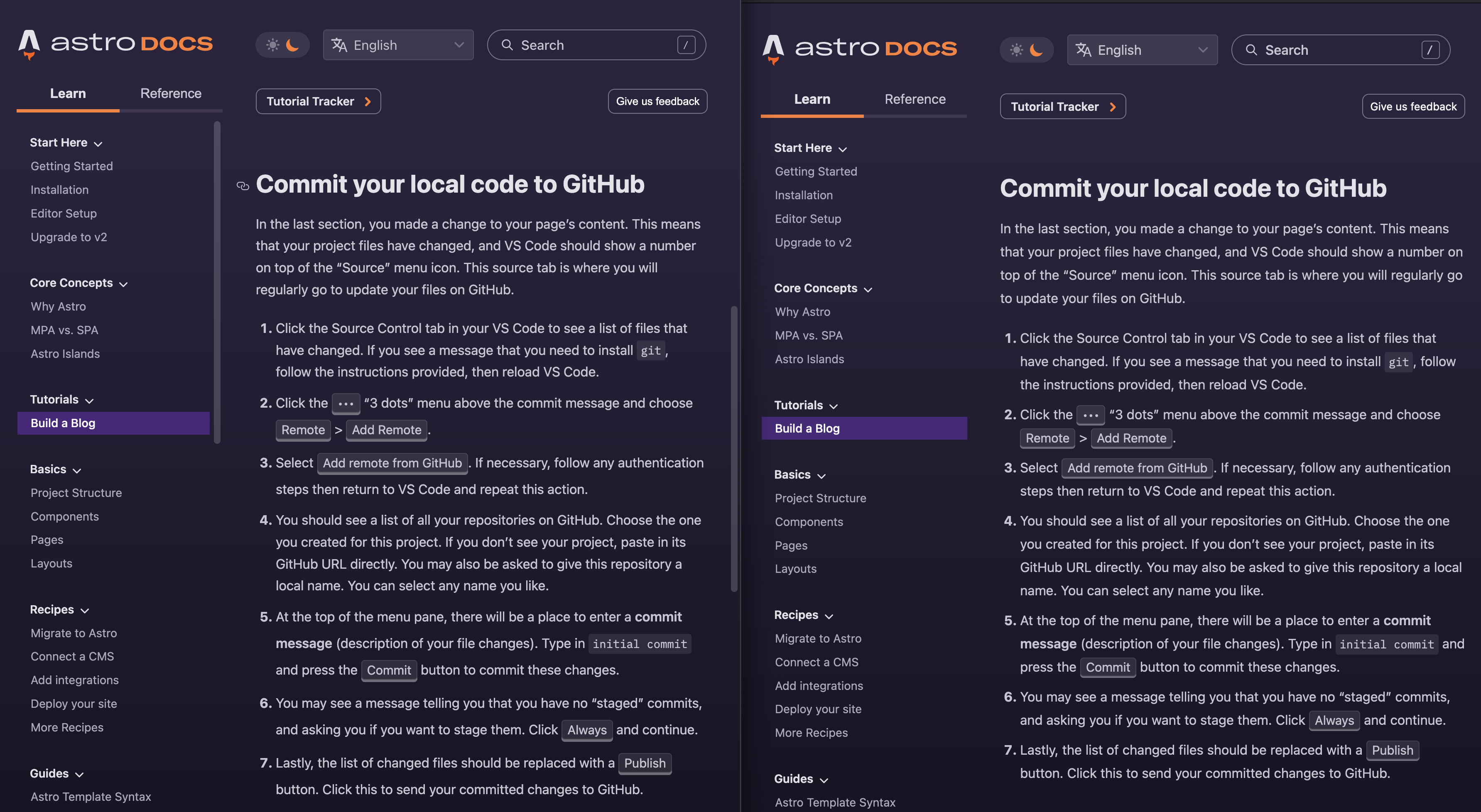
| .content > section > :is(ul, ol) :has(kbd) { |
There was a problem hiding this comment.
:has() isn’t supported in Firefox just yet, so this is only a partial fix and this approach also results in this mix of line heights which I think doesn’t look amazing:
I think I might suggest a multi-part solution. This PR on the left, my suggestion on the right:
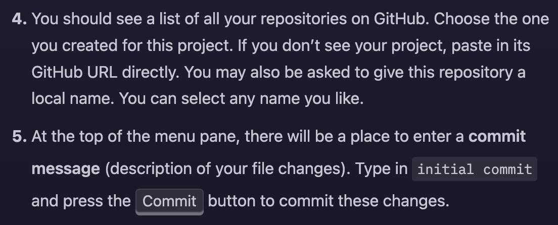
How to do it:
-
Bump up line-height everywhere to
1.75. This is a small change and I actually kind of like the extra breathing room it gives. -
Tweak
kbdstyles to take up slightly less vertical space:-
box-shadow: 0 2px var(--theme-shade-subtle)— 2px instead of the current 3px -
padding: 0.0625rem 0.375rem— 1px instead of 2px vertical padding
-
There was a problem hiding this comment.
I considered "everywhere" as in, content paragraphs & lists, which I liked, but bumping everywhere to 1.75 simply didn't feel right for some reason.
There was a problem hiding this comment.
Haha, thanks for interpreting me correctly, this was exactly what I meant by “everywhere” 😅
There was a problem hiding this comment.
Awesome — thanks for fixing this and the <Box> styles Yan! 💜
| :global([aria-selected='true']) .segment:not(.done) { | ||
| stroke: hsl(var(--color-gray-20)); | ||
| } | ||
|
|
||
| :global(.theme-dark [aria-selected='true']) .segment:not(.done) { | ||
| stroke: hsl(var(--color-gray-70)); | ||
| } | ||
|
|
There was a problem hiding this comment.
While it’s true that now you can see the empty segments better, doesn’t this now mean the contrast between complete/incomplete segments is too low?
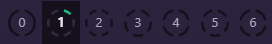
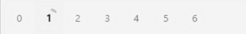
If we remove colours it’s very subtle that these are different:
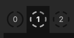
I’d suggest making the empty segments only much more slightly lighter than they are currently (or leaving as-is — I think arguably it’s the complete segments that are the key information and you can see the empty space in contrast to those).
There was a problem hiding this comment.
Tweaked these a bit. I guess this works as a compromise, but I'm fine with leaving it as-is if you still think it isn't enough contrast. I reduced the saturation of the images to zero to try emulate what you did in your screenshot.
Dark:
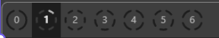
Light:
There was a problem hiding this comment.
I think this is good!
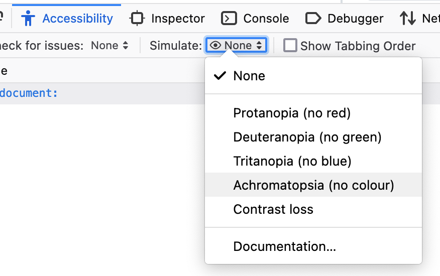
I took my screenshot using Firefox’s “Simulate Achromatopsia” option in the Accessibility tab in dev tools, which is useful for testing this and other color vision variations:
|
Thanks @delucis, made changes according to your suggestions. FYI, I can see the tutorial being properly tracked between translations, I probably thought it didn't because my local storage is constantly deleted. |
delucis
left a comment
There was a problem hiding this comment.
LGTM! Thanks for taking care of this.
One thing still to think about in the future is if we need to handle RTL layout in the keyboard navigation of <TutorialNav>. Currently right arrow moves to the next tab, which is to the left in RTL. I’d need to research whether an RTL keyboard maps that already or if we need to flip that ourselves. Either way that’s non-blocking, and I don’t think we’re likely to get an Arabic tutorial translation anytime soon.
That's something I haven't considered, good point! Just saw they do this manually in the Material UI repo and the Material Design guidelines kinda implies this has to be done manually. |
What kind of changes does this PR include?
Description
A few changes to get our tutorial ready for translations and to improve accessibility.
<Box/>and<Checklist/>components:line-heightfor lists with<kbd/>elements